Santos Organics


Santos Organics - Brand Awareness Campaign
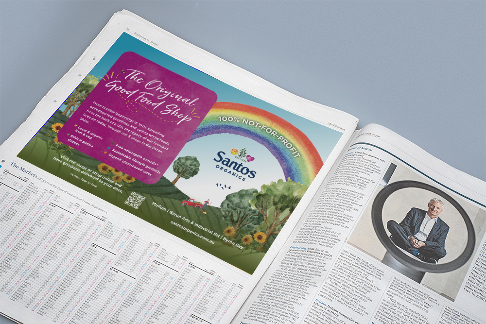
 

Santos Print Ad


The brief

Over the last few years, the Northern Rivers has transformed in terms of its’ demographics, due to an influx of people moving from metropolitan areas around Australia. If you’re gonna be locked down, why not be close to the beach and fresh air!

There has also been an influx of retailers, with major supermarkets and boutique grocery stores in most towns.

Santos Organics, an organic retail store established in the Byron shire in the mid 70’s realised the need to evolve their branding and marketing, to talk to this newer audience and remind the older audience that they are still here, and still great.

Our response

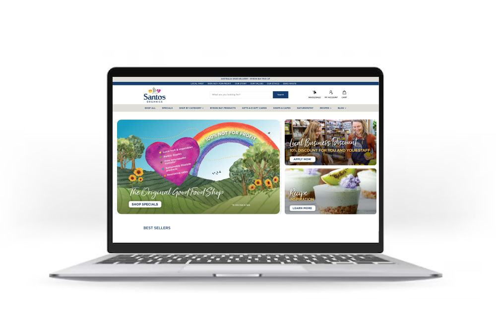
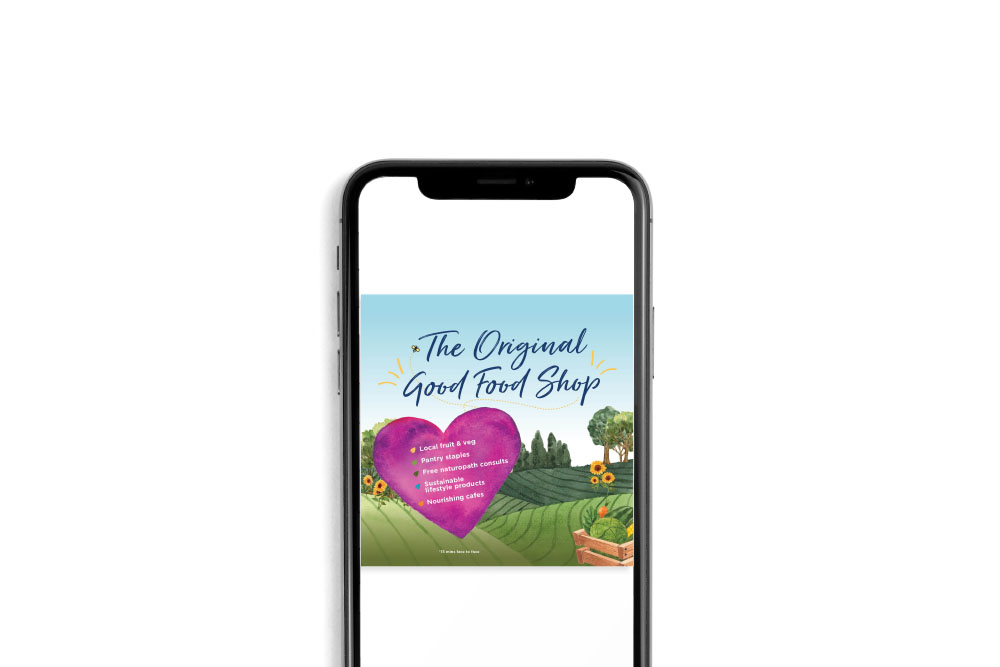
A reintroduction campaign, headlined ‘The Original Good Food Shop’, to educate and take the community on a journey back to the humble beginnings of Santos and how it all began. We also wanted to emphasise their commitment to the local community, by providing the healthiest organic food and lifestyle products, in a new and refreshing way.

Working closely with Santos, we created a brighter look and feel that aligns with Santos’ values, and brings out their true tone of voice, core values and ethics. We incorporated new watercolour elements and colour palettes through the creation of localised scenery, paying homage to their heritage and long-standing ties with the Northern Rivers community.

We created a full brand campaign which rolled out across press, in-store, website, paid and organic socials (video and static), Google Ads and email marketing.

The fruits

The Original Good Food Shop campaign has been an undeniable success, connecting with new and existing Santos customers, as well as highlight Santos’ legacy in the Northern Rivers and their commitment to community, through three content pillars of ‘Local First, Zero Waste’, ‘Health and Wellness’ and ‘Planet Based Living’.

  • Increased website traffic by + 22% YOY
  • Achieved over 600k impressions through paid social & Googles Ads campaigns.
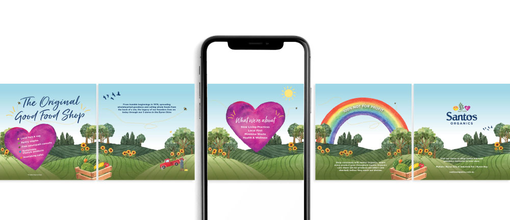


Santos Organics Socials
Santos Organics Web Banner
Santos Organics Socials

Like what we do? Let us help your business grow?with an awesome branding project.
Send us an enquiry below...
 

Hey Team Fruity!

    I'm , I'd like you to help my business 'barefruit'.

    I am interested in

    You can call me on and email me at

    We'd love to know how you heard about us?

    Lismore City Council

    Lismore City Council - Event Marketing 'Lismore Delights'


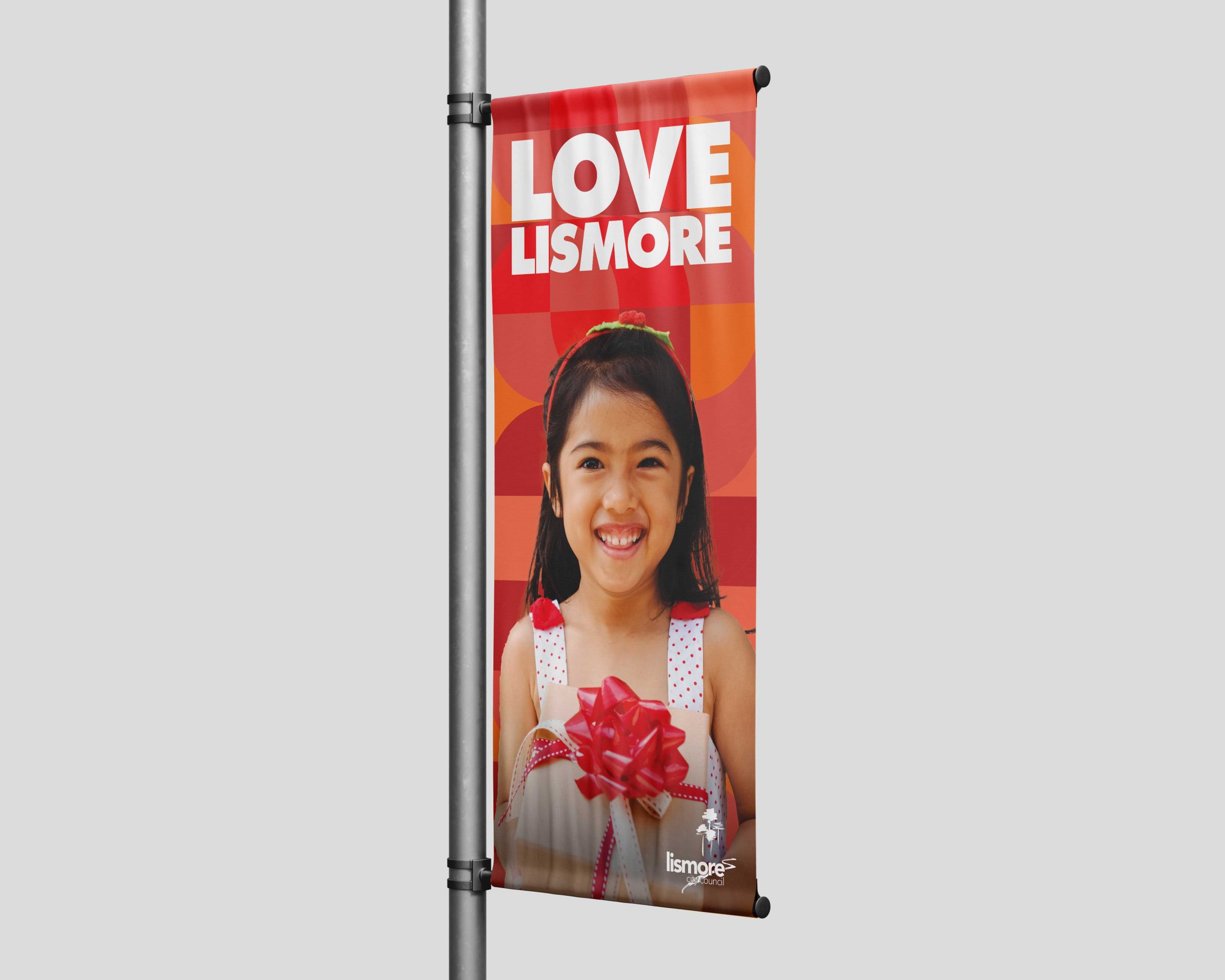
    Lismore City Council Lismore Delights Banner

    Background

    Here at Barefruit Marketing, we're passionate about creating memorable and effective marketing campaigns for our clients, ensuring we bring their visions and marketing objectives to life. Last year, we had the opportunity to work with Lismore City Council on their 'Lismore Delights' Christmas campaign, and nailed it.

    The work

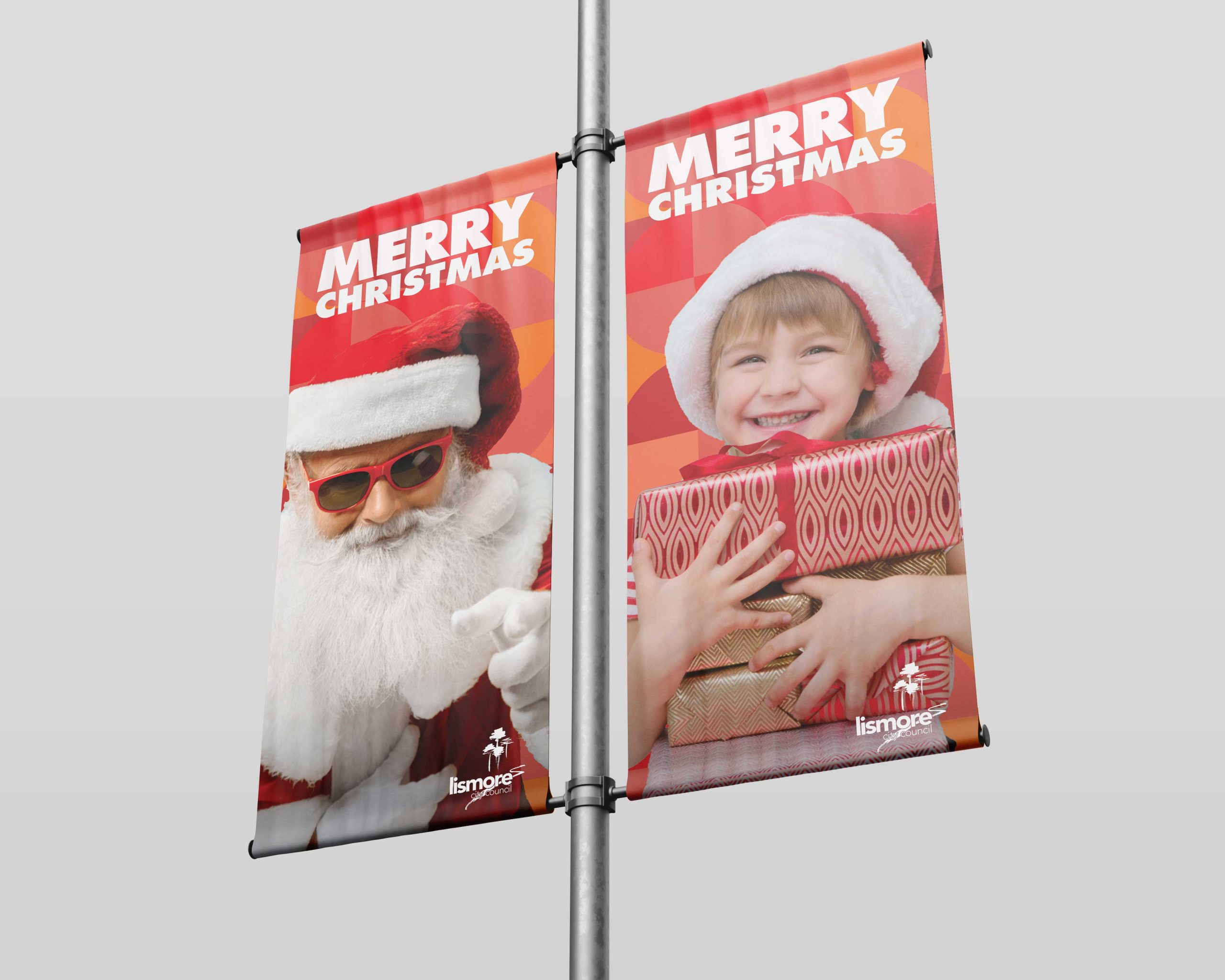
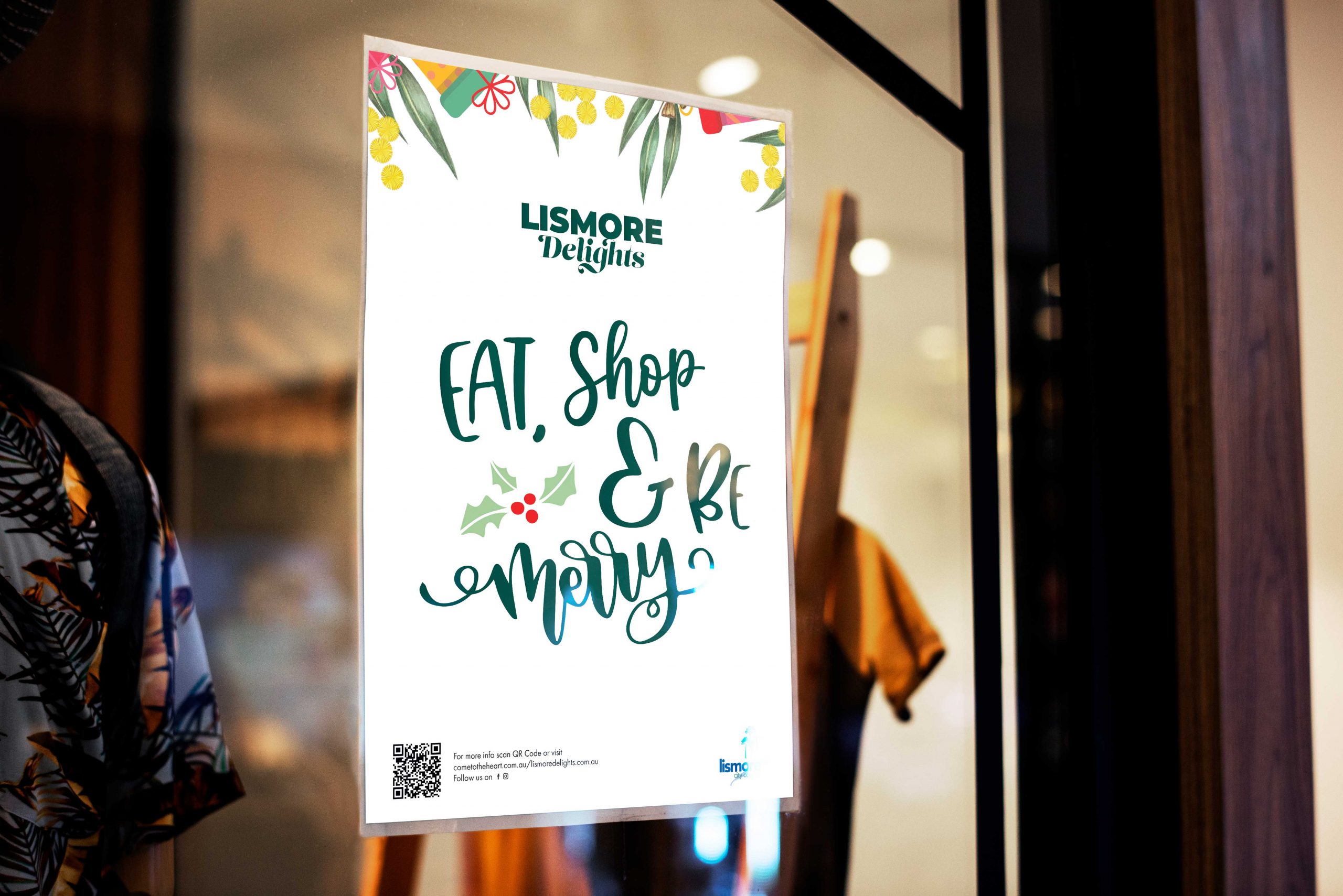
    Offering additional support to their internal marketing team, we were responsible for the roll-out of the ‘Lismore Delights’ campaign, incorporating all aspects of the project, from the design and printing of banners, to managing social media, to creating radio and television ads. The timelines weren’t for the faint-hearted, but given our experience and passion for in integrated campaign, plus the fact that we love Lismore, we embraced the challenge and like an Elf in Santa’s workshop, we set to work.

    Needless to say, the campaign was an overriding success, even Santa seemed chuffed at how seamlessly it all rolled out. In fact, ‘Lismore Delights’ was met with such welcoming enthusiasm by the community, the town was the ‘place to be seen’ over the festive season and Lismore City Council hope to build on its’ success in years to come.

    We’re all about bringing your project visions and goals to life, so if you like what we do, let’s make it happen.

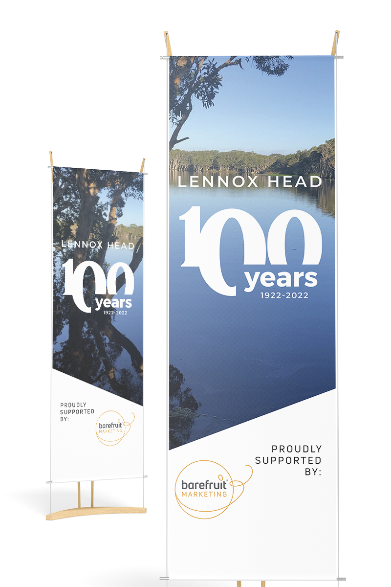
    Lismore City Council Lismore Delights Banner
    Lismore City Council Lismore Delights Shop Signage
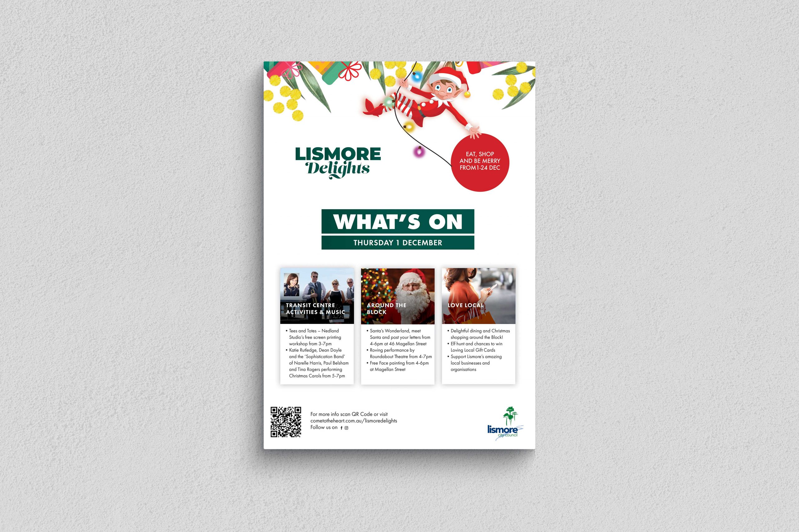
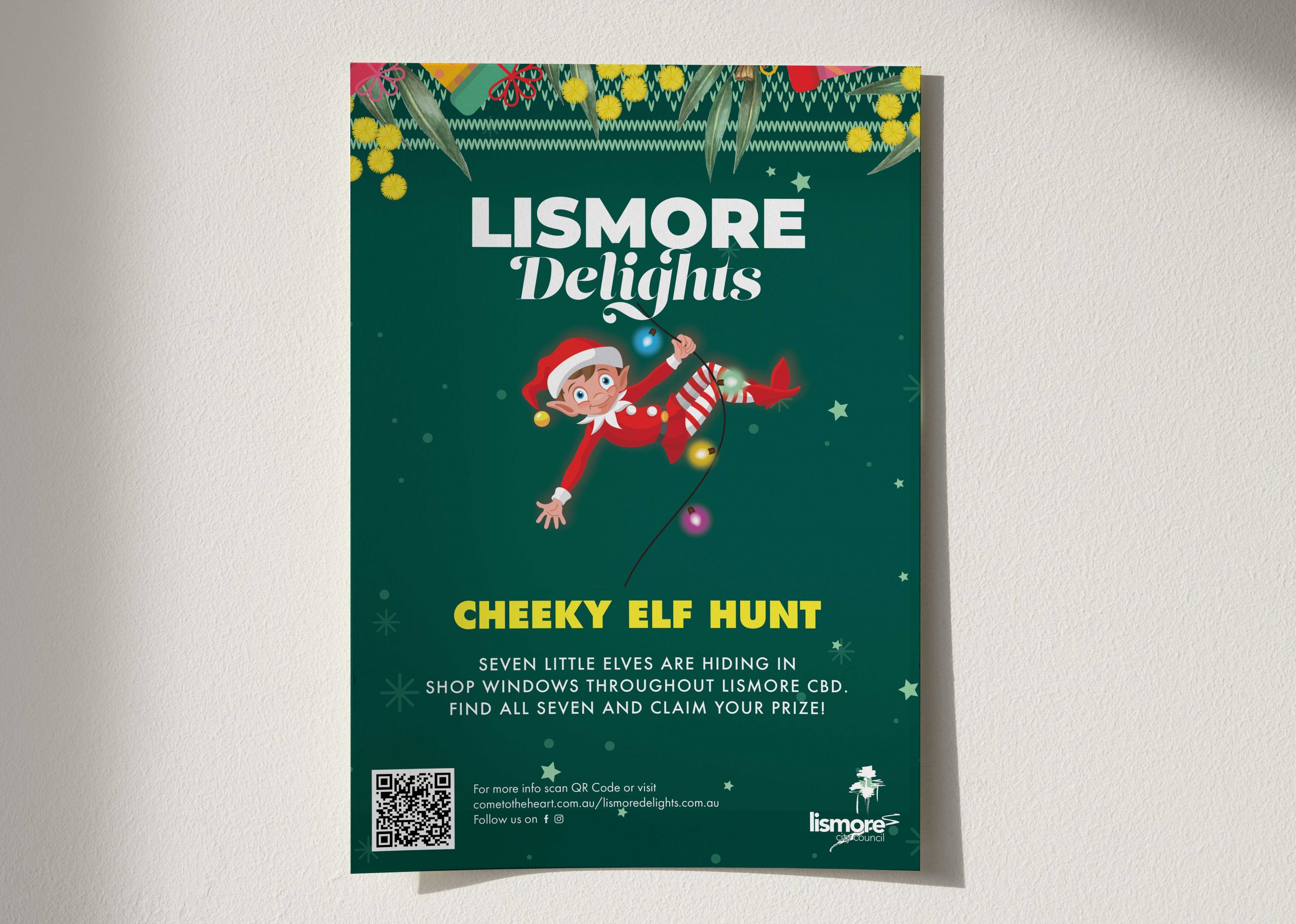
    Lismore City Council Lismore Delights Poster
    Lismore City Council Lismore Delights Poster

    Like what we do? Let us help your business grow?with an awesome branding project.
    Send us an enquiry below...
    Hey Team Fruity!

      I'm , I'd like you to help my business 'barefruit'.

      I am interested in

      You can call me on and email me at

      We'd love to know how you heard about us?

      Lennox Centenary

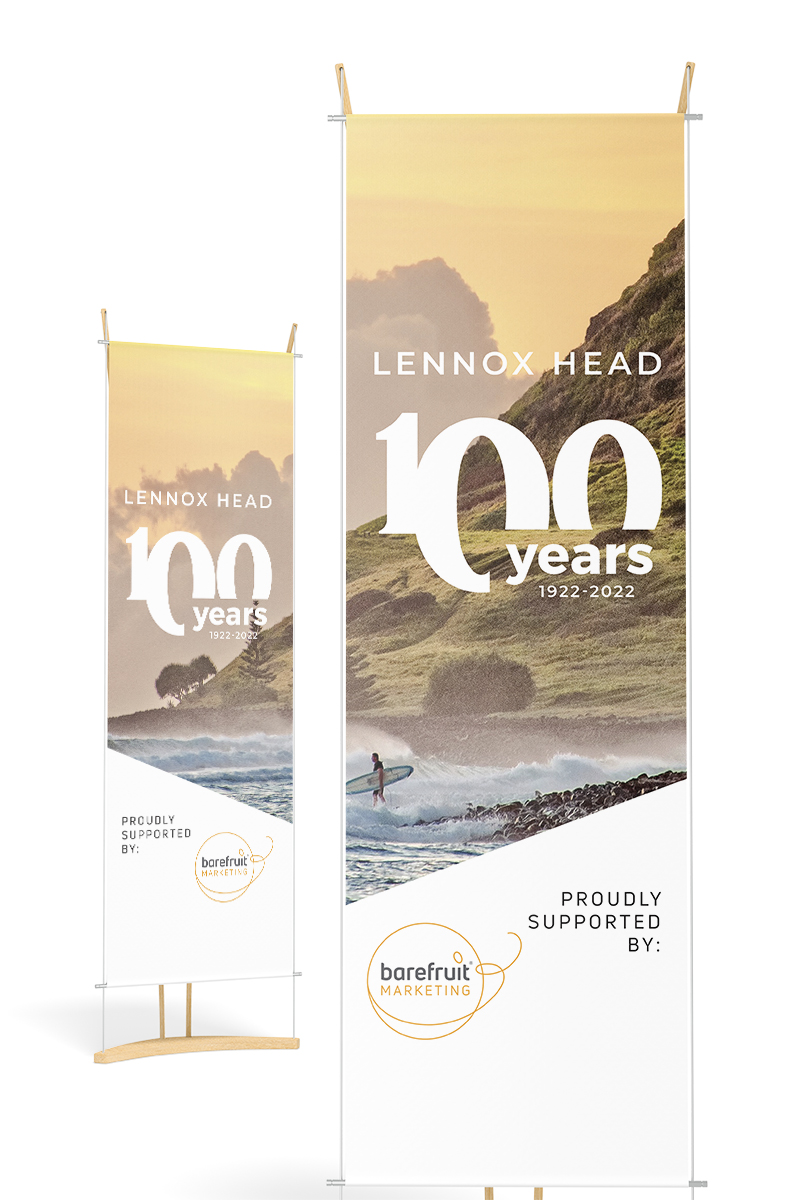
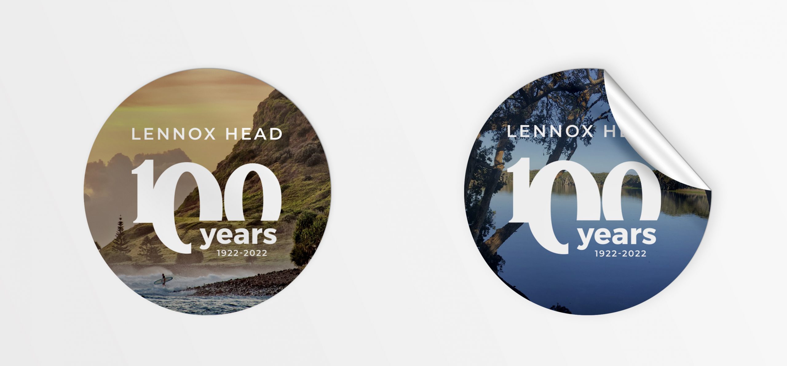
      Lennox Head 100 Years - Event Marketing


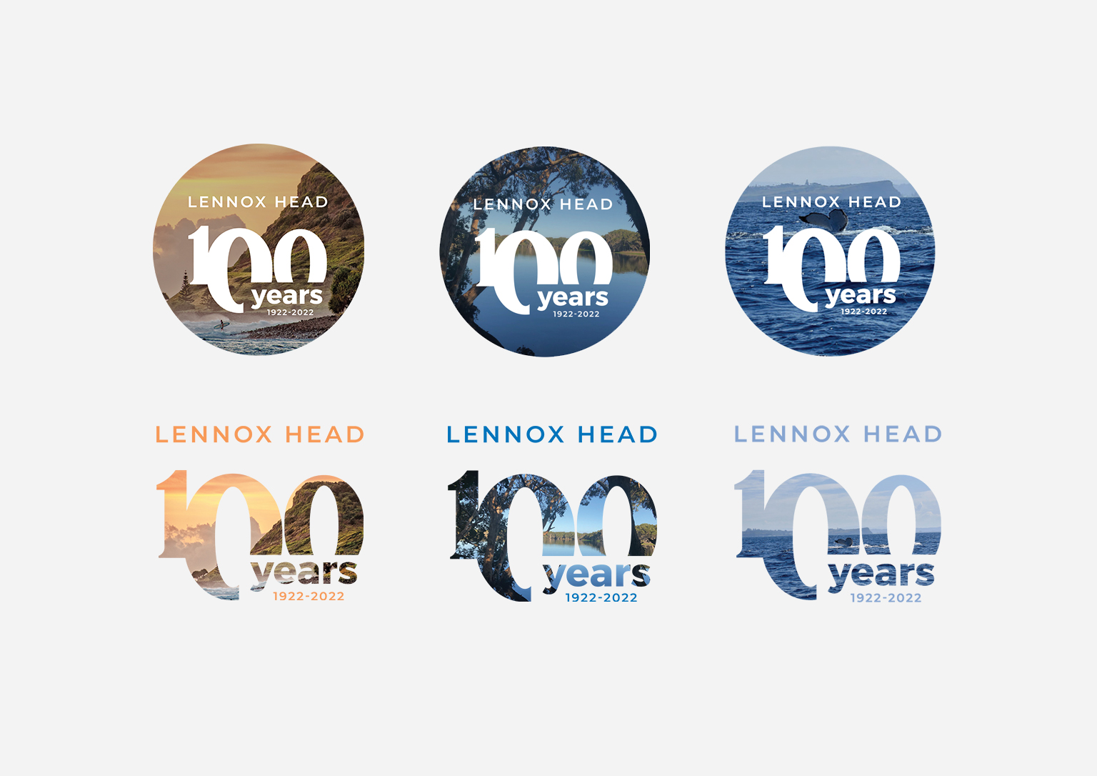
      Lennox Head Centenary logo
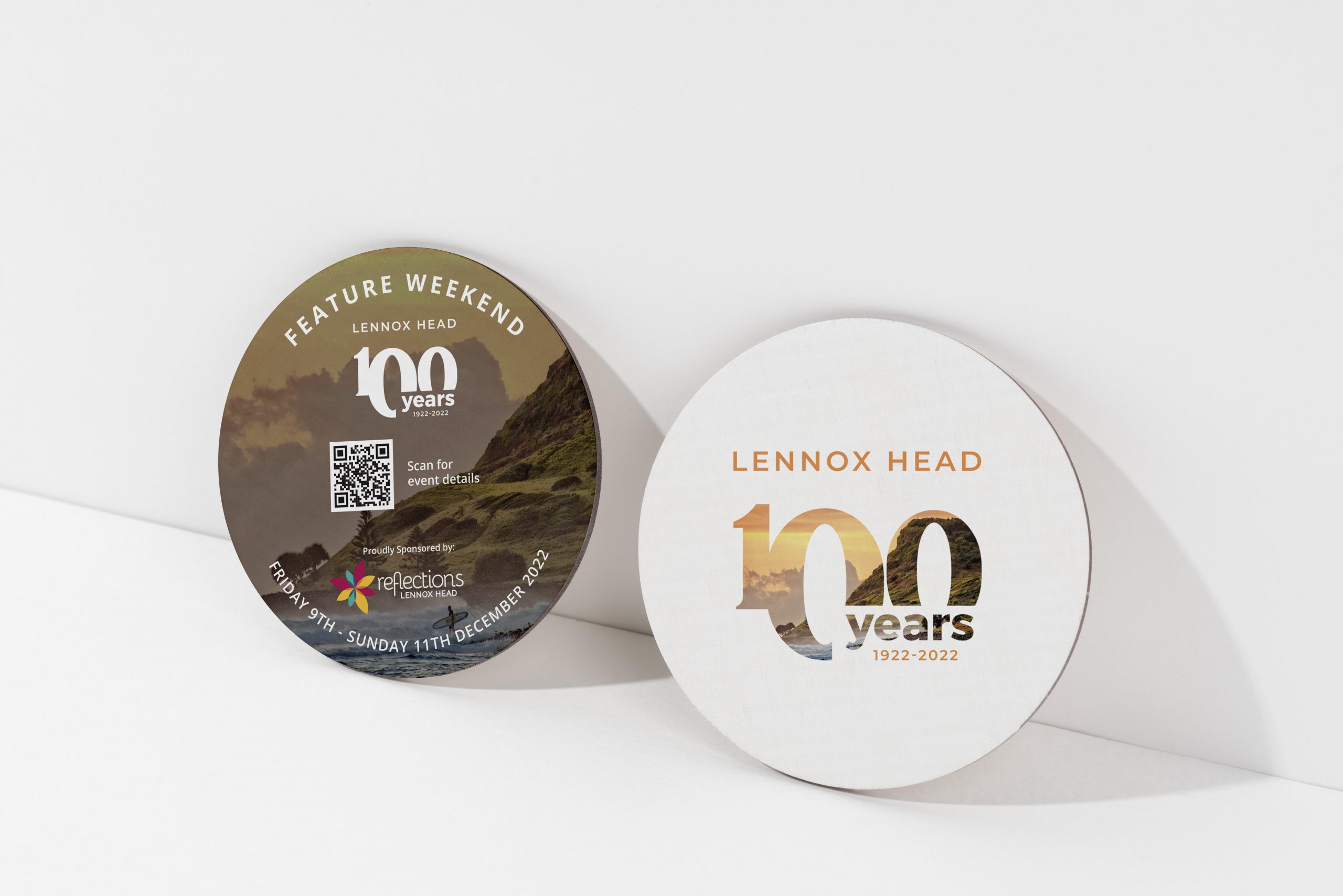
      Lennox Head Coasters
      Rugby Palooza website
      Rugby Palooza website
      Rugby Palooza website

      Like what we do? Let us help your business grow?with an awesome branding project.
      Send us an enquiry below...
      Hey Team Fruity!

        I'm , I'd like you to help my business 'barefruit'.

        I am interested in

        You can call me on and email me at

        We'd love to know how you heard about us?

        Kingscliff Accommodation

        Kingscliff Accommodation


        Kingscliff Accommodation - branding

        Background

        We were approached by Kingscliff Accommodation, a boutique guest accommodation and property management provider on the Tweed Coast. Initially we were briefed with the objective to increase the number of properties in their portfolio, however, the partnership evolved into an ongoing retainer.


        The work

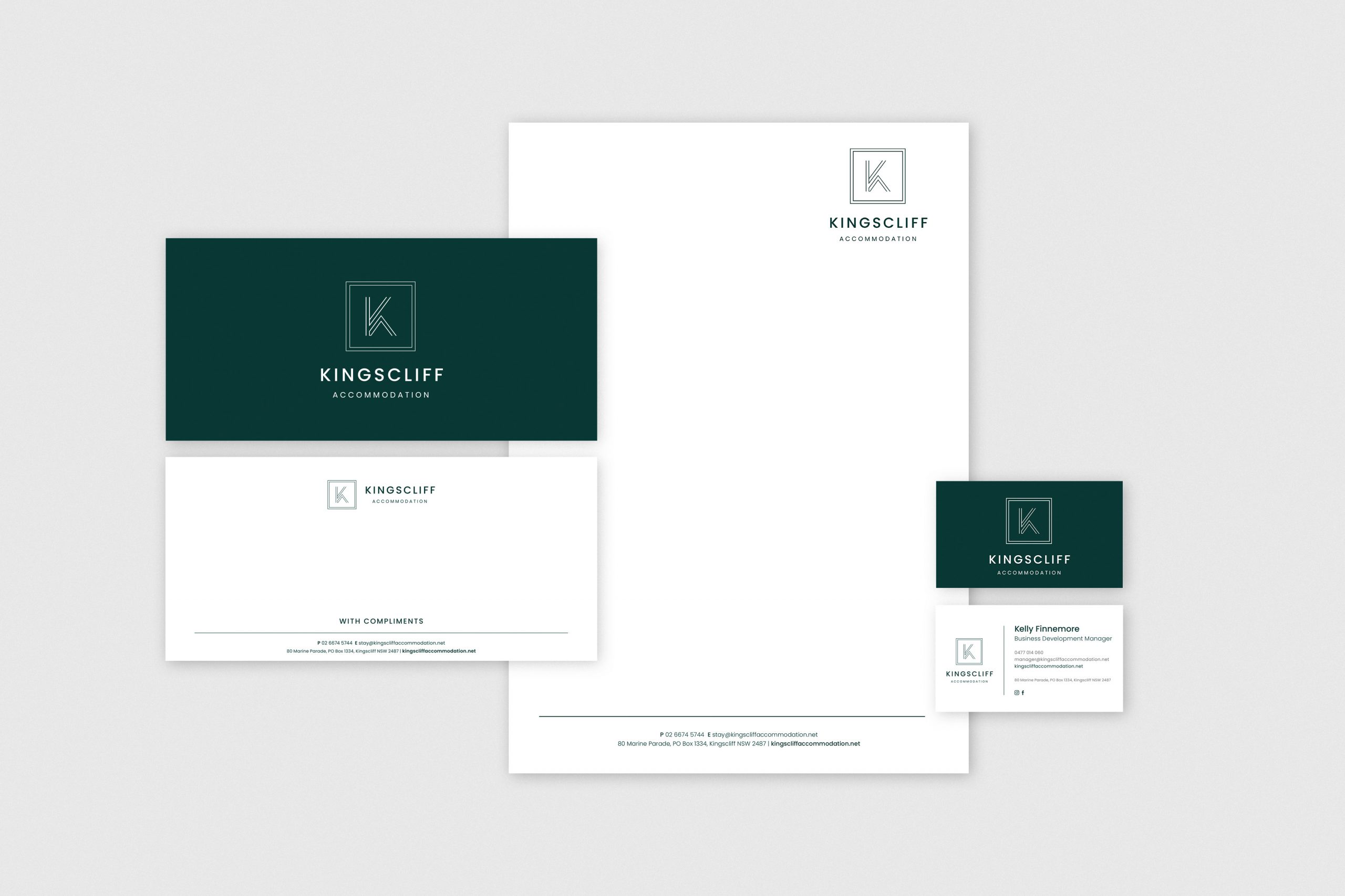
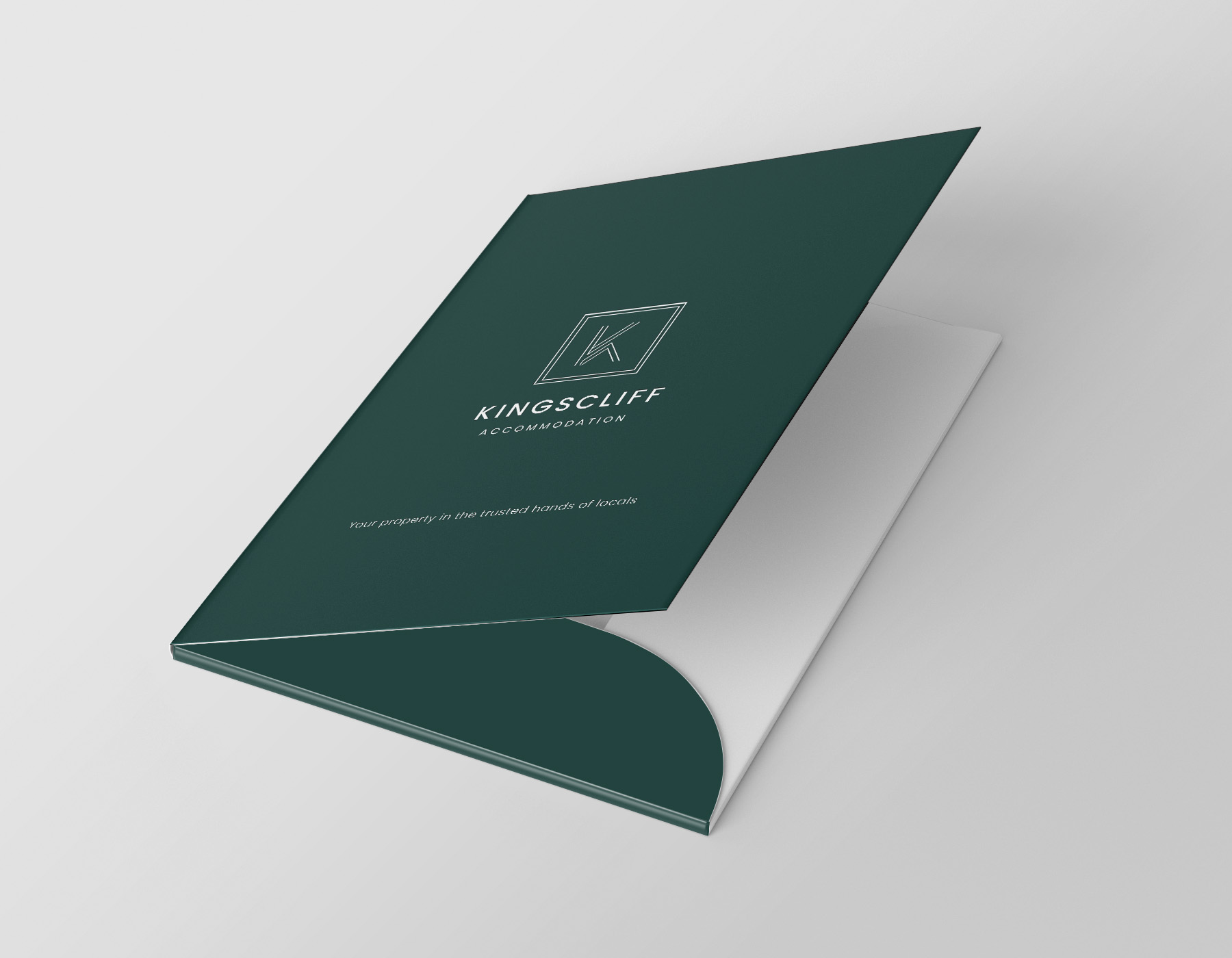
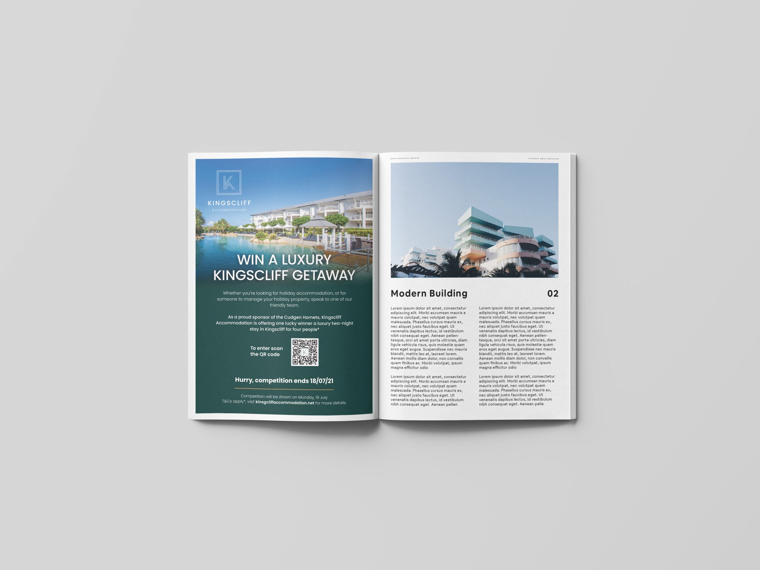
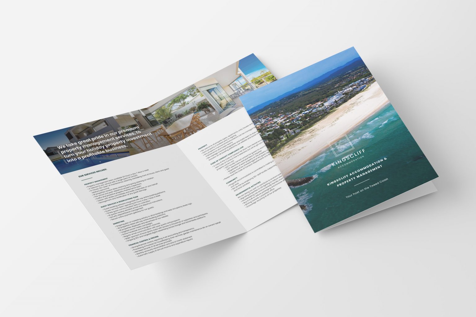
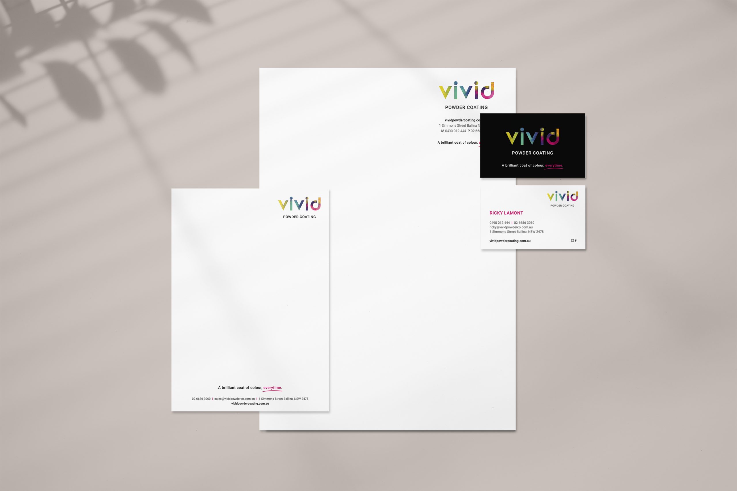
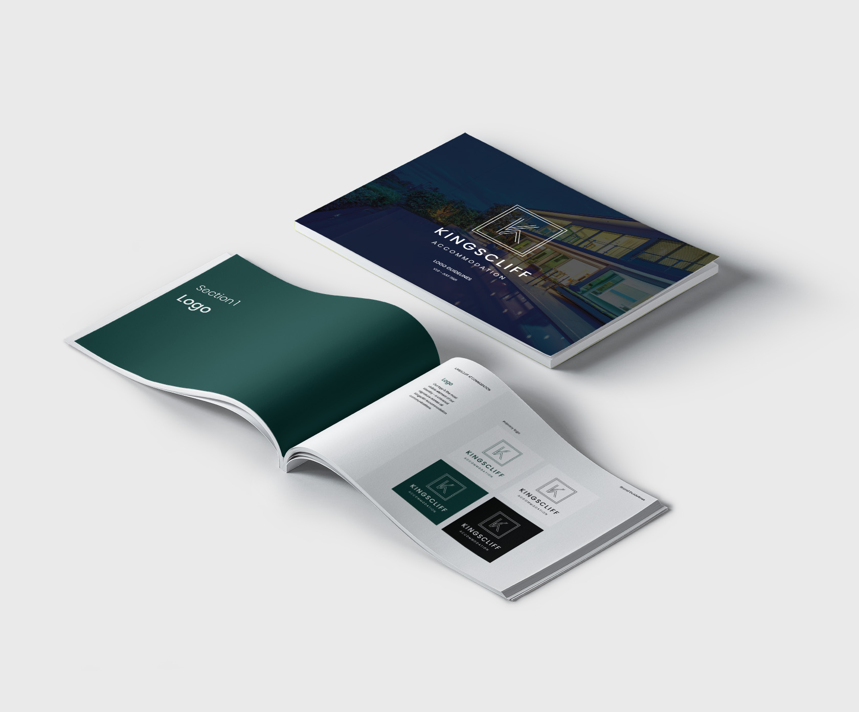
        We started the process of planning campaigns when we realised the branding, which had been created by another agency, wasn't quite right. It's application in socials wasn't working, and so before we got started on any promotional activities, we needed to correct the branding. We still had to keep the primary elements of their previous logo design, however we shifted the brand mark to a square bounded box rather than a pill-shape which was hard to use in social. From there, we rolled out the new branding across all marketing collateral, including business cards, a letterhead, comp slips and business folders. We also pulled together a Business Development Manager's pack which included a services flyer and agency agreement.

        While this was all happening, we were simultaneously working on signage, website updates and campaign strategy - more to come on these elements later.


        Kingscliff Accommodation - Business Cards
        Kingscliff Accommodation - Presentation Folder
        Kingscliff Accommodation - Presentation Folder
        Kingscliff Accommodation - brochure

        Like what we do? Let us help your business grow?with an awesome branding project.
        Send us an enquiry below...
        Hey Team Fruity!

          I'm , I'd like you to help my business 'barefruit'.

          I am interested in

          You can call me on and email me at

          We'd love to know how you heard about us?

          Vivid Powder Coating – Ballina

          Vivid Powder Coating - Branding and Website


          Vivid Powder Coating - logo

          Background

          Vivid Powder Coating is a new business and service in the heart of Ballina, NSW. Barefruit was approached to come up with the brand name, branding, marketing collateral and website to launch this new service.

          The work

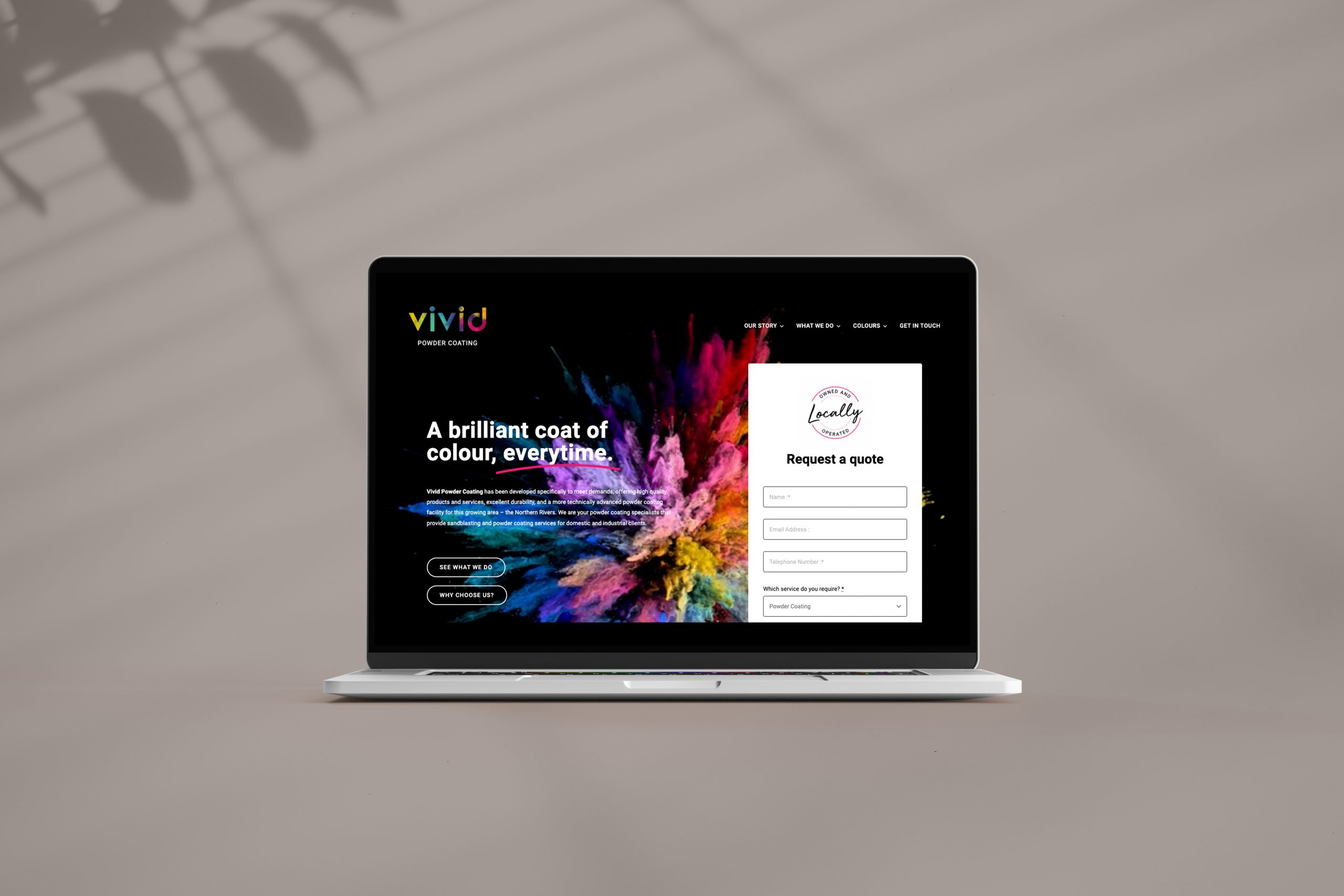
          This was a very fun project that started by researching naming options that work and tie in with their business, "Vivid" was the preferred naming option, the word suggests the perfect finish, clear, bright, vibrant the sort of finish you would expect to see if your respraying your Harley Davidson!

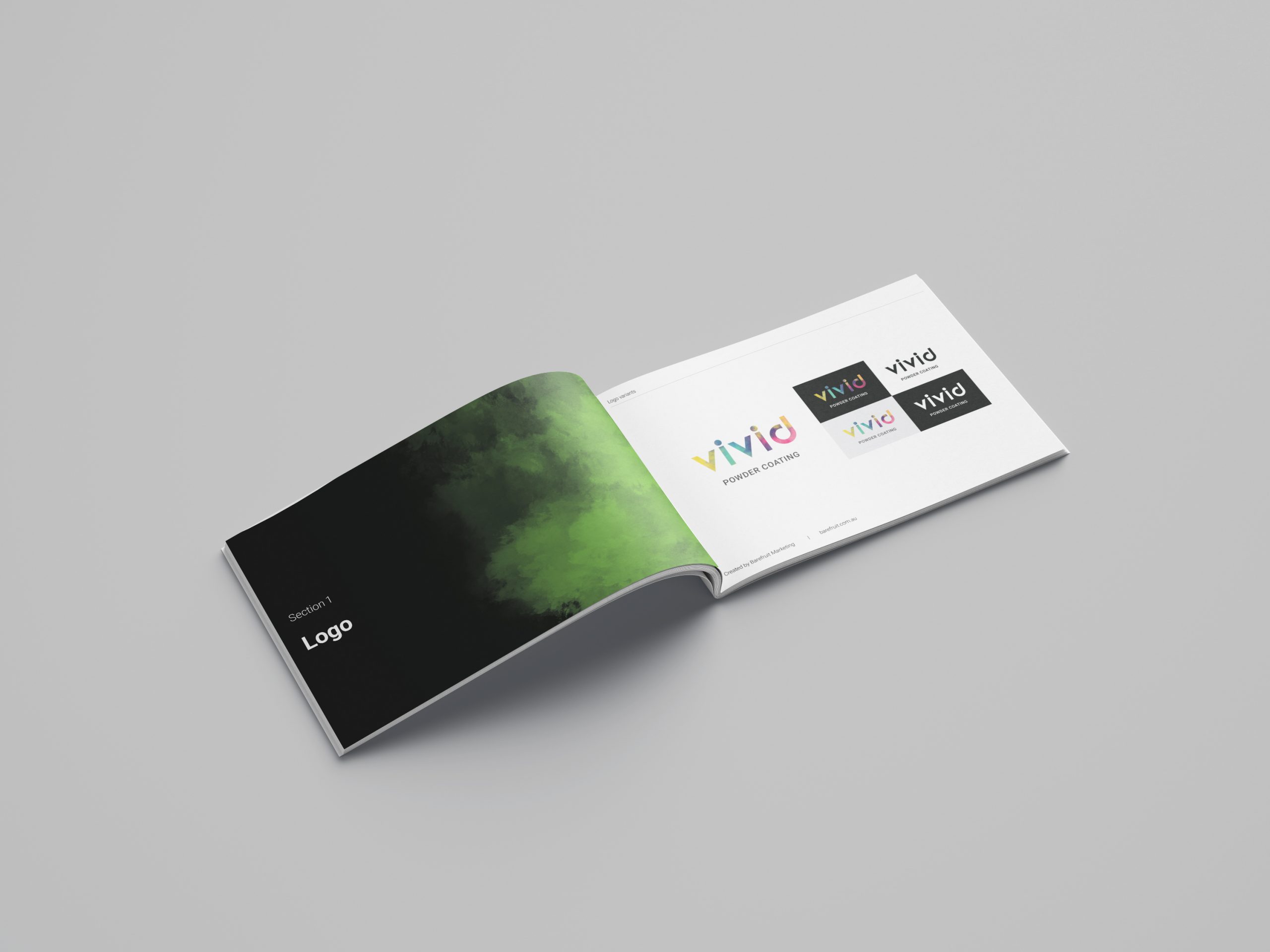
          With the business name decided we proceed on creating the identity for the brand, starting with mood boards to develop our initial concepts, the client loved the exploded powder of colour idea we presented and so this was to become the main feature of the branding on the Gold Coast and Ballina. We saw the direction for the branding working with a matt black to allow the colours to really pop, this allowed us to quickly concept how the brand elements were going to be applied. Choosing a typeface was a bit of a process, pairing a font that works with the personality of the word "Vivid" and the exploding colours, whilst staying professional looking meant the best route was a Sans Serif font. The final result was creative identity that tied in with what the business does. We also developed a strapline that really tied in with the logo and business service - "A brilliant coat of colour every time" and this has been applied consistently to their marketing.

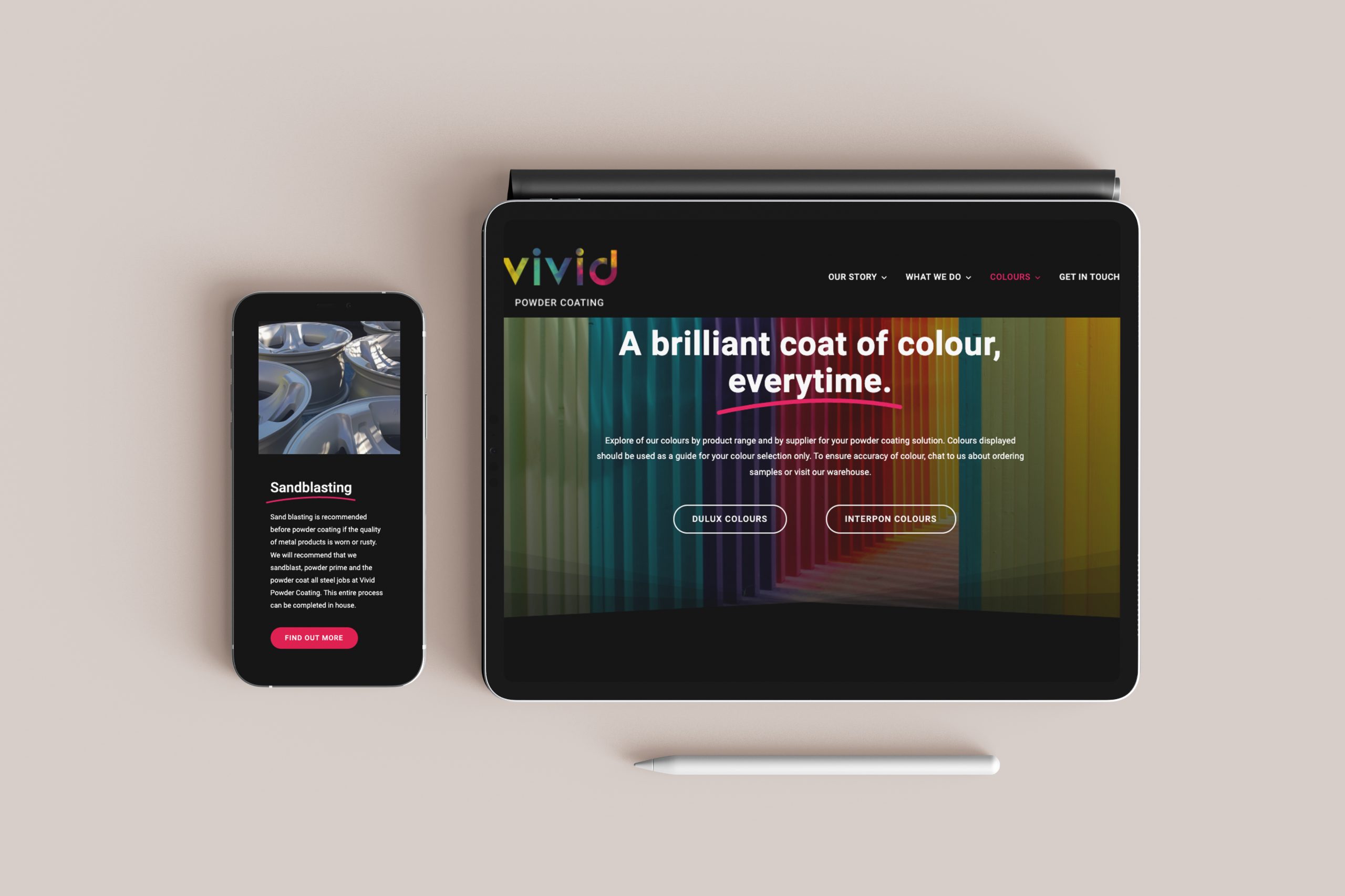
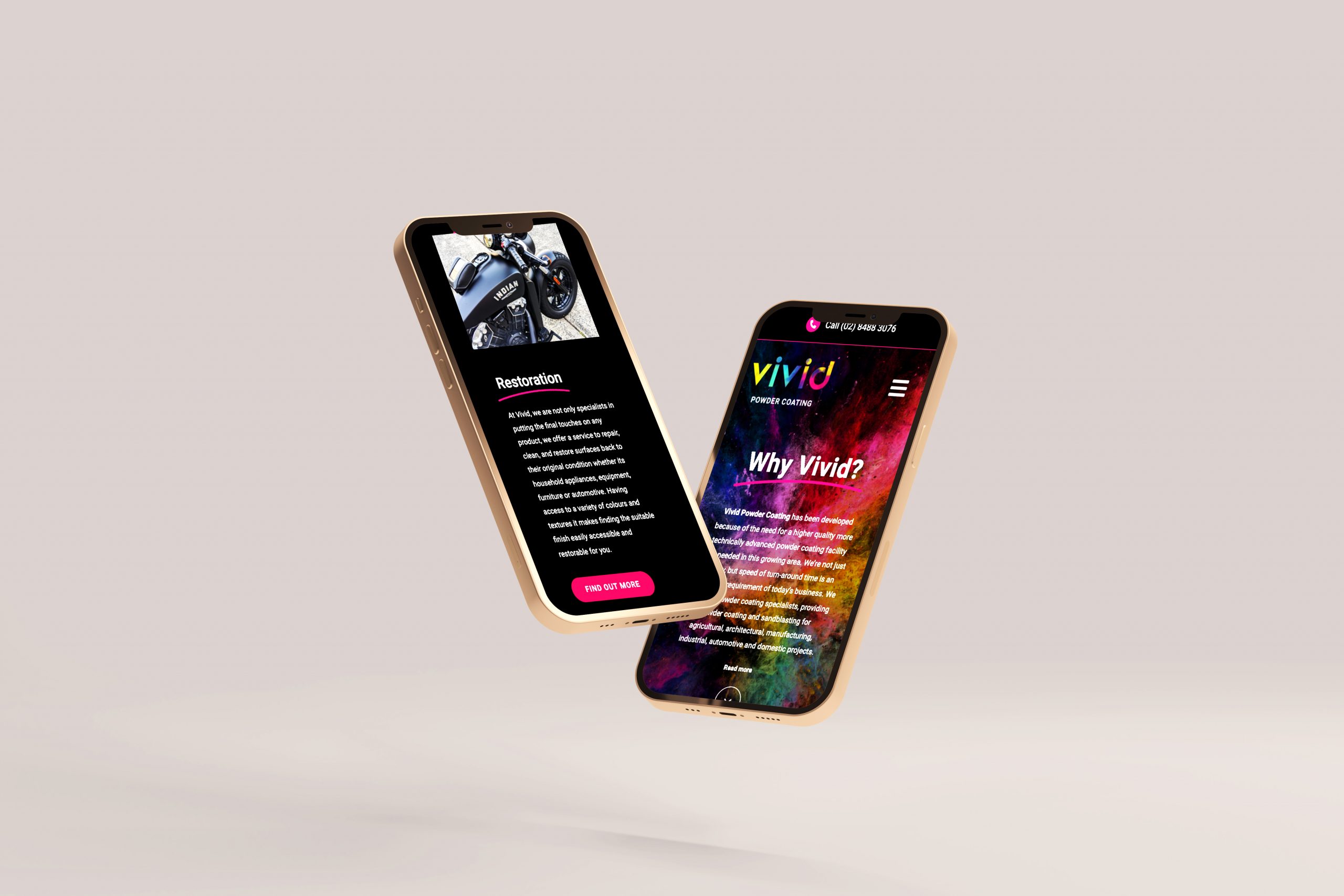
          The website was a fun process, prototyping the structure and thinking about the website goals. Styling, adding the video of the exploding powder on a black background became the website theme and we used the "hot pink" as the primary call to action and feature colour. We added in some subtle transitions to finish it off, including another brand feature which was the "Swoosh" animation added under the titles and strapline, this became a feature brand element that we used throughout the brand application to emphasis specific words and services.


          Vivid Stationary
          Vivid brand guide
          Vivid-Website mock
          Vivid-Website -desktop
          Vivid-Website-mobile

          Like what we do? Let us help your business grow?with an awesome branding project.
          Send us an enquiry below...
          Hey Team Fruity!

            I'm , I'd like you to help my business 'barefruit'.

            I am interested in

            You can call me on and email me at

            We'd love to know how you heard about us?

            Kerrect Re-brand & Website

            Kerrect - Re-brand & Website


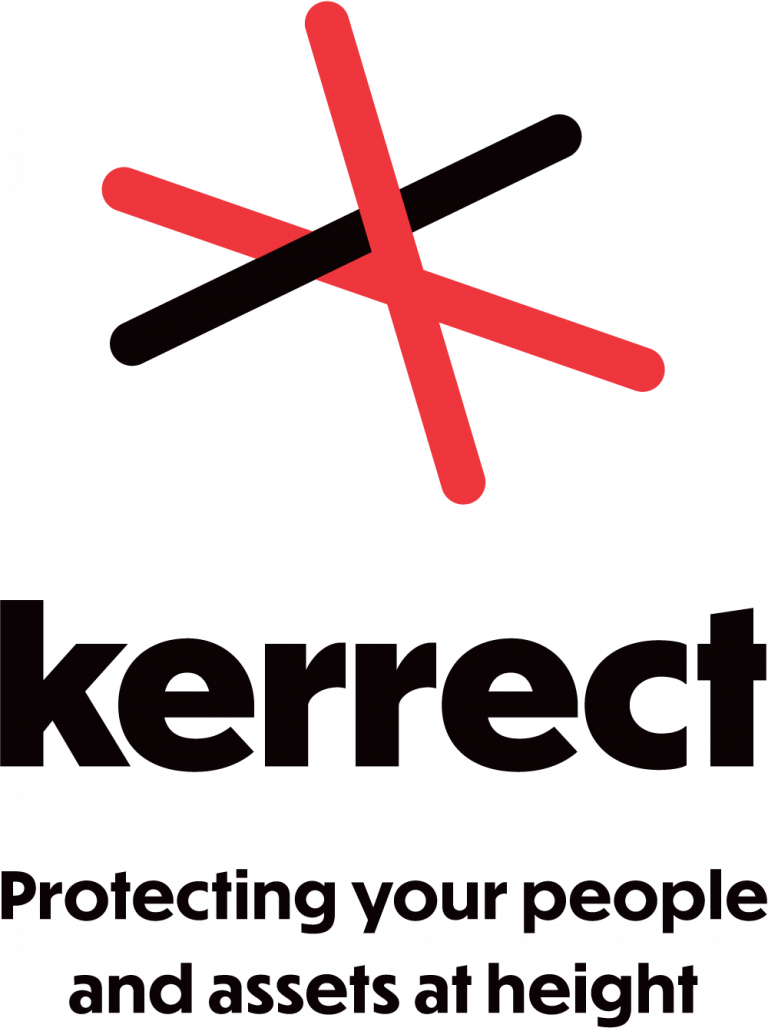
            Kerrect Logo
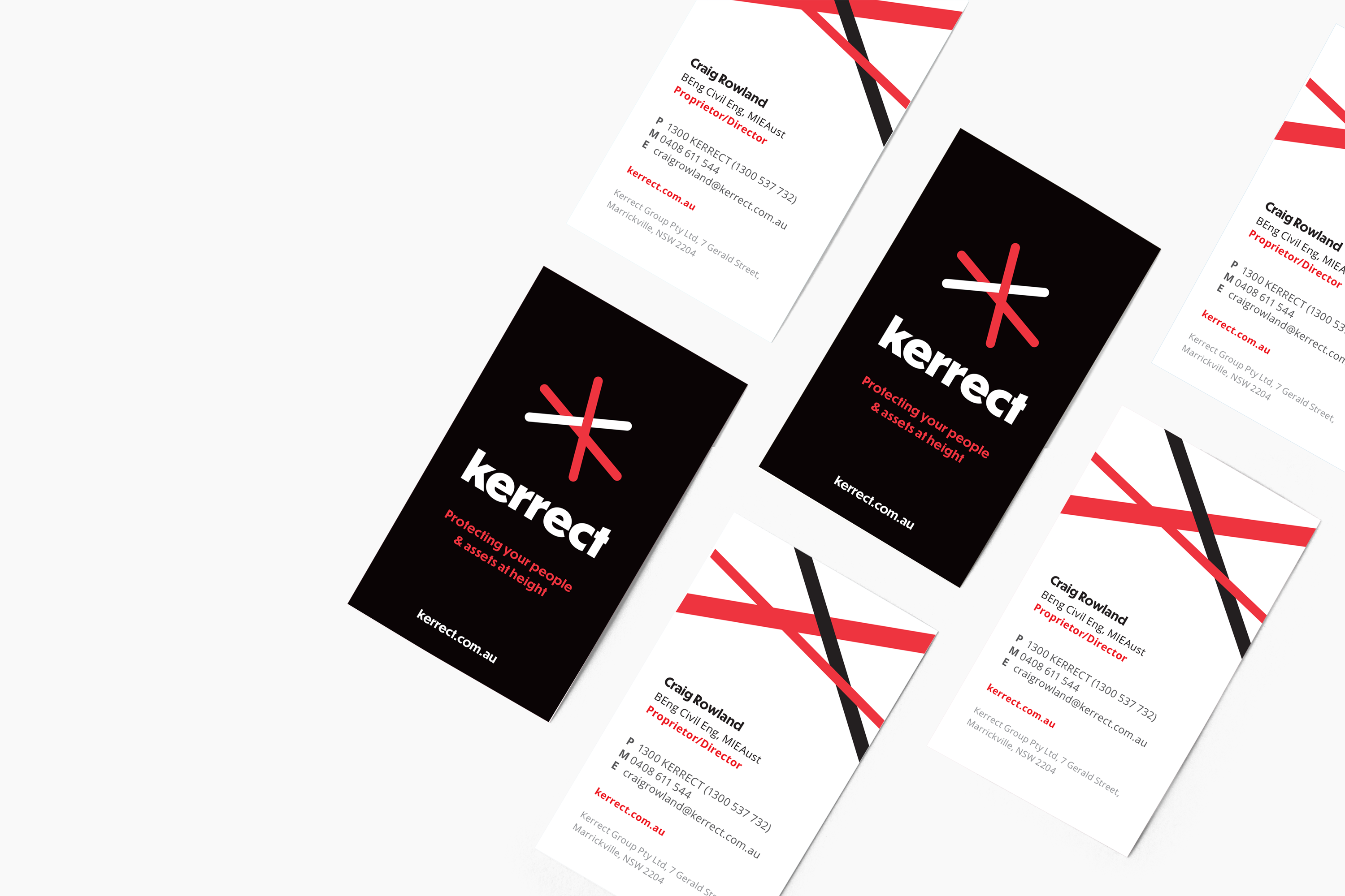
            Kerrect Business card

            Background


            Kerrect is a unique service with skilled professional rope climbers and maintenance staff that can access and install safety netting and access points on buildings - they are the go-to experts for working safely at height without scaffolding. Kerrect came to Barefruit with the aim of refreshing their brand identity, website, creating a new strapline to stay ahead of its competitors and to modernise their look and appeal for today’s purposes.


            The work

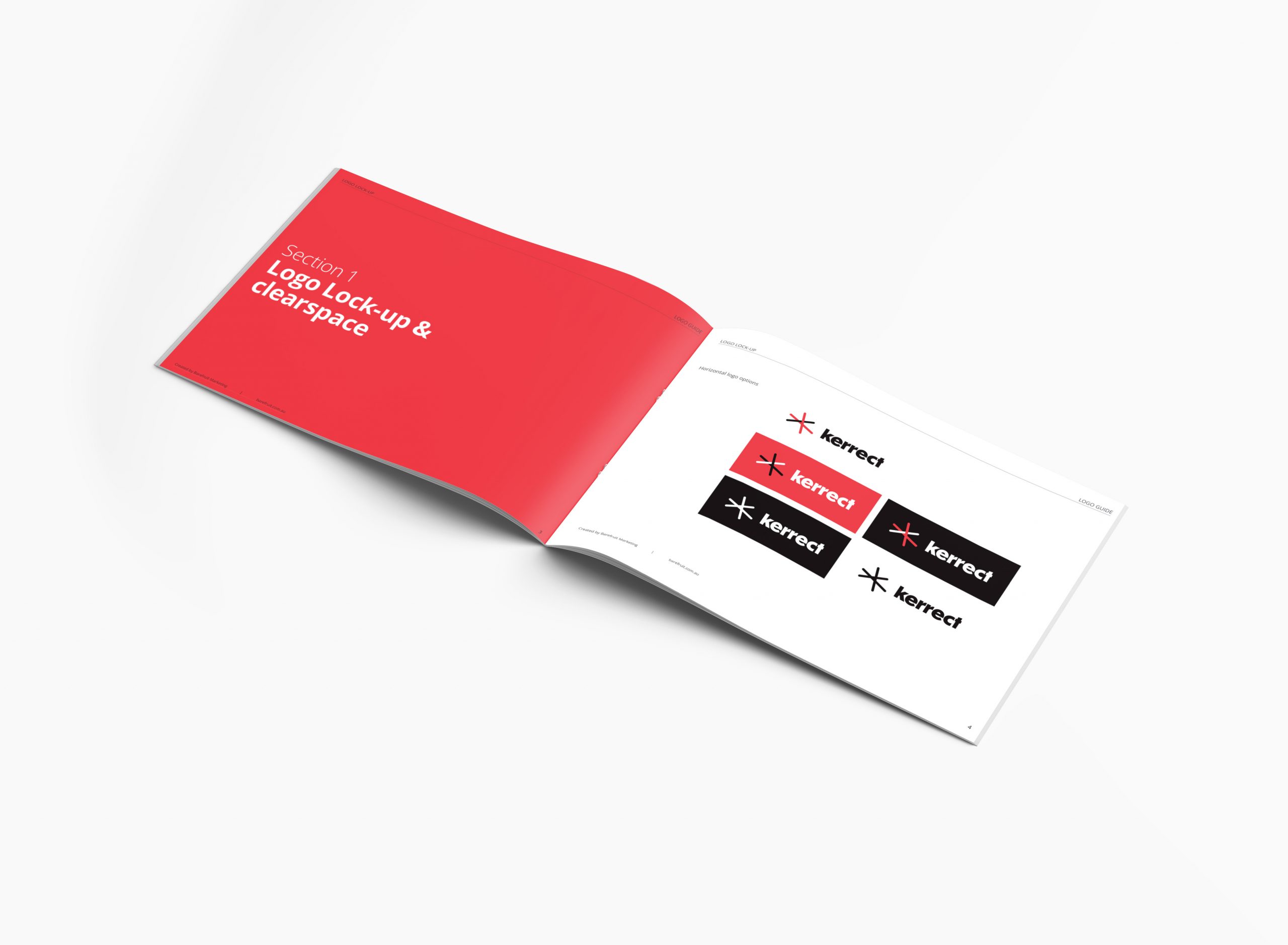
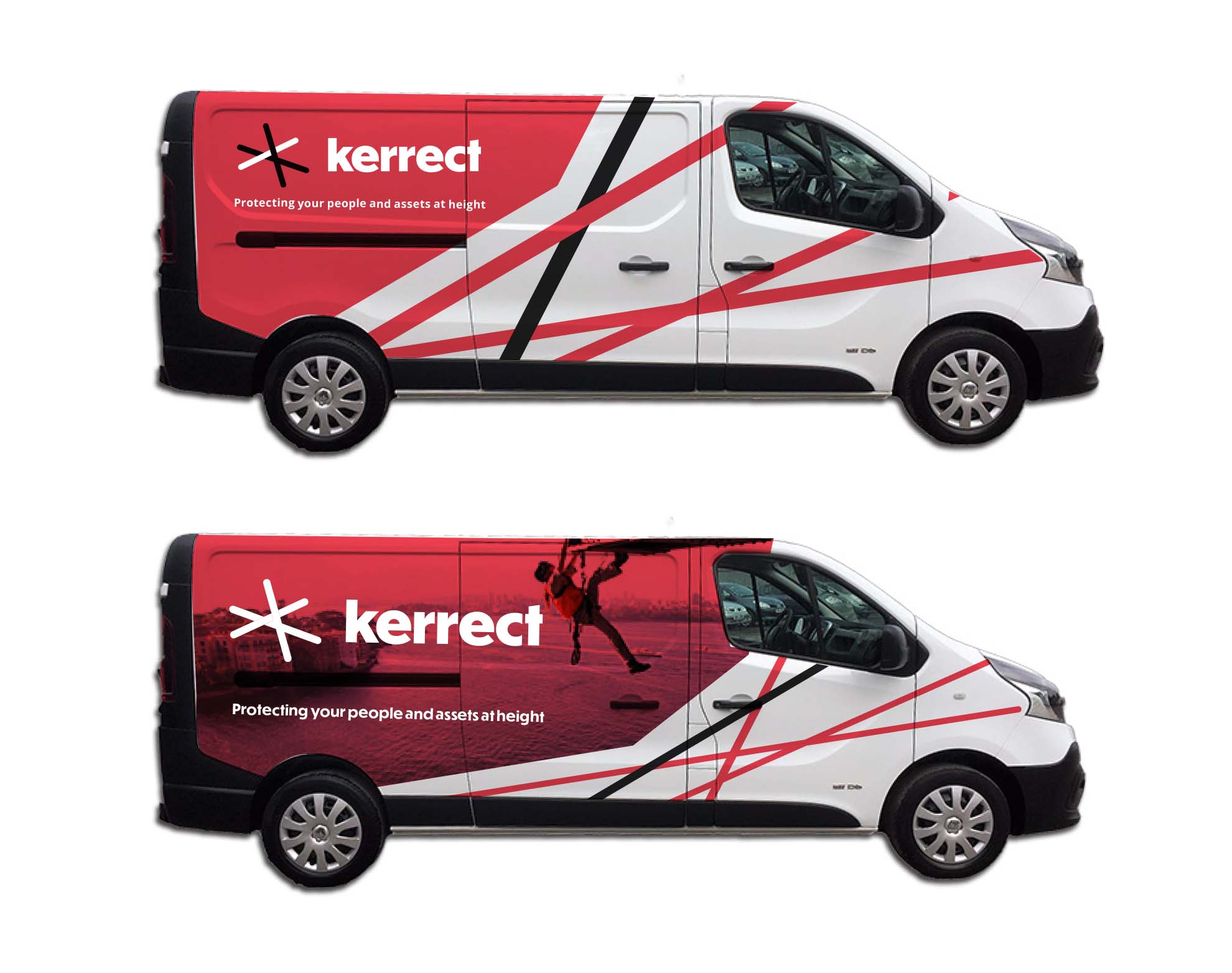
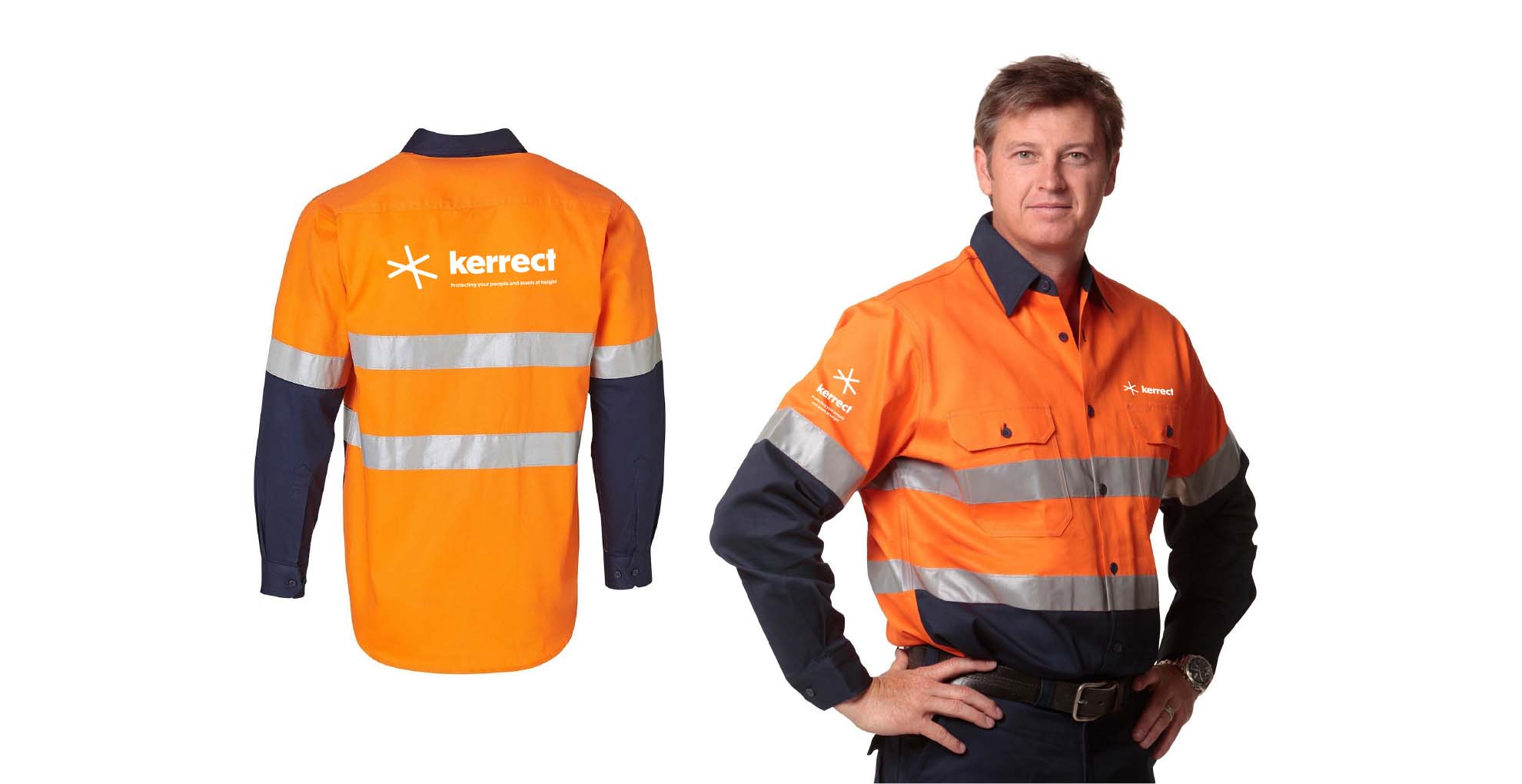
            The new logo evolved from utilising some of the old logo elements to create a stronger concept and brand identity that can be used in today’s digital world and on physical applications such as vehicles, netting on buildings, business cards and uniforms.

            The logo features lines to represent ropes, and uses the primary red and black colours of the brand to stand out amongst their competitors. The lines are positioned above the typeface to represent the safety netting and protection at height. Using a clean geometric sans font the brand identity is modern, approachable and professional.

            As part of the brand process. we also developed a new strapline for the business that really specified what Kerrect is and does - the strapline needed to be unique and ownable for the business. The original strap was “Safety at height” but Kerrect do more than just that, therefore, it evolved into, “Protecting your people and assets at height." The new strap really captures the core value of the business and what the achieve on a daily basis, making sure people and any building or business assets are always safe and protected whilst caring out their height defying work.

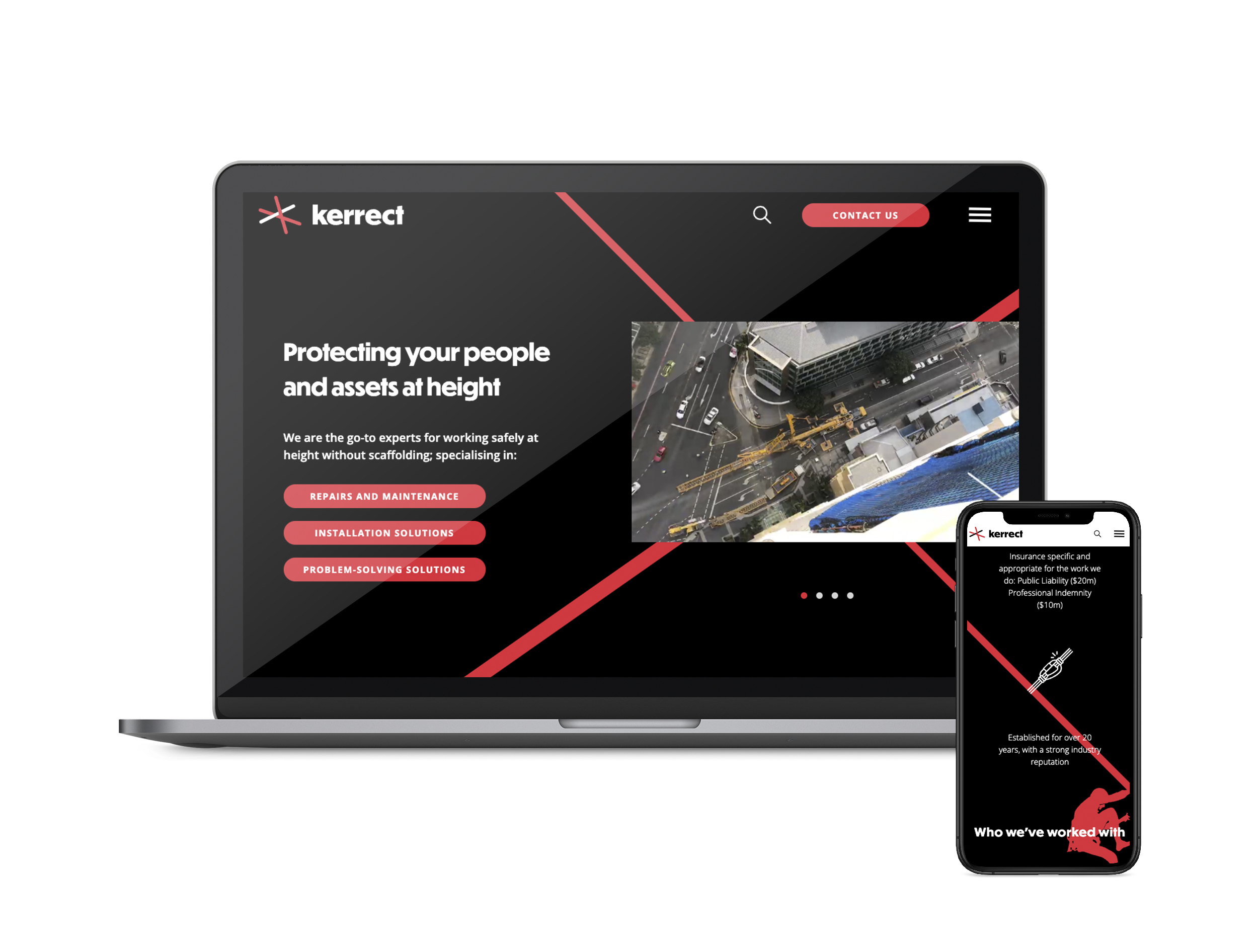
            Barefruit also designed and developed a new cutting-edge website that was unique to Kerrect and what they do. We created a slick black themed website which made their primary colour 'red' really pop, and especially when used with unique parallax scrolling effects in the background, Kerrect now have a creative looking website. Parallax scrolling is a special scrolling technique used in website design where background images throughout a site move slower than the foreground image when scrolling. This creates a two-dimensional look and feel to the website and is accustomed to the way users behave nowadays - scrolling through feeds and pages. The whole website is fresh and up-to-date featuring areas for video or image based content with room to grow their portfolio projects. The navigation is also very simple to use on mobile and desktop and focuses on their user goals to enquire for one of their services.

            We are proud that the overall brand re-fresh has given Kerrect a big jump ahead of its competitors.


            Kerrect brand guide
            Kerrect website

            Guru_of_the_day_winner

            Award winning nomination from Web Guru Awards

            Click here to view the website

            Kerrect Van 2
            Kerrect Uniform

            Like what we do? Let us help your business grow?with an awesome branding project.
            Send us an enquiry below...
            Hey Team Fruity!

              I'm , I'd like you to help my business 'barefruit'.

              I am interested in

              You can call me on and email me at

              We'd love to know how you heard about us?

              East Coast Building Consultants – Integrated Marketing Campaign

              East Coast Building Consultants

              Integrated Digital Marketing Campaign

              Byron Bay FM East Coast Building Consultants Website


              The work

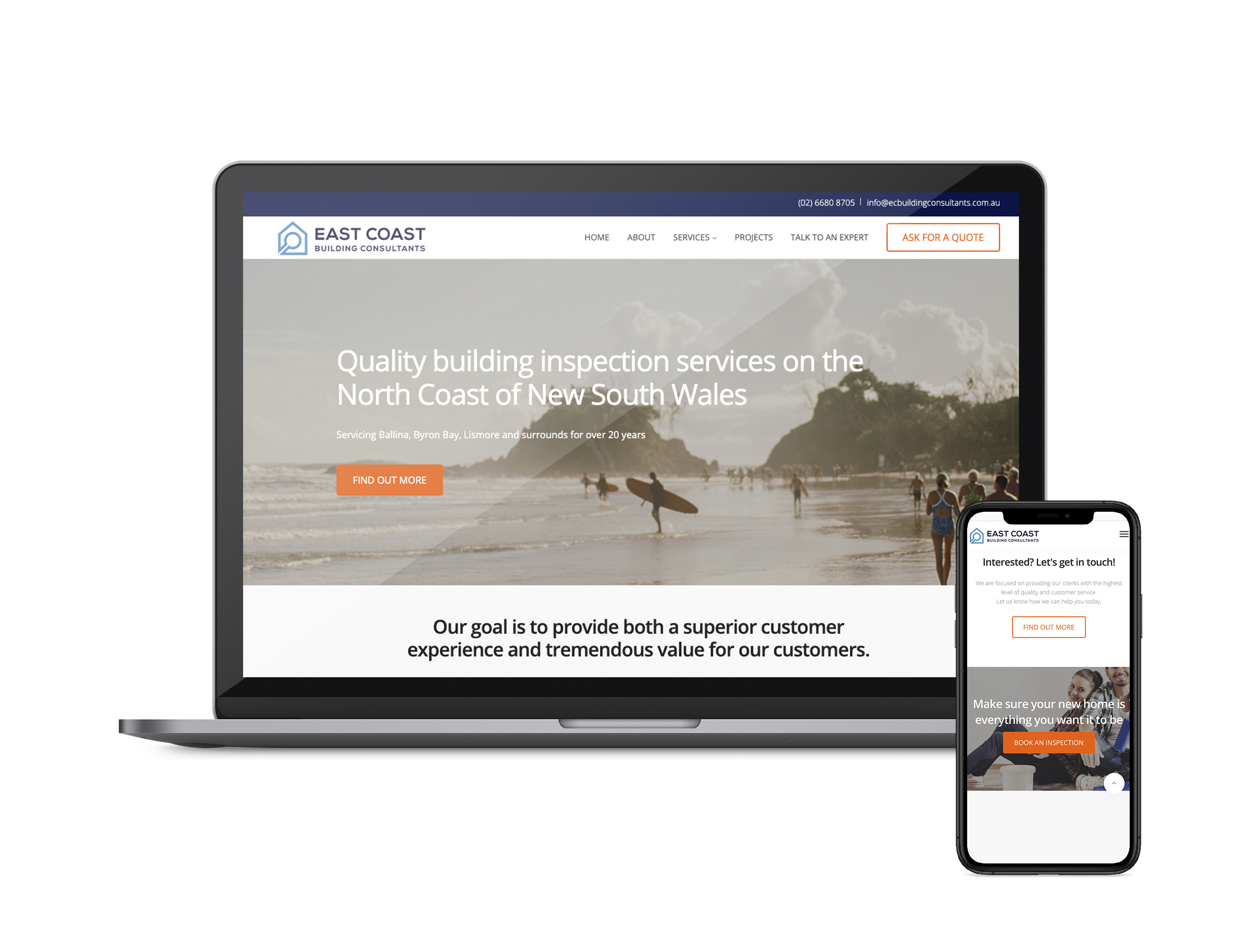
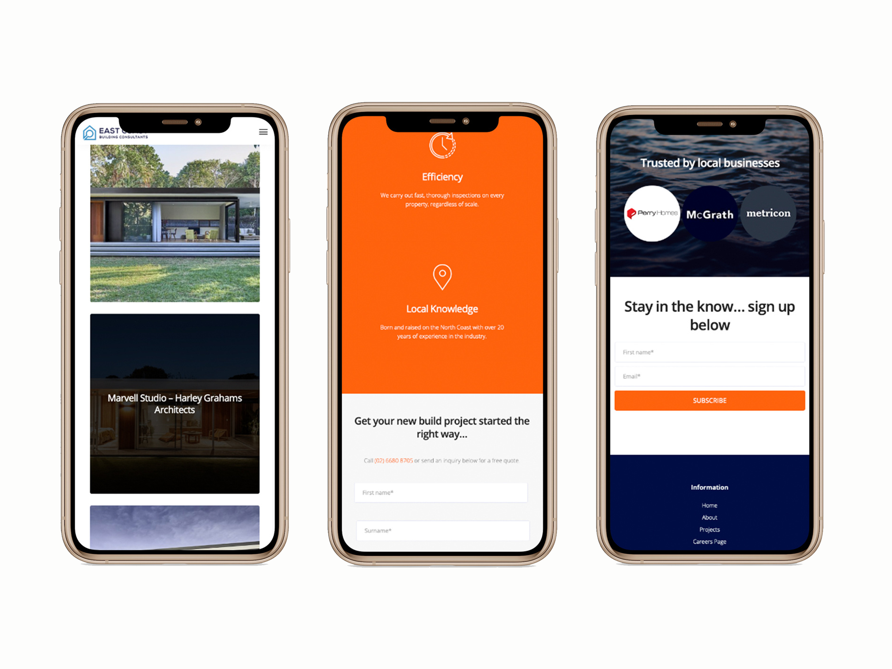
              Initially, Barefruit were engaged by East Coast Building Consultants, a building inspection services company in Byron, to build a website. There is no point in having a website that no one knows about, and so this job evolved into a strategy and implementation of an integrated digital marketing campaign to make sure this website came to life.

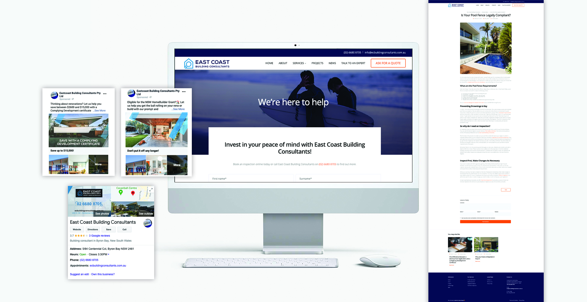
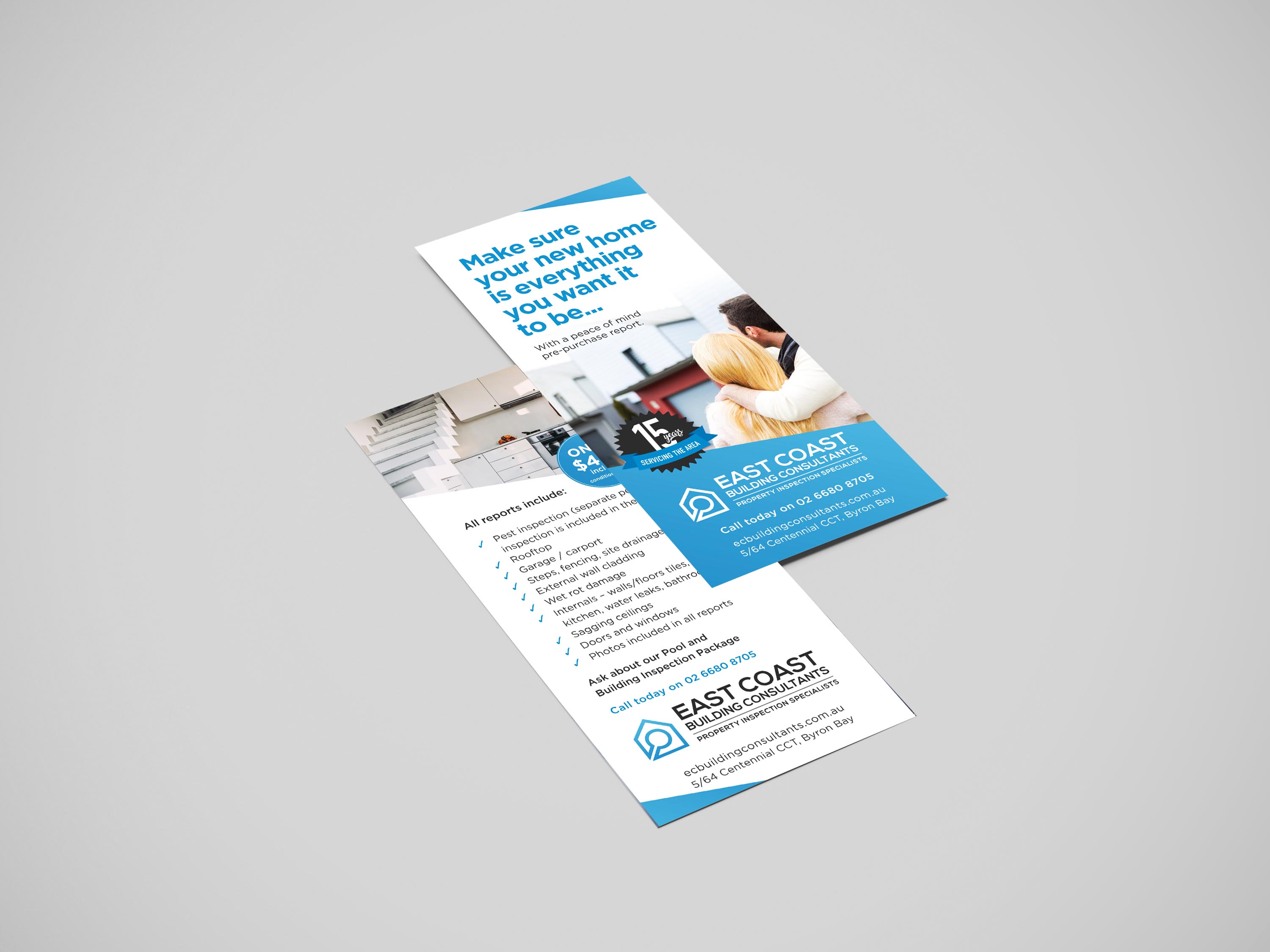
              The digital campaign was rolled out across the website, Facebook and Instagram, email marketing, and Google My Business. A series of Facebook ads (which are also served on Instagram) were developed with specific audiences in mind. The ads were Facebook Instant Experience ads which give users the opportunity to discover more about the services on offer while remaining on the platform. The ads directed people to customised landing pages for each service provided by East Coast Building Consultants. To support the increase in keyword search, we developed blog posts for each service. Our campaign was reinforced by email marketing and Google My Business posts. Like all integrated campaigns, we rolled the creative out across traditional media, including a DL flyer and a Press Ad. In addition to the ongoing digital campaigns we run for East Coast Building Consultants, this client is part of our SEO program.

              Search Engine Optimisation and digital marketing/ advertising work symbiotically, supporting and improving results for each other. This campaign and the SEO program working together resulted in a 73% increase of traffic to the website and a 50% increase in conversions made on the site (click to call, click to email, complete contact form). Inquiries made through Google My Business were up by 20%, and website clicks were boosted by 40%.

              Social Media Mock-Up
              iPhone Website
              DL flyer mock up

              Like what we do? Let us help your business grow?with an awesome rebrand.
              Send us an enquiry below...

              Hey Team Fruity!

                I'm , I'd like you to help my business 'barefruit'.

                I am interested in

                You can call me on and email me at

                We'd love to know how you heard about us?

                Raine & Horne – Integrated Marketing Campaign

                Raine & Horne

                Integrated Advertising Campaign

                The work

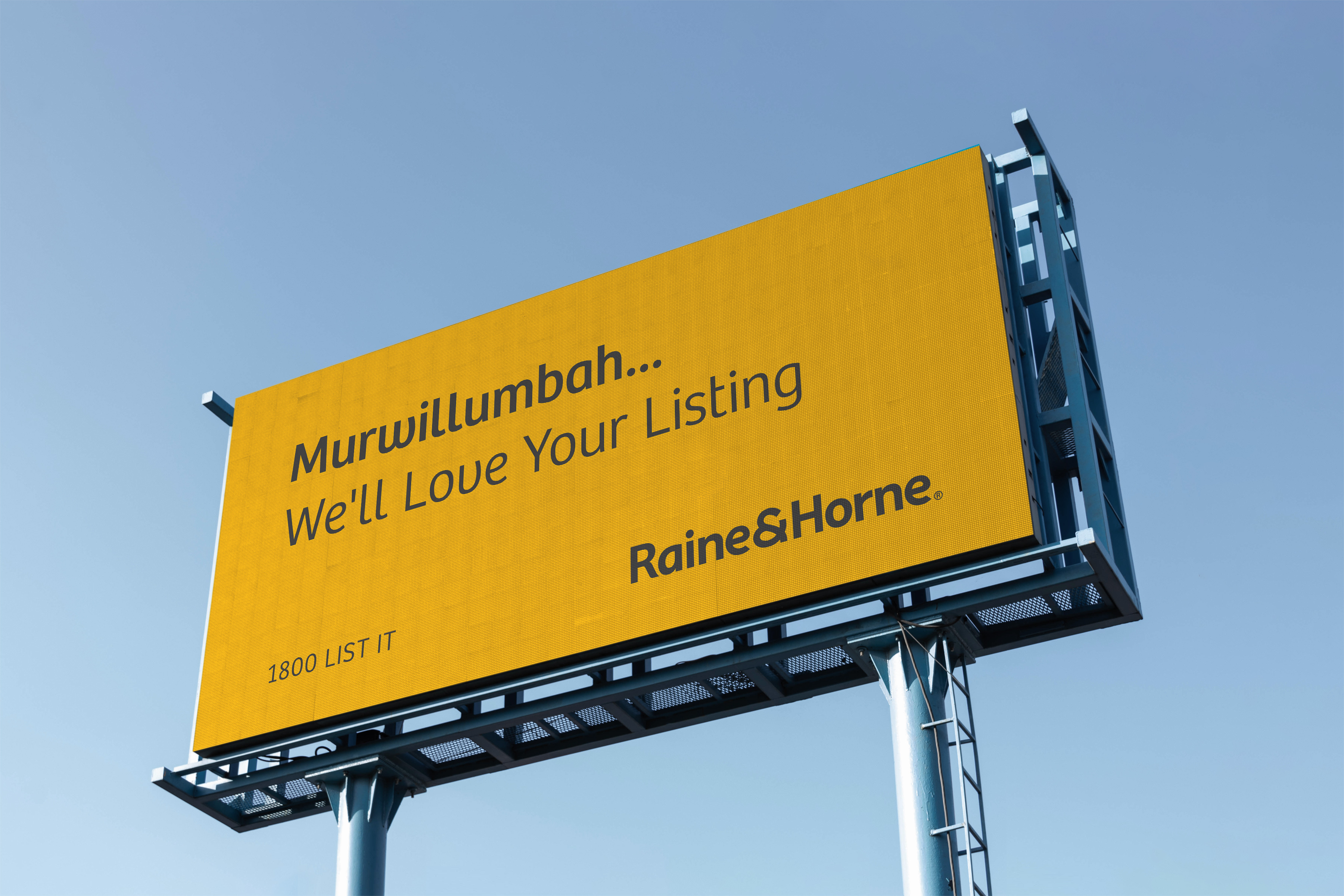
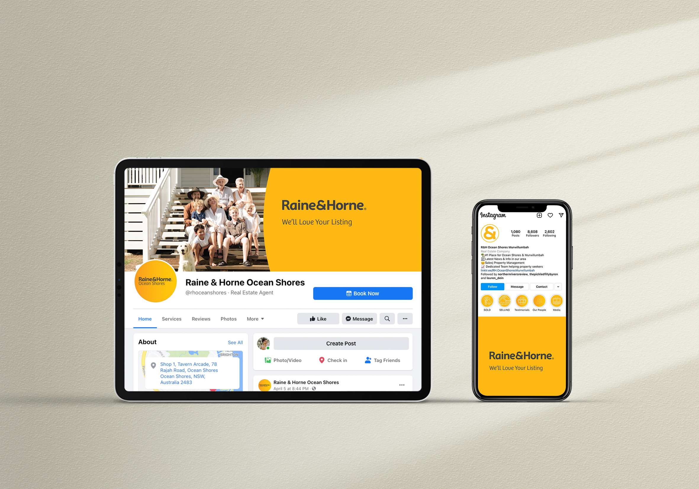
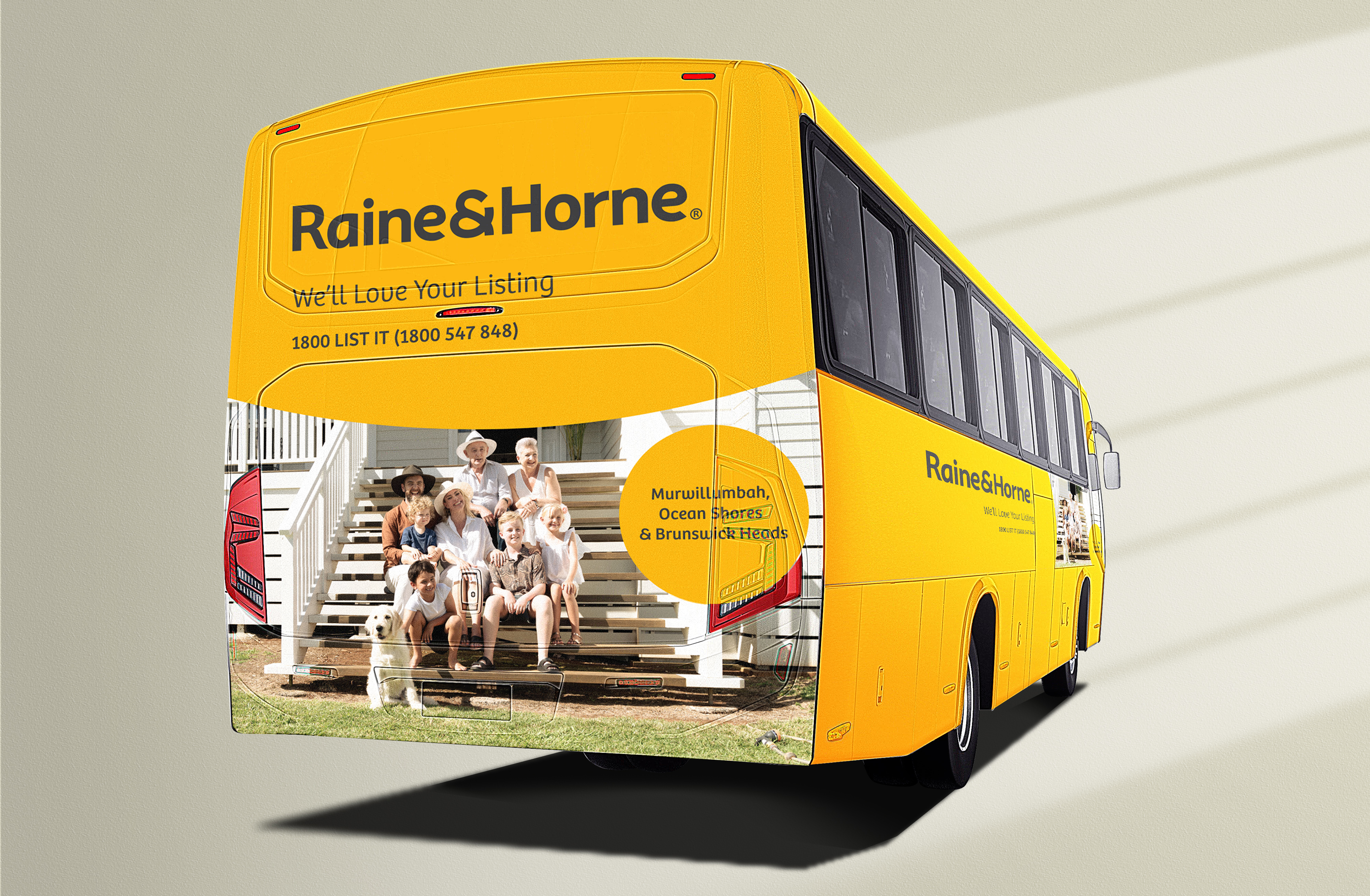
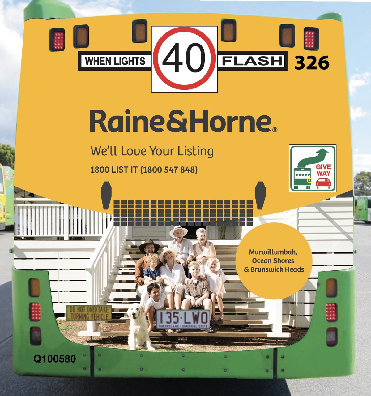
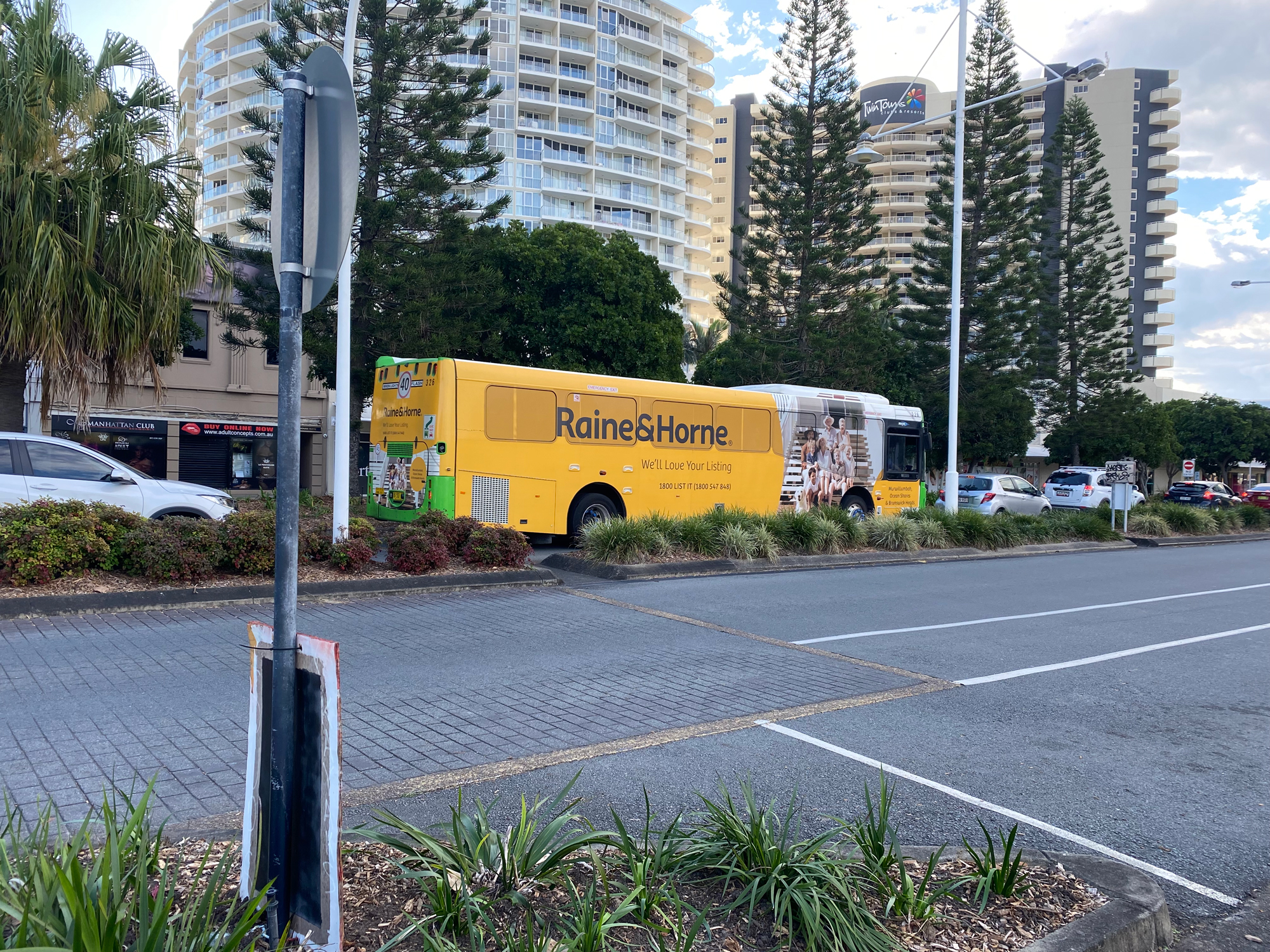
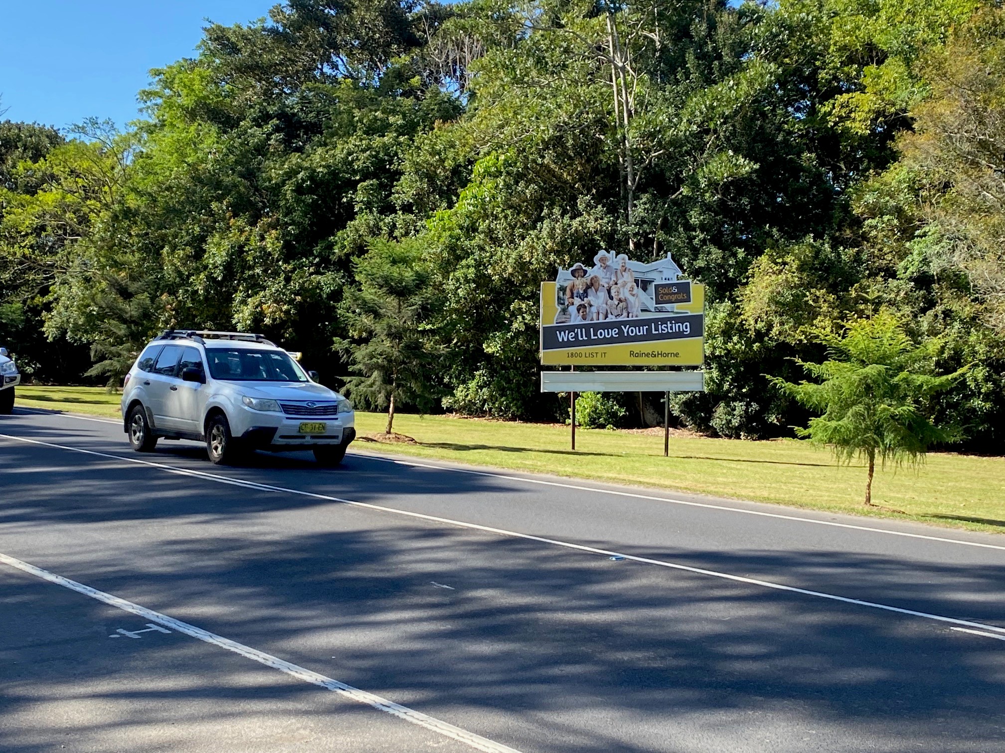
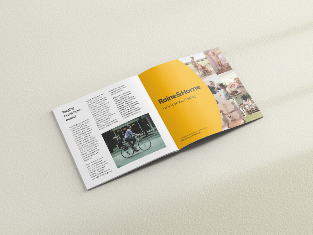
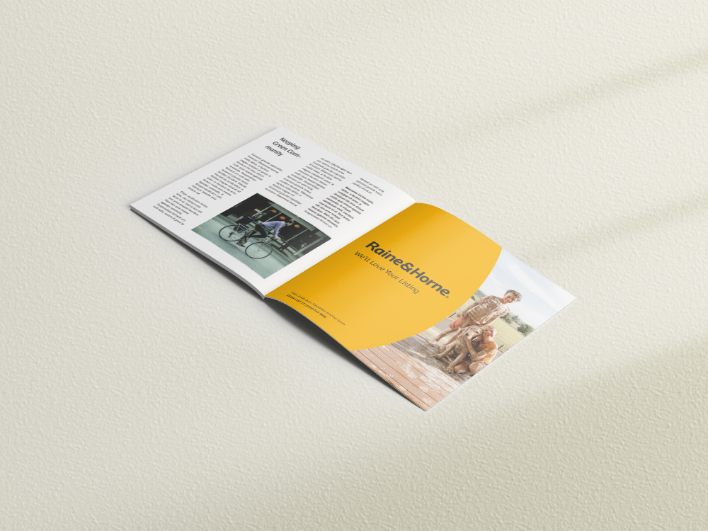
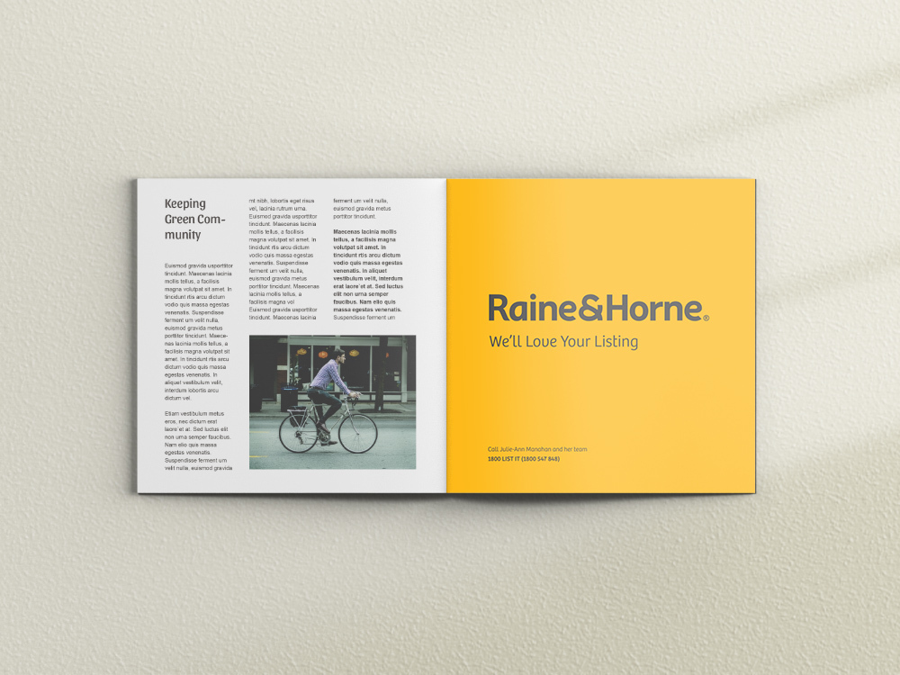
                Barefruit was engaged by nationally recognised real estate company Raine & Horne to bring a fully integrated campaign including a television commercial, press, outdoor and online to fruition. In a highly competitive market – we went above and beyond standard real estate advertising to produce a commercial and overarching campaign. ‘We’ll Love Your Listing’ has a refreshingly different approach and leaves a heart-warming impression on its audience. This was a major project for Raine & Horne, produced by Barefruit’s in-house creative team and the employment of film director, camera and lighting team from Sydney and the Northern Rivers, as well as local hair, make-up and interior stylists.

                Raine & Horne were ecstatic with the end result, a beautiful campaign that stands out from a saturated market, tells truth in a heart-warming way and has serious longevity.

                Raine & Horne Billboard
                Raine & Horne Facebook Mock Up
                Raine & Horne Bus Wrap
                Raine & Horne Bus Wrap
                Raine & Horne Bus Wrap
                Raine & Horne Bus Wrap
                Raine & Horne Print Ad
                Raine & Horne Print Bus ad
                Raine & Horne - Billboard
                Raine & Horne Print Ad
                Raine & Horne Print Ad

                Like what we do? Let us help your business grow?with an integrated campaign.
                Send us an enquiry below...

                Hey Team Fruity!

                  I'm , I'd like you to help my business 'barefruit'.

                  I am interested in

                  You can call me on and email me at

                  We'd love to know how you heard about us?

                  Westlawn

                  Westlawn Finance Website Design

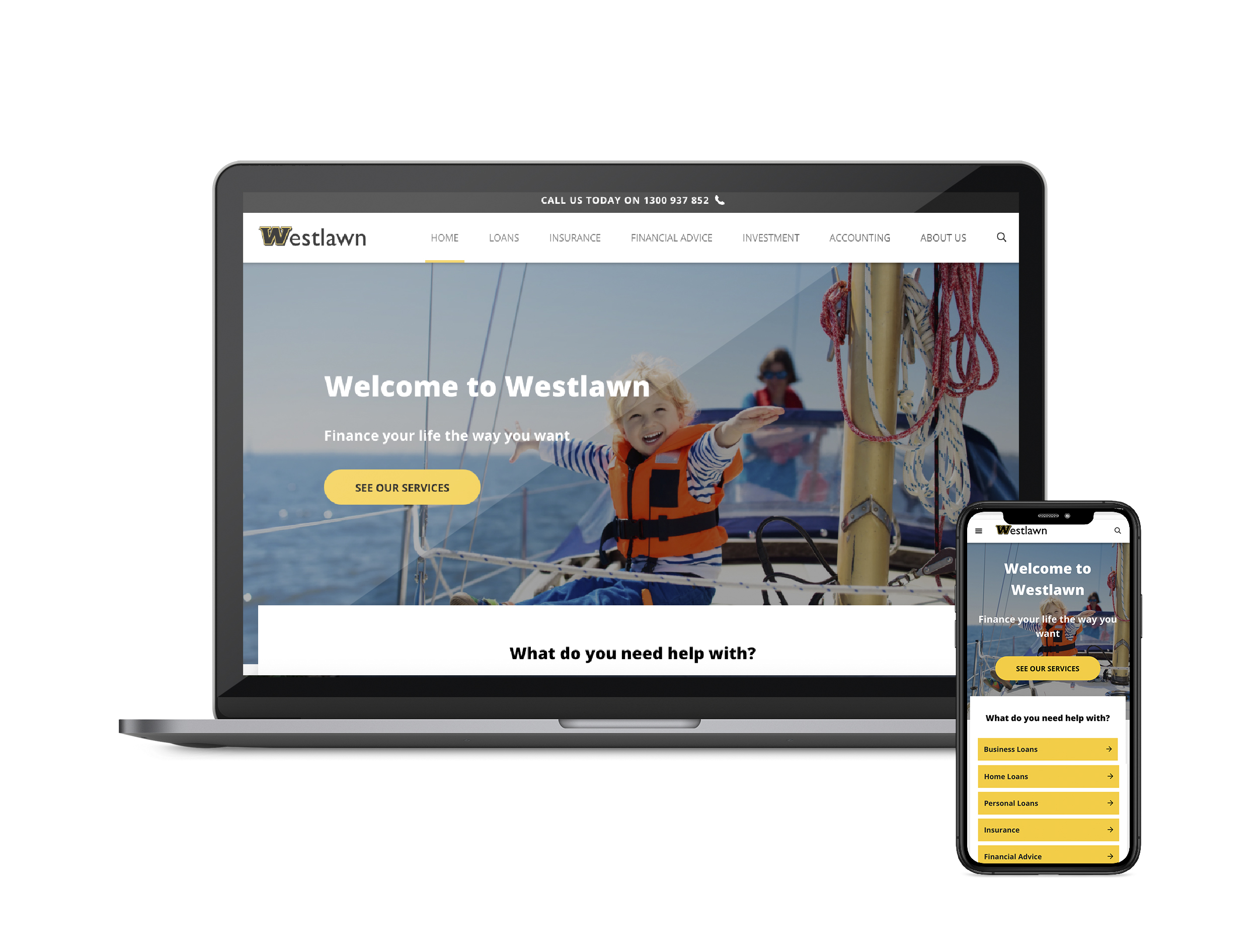
                  Westlawn Website

                  The brief

                  Westlawn approached us to revamp their current website. With an aim to reflect the brands' customer audiences and create a more user-friendly website that was optimised for mobile and future proofed for today's technology.


                  Our response

                  Following customer research undertaken by our team, we addressed several key updates for the web design project, which included:

                  • A custom-designed and responsive website
                  • Integrating better technology into the site to improve marketing opportunities
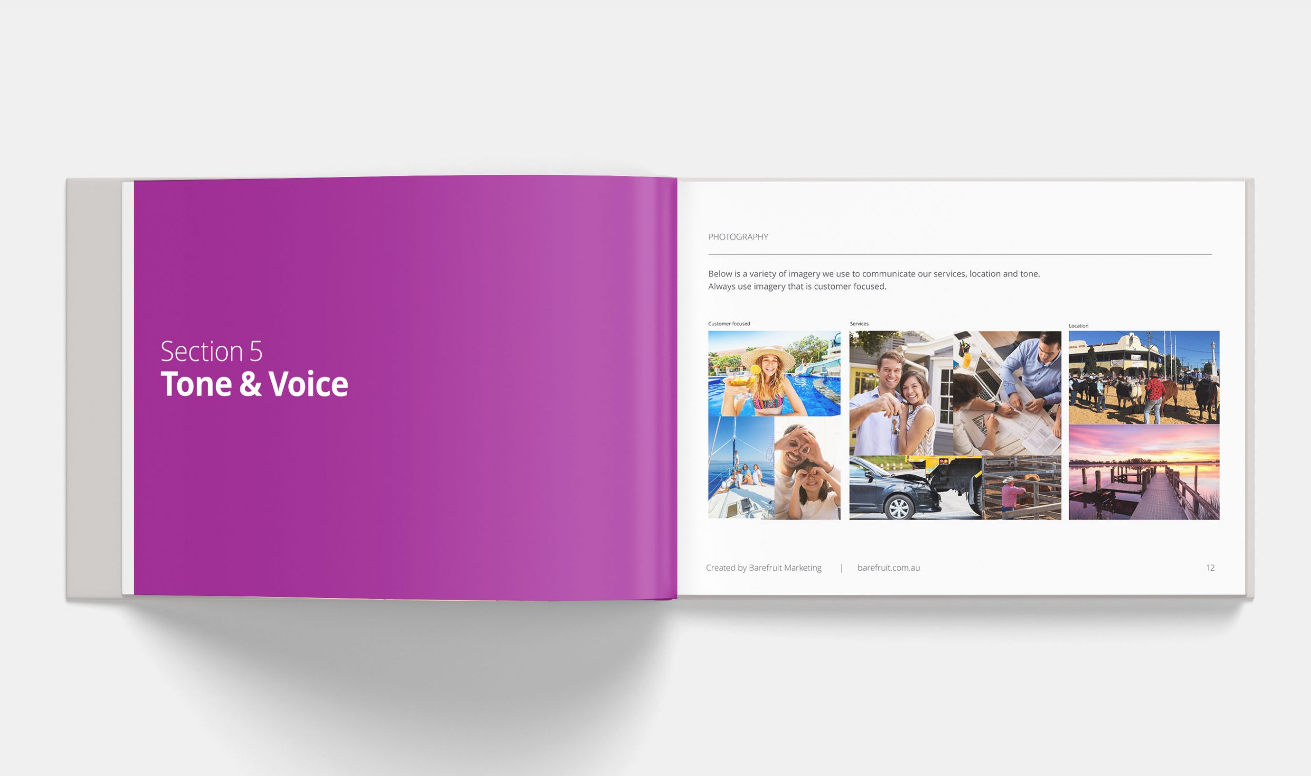
                  • Refreshing the brand with a new additional purple colour to positively uplift the personality of the brand, along with designing unique iconography to explain their services and created a curated image library to use and build upon.
                  • Photography direction for new staff shots for the site
                  • Pricing calculators and tools for customers to use for free
                  • Implementing a strategy of gathering Customer Stories, for more brand trust and transparency on what Westlawn can offer, using real life examples and integrating this as part of their ongoing digital and email marketing.


                  Westlawn Website
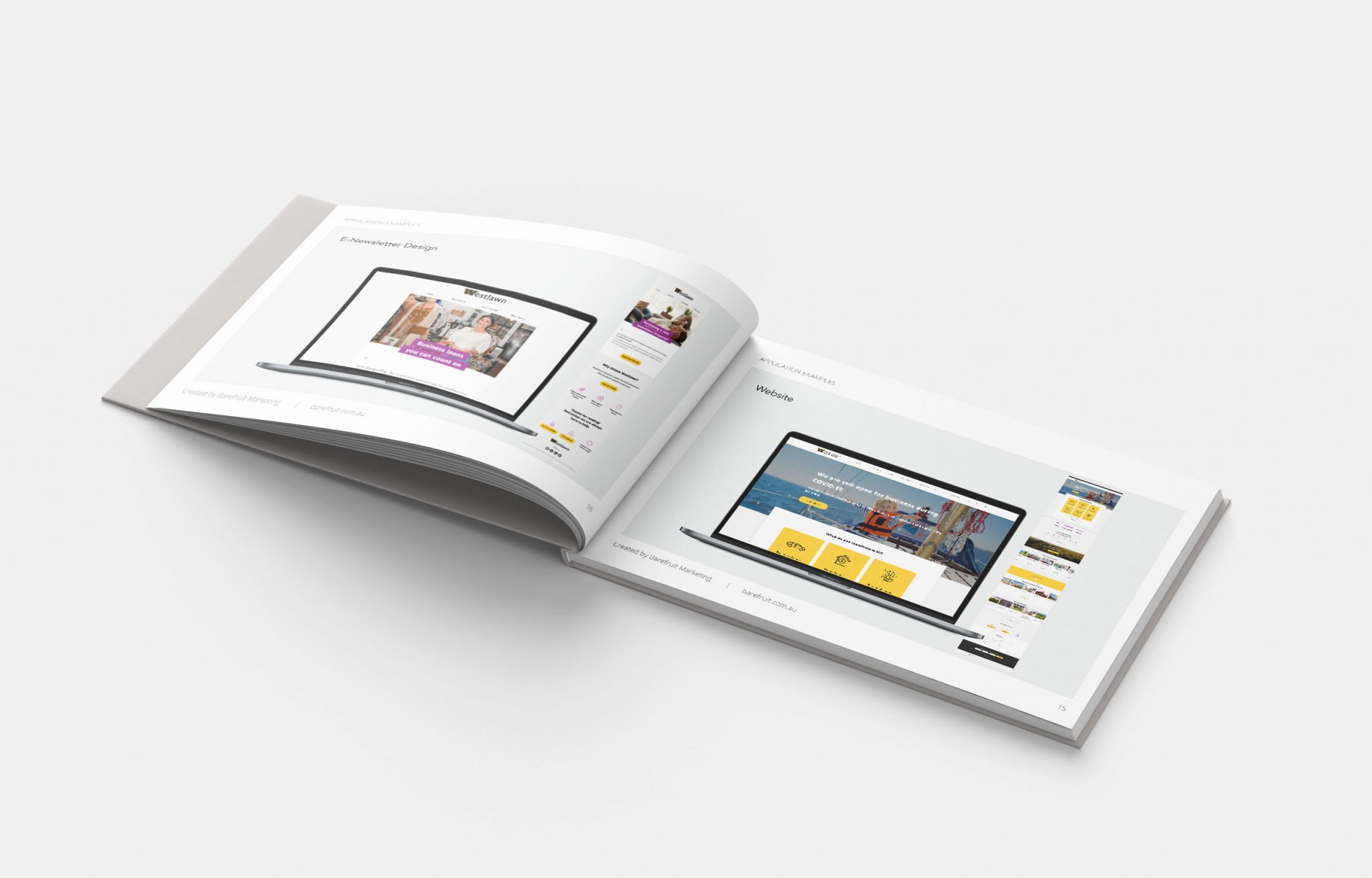
                  Westlawn - Logo Guide
                  Westlawn - Logo Guide

                  The fruits

                  Westlawn's brand-new website is a major improvement and a step forward for Westlawn to grow their audiences and customer base while building more brand awareness and trust.

                  The integration of new marketing tools into the website also allows Westlawn to intuitively create smarter ways of reaching their target-audiences.


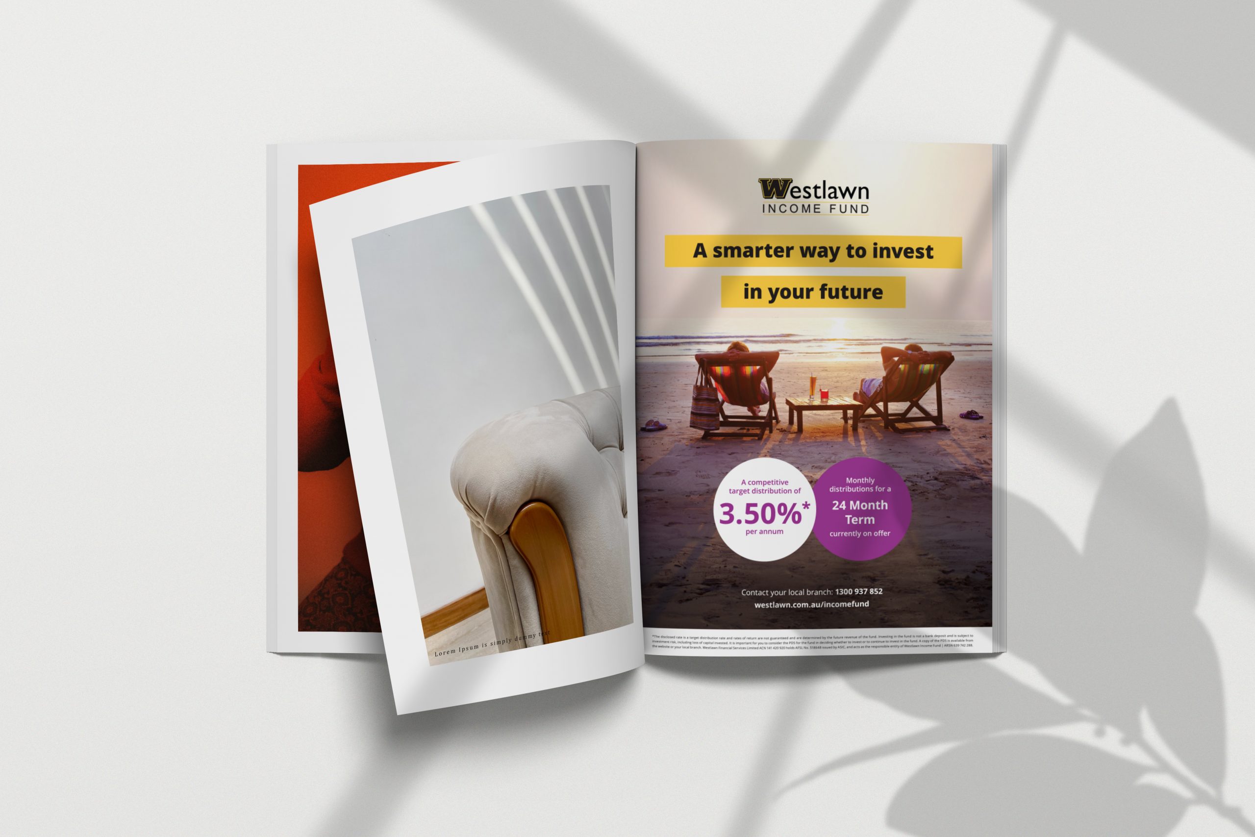
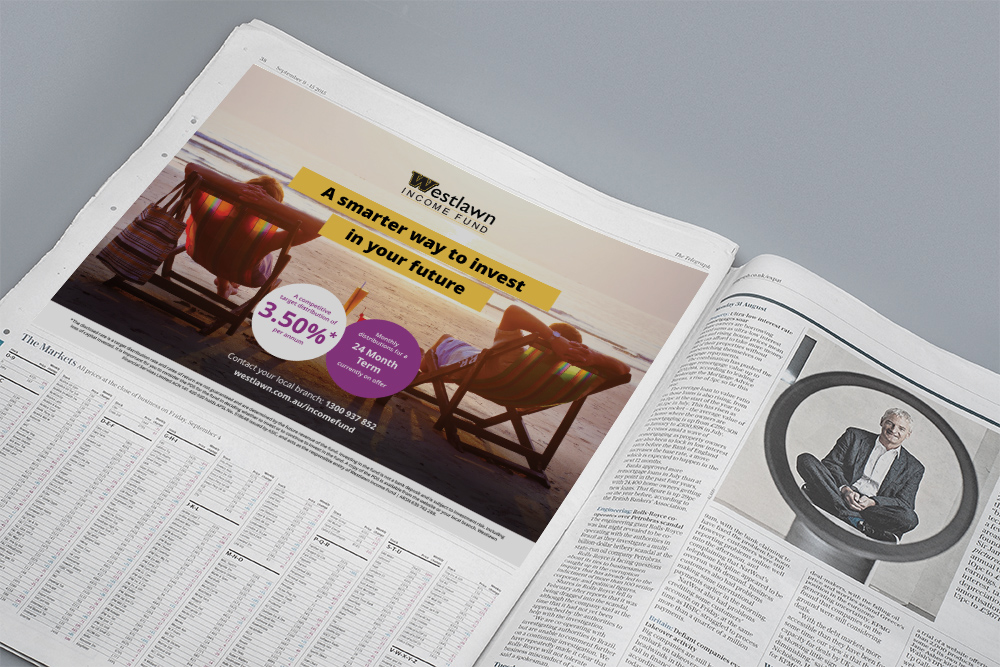
                  Westlawn - Print Ad
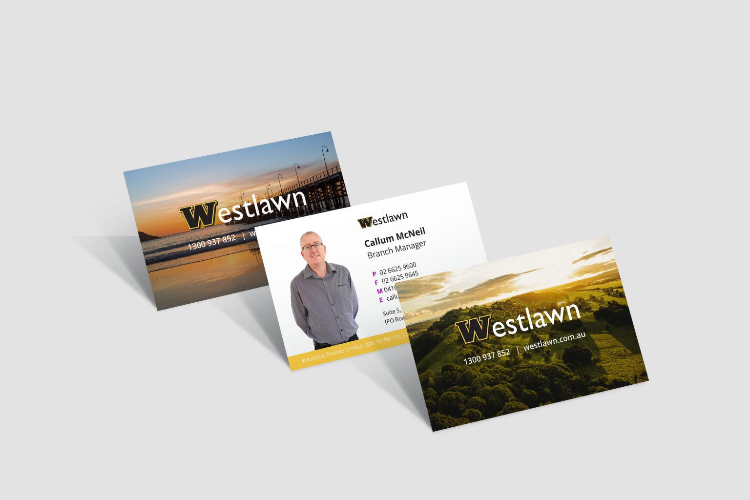
                  Westlawn - Business Cards
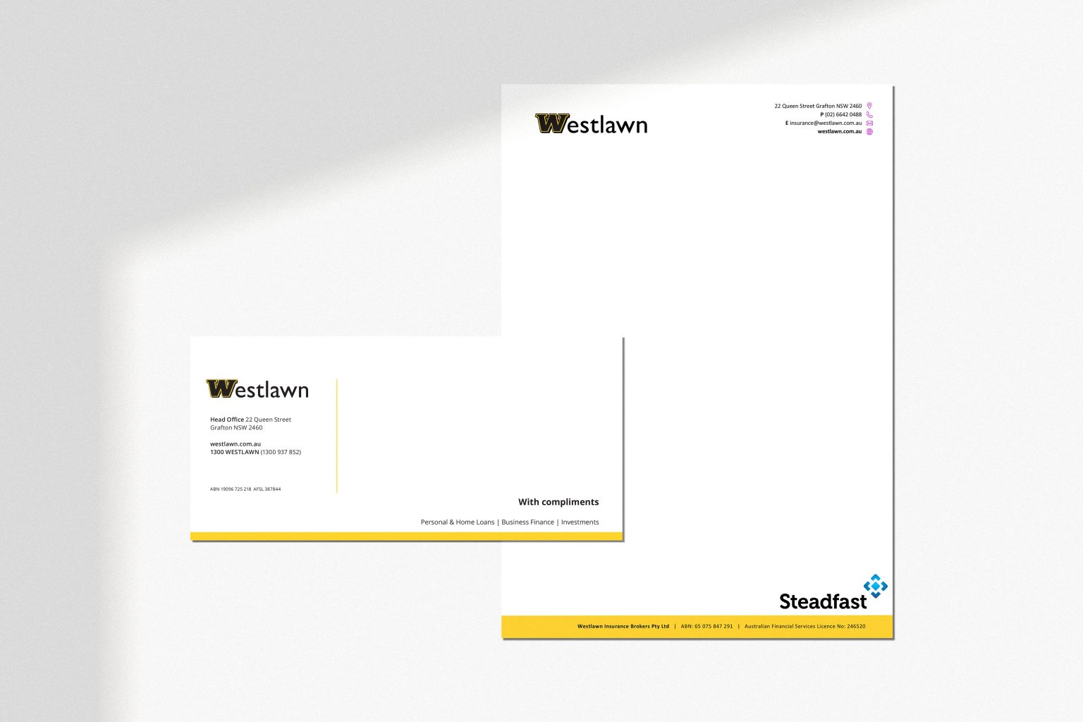
                  Westlawn - Stationery
                  Westlawn - Newspaper Ad
                  Westlawn - Business Cards
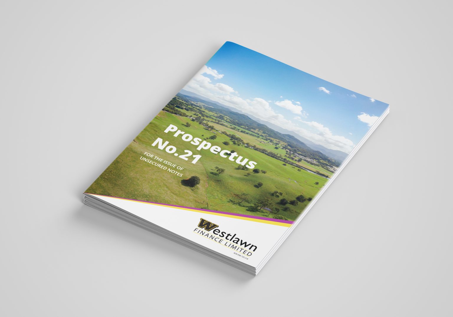
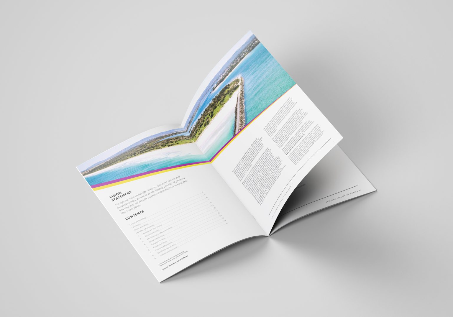
                  Westlawn - Brochure
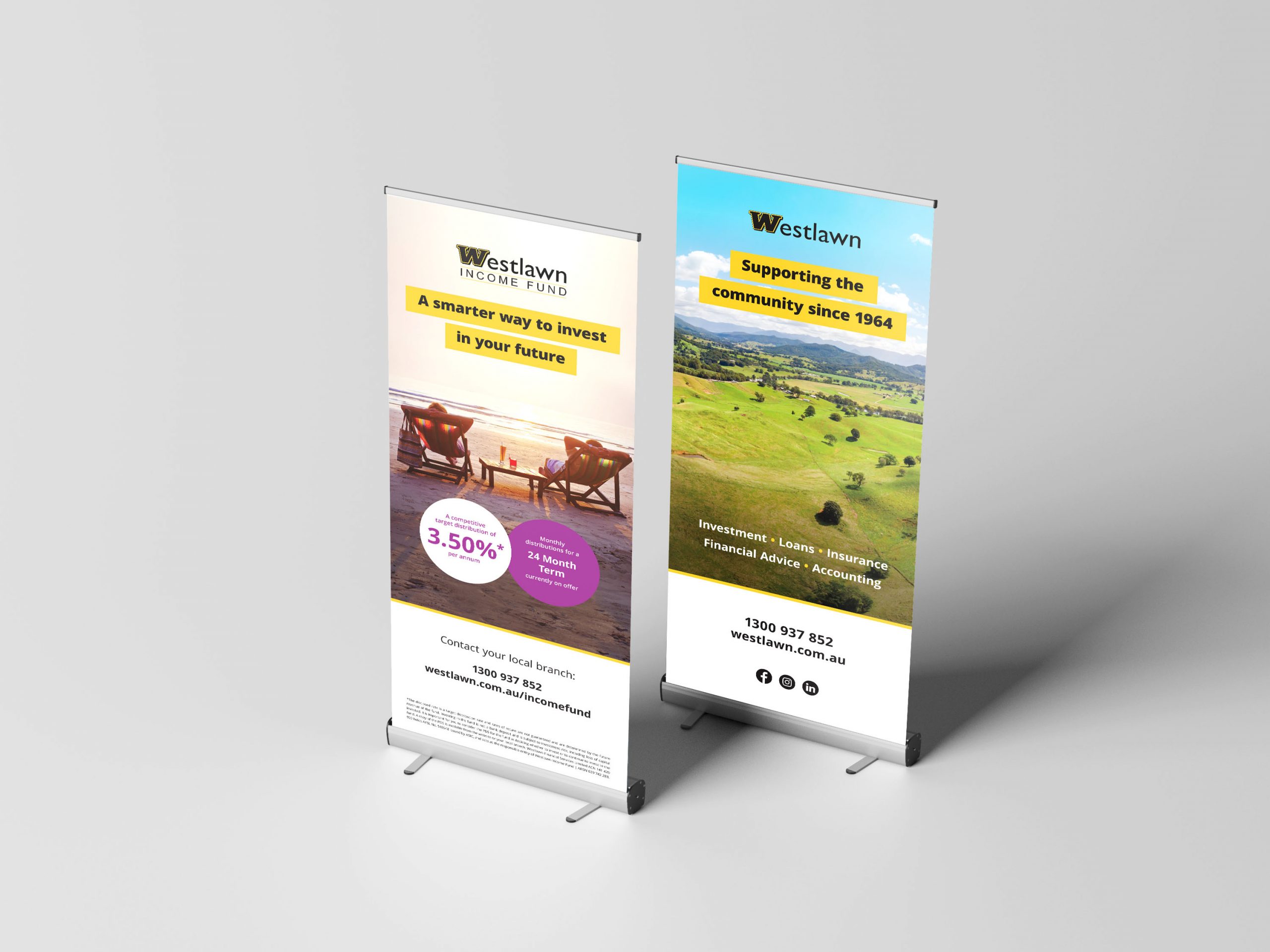
                  Westlawn - Banner

                  Like what we do? Let us help your business grow?with an awesome branding project.
                  Send us an enquiry below...
                  Hey Team Fruity!

                    I'm , I'd like you to help my business 'barefruit'.

                    I am interested in

                    You can call me on and email me at

                    We'd love to know how you heard about us?

                    Korff Wealth

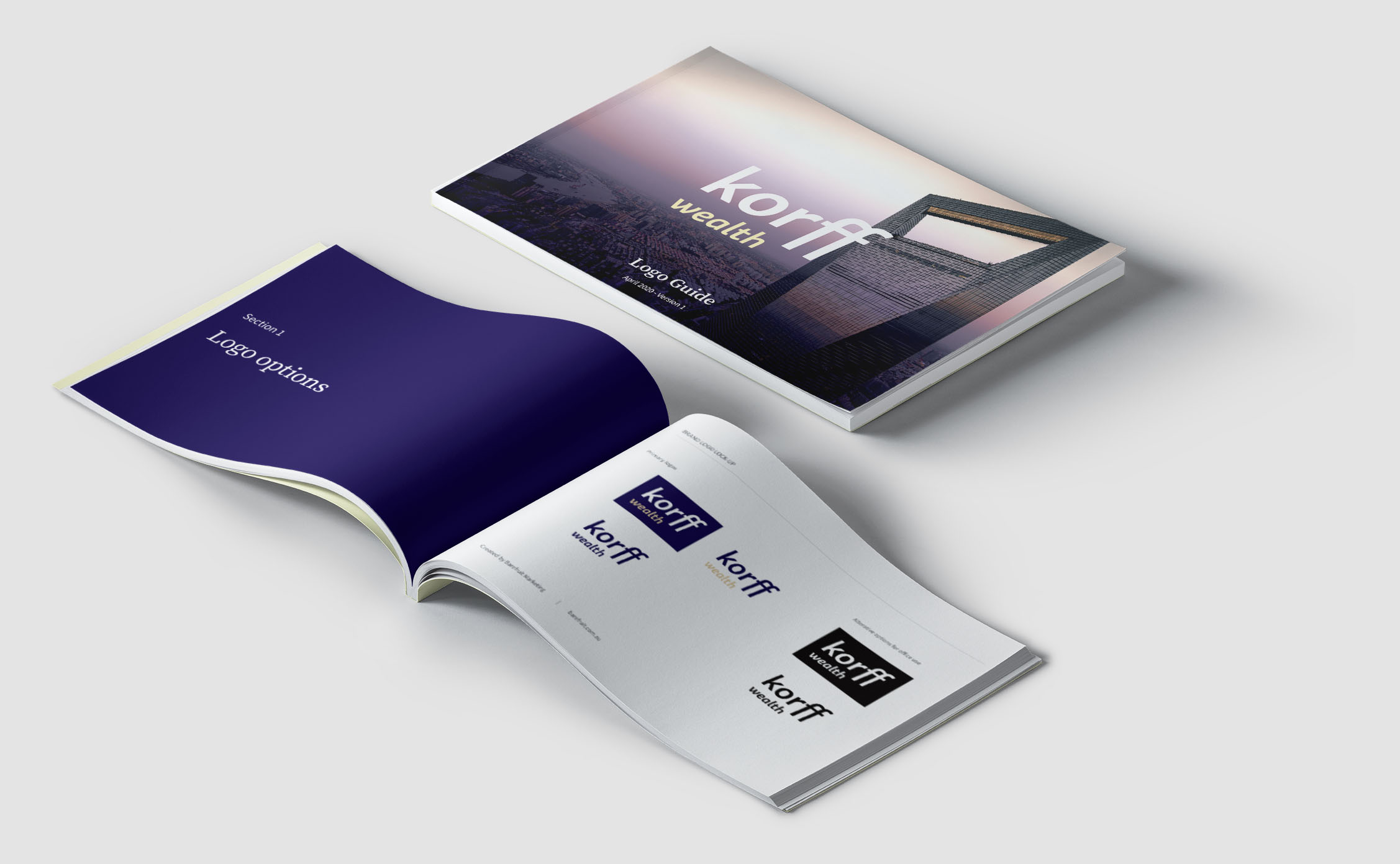
                    Korff Wealth

                    Branding, Website, Signage, Digital and Print Advertisements

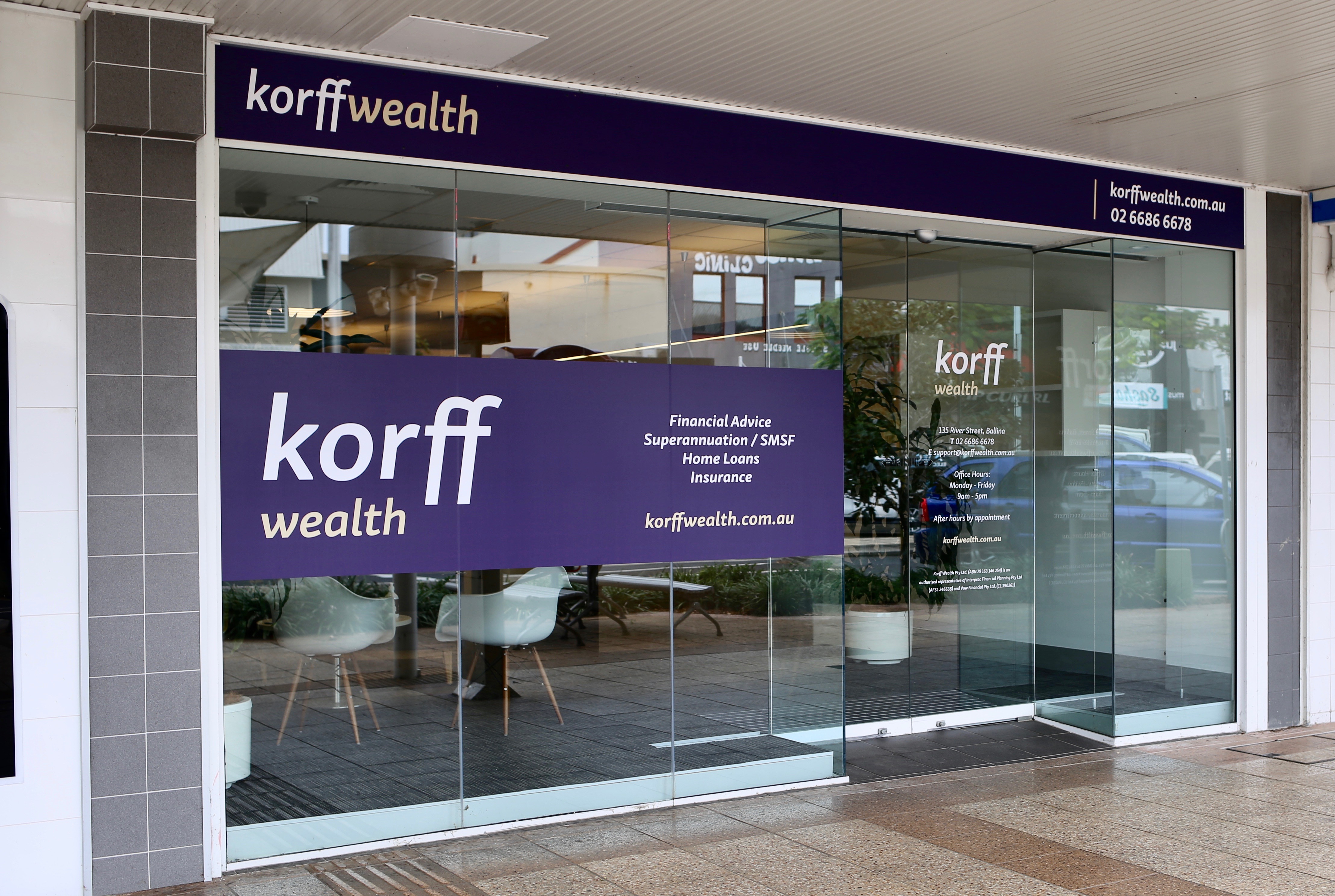
                    Korff Wealth Signage

                    the brief

                    We were thrilled when we received the brief to work on the rebrand and name change for the former, Yellow Brick Road Wealth and Management, Northern Rivers, which is now operating under Korff Wealth. The business saw an opportunity to restructure and rebrand during the current COVID-19 crisis. With the current economic climate, Australians need expert financial advice they can trust, more than ever. And so, it was the perfect time to strategically review the business and position for future growth.


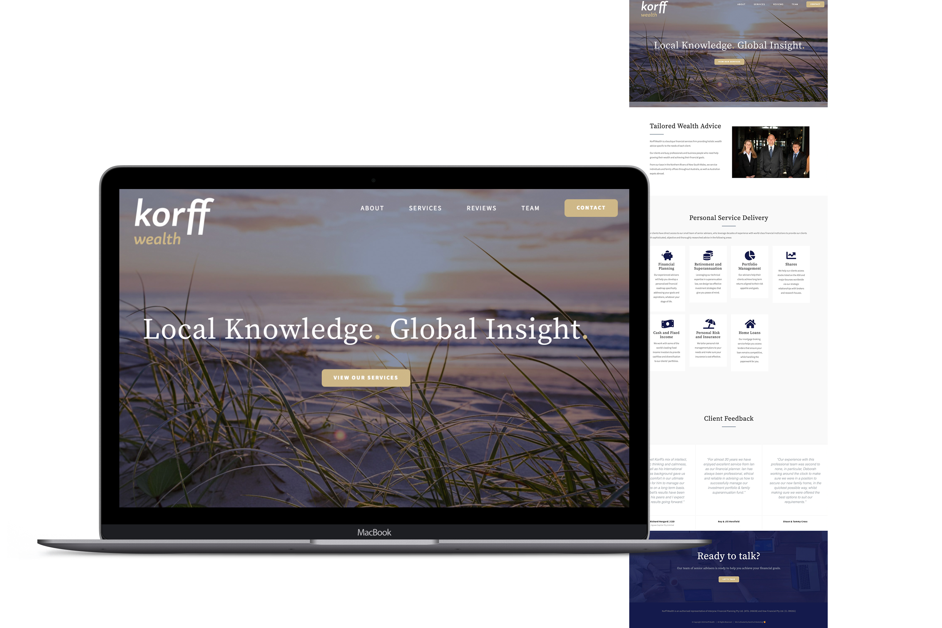
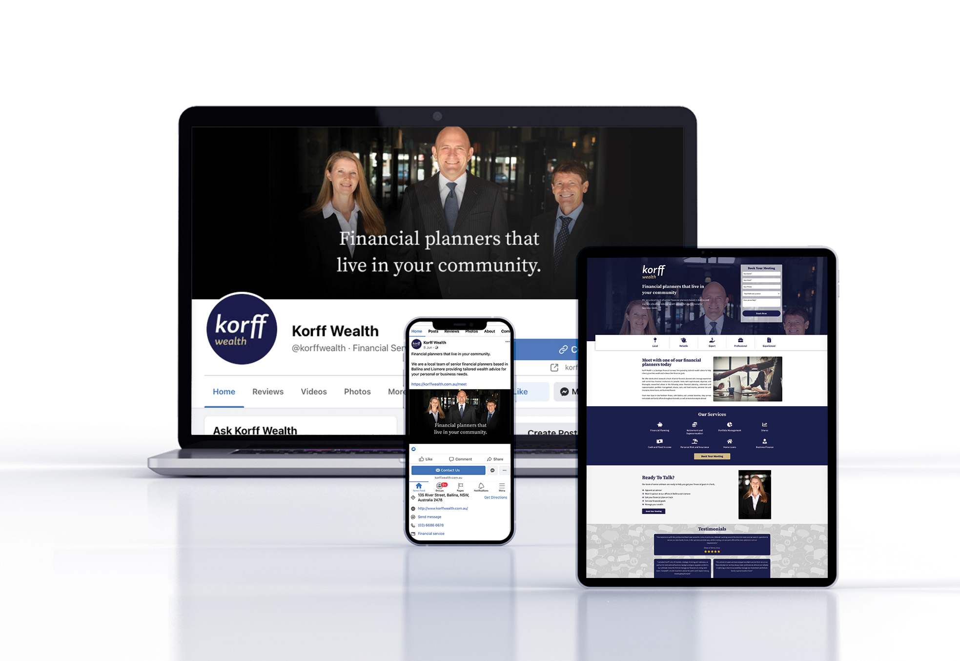
                    Korff Wealth website

                    our response

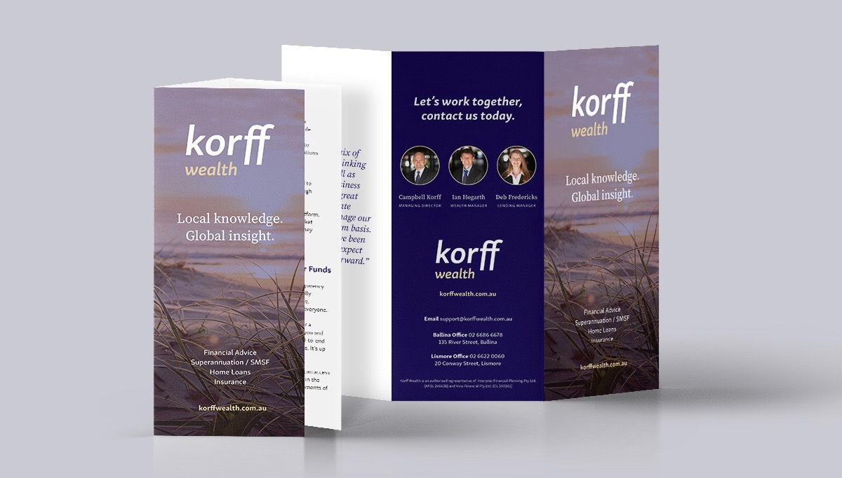
                    It was time for Yellow Brick Road Wealth Management to rebrand and restructure and position themselves in the market as Korff Wealth. With Barefruit's client services and branding expertise, we made this happen with a complete rebrand. The team worked with the client on the strategic direction for the brand's future as well as the visual aspects, including a new brand name, brand image, and brand logo and brand-new website which was designed by our creative lead and put together by our digital team who assisted in organising, uploading and optimising content. As well as completely rebranded both offices Ballina and Lismore.

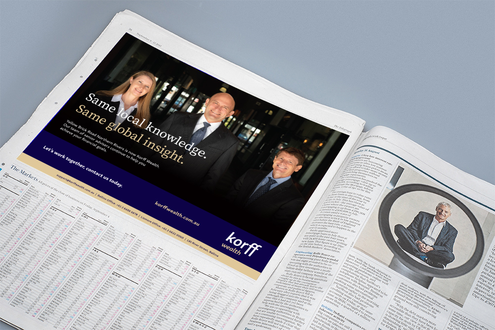
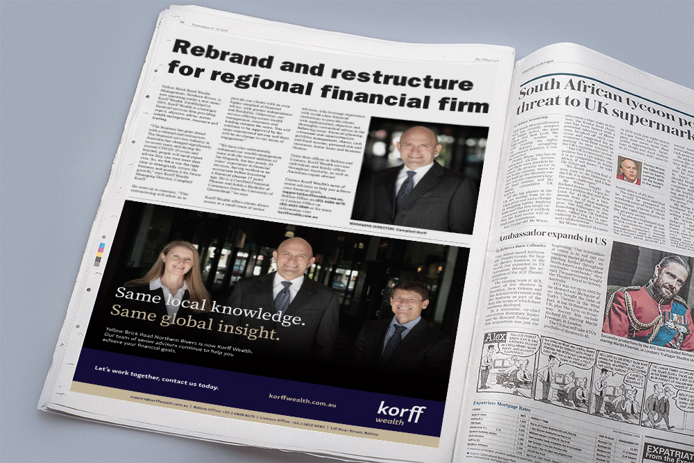
                    To inform the public of Korff Wealth's rebrand, Barefruit created an integrated campaign, that combined both online and traditional advertising. We placed online ads in GIF format to capture the attention of people searching for financial advice. This was complimented with a newspaper article and press ads that were scheduled in the local Northern Star and The Ballina Advocate over a period of four weeks as well as other collateral.

                    Korff Wealth Brochure for Rebrand
                    Korff Wealth ad for Rebrand
                    Korff Wealth GIF for Rebrand
                    Korff Wealth logo for Rebrand
                    Korff Wealth newspaper ad for Rebrand
                    Korff Wealth newspaper ad 2 for Rebrand

                    the fruits

                    The result is a slick, and professional rebrand that the client is very happy with. Korff Wealth, with its new name, new logo, brand-new website, new social media pages, and signage for the Ballina and Lismore offices will certainly be attracting old and new customers looking for an expert, objective financial advice across wealth management, insurance and lending.

                    The Korff Wealth rebrand was promoted in the local newspapers to help spread the word within the local community about the finance company's recent changes. This included paid advertorials and half page ads in the Byron Echo, the Ballina Advocate and the Northern Star.

                    Korff Wealth Logo Guide
                    Korff Wealth Logo Guide


                    Like what we do? Let us help your business grow? with a complete Rebrand.
                    Send us an enquiry below...
                    Hey Team Fruity!

                      I'm , I'd like you to help my business 'barefruit'.
                      I am interested in

                      You can call me on and email me at

                      We'd love to know how you heard about us?