Brand Strategy, Product Branding & Packaging

Barefruit were ecstatic to be awarded the brief to develop the branding (from naming straight through to production) for Seven Mile Brewing Co.’s most recent creation – a fresh and zingy Ginger Beer. The project kicked off early January 2021 and went through the full creative process to arrive at a playful, artistic, and very distinctive result – Wildling Hard Ginger Beer.
Seven Mile Brewing Co., wanted a brand that appealed primarily to women, but also men who seek out beer alternatives, and those who love a cocktail (Pro tip: Wildling goes amazingly well with spiced rum and fresh lime, over ice). To capture these key market segments, the brand personality needed to be unique, fun, cheeky and visually catching. At the same time, communicating its USP’s: use of local ingredients, the tangy ginger kick and a subtly, sweet finish
The Barefruit project management team had an excellent opportunity to ‘flex their creative muscles’ for this project with quite a bit of freedom to explore naming and design options. The process took the team on a 7-month journey to conceptualise, design and refine each and every detail of the artwork for the cans and cartons.
Creative Lead Alex Wales says
“We started with concepts and moodboards to present the client with lots of options and completed a full competitive analysis to ensure that the result was going to be distinctive, unique and match the product itself. Once we finalised the artwork, we worked on the details to the cans and cartons until everything was approved and signed off; ready for production.”
Related Tag: Branding Gold Coast


College Rebrand

We were approached by the principal at a local school in Ballina at Richmond Christian College to create a new, refreshed look for RCC that will be used to raise awareness of the school and its offering.
Richmond Christian College are moving to a new tagline that better represents the school and it's vision and values. The tagline is: “Identity Purpose. Hope” and this was an opportune time to refresh the overall branding. In the new identity we have used the symbolic nature of a shield badge identity alongside the Christian cross. We have also added the use of flowing lines to represent the journey that every student takes on at RCC, which is individual growth, every student has their own life journey, path and choices, symbolic references that tie into the new tagline. Another symbolic reference of the lines is the location of the school, being close to the ocean and alongside Richmond River.
The finished identity is a modern take on a badge logo that has strong traditional heritage and targets the parents and students who share the same values of RCC.


"The collaboration between Barefruit Marketing, North East Waste and Ballina Shire Council for the Reduce Single Use project is a great example of community stakeholders coming together to create good things for our community. The project was really well supported with a fantastic brand, website build and marketing advice from Barefruit Marketing. Thanks team!"
Print Collateral

No Space For Weeeeeds is part of the North Coast Local Land Services, they aim to increase awareness of weeds within the community, encourage people to understand weeds and know how to report and control them correctly.
North Coast No Space for Weeds (part of North Coast Local Land Services) approached us to design some print collateral to run alongside their "No Space For Weeeeeds campaign. The aim was to help promote awareness of weed identification and prevention in the local community. They were attending the annual PRIMEX event (Australia’s sustainable farm and primary industries exhibition) and was in need of a six-page A5 fact sheet flyer to hand out to event attendees with information on how to prevent spreading weeds from one location to another.
As part of their weeds awareness campaign, they requested our graphic design services to revamp their existing annual weed awareness calendar to not only reflect their branding but to also have a clean, modern look and feel. This calendar was to be distributed to local farmers within the North Coast to help with the identification process of a particular weed and provide solutions on how to treat and prevent the weed from spreading.


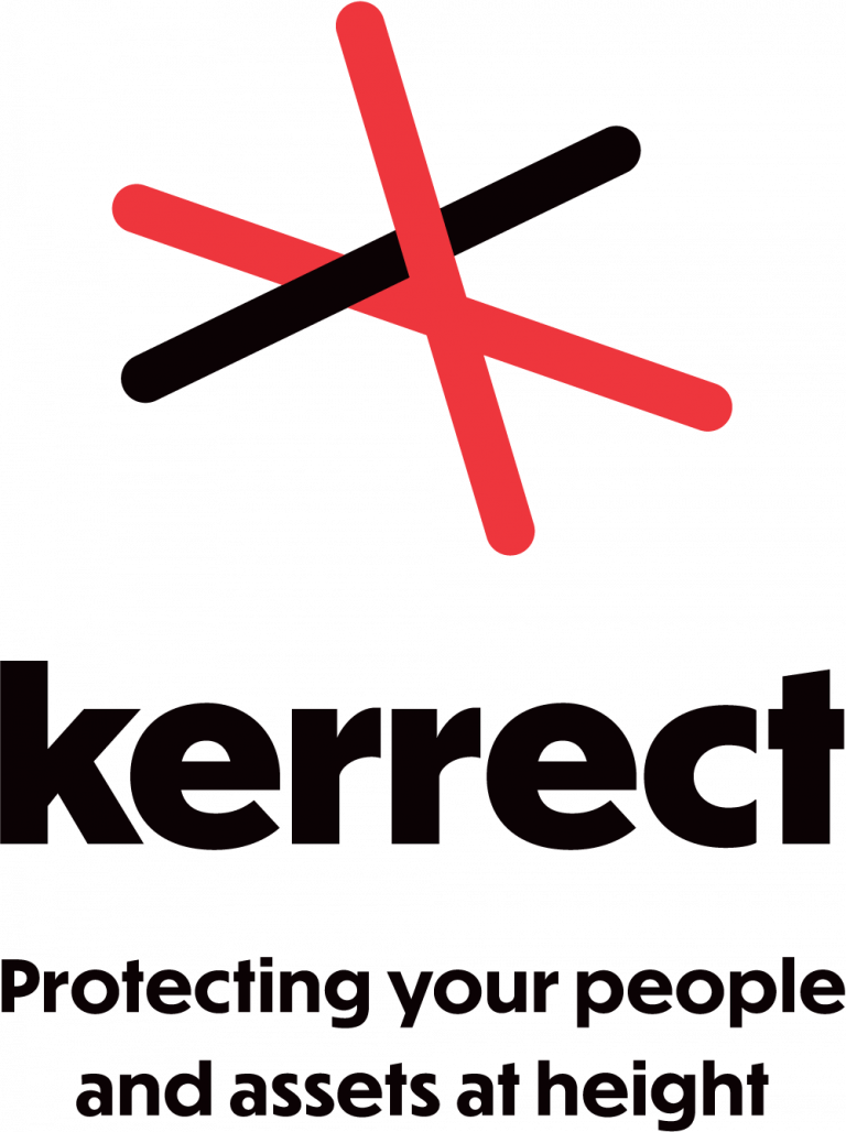
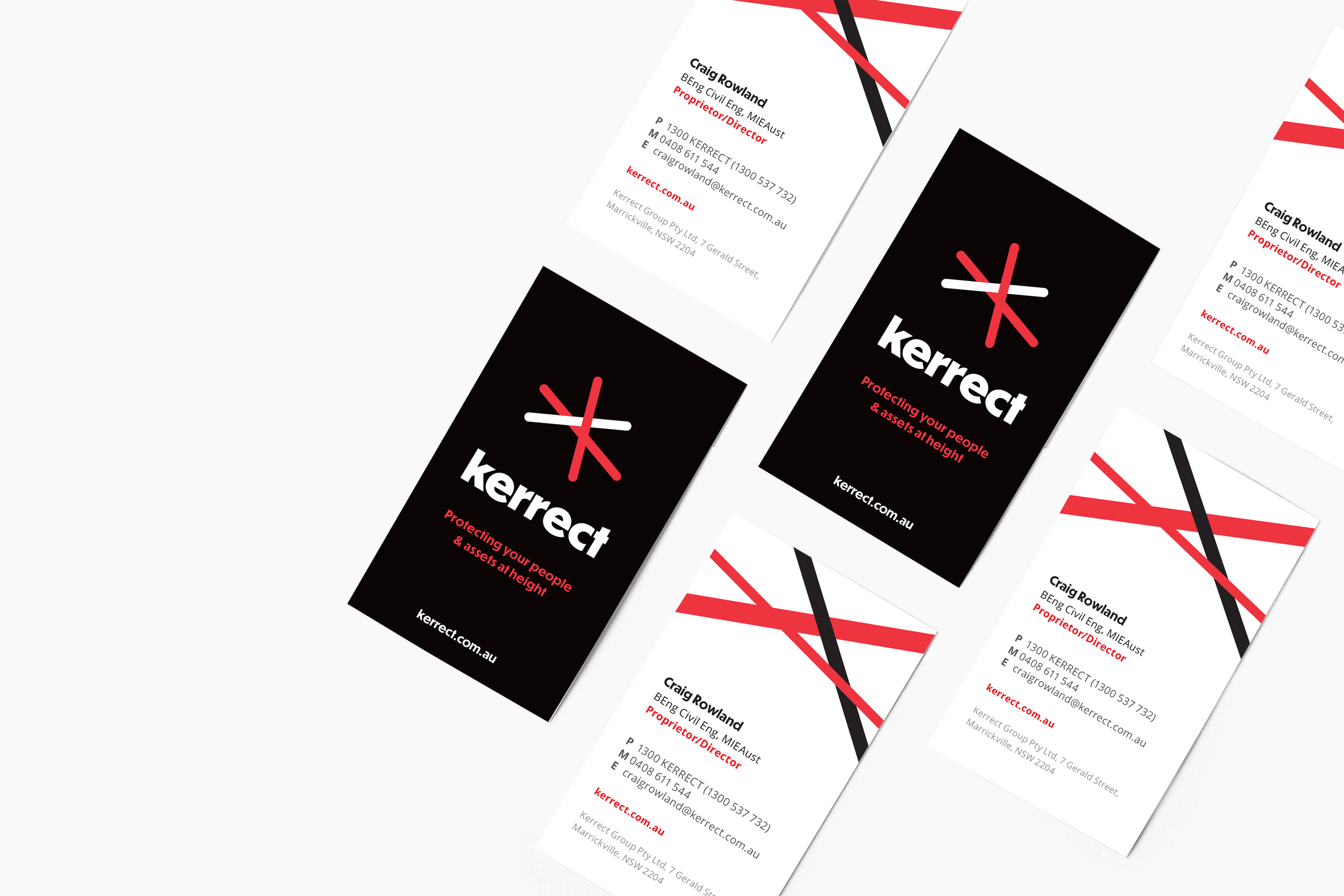
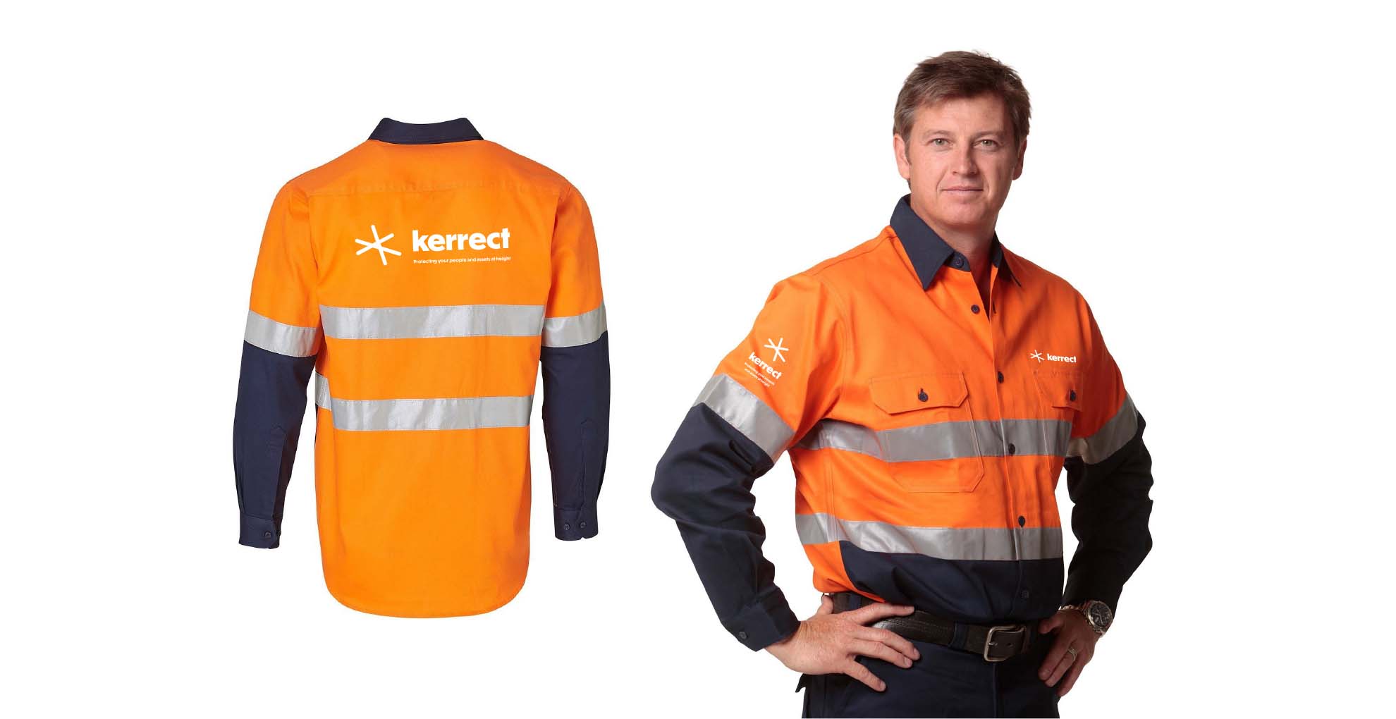
Kerrect is a unique service with skilled professional rope climbers and maintenance staff that can access and install safety netting and access points on buildings - they are the go-to experts for working safely at height without scaffolding. Kerrect came to Barefruit with the aim of refreshing their brand identity, website, creating a new strapline to stay ahead of its competitors and to modernise their look and appeal for today’s purposes.
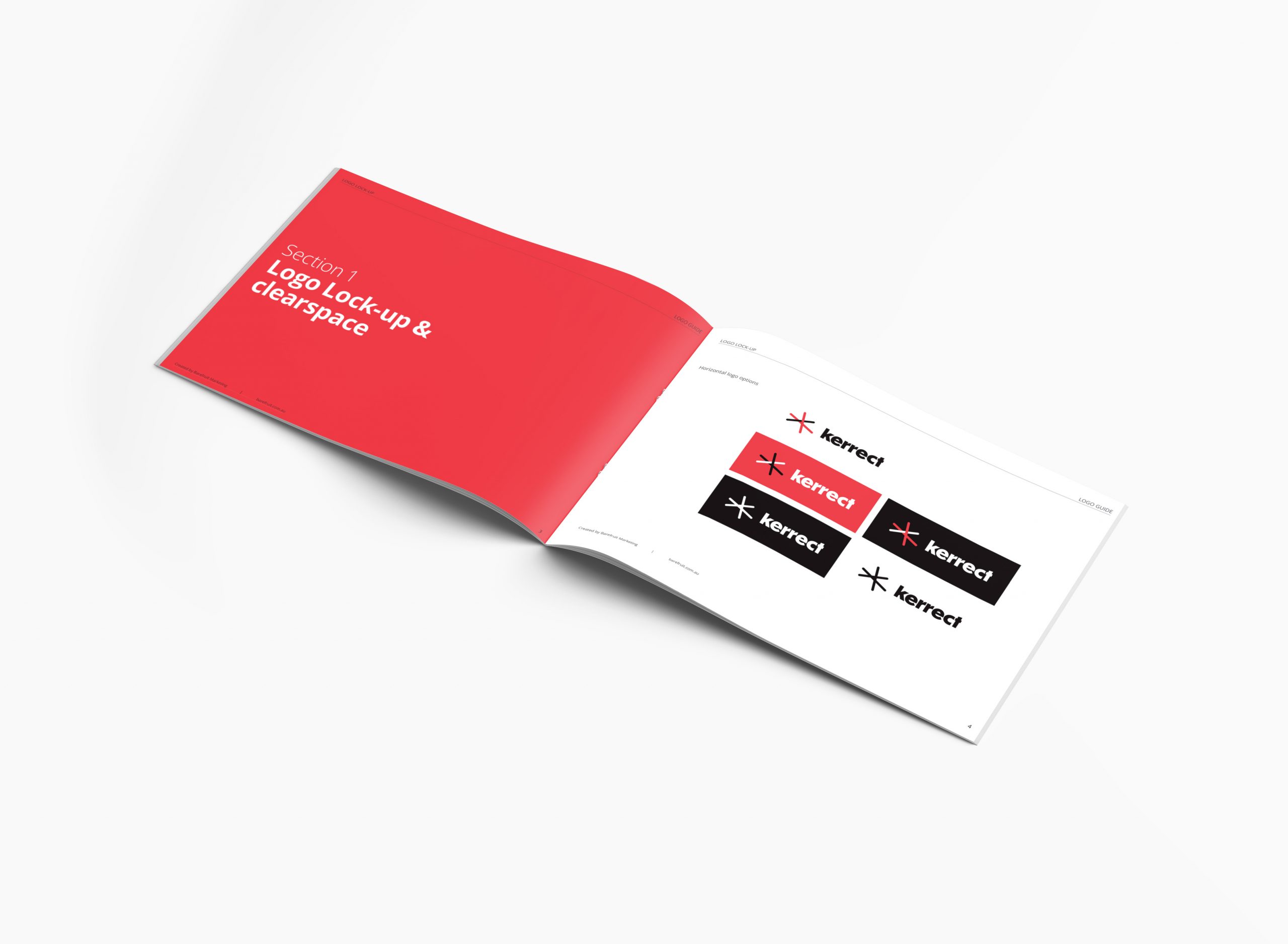
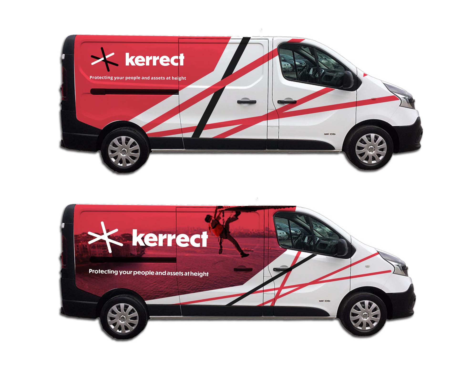
The new logo evolved from utilising some of the old logo elements to create a stronger concept and brand identity that can be used in today’s digital world and on physical applications such as vehicles, netting on buildings, business cards and uniforms.
The logo features lines to represent ropes, and uses the primary red and black colours of the brand to stand out amongst their competitors. The lines are positioned above the typeface to represent the safety netting and protection at height. Using a clean geometric sans font the brand identity is modern, approachable and professional.
As part of the brand process. we also developed a new strapline for the business that really specified what Kerrect is and does - the strapline needed to be unique and ownable for the business. The original strap was “Safety at height” but Kerrect do more than just that, therefore, it evolved into, “Protecting your people and assets at height." The new strap really captures the core value of the business and what the achieve on a daily basis, making sure people and any building or business assets are always safe and protected whilst caring out their height defying work.
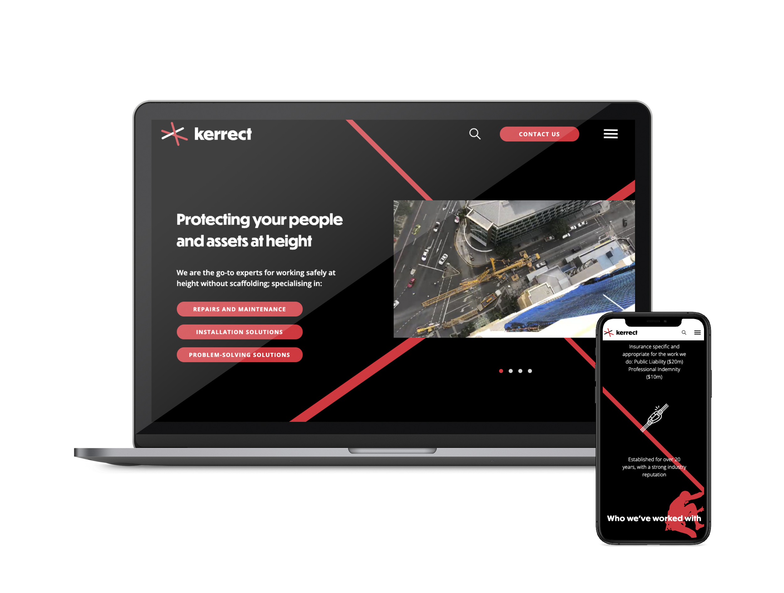
Barefruit also designed and developed a new cutting-edge website that was unique to Kerrect and what they do. We created a slick black themed website which made their primary colour 'red' really pop, and especially when used with unique parallax scrolling effects in the background, Kerrect now have a creative looking website. Parallax scrolling is a special scrolling technique used in website design where background images throughout a site move slower than the foreground image when scrolling. This creates a two-dimensional look and feel to the website and is accustomed to the way users behave nowadays - scrolling through feeds and pages. The whole website is fresh and up-to-date featuring areas for video or image based content with room to grow their portfolio projects. The navigation is also very simple to use on mobile and desktop and focuses on their user goals to enquire for one of their services.
We are proud that the overall brand re-fresh has given Kerrect a big jump ahead of its competitors.
Agriculture Awareness Video Campaign
We recently produced a series of short videos after winning a project with Lismore City Council. The brief was to create a series of videos to showcase and promote agriculture in the Lismore region. The videos were a key element of their Economic Development Strategy and were to highlight agricultural opportunities in the Lismore Region as well as help grow, support and diversify the Lismore economy.
During pre-production, Barefruit worked closely with Lismore City Council to help bring their vision to fruition. This consisted of internal meetings, location scouting, visual storyboards and shot lists. The original brief was to shoot some inspirational imagery and create five short videos that could be used in an integrated agricultural awareness campaign, however, during post-production, it was evident the content that was captured on the day of the shoot was filled with “lots of gold” which resulted in each video being approximately double in length.
The end result was a series of beautiful videos that promote the local area, opportunities available and the endless possibilities on offer within the region. The style of the videos is down to earth, visually pleasing and gives the viewer a sense of inspiration and determination to set up their own agricultural business, no matter the product or scale of their project.
Related Tag: Video Production Gold Coast
It was a joy to work with the following agribusinesses on this project:


Print Collateral

Richmond Valley Council first approached Barefruit to design a booklet that would help educate households in a fun, useful way with information about waste avoidance and how to dispose of household waste correctly.
This was a fun and educating project for our team and the project had plenty of elements that required illustrations and intricate design work. To make this booklet fun, playful and inviting, the design relied on illustrations to help explain waste avoidance practises and processes.
Our graphic designers on the Gold Coast create custom illustrations and graphics combined with a simple colour coordinated layout so readers could easily find specific information quickly. The booklet also included a tear-out calendar that had information on specific bin collection days as well as bin stickers to help households organise their waste easier.
Richmond Valley Council also entrusted Barefruit with the organisation of printing 8000 booklets on an environmentally friendly 100% recycled stock that would help reflect their environmental values.


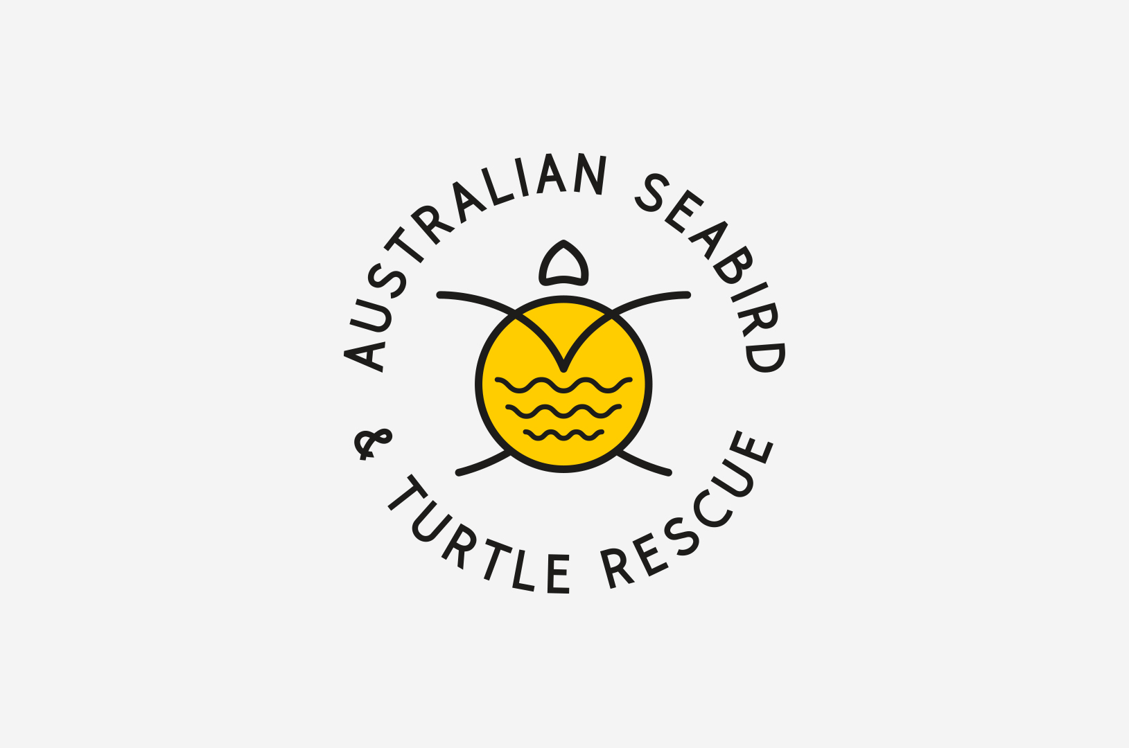
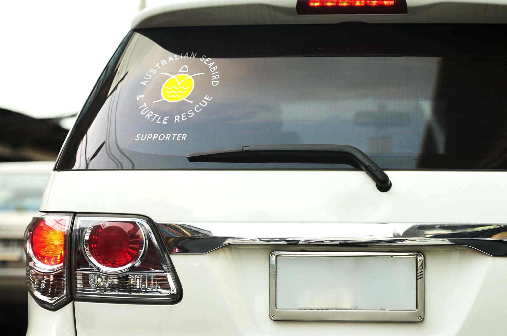
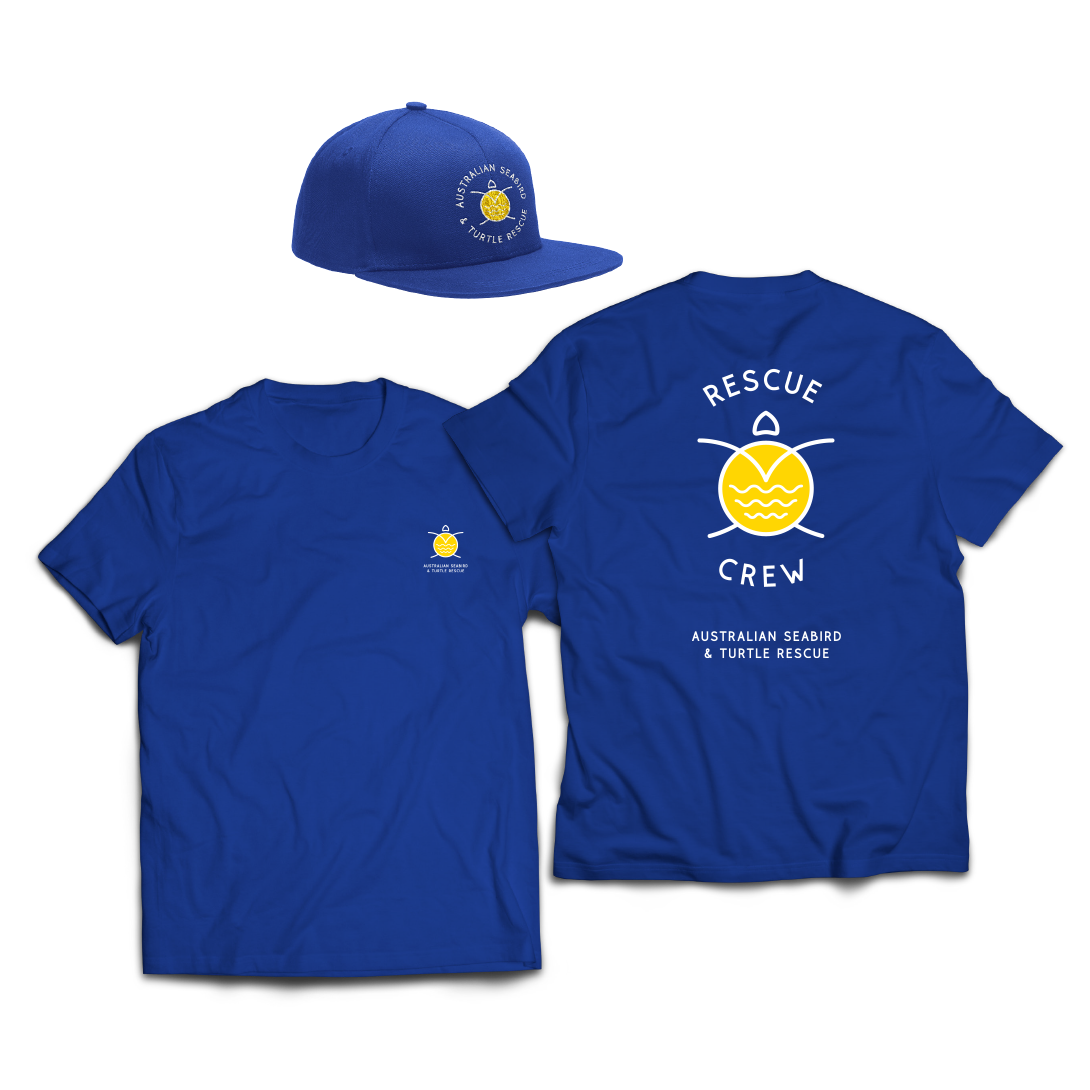
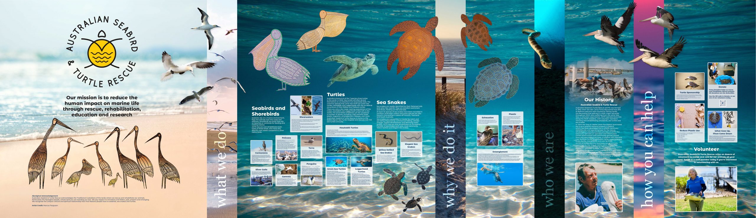
Originally Australian Seabird Rescue (ASR), the company was formed in 1992 when the late Lance Ferris discovered that 35% of Ballina’s pelicans were injured by fishing tackle. He discovered that pelicans in other major estuaries throughout NSW were suffering from the same fate. Now a volunteer organisation, Australian Seabird & Turtle Rescue (ASTR) operates branches along the NSW coastline, with volunteer members rescue and rehabilitate seabirds, shorebirds, sea turtles and sea snakes.
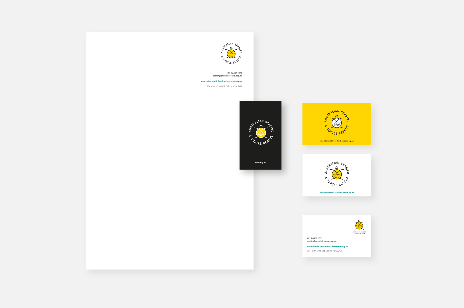
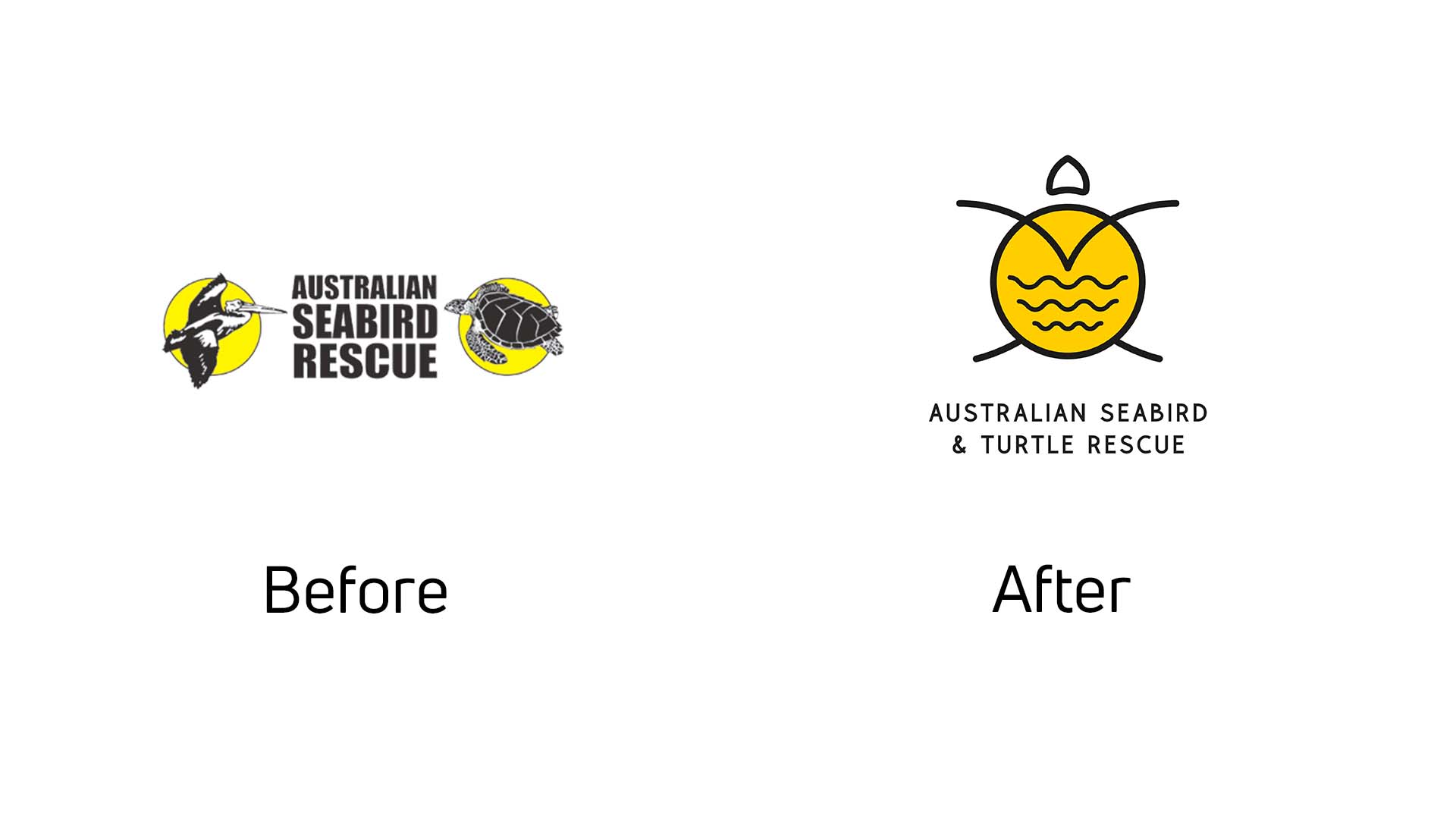
ASTR approached Barefruit with a vision to update their branding to something that is more representative to what they do. It was also an opportunity to bring their brand up to date with an identity that is modern and appealing to all audiences.
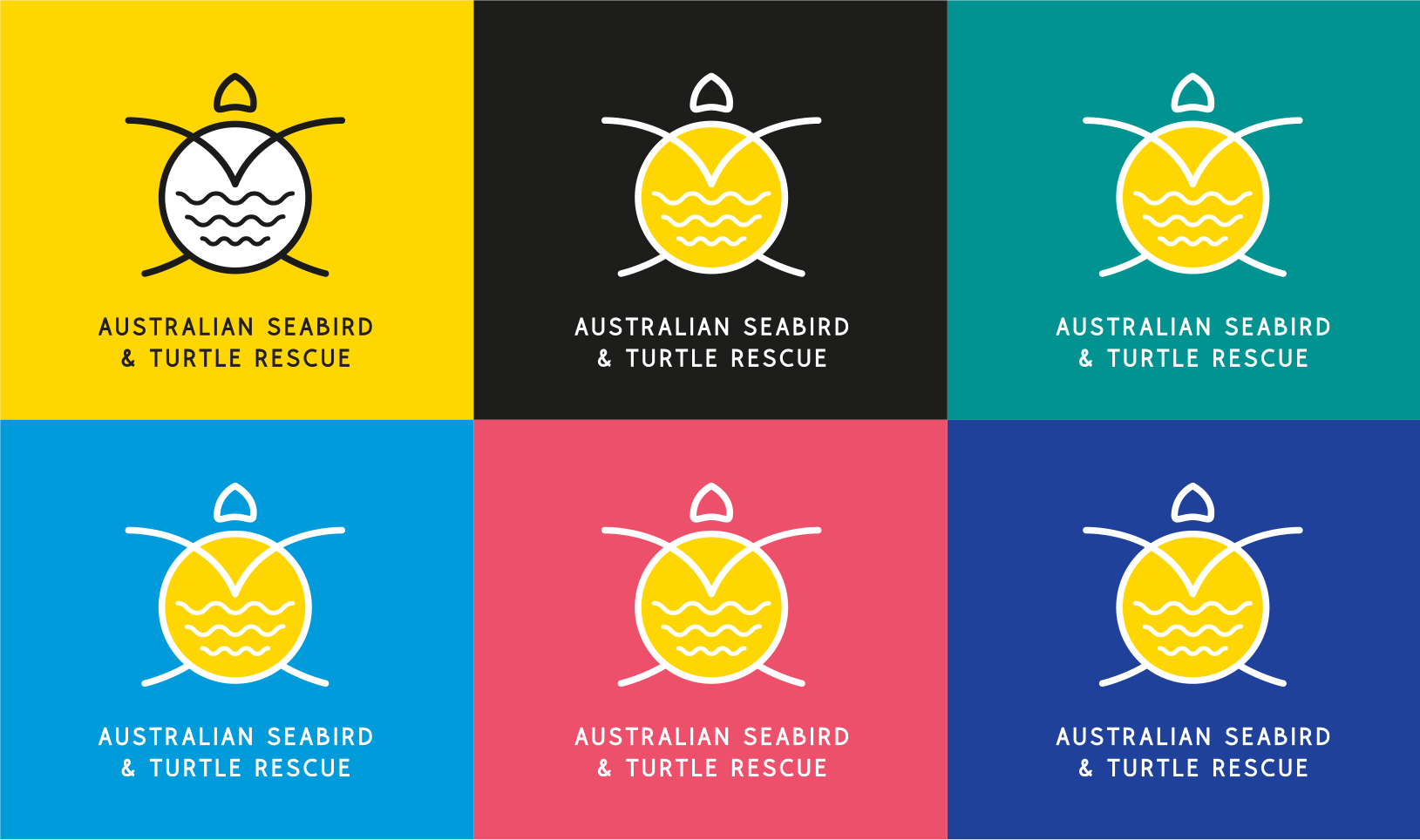
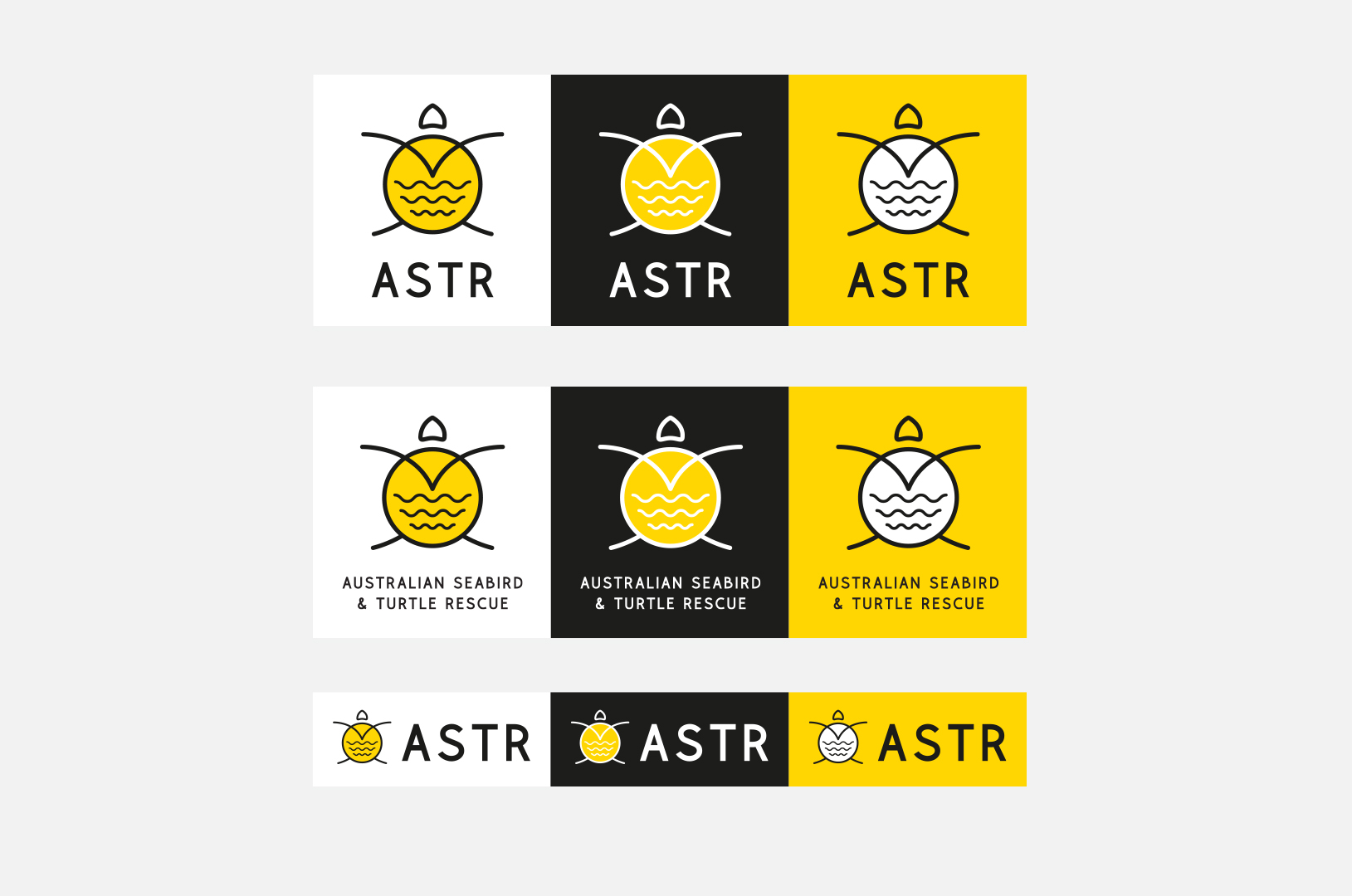
Creating the ASTR brand identity was a fun process, which began with mood boards and different directions to choose, however it came down to a very simple artwork that incorporates a turtle, seabird, sea snakes, the sun and ocean all in one using very simple line-artwork.
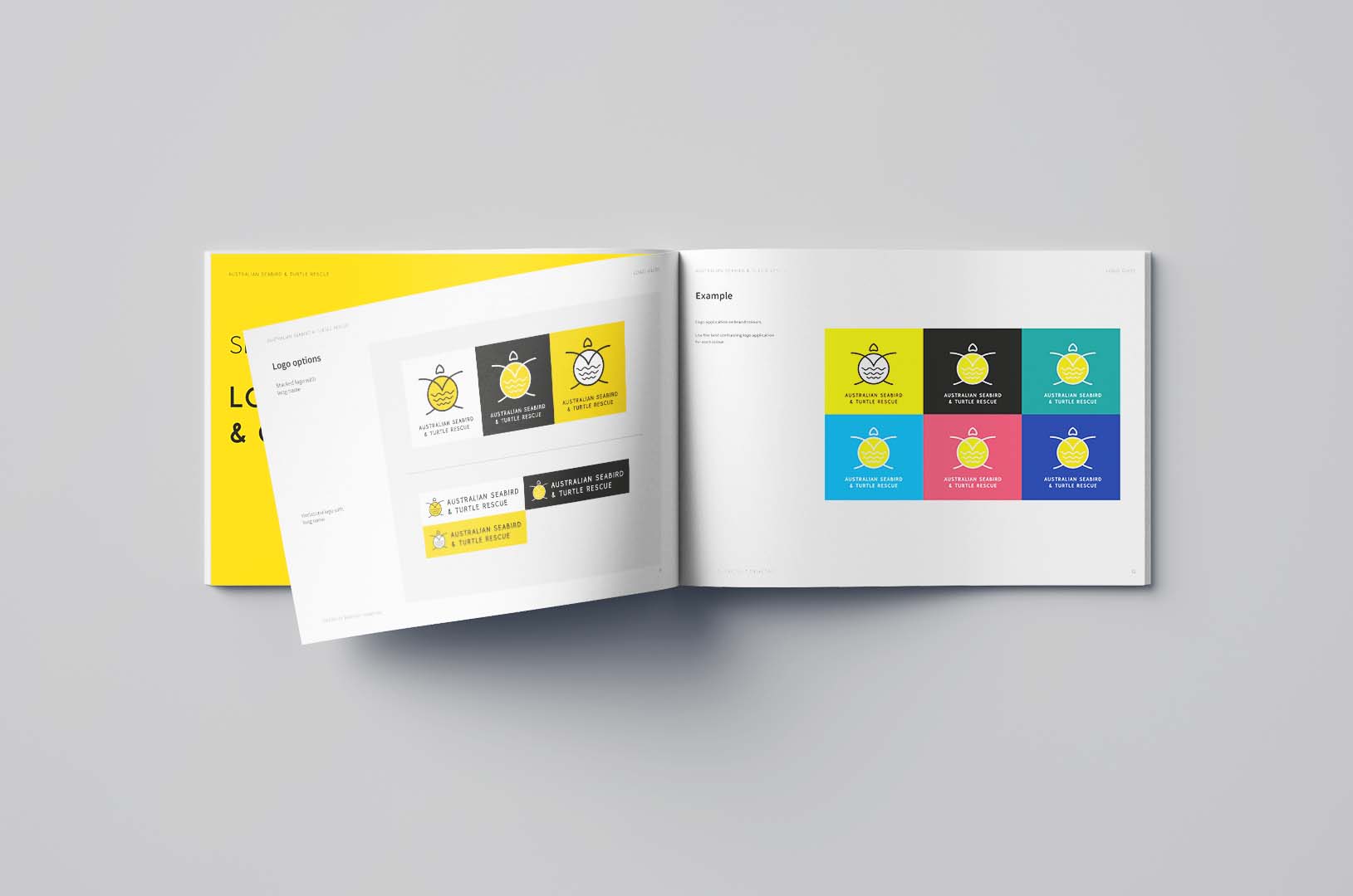
The new identity is a holistic update from the previous logo, we kept the primary yellow brand colour, which works really well with the new secondary colour palette. The yellow is also bright and draws attention as an emergency rescue operator, and we have managed to combine the multiple identities they had for turtle rescue and seabird rescue into one.
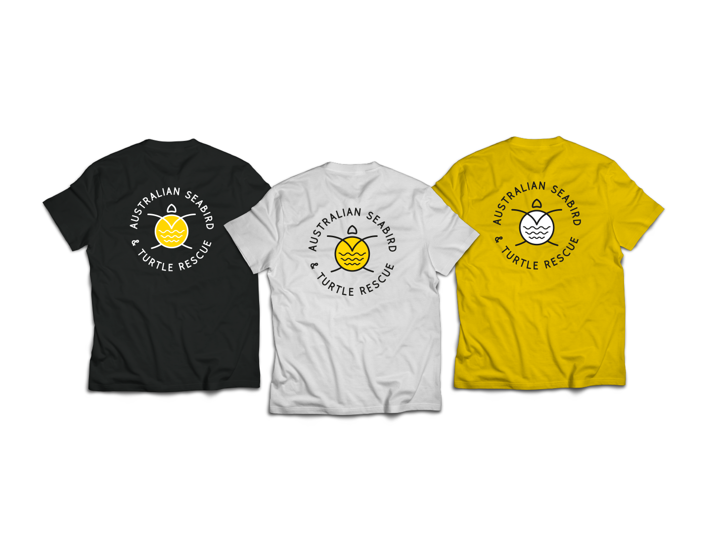
The finished logo is also a great talking point for children of all ages for educational purposes too and will remain as a unique identity that is also wearable for locals, supporters, workers and tourists.
Related Tag: Logo Design in Australia