Southern Cross University – Open Days 2024


Southern Cross University - Open Days

2024


The brief

With a packed calendar leading up to 2024 Open Days, the Office of Engagement at Southern Cross University (SCU) enlisted some extra hands to ensure everything ran smoothly. These flagship events, held across Lismore, Coffs Harbour, and the Gold Coast, required seamless logistical planning and on-the-ground support. That’s where we stepped in, working alongside the Open Day committee to coordinate every detail, from event activation to attendee engagement.

Our top priority was helping the SCU team deliver a stress-free, welcoming experience for prospective students and their families. After all, Open Days are more than just an event, they’re the first opportunity to showcase the university’s heart and soul. And let’s face it, first impressions really do matter!

Our approach

We got to work, engaging in weekly meetings with the SCU committee and dedicating ourselves to make SCU’s Open Days a hit. Here’s how we did it:

  • Planning
    • Weekly WIP meetings, post-meeting reports, onsite visits, and the ultimate tote bag packing session.
  • Digital Check-In System
    • Researched, sourced, and implemented an efficient digital check-in system.
    • Coordinated with suppliers and SCU staff to ensure seamless data integration and user-friendly operation.
  • Panellist Pre-Event Prep
    • Designed and compiled info sheets with session details, bios, headshots, and sample questions for panellists, alumni, and student ambassadors.
  • Merchandise
    • Curated SCU-branded tote bags, phone suctions, star brooches, car fresheners, caps.
    • Organised thank you gifts for academic panellists (Hello! Mayde Tea gift boxes!!!).
  • Print & Signage
    • Managed design, production, and delivery of event collateral, including name tags, lanyards, t-shirts, flyers, maps, coffee cards, and academic round badges.
  • On-the-Ground Event Support
    • Hands-on help across all three Open Days, from setup to check-ins, campus assistance, and pack-down.

The Fruits

With our event expertise in play, SCU’s Open Days ran like a dream! Attendees breezed through check-in, engaged seamlessly with event materials, and took home top-notch merch. Academic panellists had all the info they needed, and the SCU team had the support to focus on delivering an unforgettable experience.

This project proved that with the right planning, a few hundred hours of hustle, and a passion for bringing events to life, even the biggest logistical challenges can be tackled with ease.


LET'S CHAT ABOUT CULTIVATING YOUR BRAND
 

Hey Team Fruity!

    I'm , I'd like you to help my business, , 'barefruit'.

    I am interested in

    You can call me on and email me at

    We'd love to know how you heard about us?

    Santos Organics


    Santos Organics - Brand Awareness Campaign


    Santos Print Ad


    The brief

    Over the last few years, the Northern Rivers has transformed in terms of its’ demographics, due to an influx of people moving from metropolitan areas around Australia. If you’re gonna be locked down, why not be close to the beach and fresh air!

    There has also been an influx of retailers, with major supermarkets and boutique grocery stores in most towns.

    Santos Organics, an organic retail store established in the Byron shire in the mid 70’s realised the need to evolve their branding and marketing, to talk to this newer audience and remind the older audience that they are still here, and still great.

    Our response

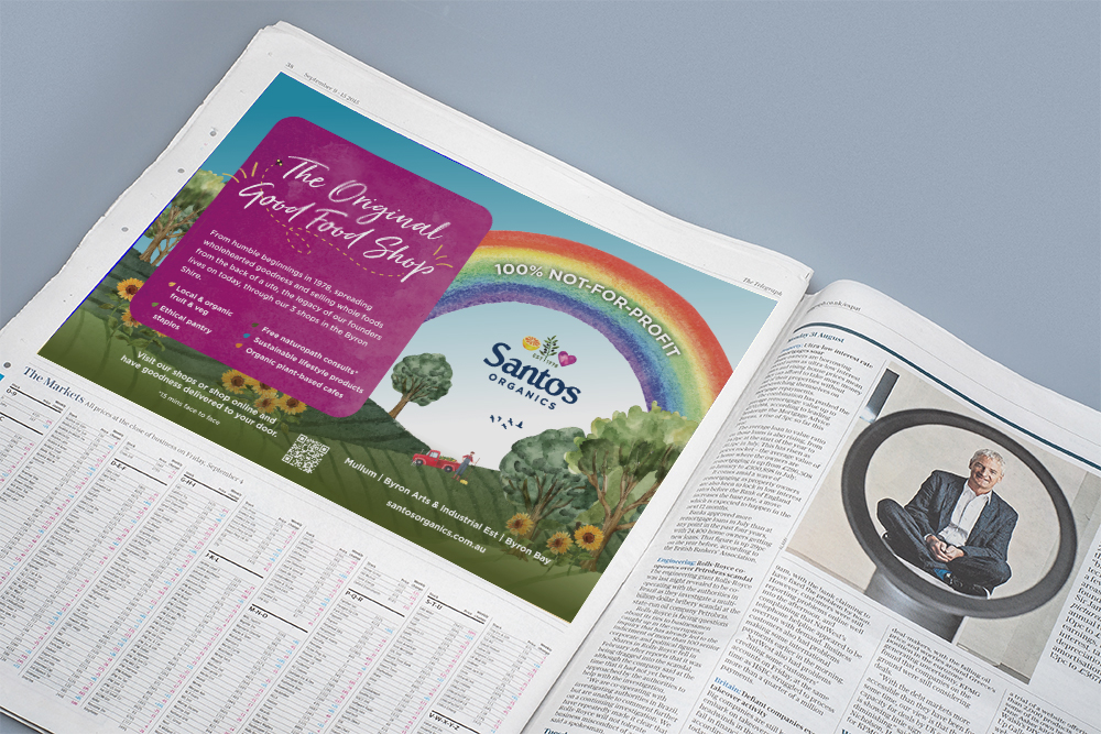
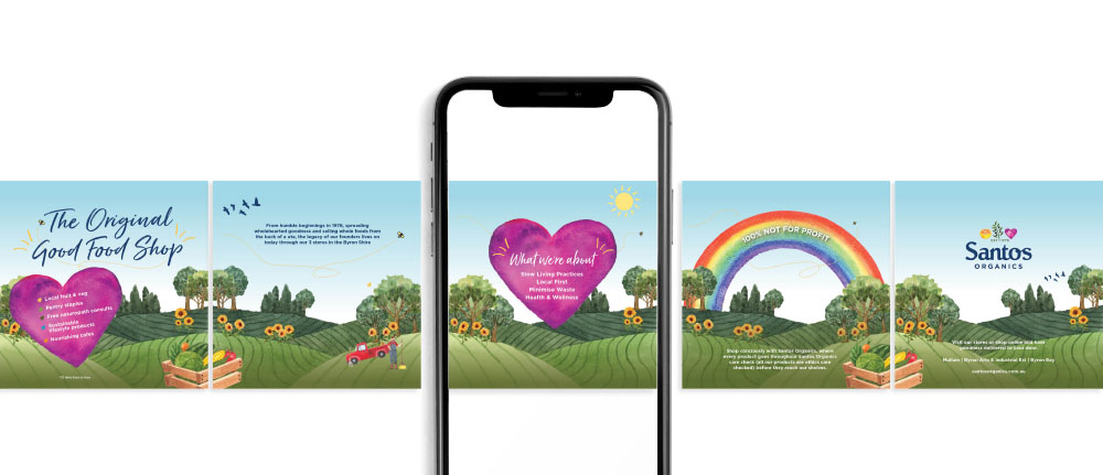
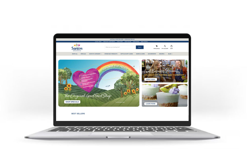
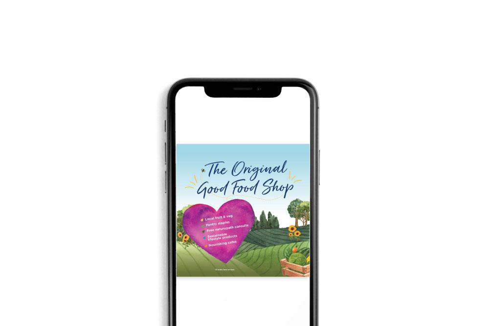
    A reintroduction campaign, headlined ‘The Original Good Food Shop’, to educate and take the community on a journey back to the humble beginnings of Santos and how it all began. We also wanted to emphasise their commitment to the local community, by providing the healthiest organic food and lifestyle products, in a new and refreshing way.

    Working closely with Santos, we created a brighter look and feel that aligns with Santos’ values, and brings out their true tone of voice, core values and ethics. We incorporated new watercolour elements and colour palettes through the creation of localised scenery, paying homage to their heritage and long-standing ties with the Northern Rivers community.

    We created a full brand campaign which rolled out across press, in-store, website, paid and organic socials (video and static), Google Ads and email marketing.

    The fruits

    The Original Good Food Shop campaign has been an undeniable success, connecting with new and existing Santos customers, as well as highlight Santos’ legacy in the Northern Rivers and their commitment to community, through three content pillars of ‘Local First, Zero Waste’, ‘Health and Wellness’ and ‘Planet Based Living’.

    • Increased website traffic by + 22% YOY
    • Achieved over 600k impressions through paid social & Googles Ads campaigns.


    Santos Organics Socials
    Santos Organics Web Banner
    Santos Organics Socials

    LET'S CHAT ABOUT CULTIVATING YOUR BRAND
     

    Hey Team Fruity!

      I'm , I'd like you to help my business, , 'barefruit'.

      I am interested in

      You can call me on and email me at

      We'd love to know how you heard about us?

      Lismore City Council

      Lismore City Council - Event Marketing 'Lismore Delights'


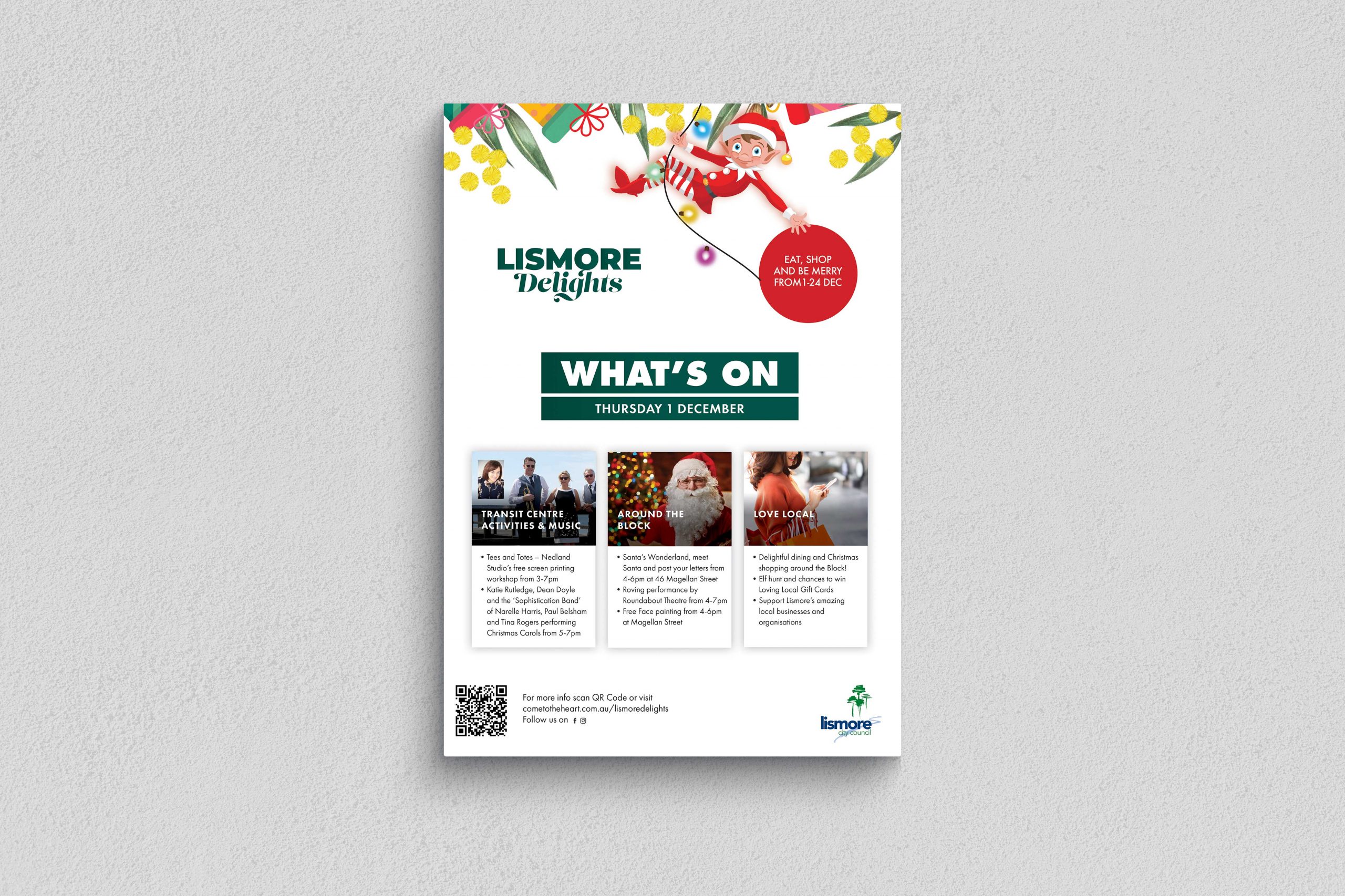
      Lismore City Council Lismore Delights Banner

      Background

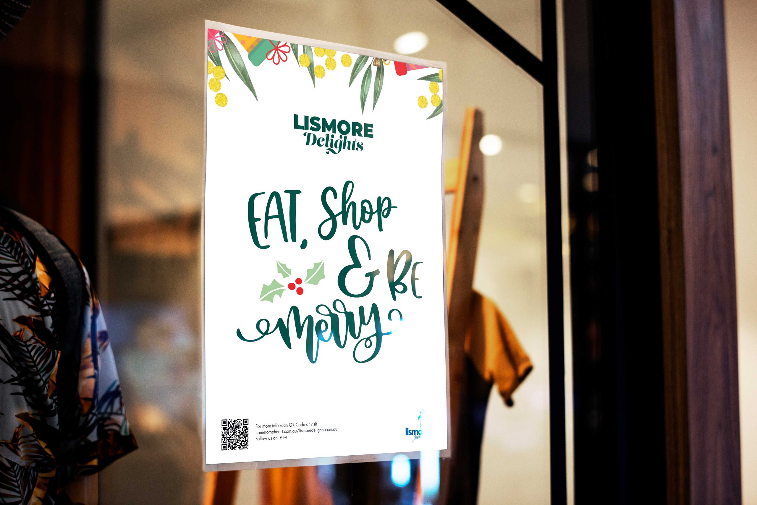
      Here at Barefruit Marketing, we're passionate about creating memorable and effective marketing campaigns for our clients, ensuring we bring their visions and marketing objectives to life. Last year, we had the opportunity to work with Lismore City Council on their 'Lismore Delights' Christmas campaign, and nailed it.

      The work

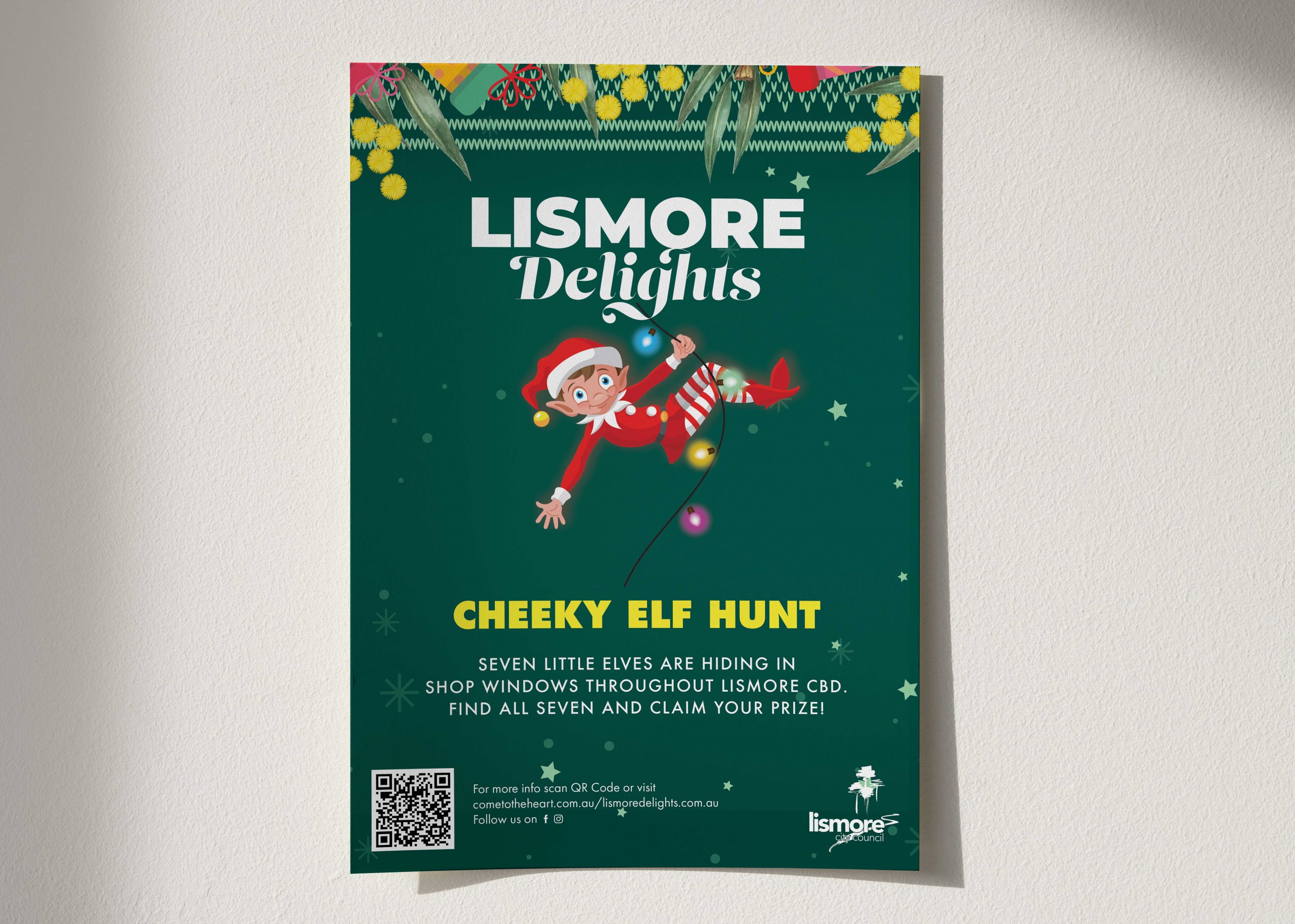
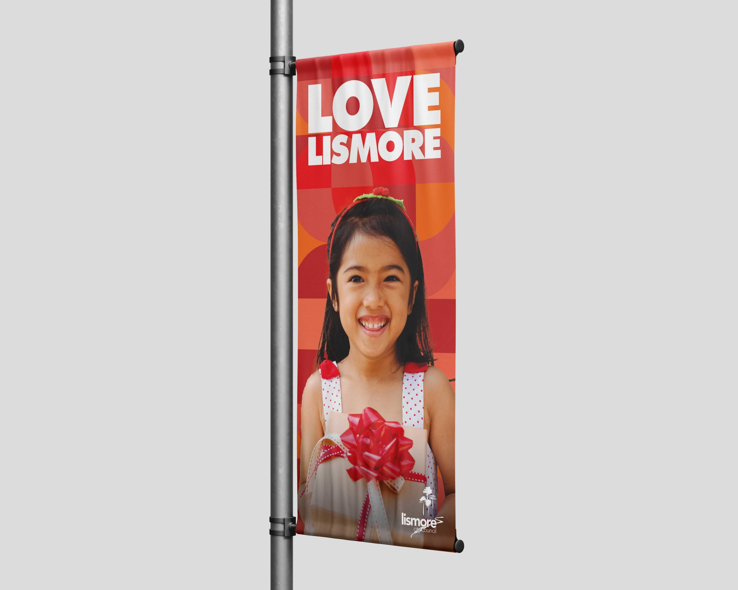
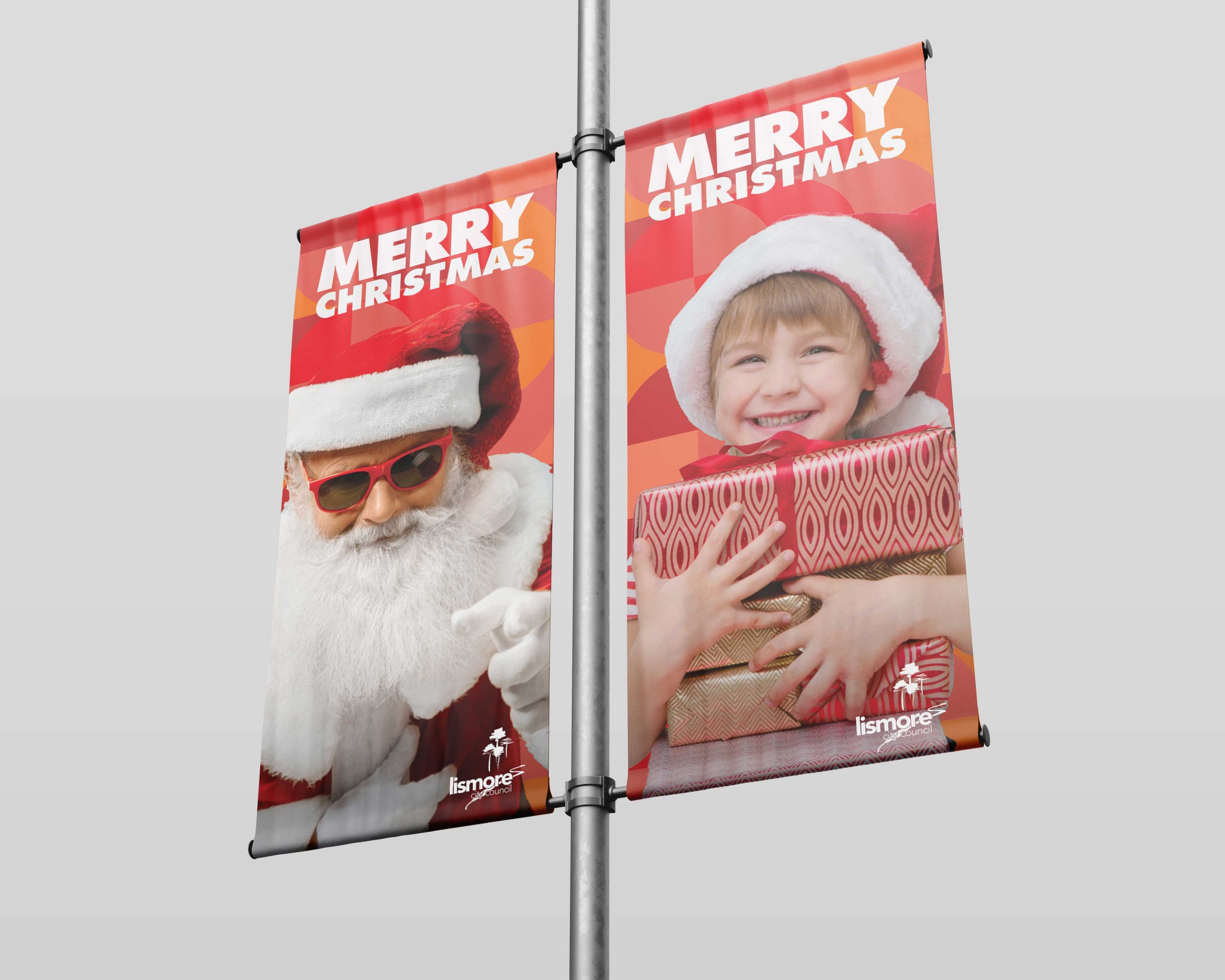
      Offering additional support to their internal marketing team, we were responsible for the roll-out of the ‘Lismore Delights’ campaign, incorporating all aspects of the project, from the design and printing of banners, to managing social media, to creating radio and television ads. The timelines weren’t for the faint-hearted, but given our experience and passion for in integrated campaign, plus the fact that we love Lismore, we embraced the challenge and like an Elf in Santa’s workshop, we set to work.

      Needless to say, the campaign was an overriding success, even Santa seemed chuffed at how seamlessly it all rolled out. In fact, ‘Lismore Delights’ was met with such welcoming enthusiasm by the community, the town was the ‘place to be seen’ over the festive season and Lismore City Council hope to build on its’ success in years to come.

      We’re all about bringing your project visions and goals to life, so if you like what we do, let’s make it happen.

      Lismore City Council Lismore Delights Banner
      Lismore City Council Lismore Delights Shop Signage
      Lismore City Council Lismore Delights Poster
      Lismore City Council Lismore Delights Poster

      LET'S CHAT ABOUT CULTIVATING YOUR BRAND
      Hey Team Fruity!

        I'm , I'd like you to help my business, , 'barefruit'.

        I am interested in

        You can call me on and email me at

        We'd love to know how you heard about us?

        Rous County Council


        Rous County Council - Print & Social Campaign


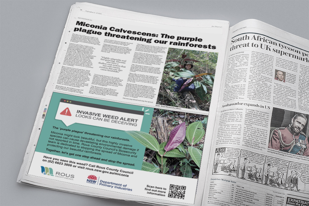
        Rous County Council Print Ad
        Rous County Council Print Ad

        LET'S CHAT ABOUT CULTIVATING YOUR BRAND
         

        Hey Team Fruity!

          I'm , I'd like you to help my business, , 'barefruit'.

          I am interested in

          You can call me on and email me at

          We'd love to know how you heard about us?

          Wildling Ginger Beer – Seven Mile Brewing Co

          Seven Mile Brewing Co - Wildling Ginger Beer

          Brand Strategy, Product Branding & Packaging

          Wildling Seven Mile Brewing Co Can

          The work

          Barefruit were ecstatic to be awarded the brief to develop the branding (from naming straight through to production) for Seven Mile Brewing Co.’s most recent creation – a fresh and zingy Ginger Beer. The project kicked off early January 2021 and went through the full creative process to arrive at a playful, artistic, and very distinctive result – Wildling Hard Ginger Beer.

          Seven Mile Brewing Co., wanted a brand that appealed primarily to women, but also men who seek out beer alternatives, and those who love a cocktail (Pro tip: Wildling goes amazingly well with spiced rum and fresh lime, over ice). To capture these key market segments, the brand personality needed to be unique, fun, cheeky and visually catching. At the same time,  communicating its USP’s: use of local ingredients, the tangy ginger kick and a subtly, sweet finish

          The Barefruit project management team had an excellent opportunity to ‘flex their creative muscles’ for this project with quite a bit of freedom to explore naming and design options. The process took the team on a 7-month journey to conceptualise, design and refine each and every detail of the artwork for the cans and cartons.

          Creative Lead Alex Wales says

          “We started with concepts and moodboards to present the client with lots of options and completed a full competitive analysis to ensure that the result was going to be distinctive, unique and match the product itself. Once we finalised the artwork, we worked on the details to the cans and cartons until everything was approved and signed off; ready for production.”

          Related Tag: Branding Gold Coast

          Wildling Ginger Beer Packaging Design Media Mock-Up
          Wildling Ginger Beer Packaging Design Media Mock-Up
          Wildling Ginger Beer Packaging
          Wildling Ginger Beer Carton

          LET'S CHAT ABOUT CULTIVATING YOUR BRAND
          Hey Team Fruity!

            I'm , I'd like you to help my business, , 'barefruit'.

            I am interested in

            You can call me on and email me at

            We'd love to know how you heard about us?

            Rugby Palooza – Branding and Website

            Rugby Palooza - Branding & Website


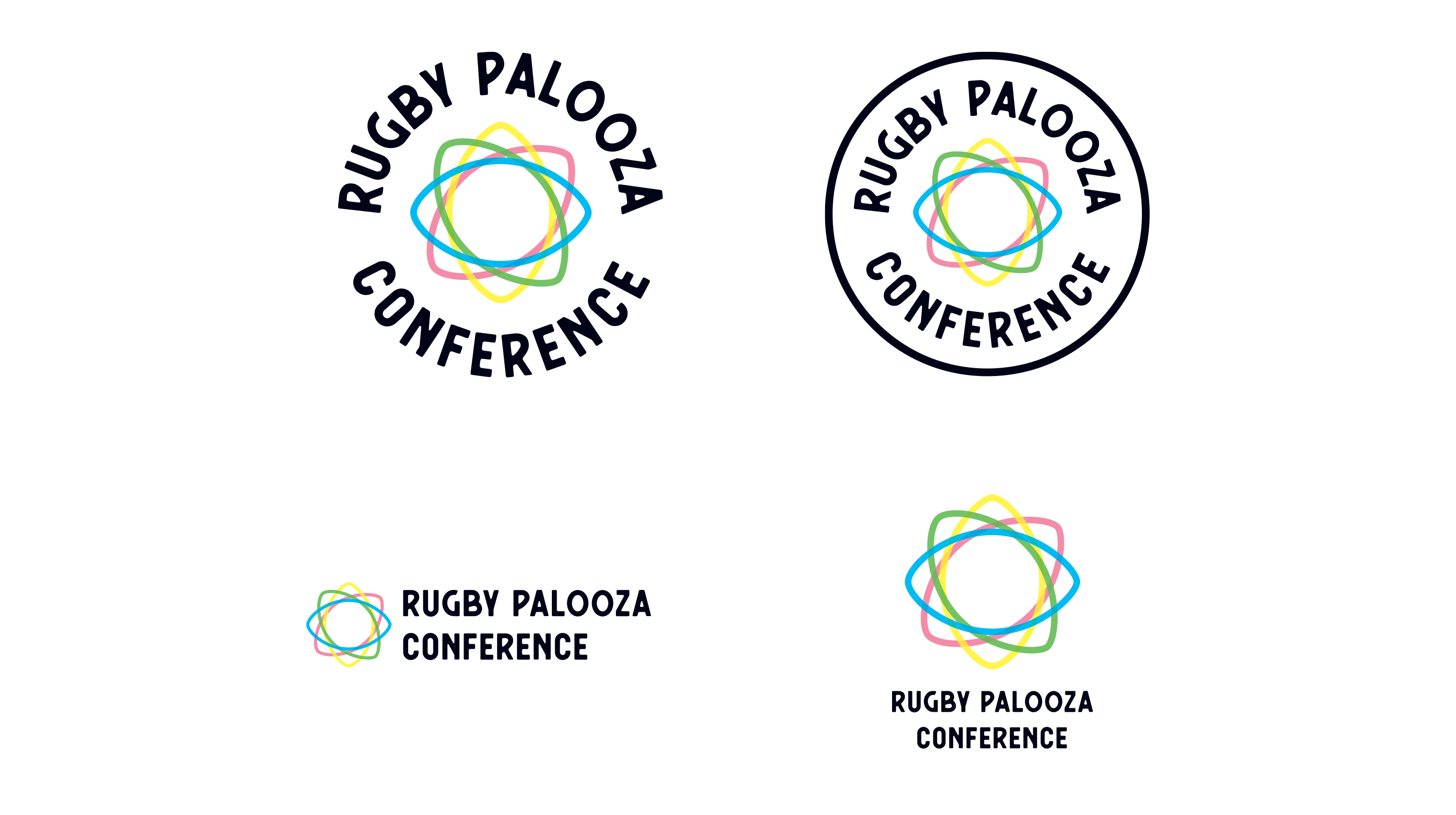
            Rugby Palooza logo

            Background

            We were approached by Andrew Fraser

            The work

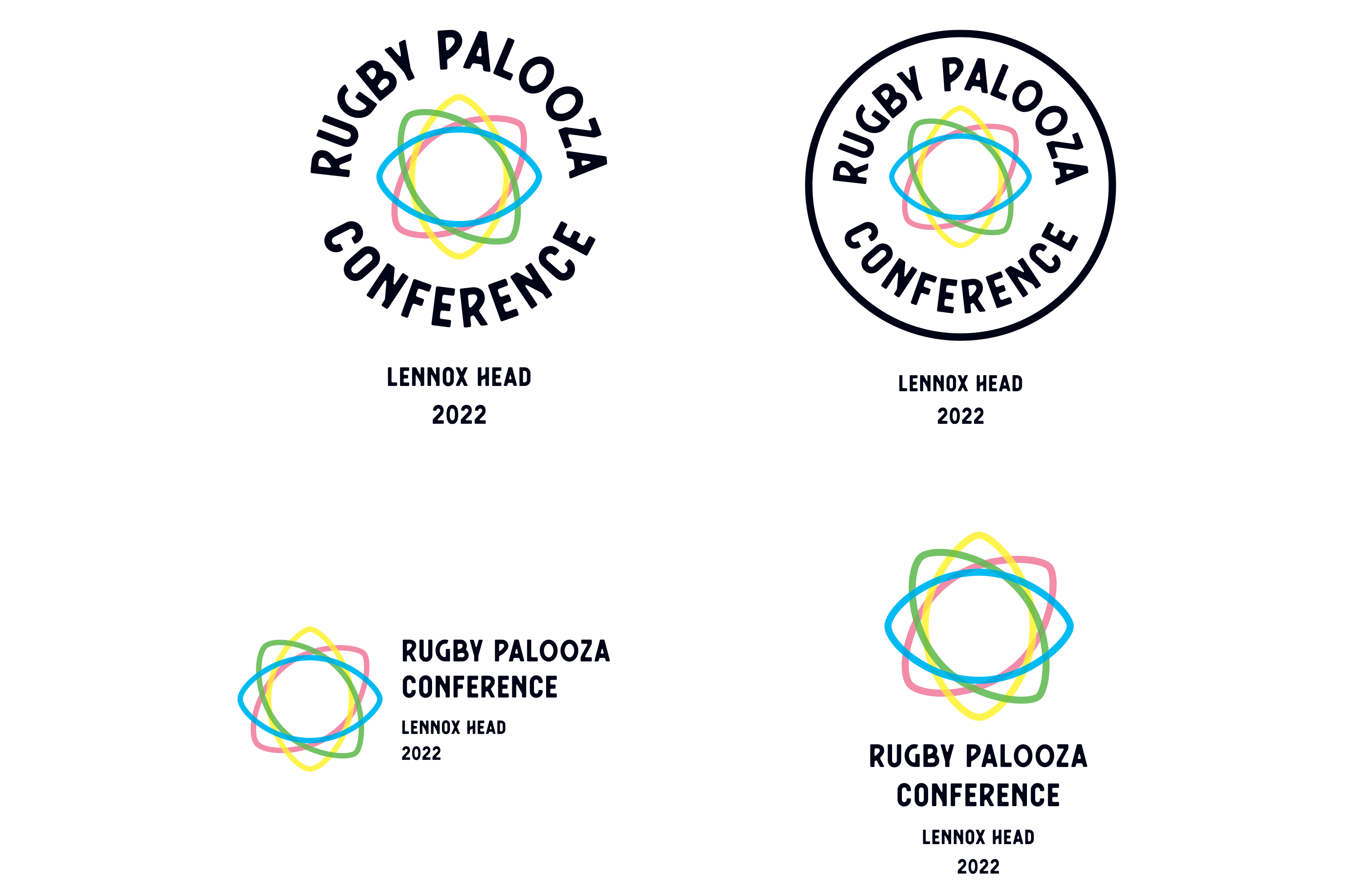
            We started the process with a brand naming brainstorm and the client arrived at using Rugby Palooza Conference. Using this our goal was to create an easy to use identity that was both sporty and professional with the aim of the conference attracting some of Australia's, if not the world's best rugby coaches.

            The final logo concept utilised the rugby ball shape into an abstract pattern with different colours to represent the meeting of different teams from all over the country. The joining of the shape was a nice way to create a networking concept for the identity. We created stacked, horizontal and badge logo designs that could be easily applied in a cool fun way to merchandise as well as other marketing collateral such as the website. The identity was also adapted and considered the location placement of the conference as the conference location will change each year, so we created a simple logo lock-up to accommodate this.

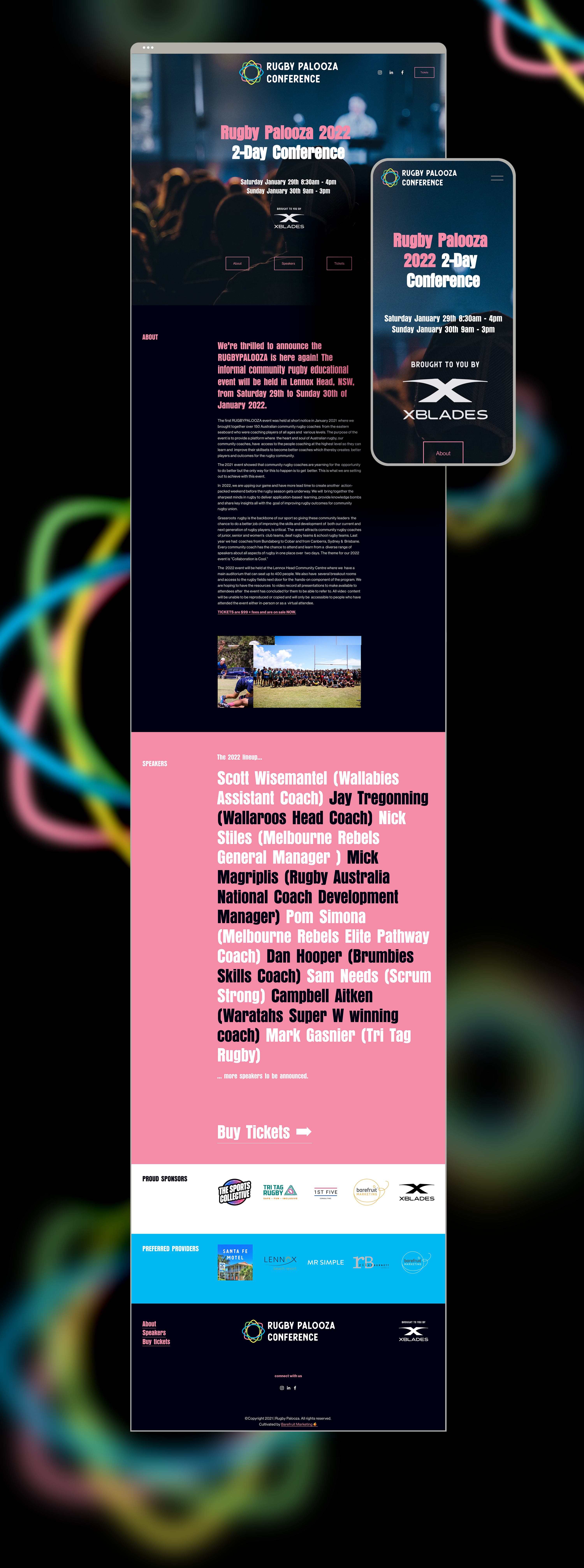
            We also designed and built the Rugby Palooza Conference website, a simple one pager site that could drive traffic to a ticketing platform as well build upon as the conferences continue in the future.


            Rugby Palooza logo 2
            Rugby Palooza website

            LET'S CHAT ABOUT CULTIVATING YOUR BRAND
            Hey Team Fruity!

              I'm , I'd like you to help my business, , 'barefruit'.

              I am interested in

              You can call me on and email me at

              We'd love to know how you heard about us?

              Parker & Kissane Rebrand

              Parker & Kissane - Re-brand


              Parker & Kissane Logo
              Parker & Kissane Logo
              Parker & Kissane Logo before and after

              Background

              Parker & Kissane Solicitors is a legal practice established in 1902, located in the Northern Rivers area of New South Wales with offices in Casino, Lismore, and Kyogle. They offer a complete range of legal services to all members of the community. We were approached by P&K to look at updating their brand identity as they wanted a refresh and bring it up-to-date and to see how they could include new services into their offering.

              The work

              We started with a bit of a brainstorm workshop to outline the basic values of the business, P&K needed to include a new conveyancing service as part of the rebrand as well as give their logo a new feel. Our solution was to solve their brand hierarchy through segmenting their services through brand colours, so they can clearly communicate their services to specific target audiences without diluting the main brand and keep the P&K name as the core provider of soliciting and conveyancing.

              We utilised a nice serif typeface to create the new P&K logo mark that looks professional and yet is still friendly and approachable for new customers seeking legal services. We defined and created simple identities that can be used through all their office collateral as well as online for their websites and social media. The assuring P&K mark is a strong abbreviation locally that everyone refers to, so keeping that in place essential alongside Parker & Kissane logo options.

              The client loved the simple, elegant and timeless design of the re-brand.

              Parker & Kissane brand guide 1
              Parker & Kissane brand guide 2
              Parker & Kissane brand guide 3
              Parker & Kissane website
              Parker & Kissane website
              Parker & Kissane website

              LET'S CHAT ABOUT CULTIVATING YOUR BRAND
              Hey Team Fruity!

                I'm , I'd like you to help my business, , 'barefruit'.

                I am interested in

                You can call me on and email me at

                We'd love to know how you heard about us?