Invercauld House | Website Redesign


Invercauld House

Website Redesign


The brief

Invercauld House needed a complete website redesign to modernise their online presence. Their previous site relied heavily on downloadable PDFs, had limited imagery, and didn’t effectively showcase their stunning venue or broad service offering. The goal was to create an informative, user-friendly website that kept visitors engaged on the site, rather than directing them away.


Our response

We restructured the website from the ground up, expanding the content to clearly explain Invercauld House’s services, facilities and accommodation options. We developed fresh, SEO-friendly copy, integrated new photography, and built a cleaner, more intuitive layout. The result was a digital experience that feels warm, welcoming and elevated — reflecting the venue’s unique setting and professional offering.

The fruits

• A modern, fully refreshed website aligned with Invercauld House’s brand and tone.
• Rich on-page information replacing PDFs, improving user experience.
• New imagery showcasing the venue’s natural beauty and facilities.


Hey Team Fruity!

    I'm , I'd like you to help my business, , 'barefruit'.

    I am interested in

    You can call me on and email me at

    We'd love to know how you heard about us?

    Burgess Hughes Family Lawyers | Branding & Collateral


    Burgess Hughes

    Branding & Collateral


    The brief

    Two established firms — Burgess Family Law and Christopher Hughes & Associates — were merging to become Burgess Hughes. They needed a new brand identity that communicated a fresh start while maintaining professionalism, trust and authority. The brand needed to speak clearly to individuals and families seeking legal support.


    Our response

    We explored the family law landscape, reviewing competitors and reviewing the styles that resonated with the client. From there, we developed a clear brand hierarchy and refined a set of logo options that balanced tradition with a modern touch. Colour palettes and typography were chosen to appeal to the target audience, ensuring the brand felt both credible and compassionate. We then rolled the brand out across stationery (business cards, email signatures and letterheads)

    The fruits

    • A polished, professional brand that unites both firms under one clear identity.
    • A logo suite that works seamlessly across the firm’s stationery
    • A cohesive visual style that reflects expertise, approachability and trust — supporting the firm’s positioning as a reliable legal partner for families.


    Hey Team Fruity!

      I'm , I'd like you to help my business, , 'barefruit'.

      I am interested in

      You can call me on and email me at

      We'd love to know how you heard about us?

      University Centre for Rural Health (UCRH) | Rebrand & Website


      University Centre for Rural Health (UCRH) - Rebrand & Website


      UCRH - Logo


      The brief

      The University Centre for Rural Health (UCRH) is a collaborative academic hub for rural health development, located in the heart of Lismore in the northern Rivers. It is a joint venture between University of Sydney, Western Sydney University, the University of Wollongong, and Southern Cross University and operates in close collaboration with Northern NSW Local Health Networks.

      UCRH engaged Barefruit with the exciting task of revitalising their brand, embarking on a creative journey to reignite their identity. Working closely with the UCRH in-house team, the overall project had three components:

      • Brand / Logo refresh
      • A new website
      • Collateral rollout

      Our response

      First, we breathed new life into their brand with a new brandmark, infusing it with vitality whilst honouring its heritage and preserving elements of the much-loved flame tree that sits in the centre of the campus. Next, we designed and developed a shiny new, user-centric website that serves as a captivating gateway to the Centre. The website was designed and structured so that it can adapt and grow with the University. From there, we curated a suite of meticulously branded templates and documents, ensuring consistency and professionalism across all touchpoints.

      We introduced the brand identity to the entire team at the University using an interactive presentation and breakout workshops to train the team in using the new identity and templates in their everyday roles.

      The fruits

      Together, we’ve not only refreshed UCRH’S visual identity but also laid the foundation for a cohesive brand narrative that resonates with staff, students and the wider community. It’s been a privilege to collaborate with UCRH, and we’re looking forward to seeing the new branding rolled out over the coming months.

      Client Testimonial

      Barefruit Marketing’s approach was practical and grounded in the right mix of creativity and common sense. The team were great to work with, responsive to our needs and worked hard to support us through every step of what was a complex project. We are so pleased with the outcomes and have enjoyed wonderful feedback from staff and stakeholders. - UCRH Team 


      UCRH website
      URCH Presentation Folder
      URCH Poster
      URCH Letterhead and Email Signature
      URCH Style Guide
      URCH Style Guide
      URCH Style Guide


      Hey Team Fruity!

        I'm , I'd like you to help my business, , 'barefruit'.

        I am interested in

        You can call me on and email me at

        We'd love to know how you heard about us?

        UPA Home Care | Brand Advertising Campaign


        UPA Home Care

        Brand Awareness Advertising


        the brief

        UPA North Coast are providers of Aged Care Services, as well as Youth Care Services and Residential Care on the North Coast. An award-winning provider that has been established in the Home Care industry, with an excellent reputation, since 1995. UPA North Coast approached us wanting to grow awareness of their brand and to talk directly to the people who may need their services along with the people whose parents may need Aged Care services one day.

        our response

        We created and rolled out a campaign for UPA North Coast called 'Keep Your Traditions'. This campaign was specifically for their Home Care Service sector. The 30-second emotive Television Commercial is centred around concerns that one may have as they age which may result in the need for Home Care services. With an aim to put everyones minds at ease that they are in compassionate hands, the television commercial shows the audience a “Family Tradition” scene that we all know and love – Sunday roast with  the family.

        In support of the television commercial, Barefruit created additional marketing collateral to ensure an integrated marketing campaign. A comprehensive information booklet showcasing and explaining  UPA North Coast Home Care Services was designed. This booklet includes all of the vital first port of call information including; information about the not-for-profit, cost of services and ways you can access services. This was supported by an attractive and informative brochure, that summarises the information in the booklet succinctly.

        BFM TV Advertisement and Marketing Collateral
        advertising agency northern rivers

        the fruits

        This kind of strategic and focused campaign is both challenging and highly rewarding to pull together. When executed correctly it  creates incredible brand awareness, emotional response in the audience and excellent results for the client, which makes us extremely happy!

        You can read more about UPA North Coast and the service they offer here.

        LET'S CHAT ABOUT CULTIVATING YOUR BRAND

        Hey Team Fruity!

          I'm , I'd like you to help my business, , 'barefruit'.

          I am interested in

          You can call me on and email me at

          We'd love to know how you heard about us?

          Good Cover Insurance | Rebrand


          Good Cover Insurance Solutions

          Rebrand

          Good Cover - Signage

          The brief

          Good Cover is a down-to-earth insurance broker in Bangalow, NSW, breaking the industry mould with simplicity, transparency, and genuine service. Founded by Matt, an industry pro with 20+ years of experience, operating for 2.5 years, and ready to scale up. With big plans for growth,including new projects, team expansion, and a website revamp,they needed a fresh new brand identity to reflect their values, build trust, and stand out.

          The goal was to cultivate a distinctive brand identity, communicate core values, enhance credibility, and ensure consistent branding across all marketing collateral and business materials.

          Our response

          A fresh new look that reflects trust and approachability:

          • A Logo with Personality – A relaxed, modern design with ocean-inspired blues and corals, reflecting their down-to-earth, community-driven vibe.
          • A Coastal-Inspired Palette – Fresh, fun colours that balance professionalism with warmth, making insurance feel less intimidating.
          • Brand Guidelines  – A playbook to keep branding sharp and consistent across all platforms, ensuring a polished, cohesive look.

          The fruits

          The result? A standout identity that sets Good Cover apart in a crowded market. The refreshed brand boosts credibility, making it easier to scale and connect with clients in Northern NSW and Sydney. Mission accomplished!


          " I am only too happy to recommend Barefruit marketing, they recently updated my logo, which I am super stoked with. This aside, what I also know to be true is they work with a number of my own clients, and I am always impressed by the work they turn out for them as well. ”

          - Matt, Good Cover.


          Good Cover - Logo
          Good Cover Stationery
          Good Cover Logo Guide

          LET'S CHAT ABOUT CULTIVATING YOUR BRAND


          Hey Team Fruity!

            I'm , I'd like you to help my business, , 'barefruit'.

            I am interested in

            You can call me on and email me at

            We'd love to know how you heard about us?

            Comedy Commune | Rebrand & Socials

            Comedy Commune - Branding & Social


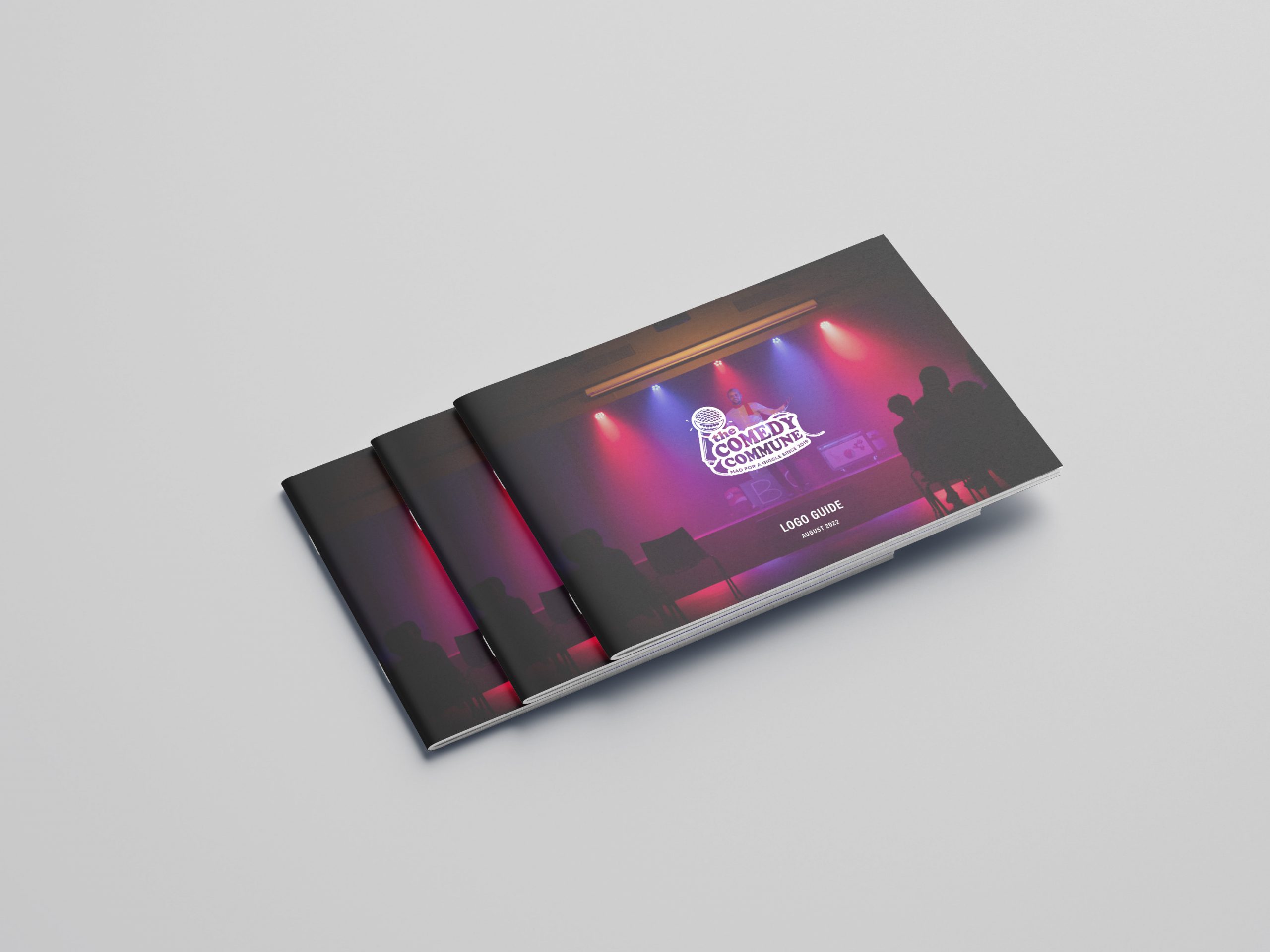
            Comedy Commune Logo
            Comedy Commune Logo
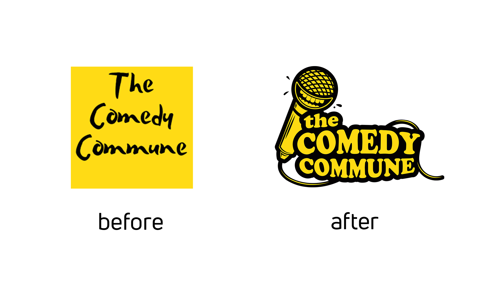
            Comedy Commune - before & after logo
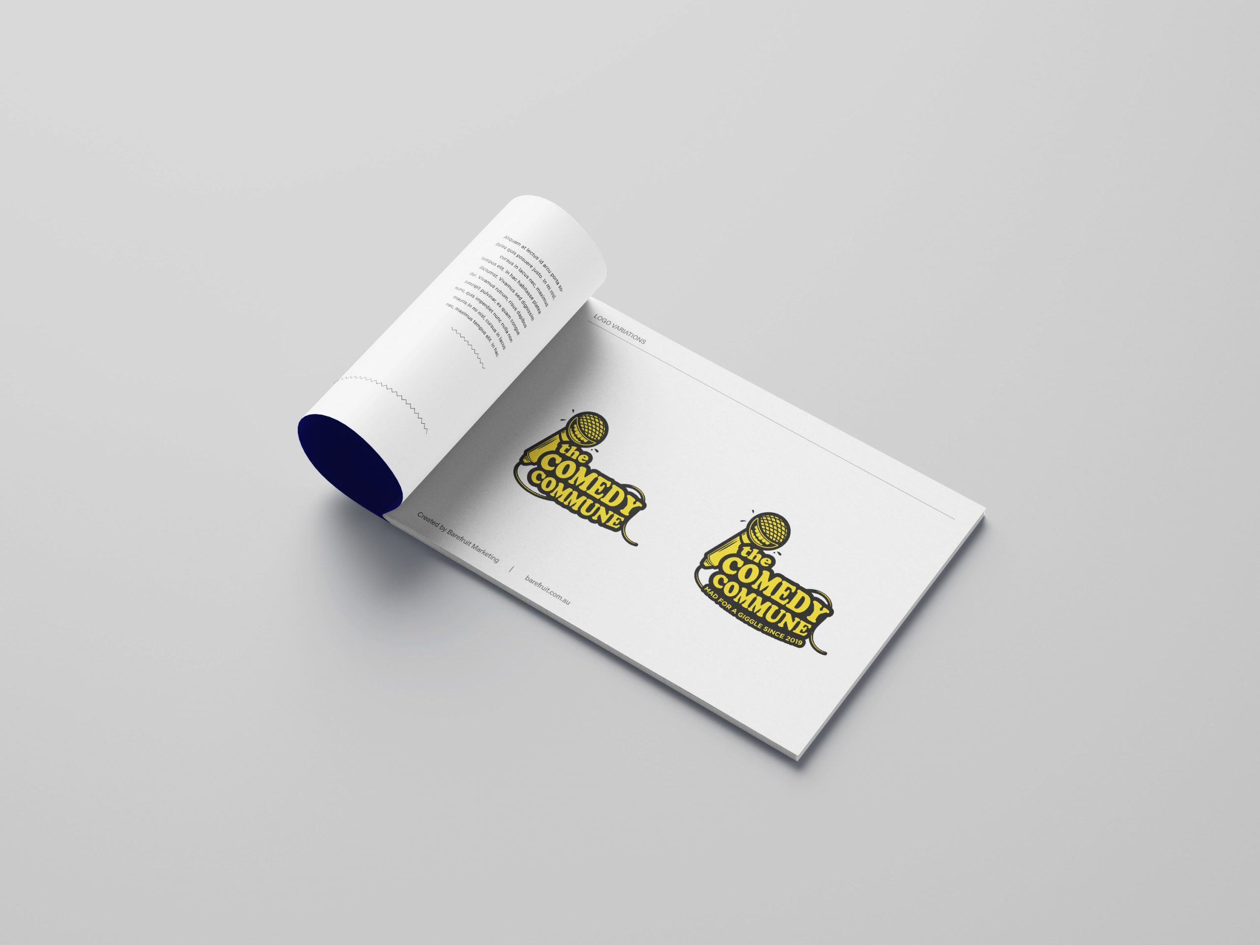
            Comedy Commune Logo Guide
            Comedy Commune - Logo Guide

            LET'S CHAT ABOUT CULTIVATING YOUR BRAND

            Hey Team Fruity!

              I'm , I'd like you to help my business, , 'barefruit'.

              I am interested in

              You can call me on and email me at

              We'd love to know how you heard about us?

              Lismore City Council

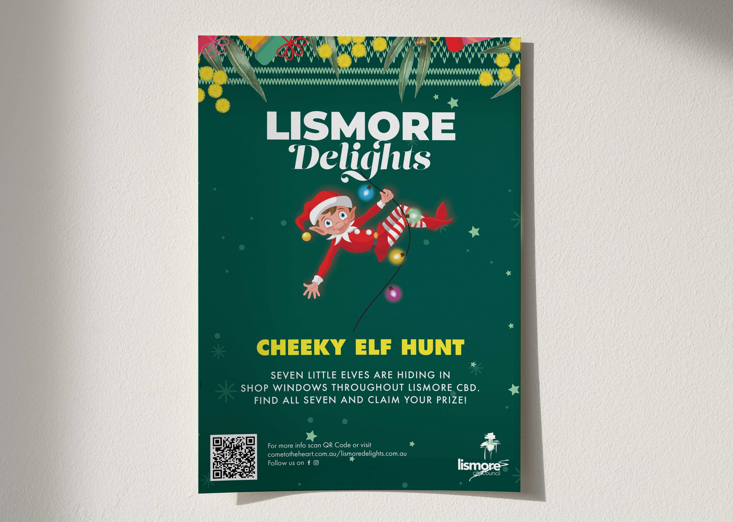
              Lismore City Council - Event Marketing 'Lismore Delights'


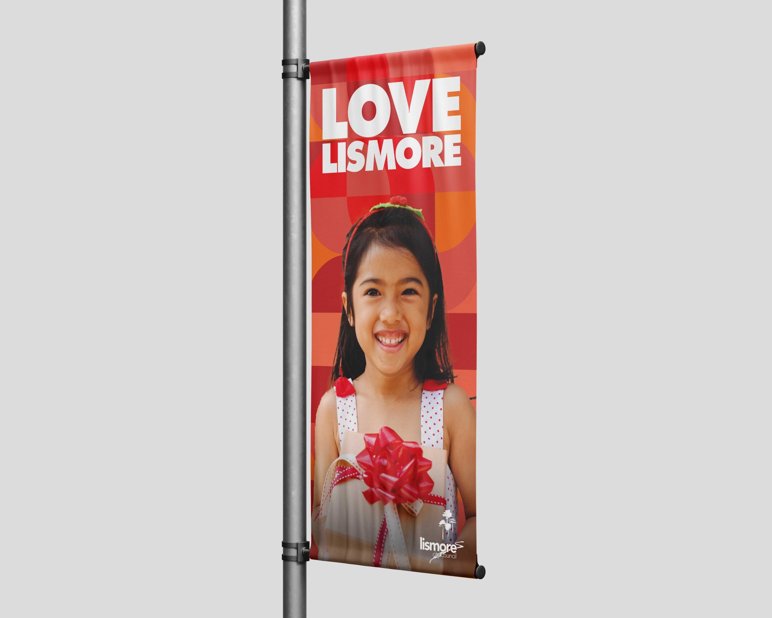
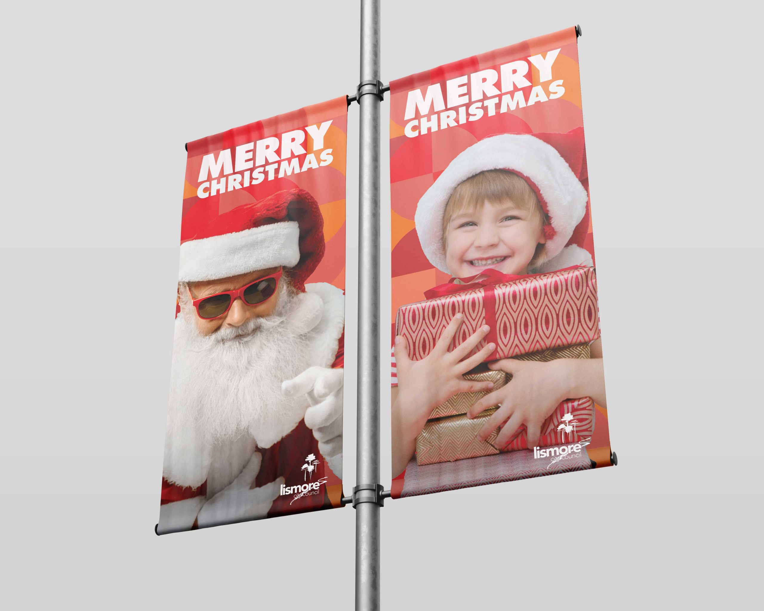
              Lismore City Council Lismore Delights Banner

              Background

              Here at Barefruit Marketing, we're passionate about creating memorable and effective marketing campaigns for our clients, ensuring we bring their visions and marketing objectives to life. Last year, we had the opportunity to work with Lismore City Council on their 'Lismore Delights' Christmas campaign, and nailed it.

              The work

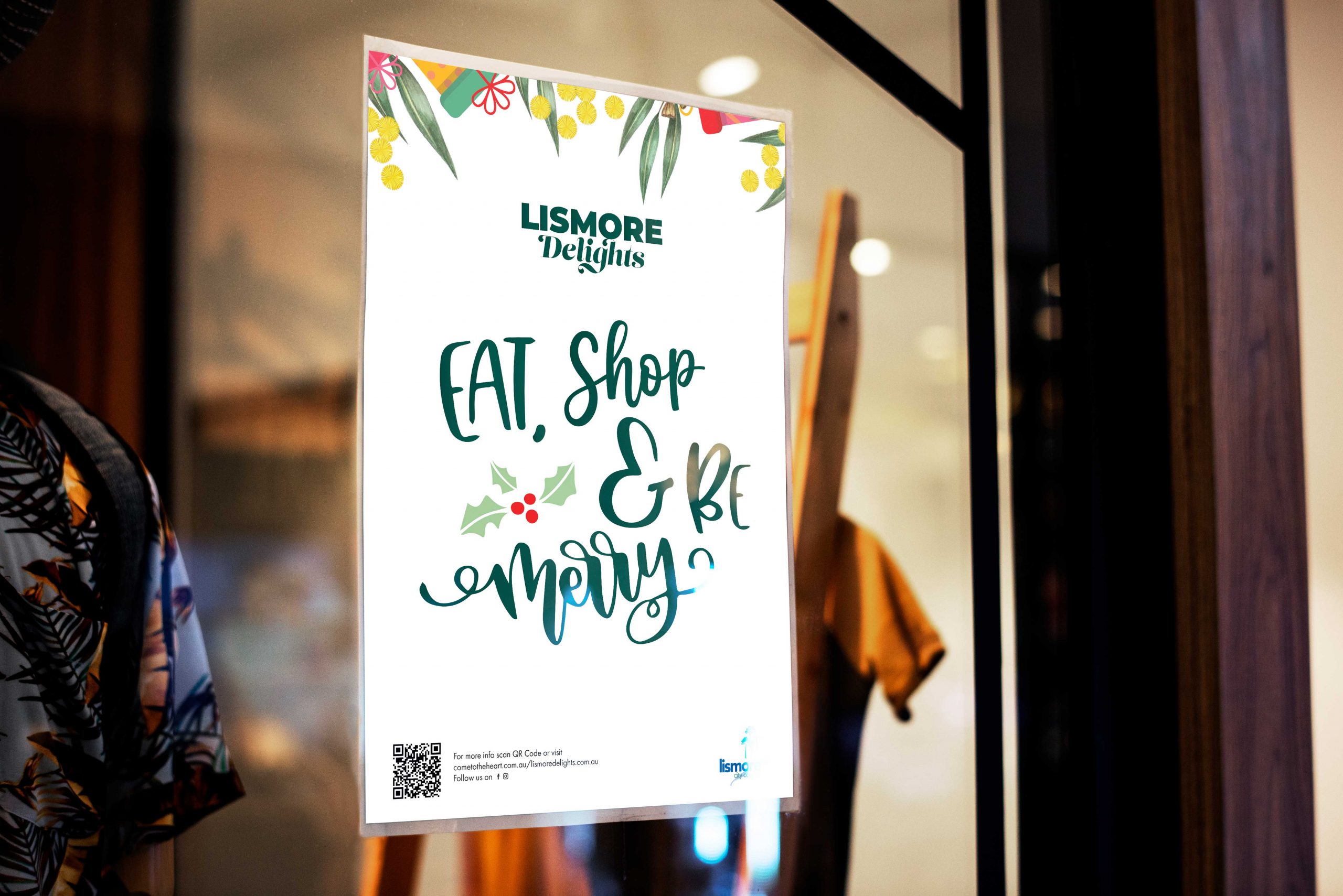
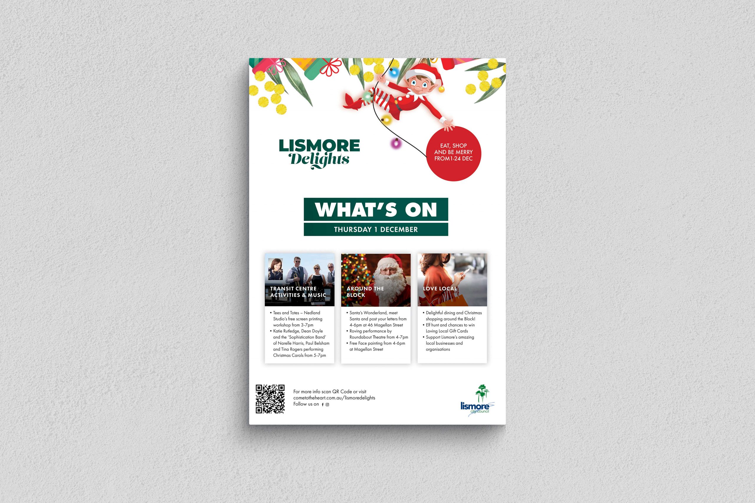
              Offering additional support to their internal marketing team, we were responsible for the roll-out of the ‘Lismore Delights’ campaign, incorporating all aspects of the project, from the design and printing of banners, to managing social media, to creating radio and television ads. The timelines weren’t for the faint-hearted, but given our experience and passion for in integrated campaign, plus the fact that we love Lismore, we embraced the challenge and like an Elf in Santa’s workshop, we set to work.

              Needless to say, the campaign was an overriding success, even Santa seemed chuffed at how seamlessly it all rolled out. In fact, ‘Lismore Delights’ was met with such welcoming enthusiasm by the community, the town was the ‘place to be seen’ over the festive season and Lismore City Council hope to build on its’ success in years to come.

              We’re all about bringing your project visions and goals to life, so if you like what we do, let’s make it happen.
              Lismore City Council Lismore Delights Banner
              Lismore City Council Lismore Delights Shop Signage
              Lismore City Council Lismore Delights Poster
              Lismore City Council Lismore Delights Poster

              LET'S CHAT ABOUT CULTIVATING YOUR BRAND

              Hey Team Fruity!

                I'm , I'd like you to help my business, , 'barefruit'.
                I am interested in

                You can call me on and email me at

                We'd love to know how you heard about us?

                Rous County Council


                Rous County Council - Print & Social Campaign


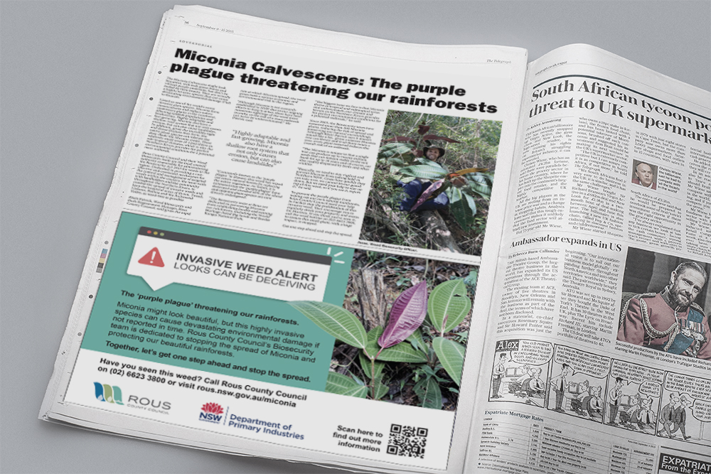
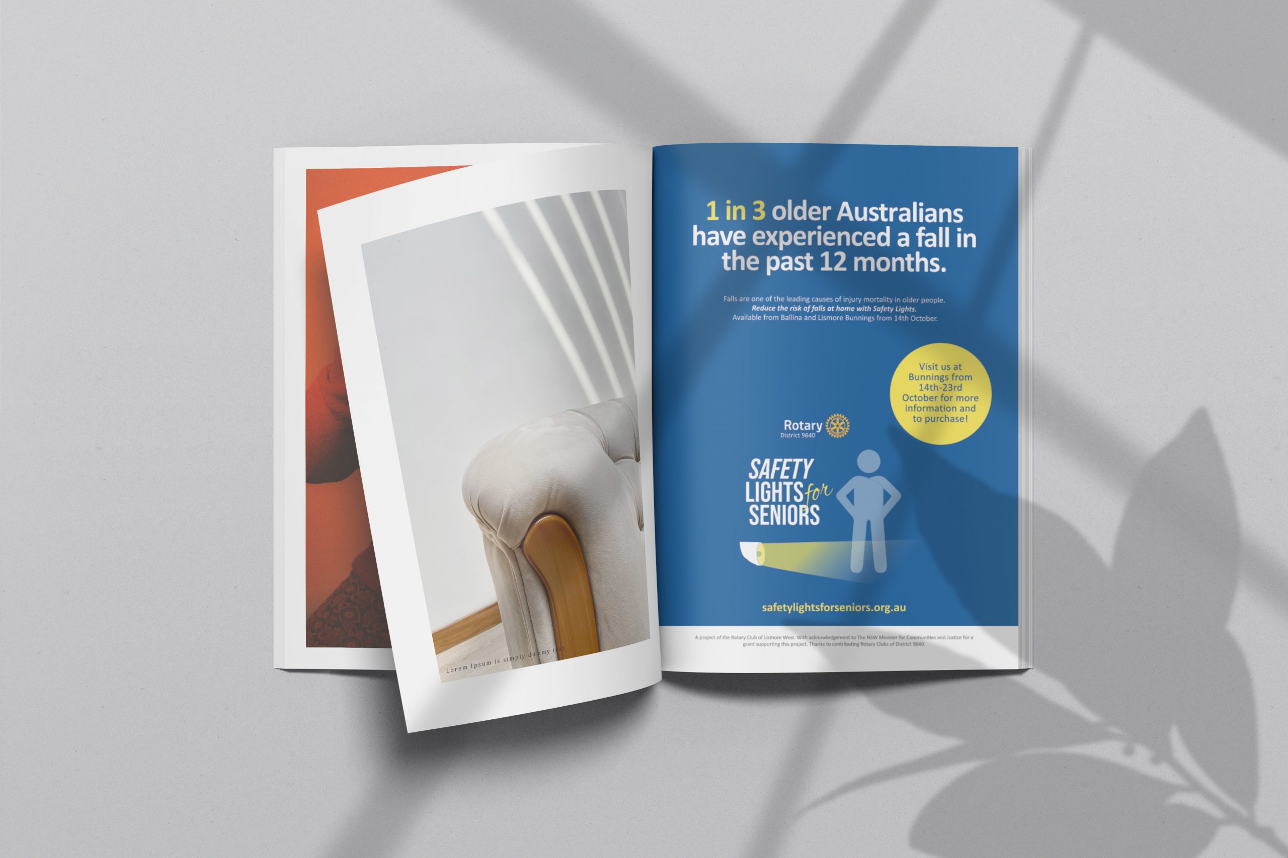
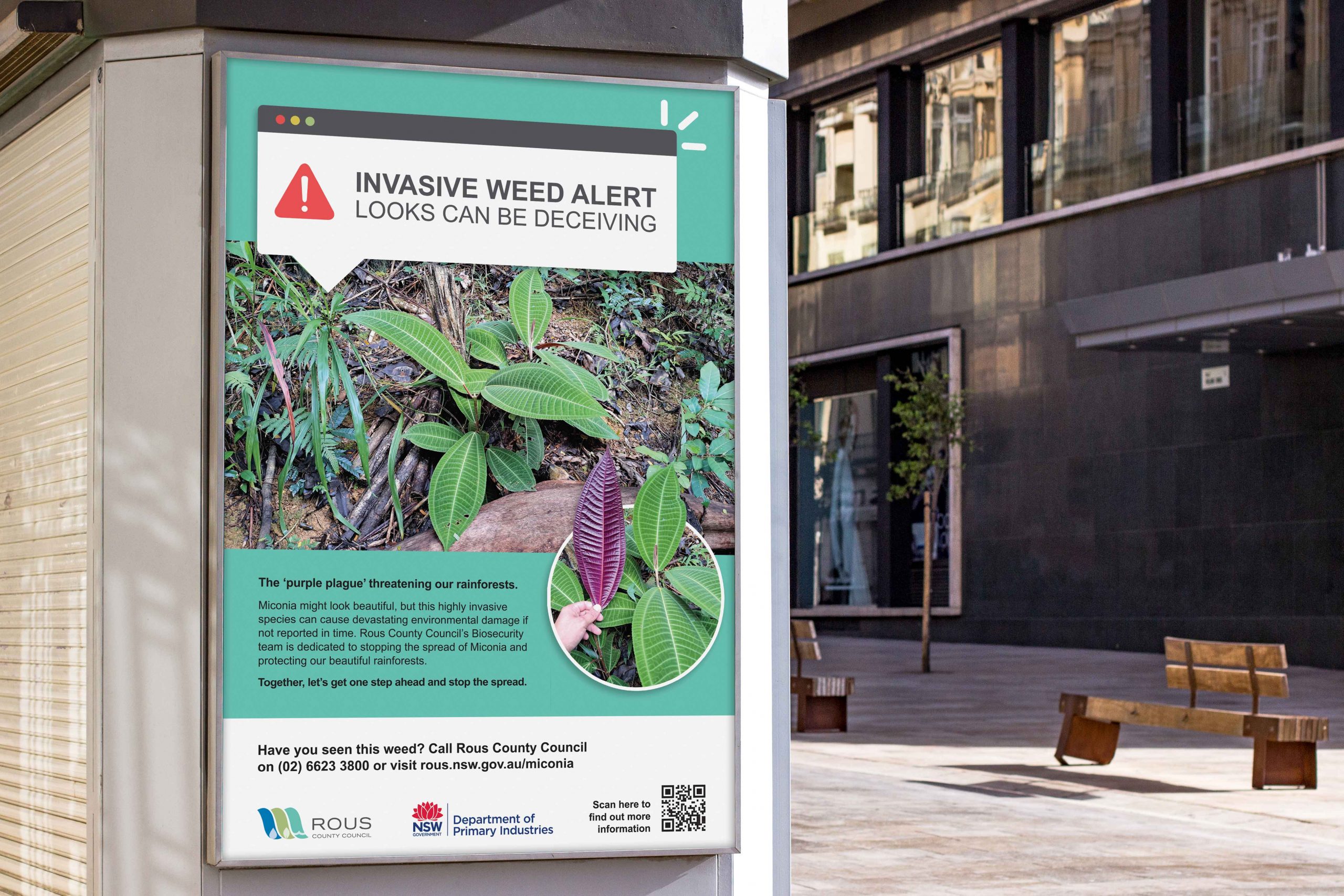
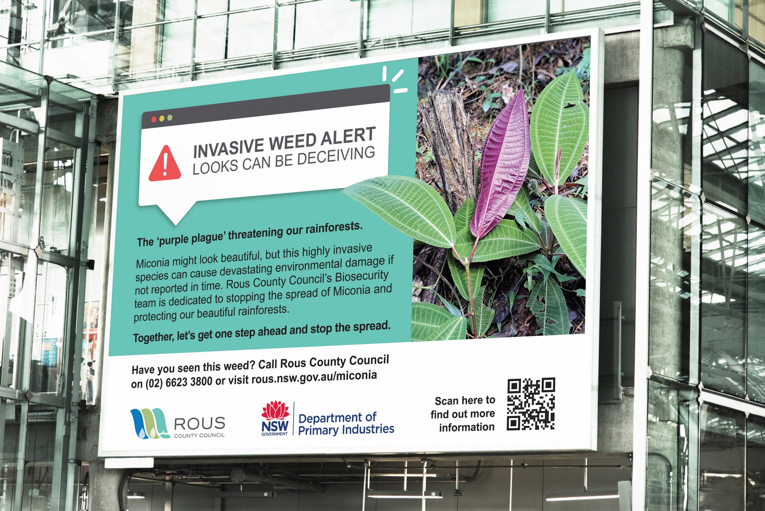
                Rous County Council Print Ad
                Rous County Council Print Ad

                LET'S CHAT ABOUT CULTIVATING YOUR BRAND


                Hey Team Fruity!

                  I'm , I'd like you to help my business, , 'barefruit'.

                  I am interested in

                  You can call me on and email me at

                  We'd love to know how you heard about us?

                  Jobs Northern Rivers


                  Live Northern Rivers
                  Branding & Launch Campaign

                  Jobs Northern Rivers logo design on Richmond River
                  Live Northern Rivers logo by Barefruit Marketing
                  Jobs Northern Rivers logo by Barefruit Marketing
                  Jobs Northern Rivers - Flyers
                  Jobs Northern Rivers - Print Advertisement
                  Jobs Northern Rivers - Banner
                  Jobs Northern Rivers - Posters

                  LET'S CHAT ABOUT CULTIVATING YOUR BRAND


                  Hey Team Fruity!

                    I'm , I'd like you to help my business, , 'barefruit'.

                    I am interested in

                    You can call me on and email me at

                    We'd love to know how you heard about us?

                    Wildling Ginger Beer – Seven Mile Brewing Co

                    Seven Mile Brewing Co - Wildling Ginger Beer

                    Brand Strategy, Product Branding & Packaging

                    Wildling Seven Mile Brewing Co Can

                    The work

                    Barefruit were ecstatic to be awarded the brief to develop the branding (from naming straight through to production) for Seven Mile Brewing Co.’s most recent creation – a fresh and zingy Ginger Beer. The project kicked off early January 2021 and went through the full creative process to arrive at a playful, artistic, and very distinctive result – Wildling Hard Ginger Beer.

                    Seven Mile Brewing Co., wanted a brand that appealed primarily to women, but also men who seek out beer alternatives, and those who love a cocktail (Pro tip: Wildling goes amazingly well with spiced rum and fresh lime, over ice). To capture these key market segments, the brand personality needed to be unique, fun, cheeky and visually catching. At the same time,  communicating its USP’s: use of local ingredients, the tangy ginger kick and a subtly, sweet finish

                    The Barefruit project management team had an excellent opportunity to ‘flex their creative muscles’ for this project with quite a bit of freedom to explore naming and design options. The process took the team on a 7-month journey to conceptualise, design and refine each and every detail of the artwork for the cans and cartons.

                    Creative Lead Alex Wales says

                    “We started with concepts and moodboards to present the client with lots of options and completed a full competitive analysis to ensure that the result was going to be distinctive, unique and match the product itself. Once we finalised the artwork, we worked on the details to the cans and cartons until everything was approved and signed off; ready for production.”

                    Related Tag: Branding Gold Coast

                    Wildling Ginger Beer Packaging Design Media Mock-Up
                    Wildling Ginger Beer Packaging Design Media Mock-Up
                    Wildling Ginger Beer Packaging
                    Wildling Ginger Beer Carton

                    LET'S CHAT ABOUT CULTIVATING YOUR BRAND

                    Hey Team Fruity!

                      I'm , I'd like you to help my business, , 'barefruit'.

                      I am interested in

                      You can call me on and email me at

                      We'd love to know how you heard about us?