Australian Seabird and Turtle Rescue

Australian Seabird & Turtle Rescue - Rebrand
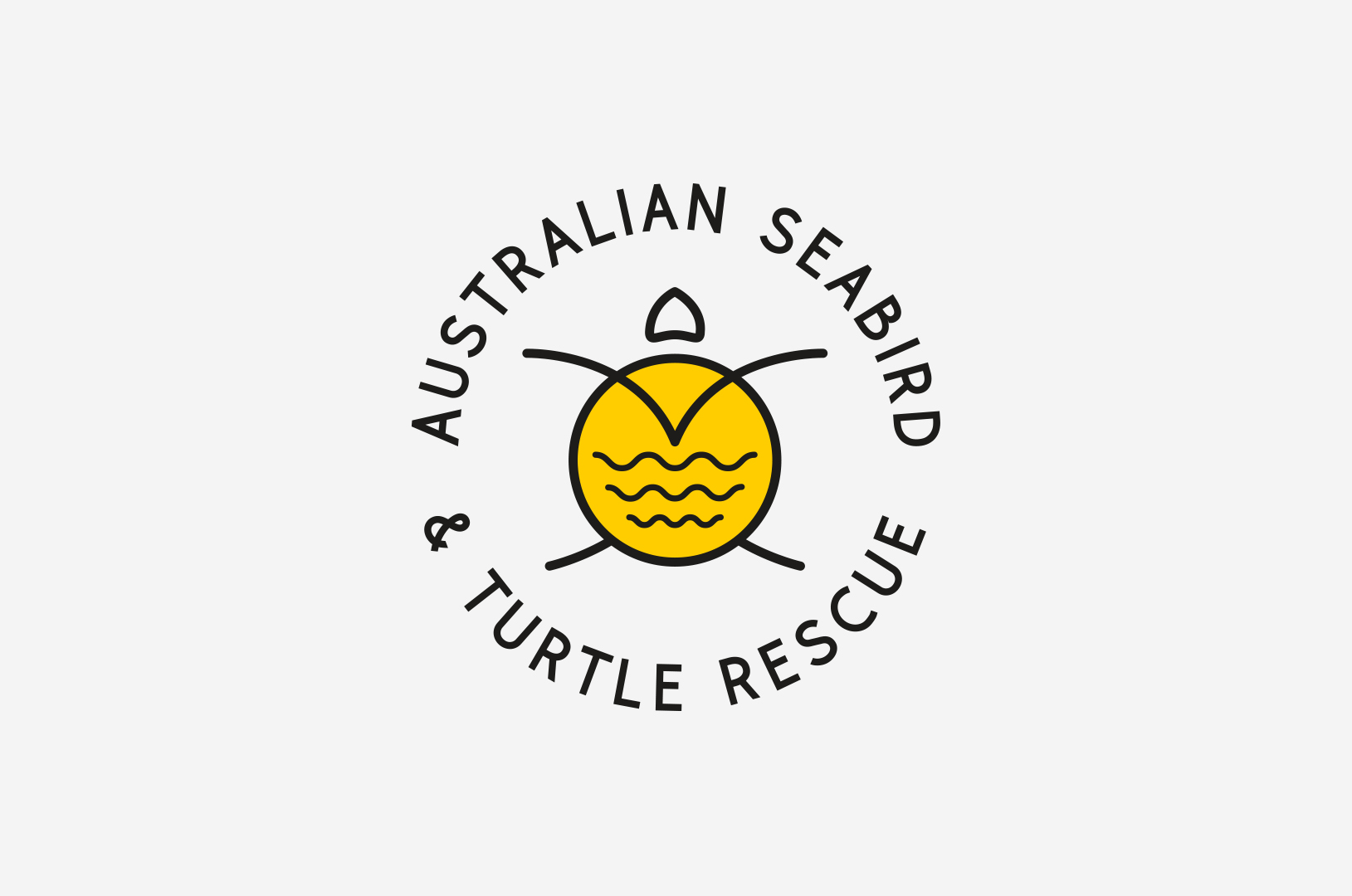
 

Australian Seabird & Turtle Rescue logo
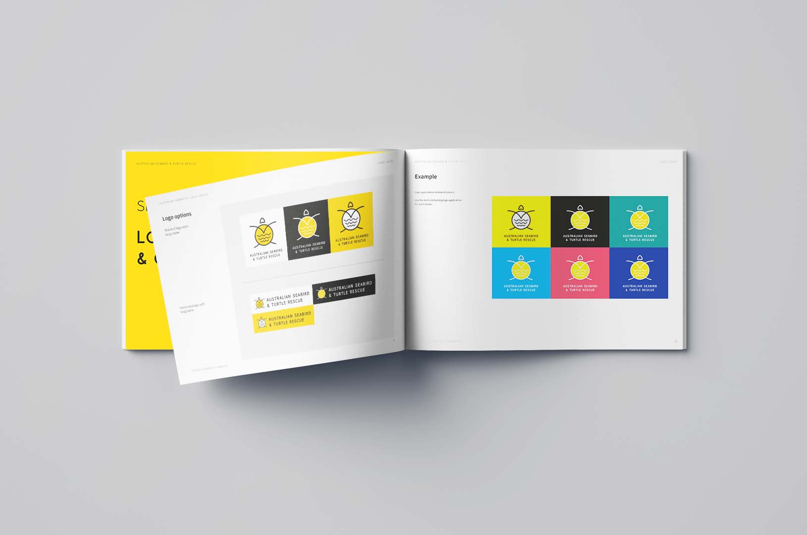
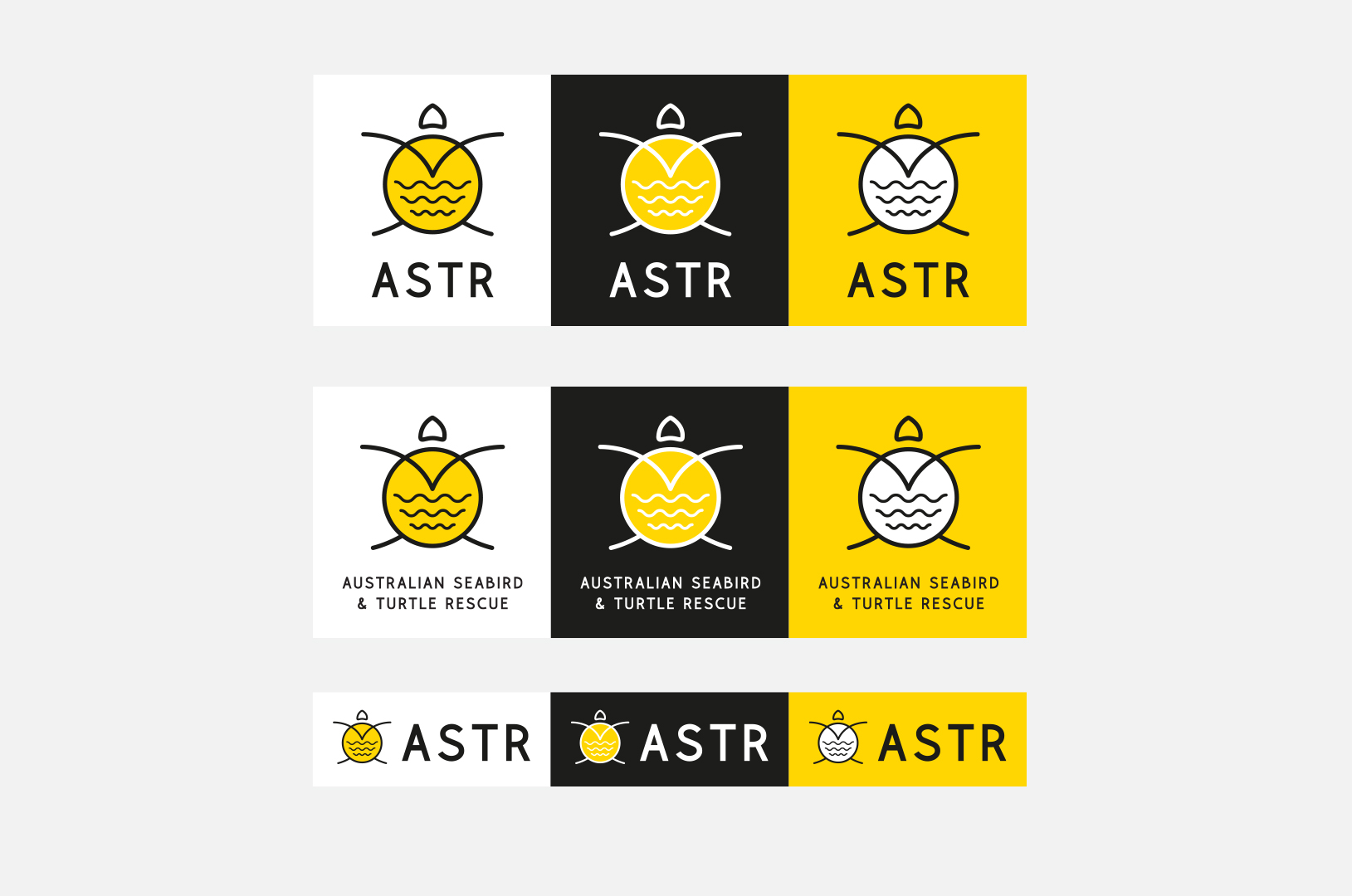
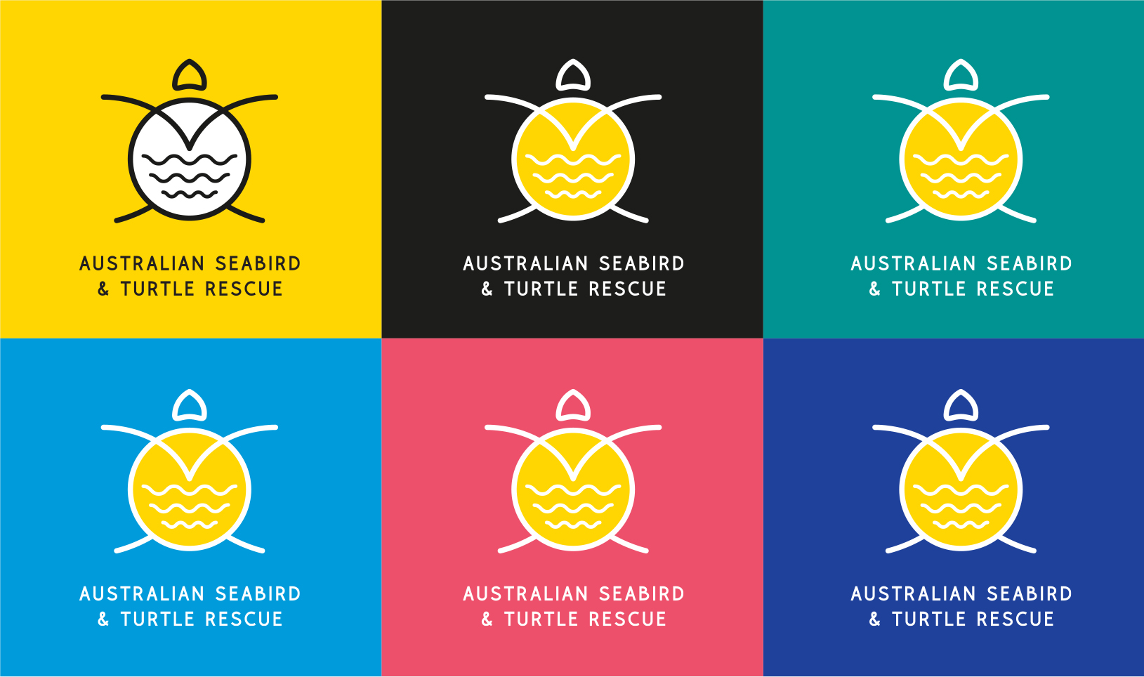
Australian Seabird & Turtle Rescue - logo variants
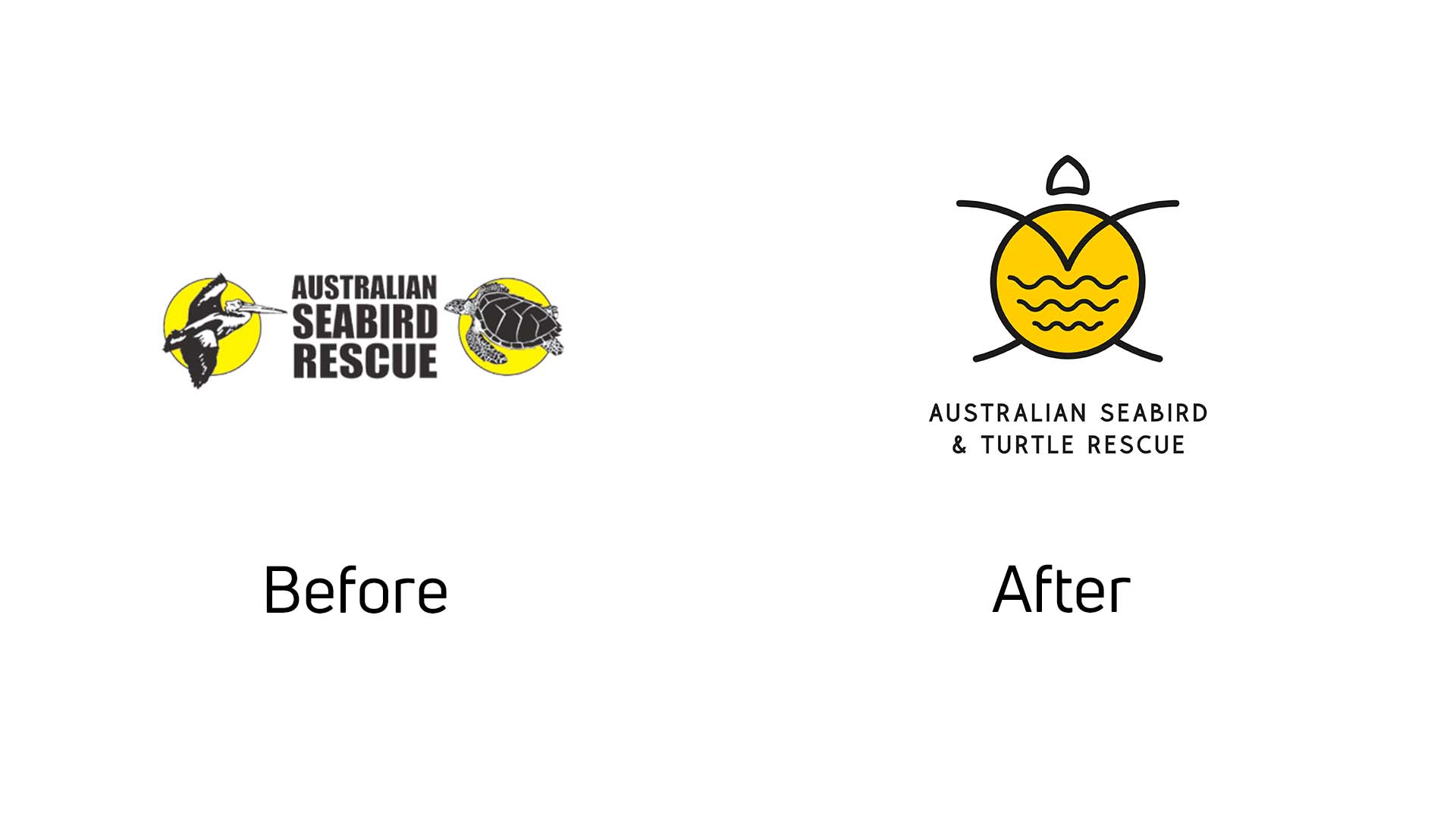
Australian Seabird & Turtle Rescue - before and after

Background

Originally Australian Seabird Rescue (ASR), the company was formed in 1992 when the late Lance Ferris discovered that 35% of Ballina’s pelicans were injured by fishing tackle. He discovered that pelicans in other major estuaries throughout NSW were suffering from the same fate. Now a volunteer organisation, Australian Seabird & Turtle Rescue (ASTR) operates branches along the NSW coastline, with volunteer members rescue and rehabilitate seabirds, shorebirds, sea turtles and sea snakes.

ASTR approached Barefruit with a vision to update their branding to something that is more representative to what they do. It was also an opportunity to bring their brand up to date with an identity that is modern and appealing to all audiences.


The work

Creating the ASTR brand identity was a fun process, which began with mood boards and different directions to choose, however it came down to a very simple artwork that incorporates a turtle, seabird, sea snakes, the sun and ocean all in one using very simple line-artwork.

The new identity is a holistic update from the previous logo, we kept the primary yellow brand colour, which works really well with the new secondary colour palette. The yellow is also bright and draws attention as an emergency rescue operator, and we have managed to combine the multiple identities they had for turtle rescue and seabird rescue into one.

The finished logo is also a great talking point for children of all ages for educational purposes too and will remain as a unique identity that is also wearable for locals, supporters, workers and tourists.

Related Tag: Logo Design in Australia
 

ABST colours
ABST brand guide
ABST stationary
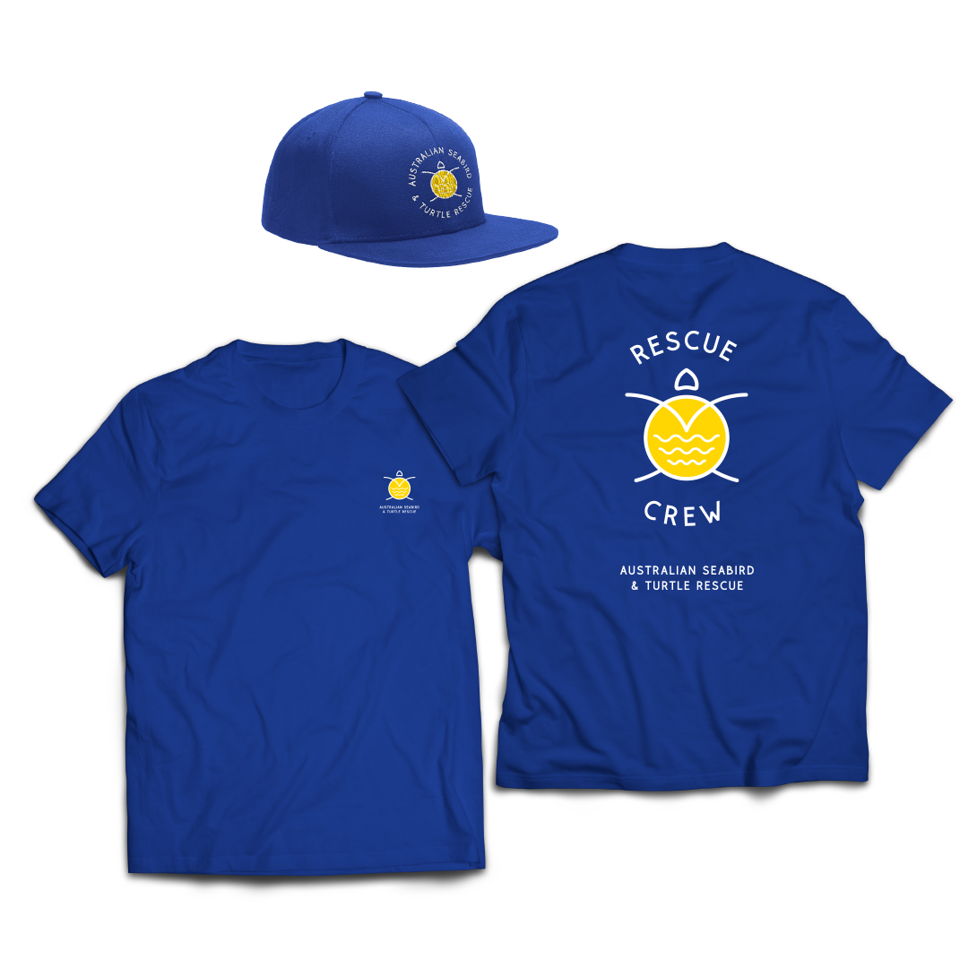
ASBT-Shirts
ASBT-Bumper Sticker
ASBT-uniform
ASBT-Signage Wall

Like what we do? Let us help your business grow?with an awesome branding project.
Send us an enquiry below...

Hey Team Fruity!

    I'm , I'd like you to help my business 'barefruit'.

    I am interested in

    You can call me on and email me at

    We'd love to know how you heard about us?

    Byron Magazine features Barefruit’s rebrand of BayFM

    It was exciting to see that the local Byron Magazine ran our story on the pro-bono work we recently completed for not-for-profit, community radio station, BayFM. We completed a rebrand to help strengthen the brand and increase funding for the station which was near closing down.

    The new branding is the result of an 18-month collaboration and sees the inclusion of the station’s home of Byron and was rolled out across all brand assets including a new website. Barefruit Marketing’s Co-Founder Evan Harding says,

    “It was decided that to change the station’s name was a step too far, so the logo was simplified to be more digitally friendly, flexible and to include the world-famous name ‘Byron’. The brand’s fonts, colours, and images were all recreated for today’s digital world.”

    Read more about the project here.

    Far North Coast Creative Agency Rebrand Financial Services Firm

    September has been an exciting month for Barefruit. Another one of our client projects has been recognised and featured by B&T Australia. Korff Wealth, formerly known as Yellow Brick Road Wealth and Management, Northern Rivers approached us with a rebrand brief at the beginning of the year. It was interesting timing, with Australia heading into lockdown due to the COVID-19 pandemic mid-way through strategic and branding conversations. However, Korff Wealth saw this as an opportunity; with the current economic climate, Australians are looking for expert financial advice they can trust, more than ever. Considering, it was the perfect timing for a strategical review and rebrand of the business.

    Read more about the project here.

    Related Tag: Advertising Gold Coast