Behind the Barrel – Custom Interactive Map


Behind the Barrel - Custom Interactive Map


Behind the Barrel Custom Interactive Map

The brief

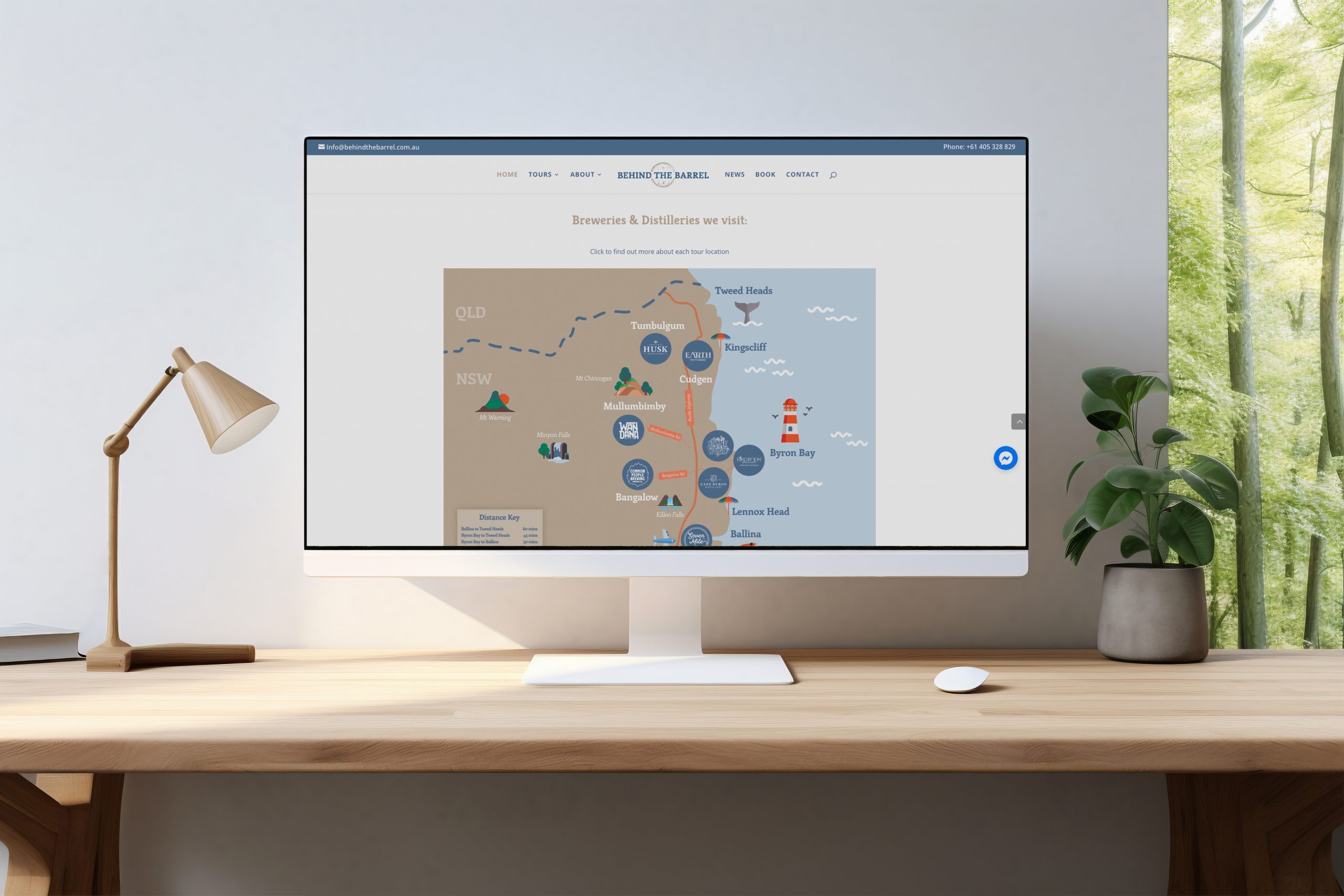
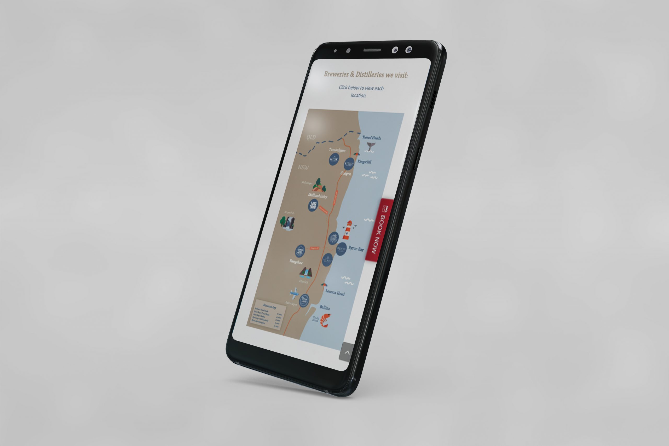
Behind The Barrel approached Barefruit in search of a visual solution to promote their brewery tour routes and destinations to potential clients. One persistent challenge was that when customising their Behind The Barrel tour, customers were choosing locations that were geographically too far from each other to make a logical and smooth tour experience.

Our response

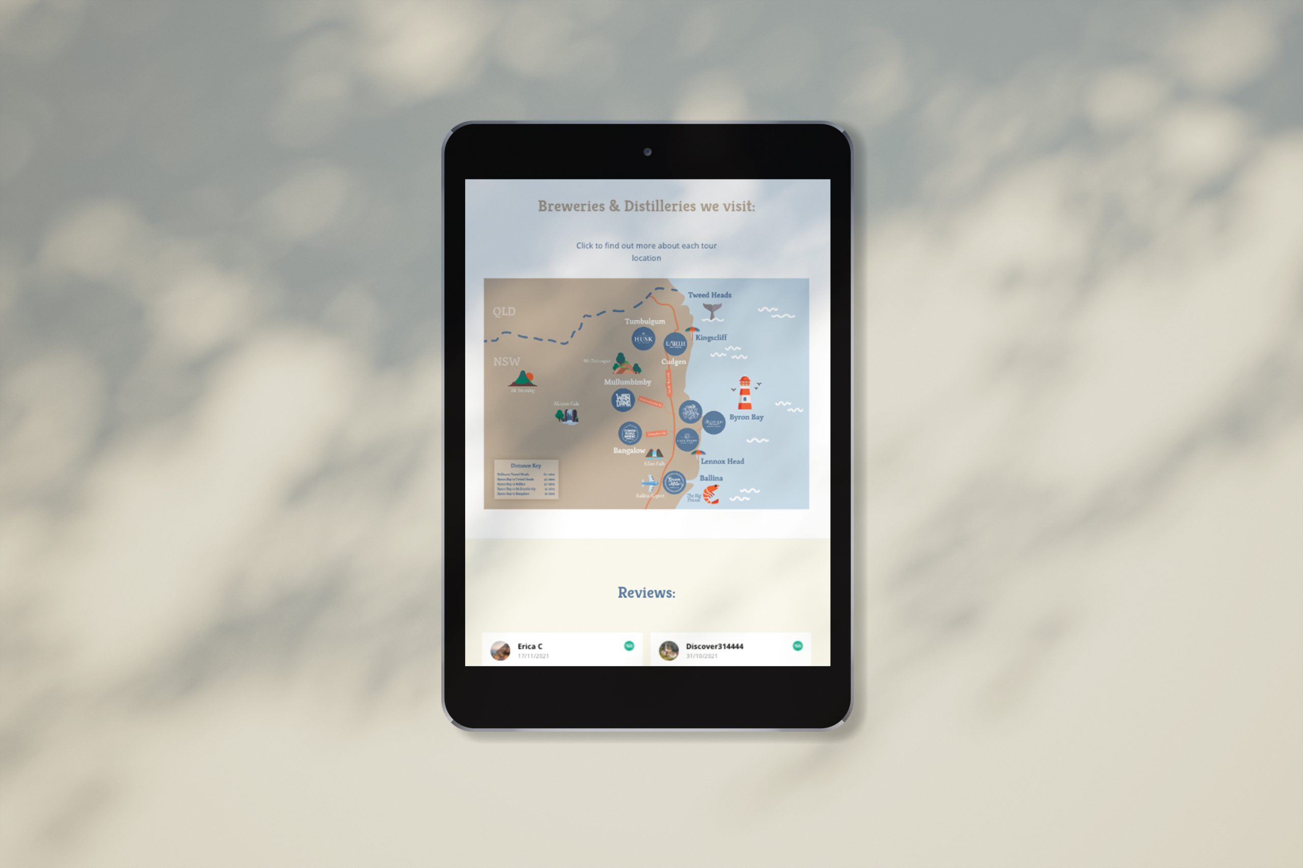
Given we love a craft beer (or two), this project was right up our alley. After some brand immersion to check out said locations, our team designed a bespoke map using Behind the Barrel’s look and feel and set out the geographical distances of the tour destinations on offer.

The fruits

The final product was a beautifully designed and informative map including links to each location. It’s a fun and appealing way of making the booking process easier, allowing customers to plan their tour more efficiently so they have optimum beer or spirit drinking time at their chosen destination.

Behind the Barrel Custom Interactive Map

Like what we do? Let us help your business grow?with an awesome branding project.
Send us an enquiry below...

Hey Team Fruity!

    I'm , I'd like you to help my business 'barefruit'.

    I am interested in

    You can call me on and email me at

    We'd love to know how you heard about us?

    Biala Website, Print and Branding


    Biala - Website, Print & Branding


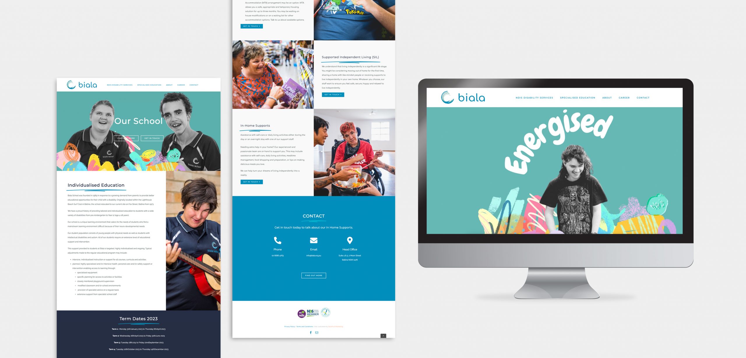
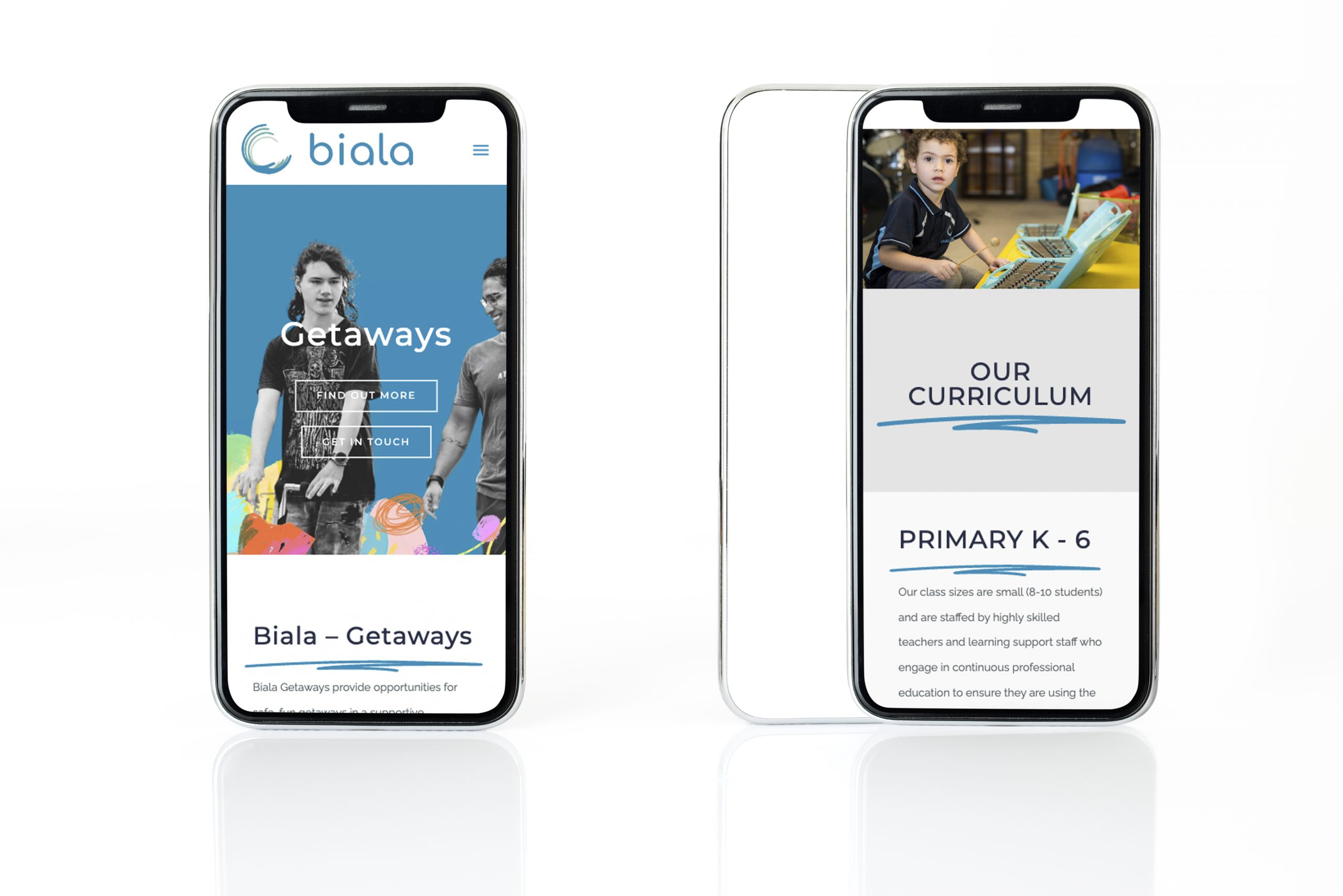
    Biala - website
    Biala - website
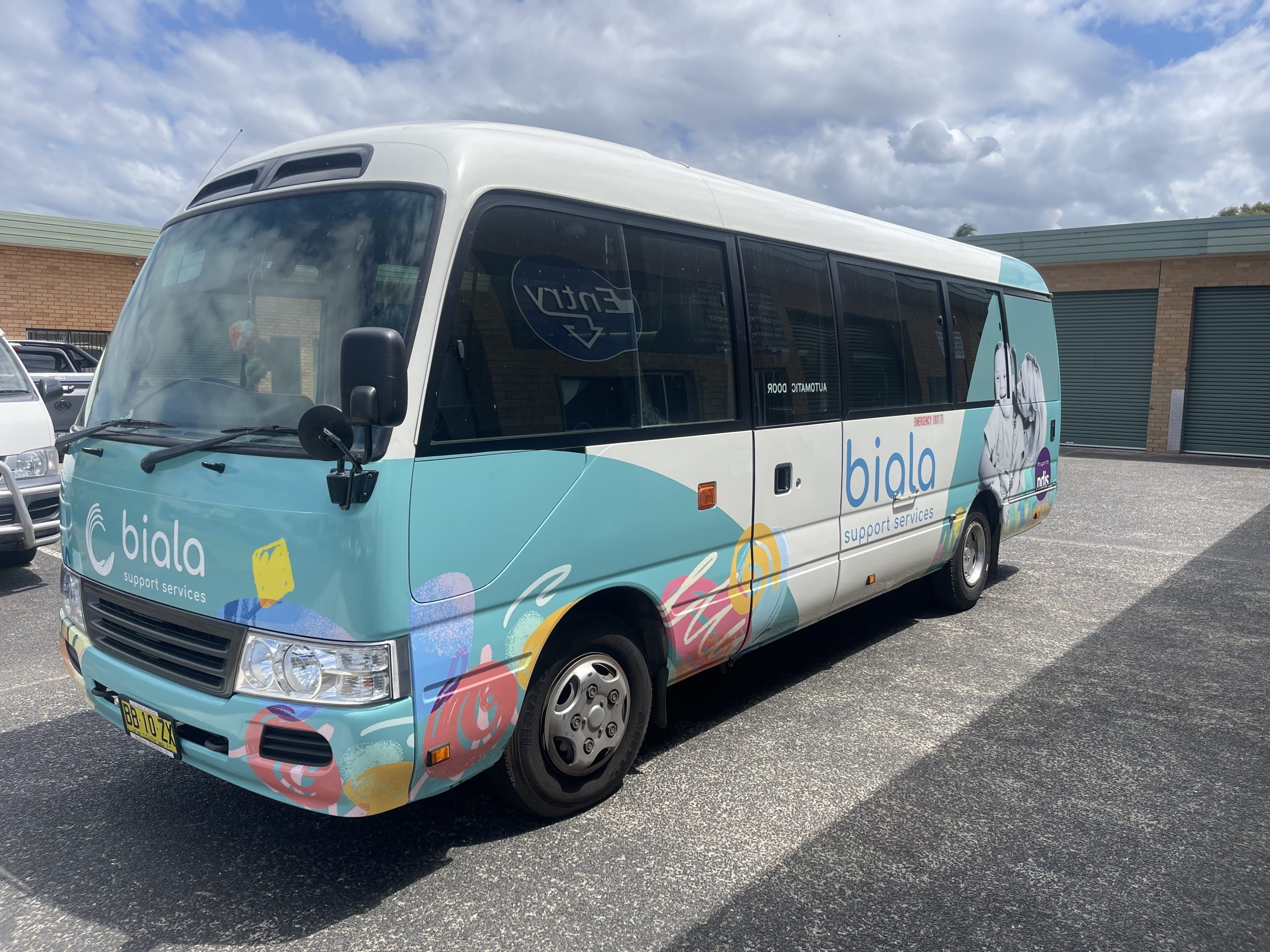
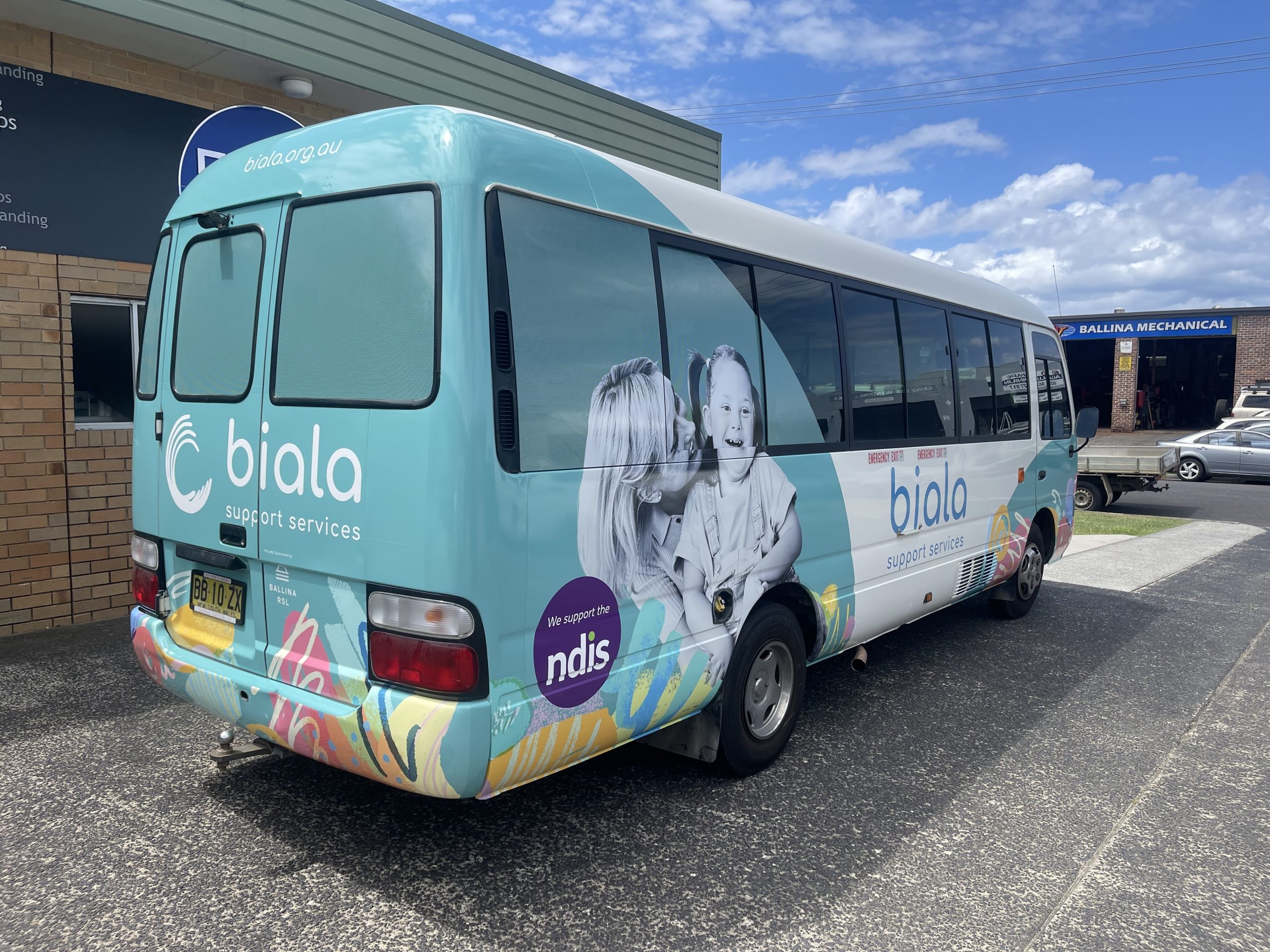
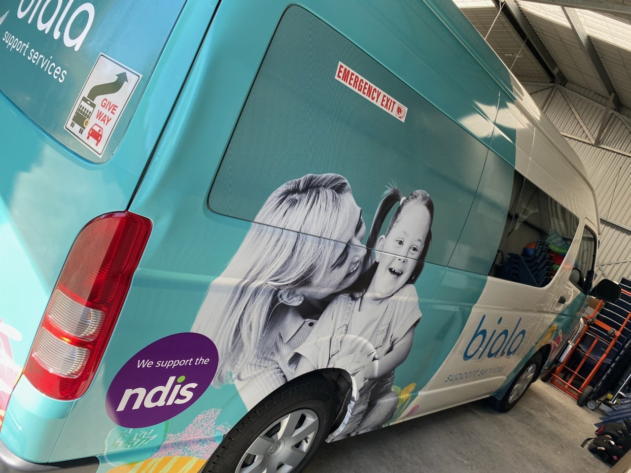
    Biala - wrap
    Biala - wrap
    Biala - wrap
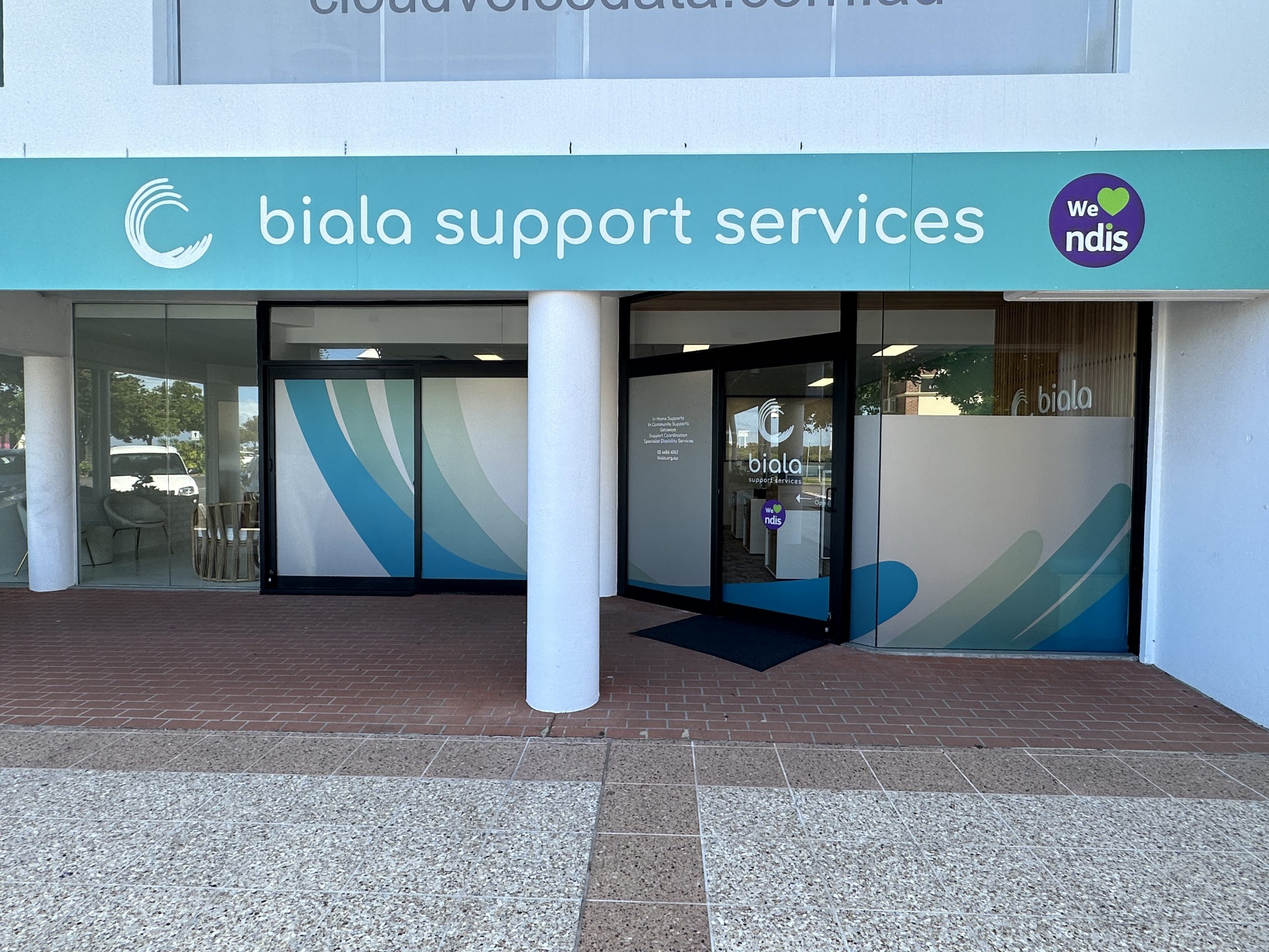
    Biala signage
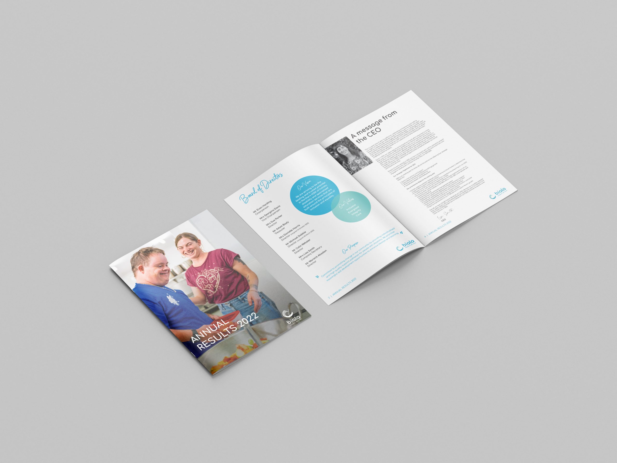
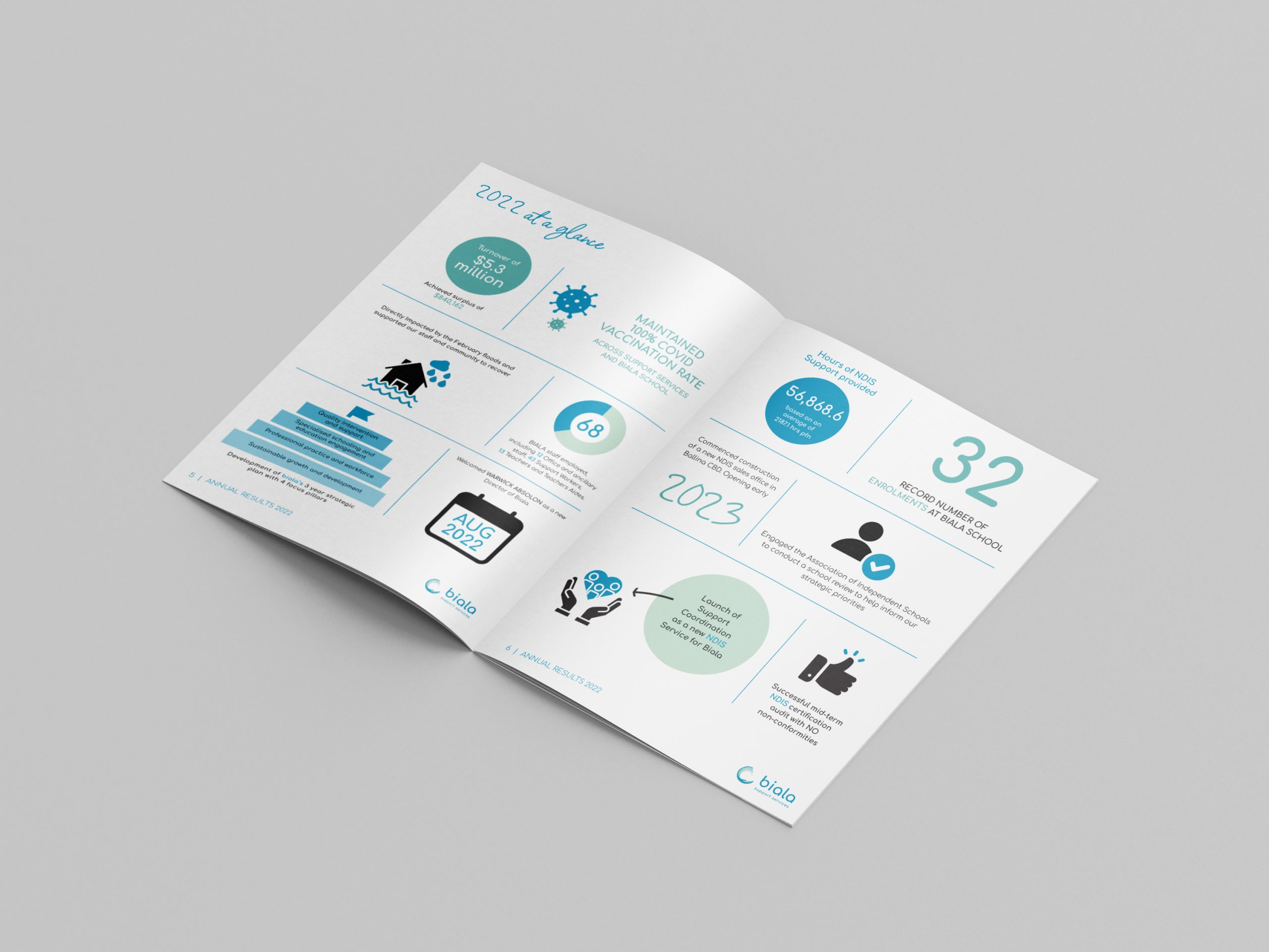
    Biala - Annual Report
    Biala - Annual Report

    Like what we do? Let us help your business grow?with an awesome branding project.
    Send us an enquiry below...

    Hey Team Fruity!

      I'm , I'd like you to help my business 'barefruit'.

      I am interested in

      You can call me on and email me at

      We'd love to know how you heard about us?

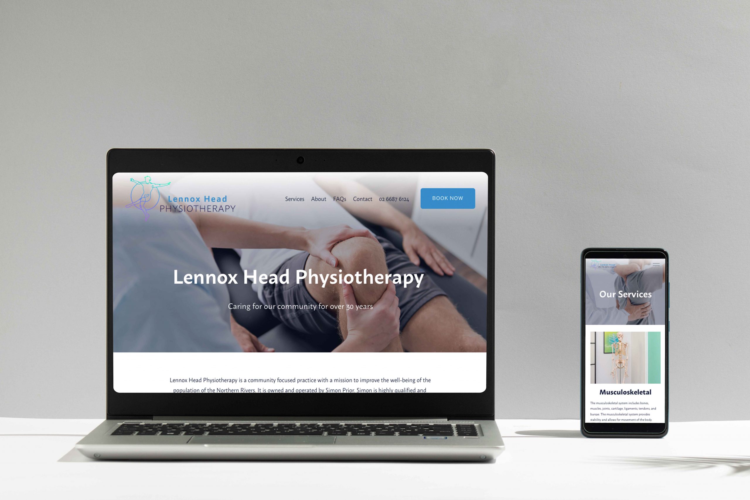
      Lennox Head Physiotherapy


      Lennox Head Physio - Branding, Print & Website


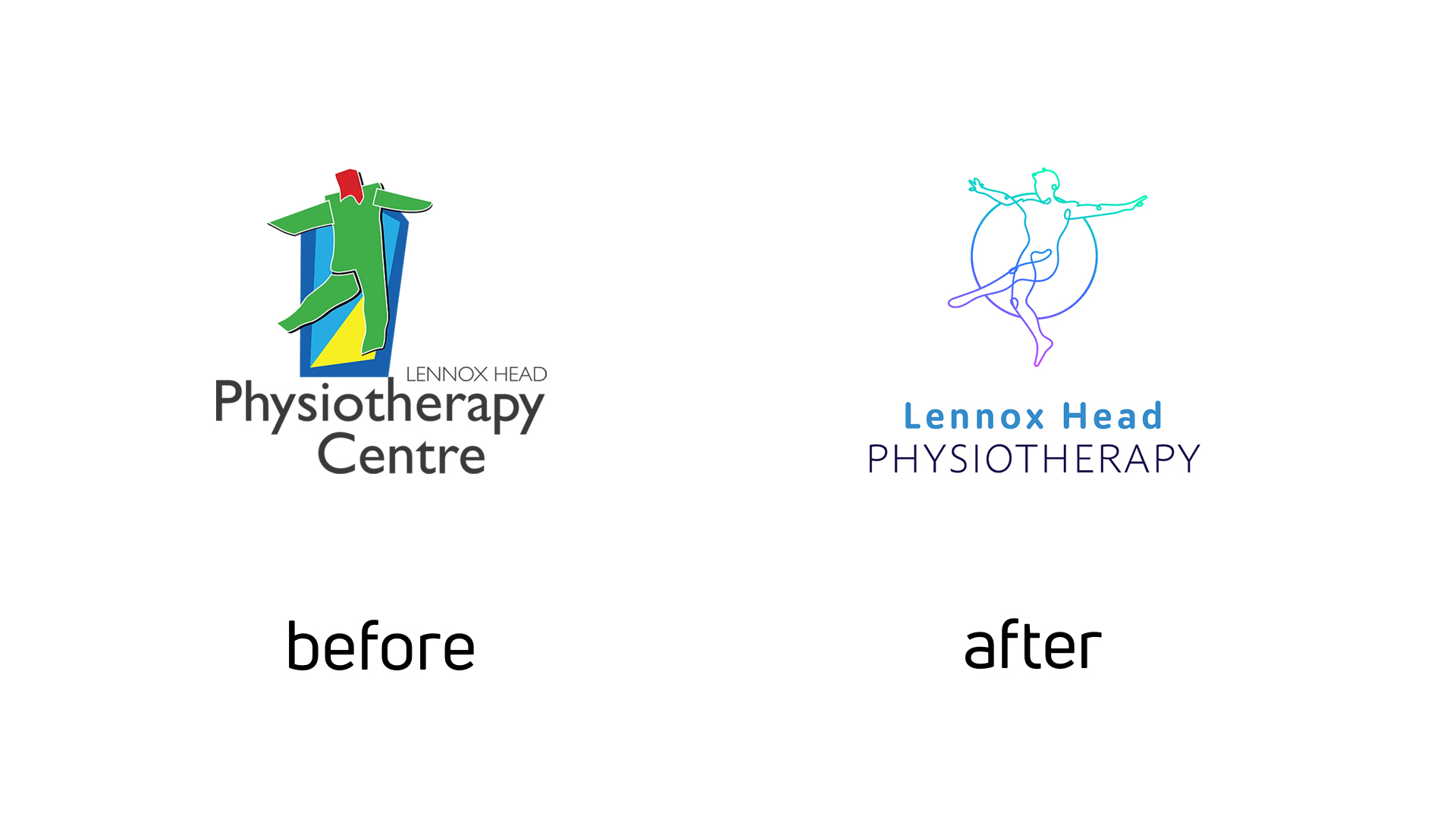
      Lennox Head Physio - Logo
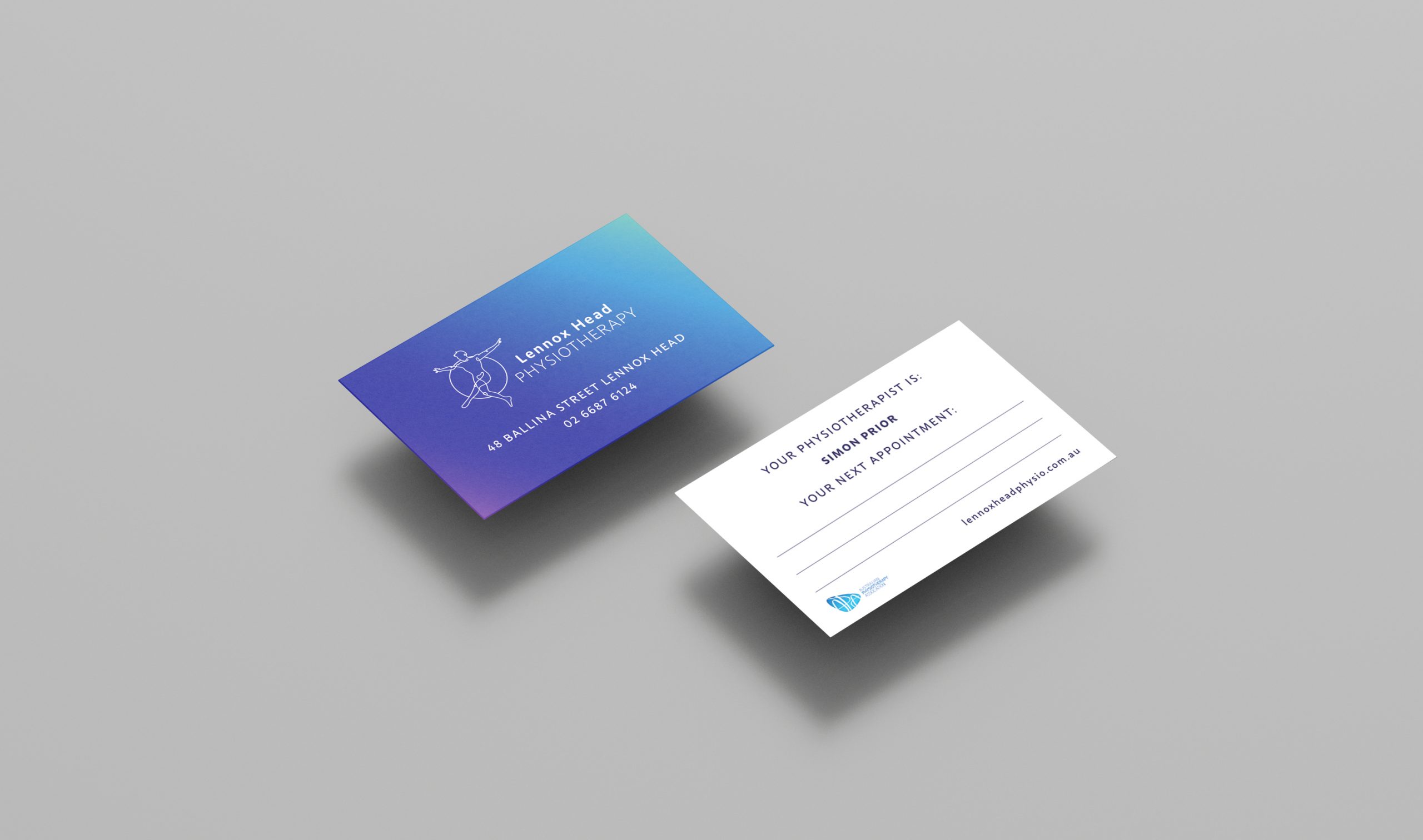
      Lennox Head Physio - Business Cards
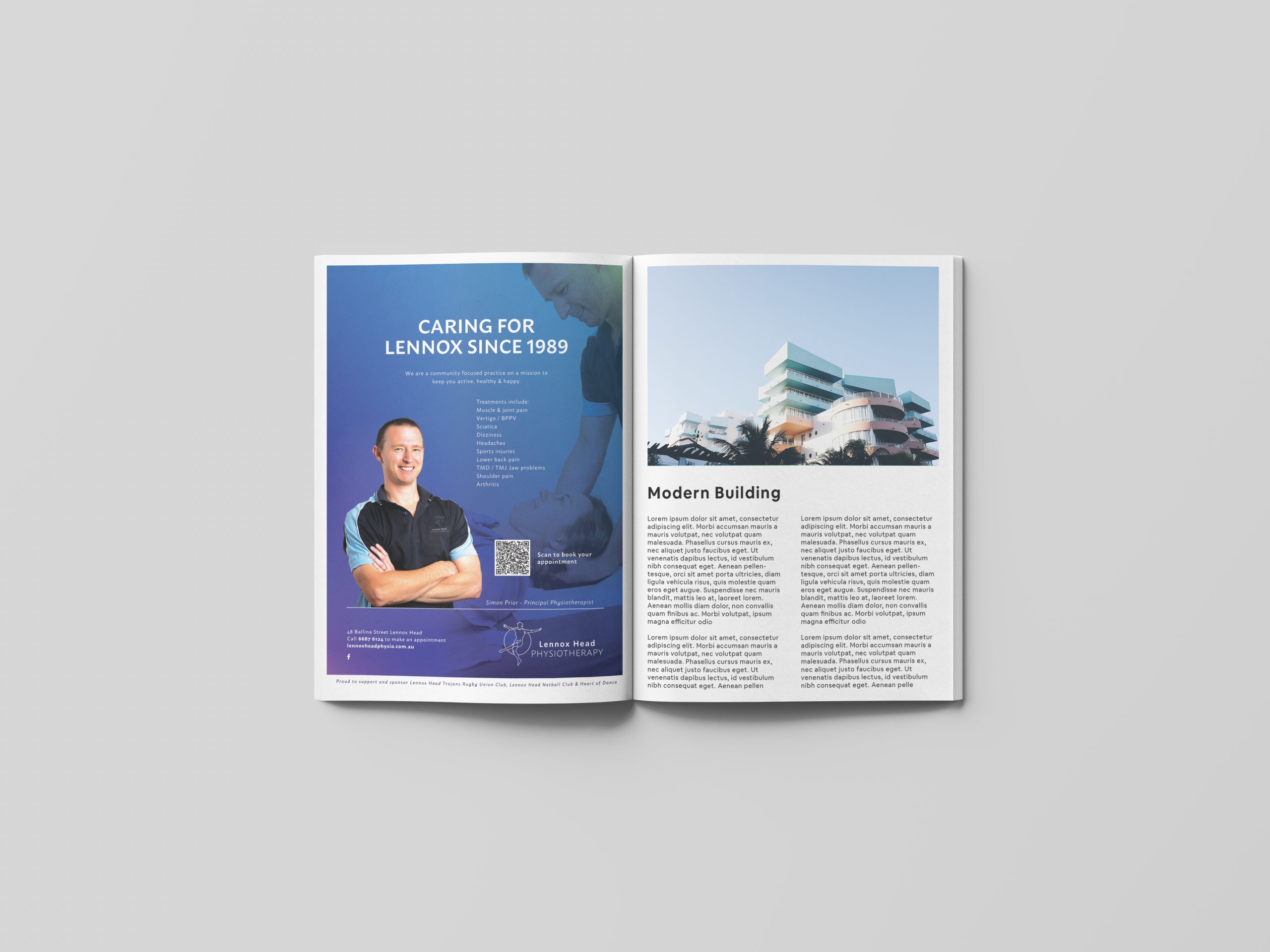
      Lennox Head Physio - Print Advertisement
      Lennox Head Physio - website

      Like what we do? Let us help your business grow?with an awesome branding project.
      Send us an enquiry below...

      Hey Team Fruity!

        I'm , I'd like you to help my business 'barefruit'.

        I am interested in

        You can call me on and email me at

        We'd love to know how you heard about us?

        Farmstyle Insurance – Branding, Website & Social

        Farmstyle Insurance - Branding & Website


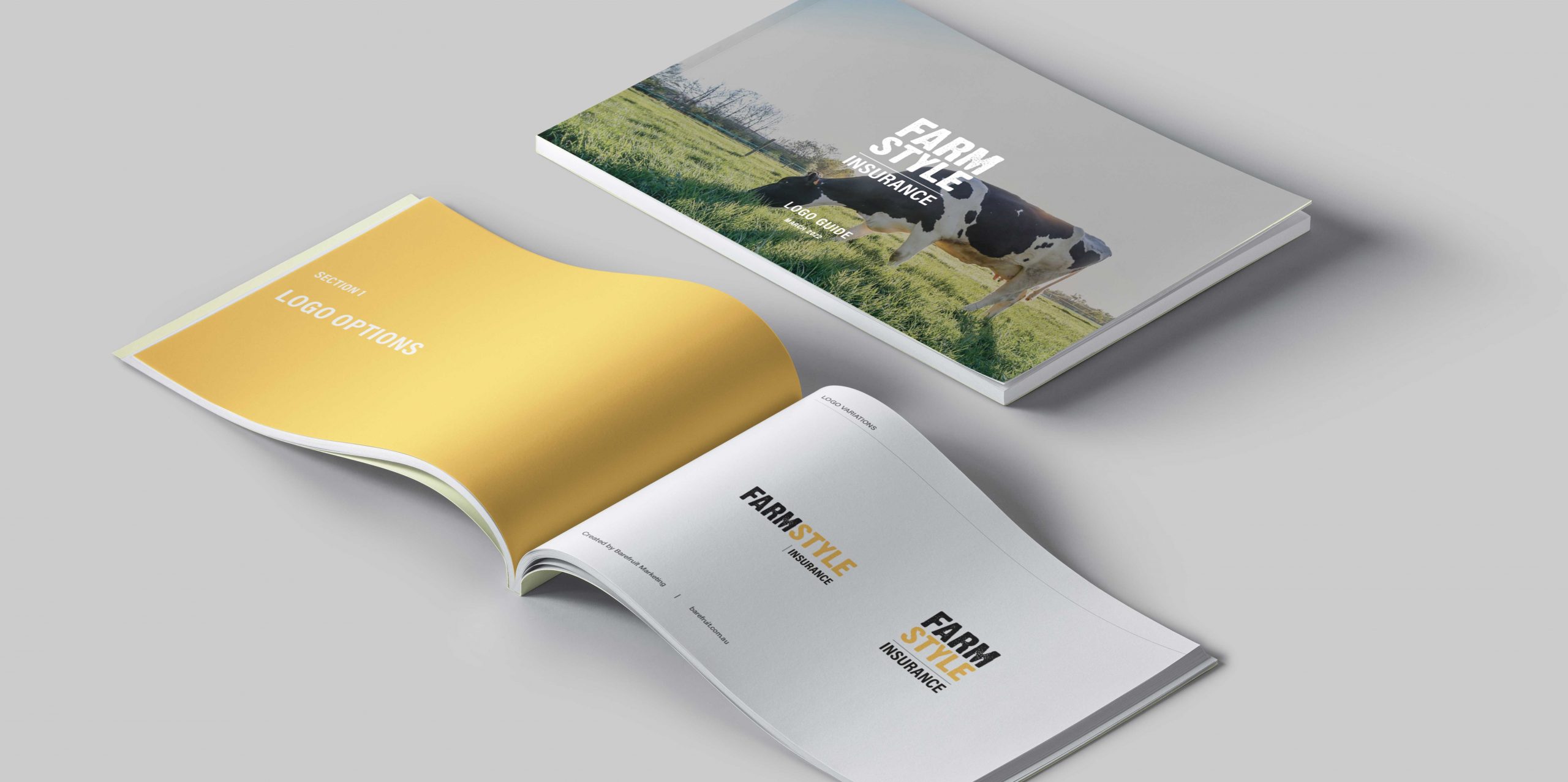
        Farmstyle Branding
        Farmstyle Stationery
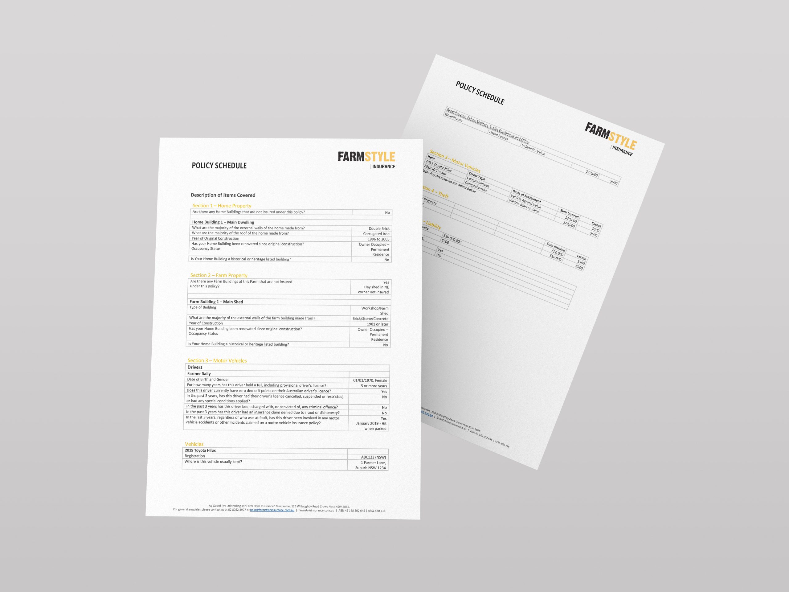
        Farmstyle Documents
        Farmstyle Documents
        Farmstyle Documents
        Farmstyle Documents

        Like what we do? Let us help your business grow?with an awesome branding project.
        Send us an enquiry below...

        Hey Team Fruity!

          I'm , I'd like you to help my business 'barefruit'.

          I am interested in

          You can call me on and email me at

          We'd love to know how you heard about us?

          Rugby Palooza – Branding and Website

          Rugby Palooza - Branding & Website


          Rugby Palooza logo

          Background

          We were approached by Andrew Fraser

          The work

          We started the process with a brand naming brainstorm and the client arrived at using Rugby Palooza Conference. Using this our goal was to create an easy to use identity that was both sporty and professional with the aim of the conference attracting some of Australia's, if not the world's best rugby coaches.

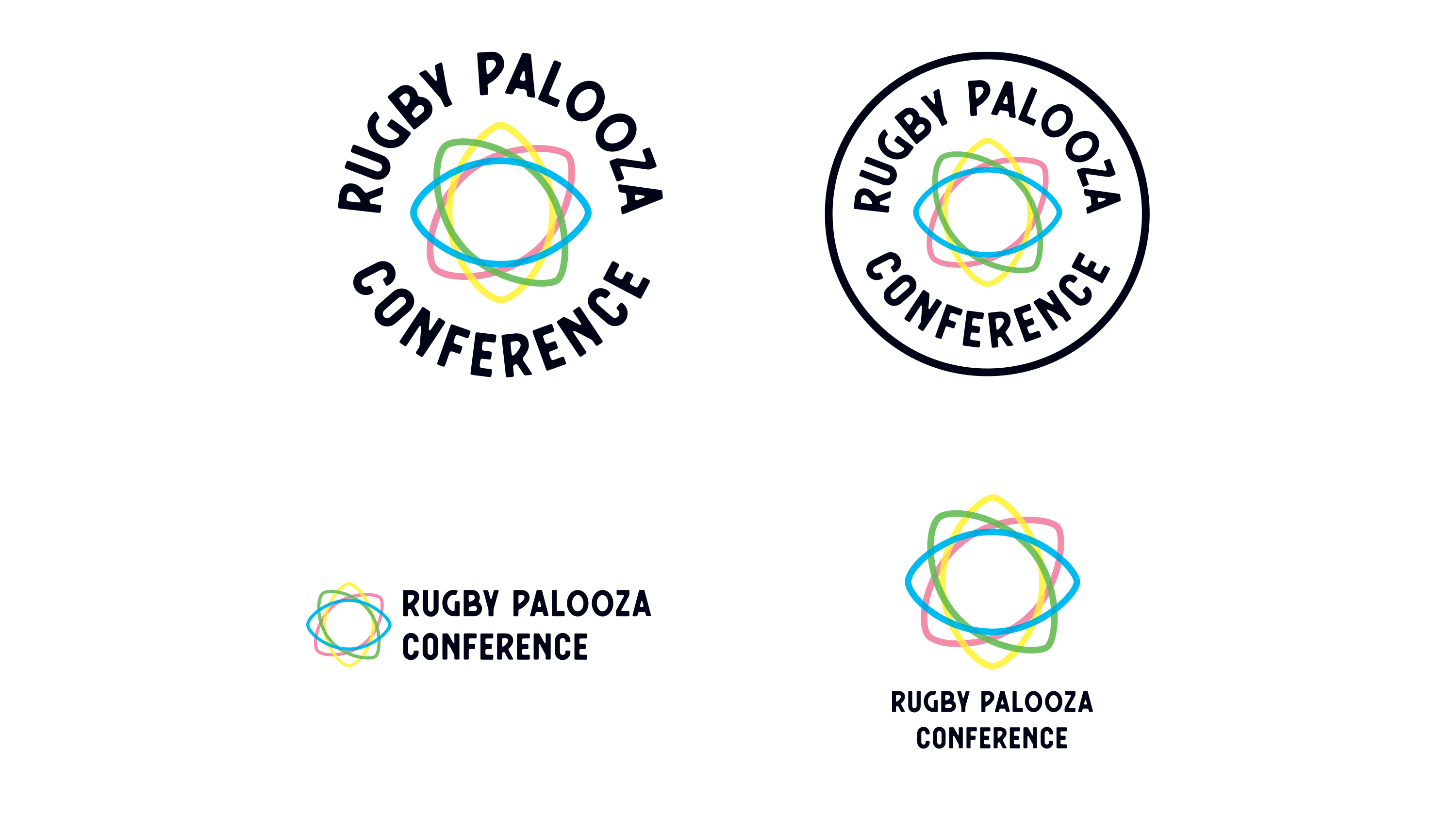
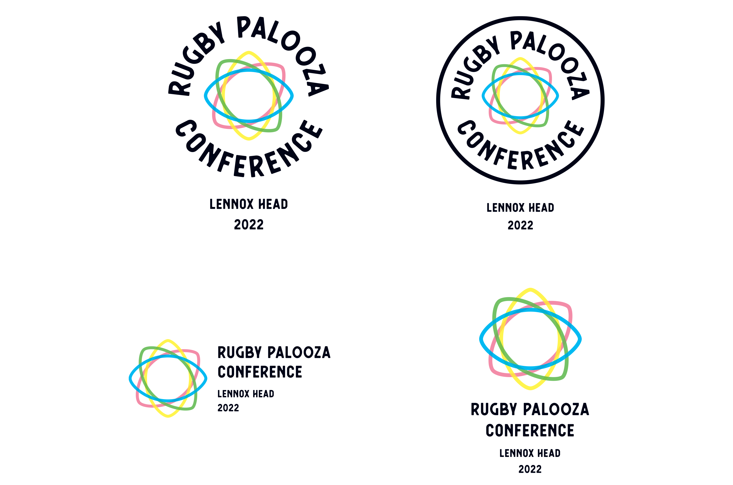
          The final logo concept utilised the rugby ball shape into an abstract pattern with different colours to represent the meeting of different teams from all over the country. The joining of the shape was a nice way to create a networking concept for the identity. We created stacked, horizontal and badge logo designs that could be easily applied in a cool fun way to merchandise as well as other marketing collateral such as the website. The identity was also adapted and considered the location placement of the conference as the conference location will change each year, so we created a simple logo lock-up to accommodate this.

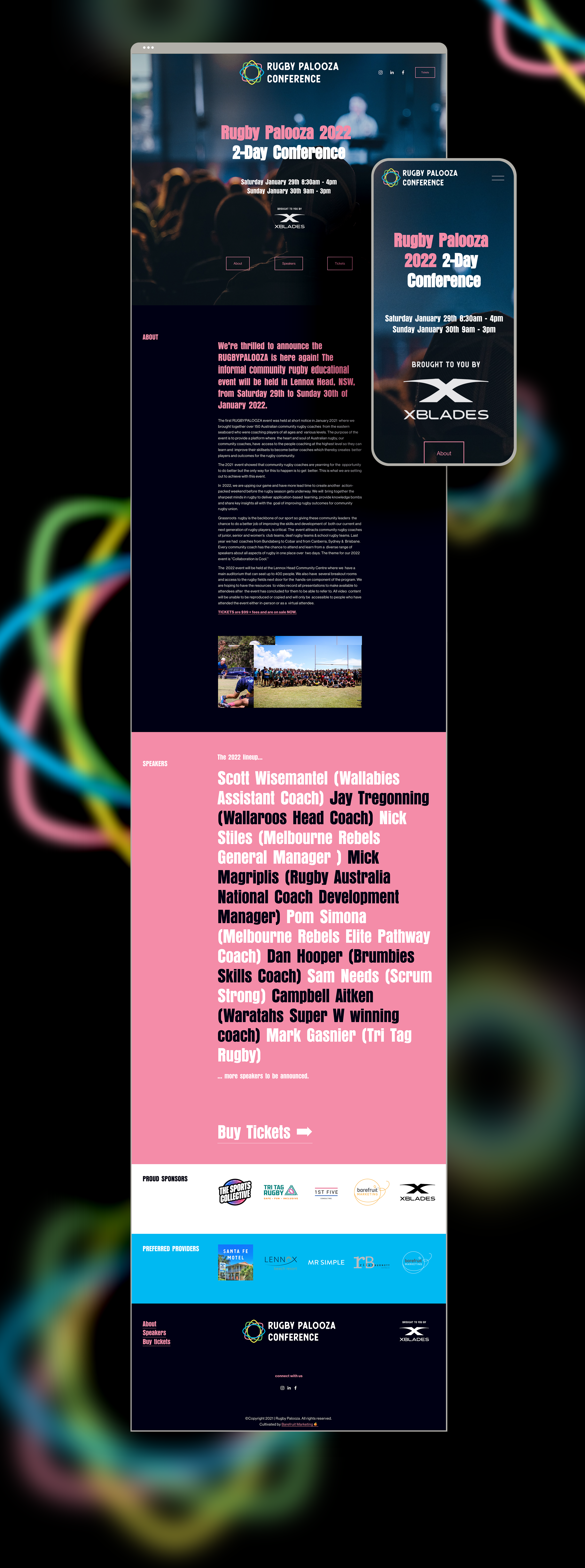
          We also designed and built the Rugby Palooza Conference website, a simple one pager site that could drive traffic to a ticketing platform as well build upon as the conferences continue in the future.


          Rugby Palooza logo 2
          Rugby Palooza website

          Like what we do? Let us help your business grow?with an awesome branding project.
          Send us an enquiry below...

          Hey Team Fruity!

            I'm , I'd like you to help my business 'barefruit'.

            I am interested in

            You can call me on and email me at

            We'd love to know how you heard about us?

            Corromount – Rebrand and Website

            Corromount - Rebrand and Website


            Corromount - logo

            Background

            Corromount came to Barefruit with the aim of refreshing their website and logo. Corromount is a new essential product for tradesman and architects looking to creating the perfect finish when mounting electrical or plumbing appliances or fittings to corrugated interior/exterior walls.

            The work

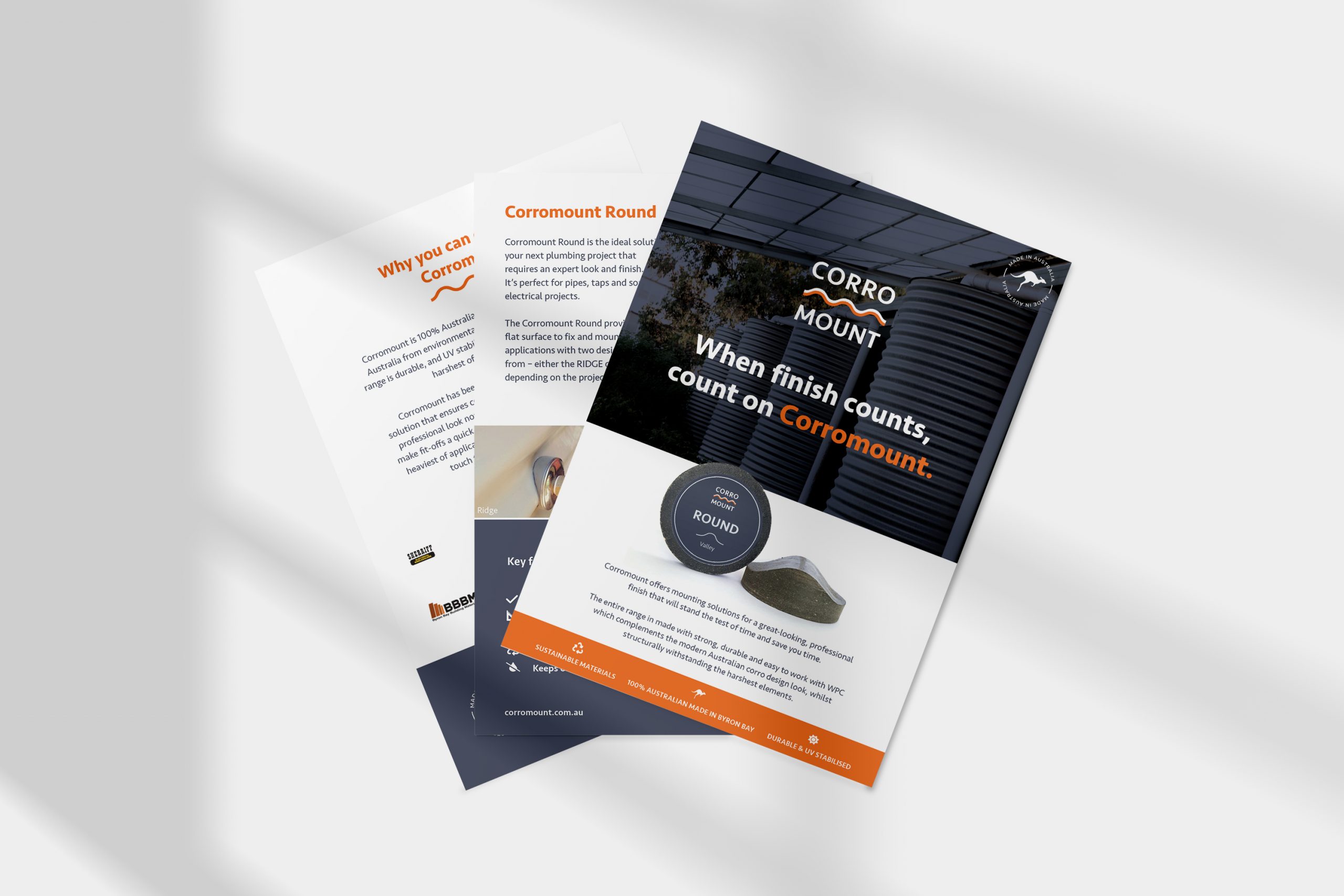
            The new logo was a refreshed version of the old, utilising the initial concept that was created for the identity but refreshing it with a stronger typeface, colours. The logo features two wavey lines in the centre, which represents the joining of the product to the corrugated surface. We also took the opportunity in created a strong strap line for the brand that they can own and use throughout their marketing collateral, “When finish counts, count on Corromount”.

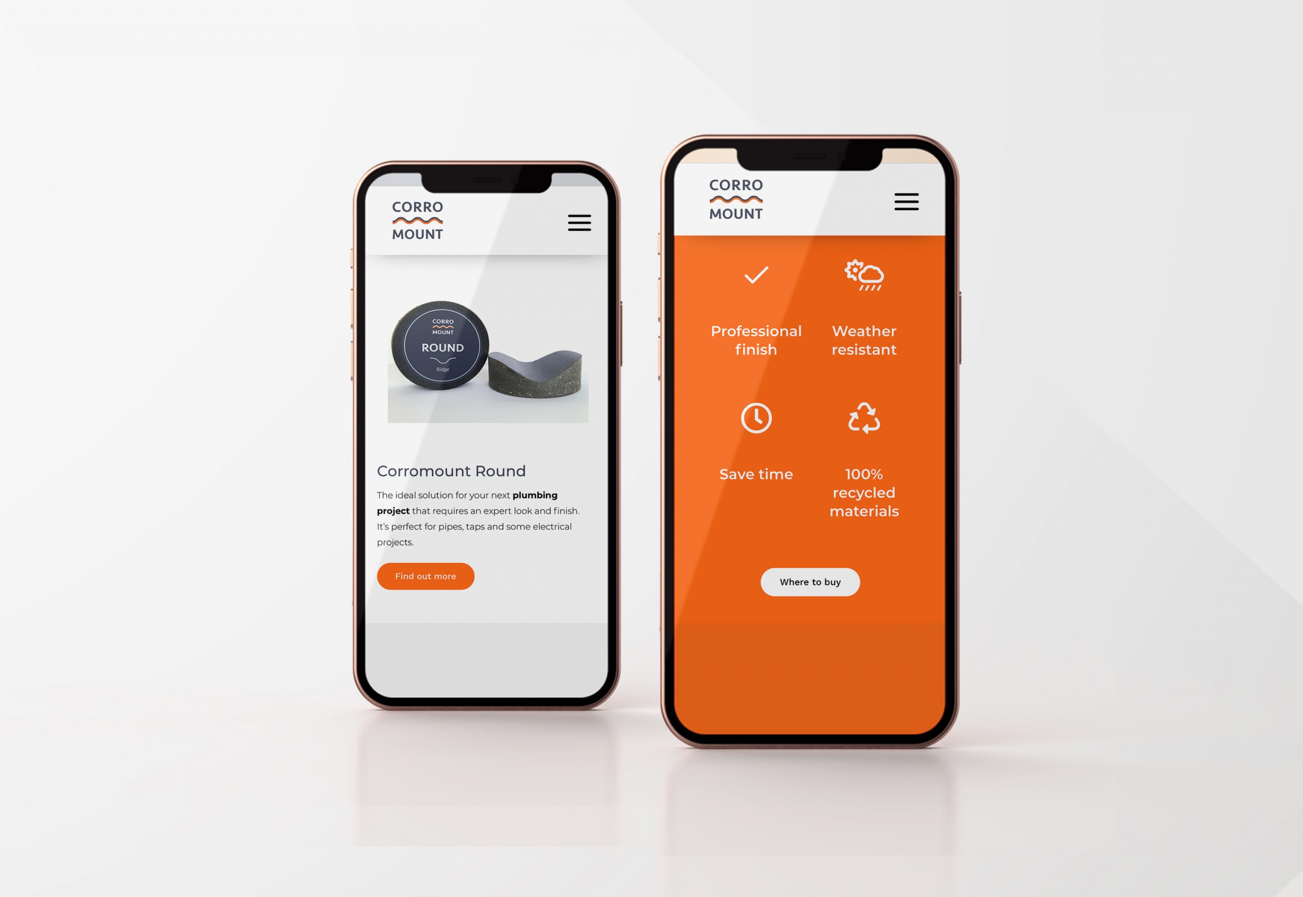
            Barefruit also designed and developed the new Corromount website, which needed to speak primarily to their B2B audience. The product pages and primary goal for the users is to enquire about the Corromount products and enquire for those looking to purchase. The website was designed to be responsive and implement content that the client had already created, with the aim of updating it, the website is future proofed for ongoing updates and changes.

            Unique brand features of the website include a parallax loading effect whilst scrolling the page contents, we also adding a nice wave line animation that highlights key words/actions on the website, which ties in with the logo design. Combining this with the new brand logo, colours and copy we have created the perfect finish for Corromount.

            Corromount Website-mobile
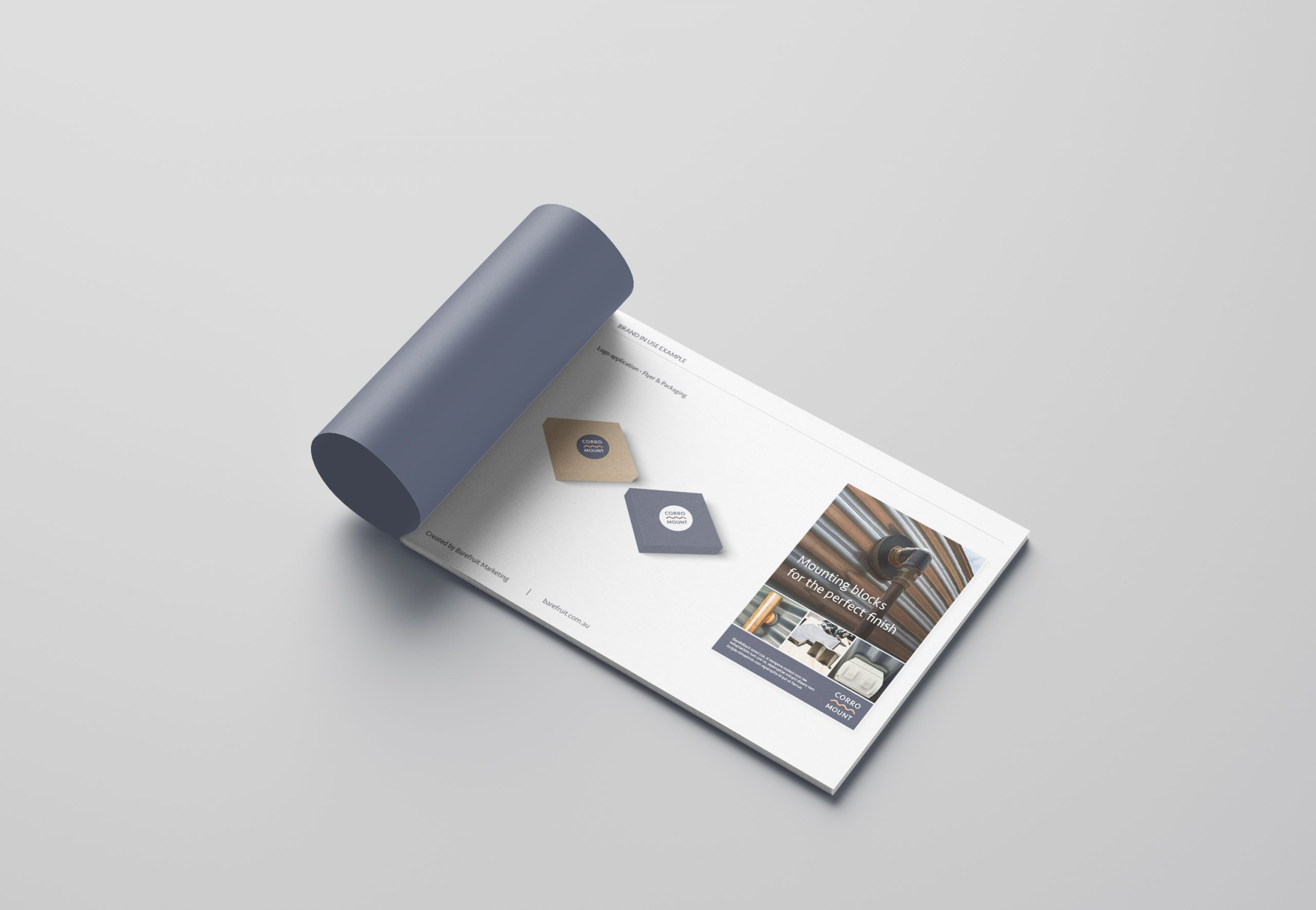
            Corromount flyers
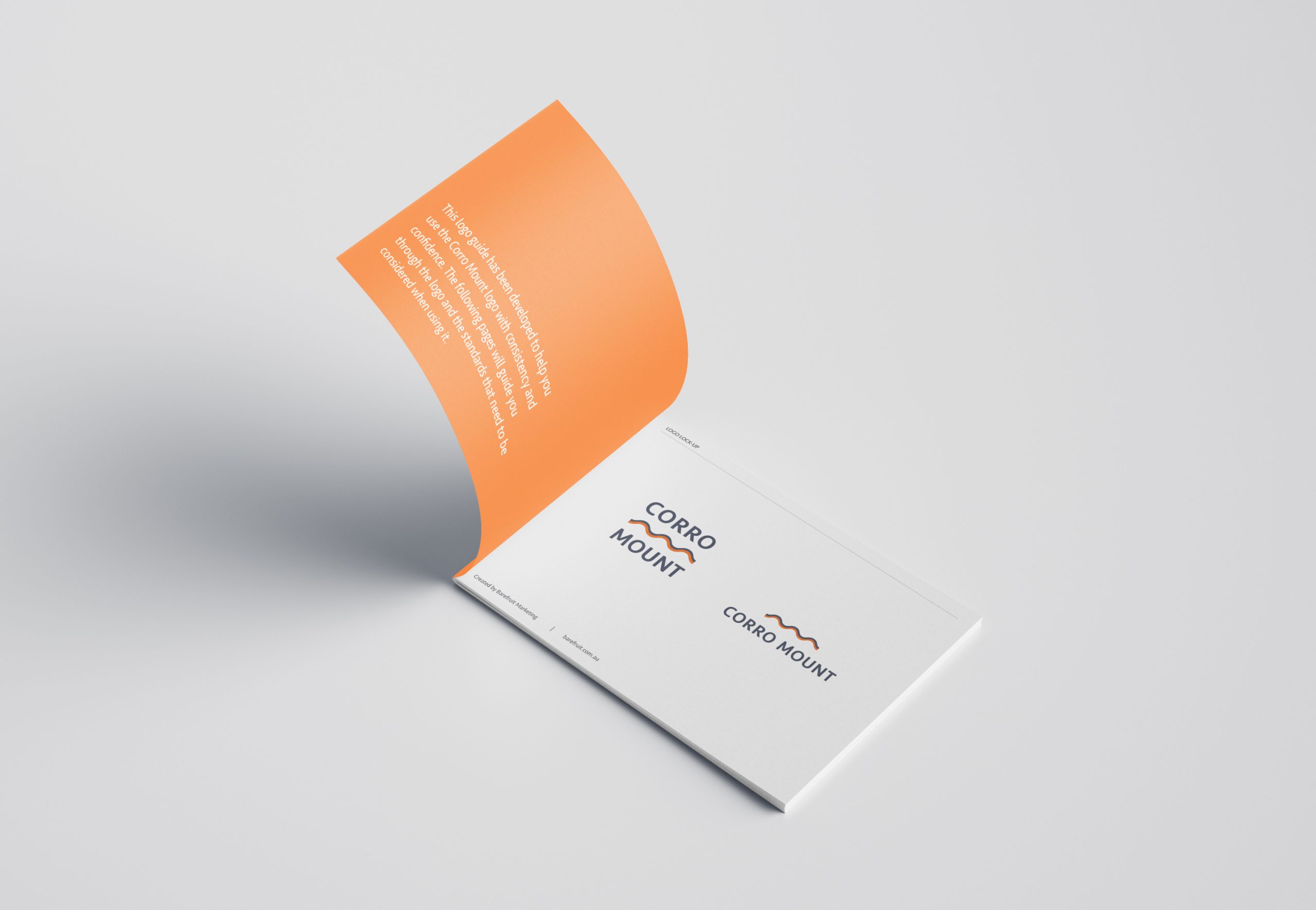
            Corromount Style Guide
            Corromount Syle Guide-2
            Corromount uniform
            Corromount caps

            Like what we do? Let us help your business grow?with an awesome branding project.
            Send us an enquiry below...

            Hey Team Fruity!

              I'm , I'd like you to help my business 'barefruit'.

              I am interested in

              You can call me on and email me at

              We'd love to know how you heard about us?

              Vivid Powder Coating – Ballina

              Vivid Powder Coating - Branding and Website


              Vivid Powder Coating - logo

              Background

              Vivid Powder Coating is a new business and service in the heart of Ballina, NSW. Barefruit was approached to come up with the brand name, branding, marketing collateral and website to launch this new service.

              The work

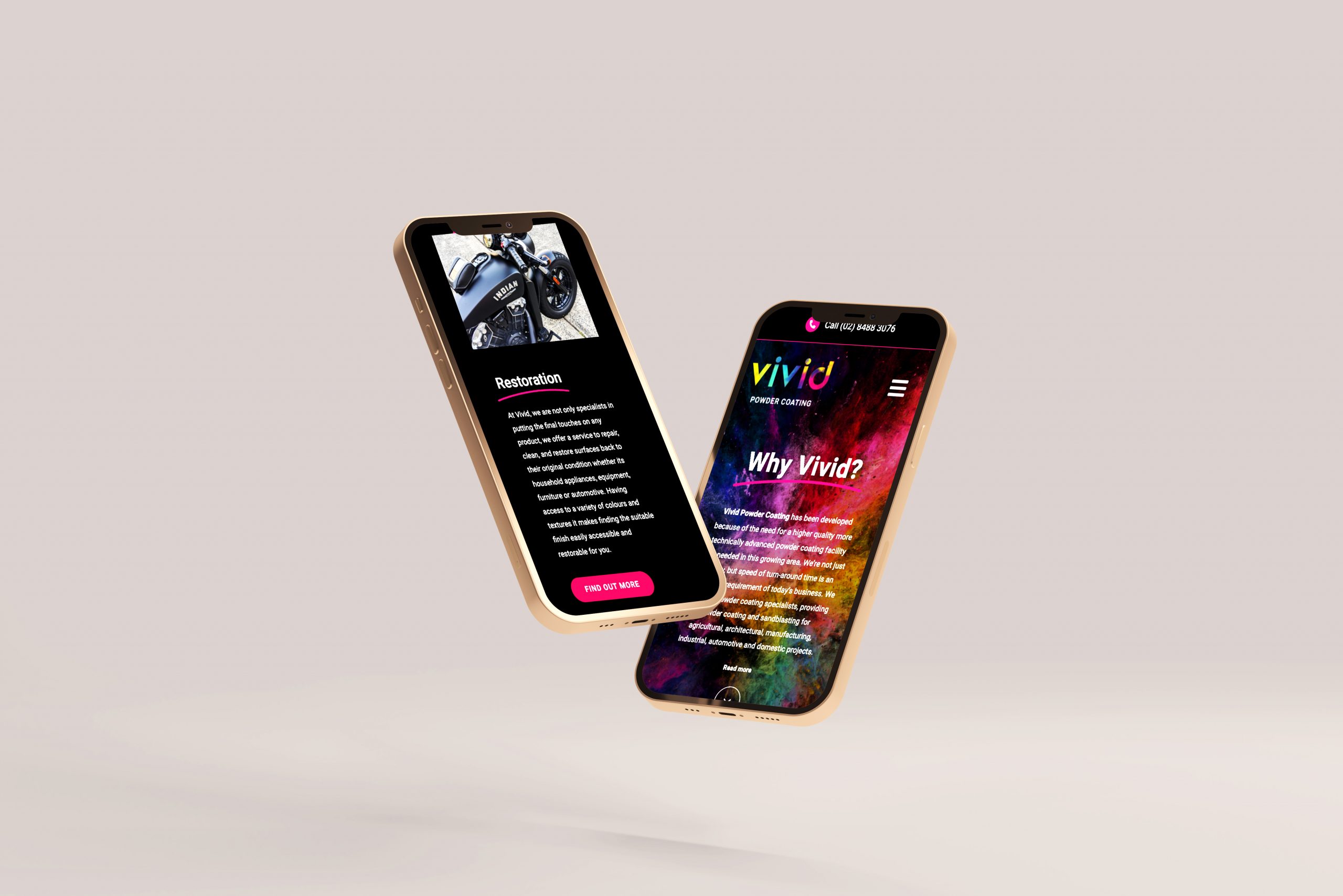
              This was a very fun project that started by researching naming options that work and tie in with their business, "Vivid" was the preferred naming option, the word suggests the perfect finish, clear, bright, vibrant the sort of finish you would expect to see if your respraying your Harley Davidson!

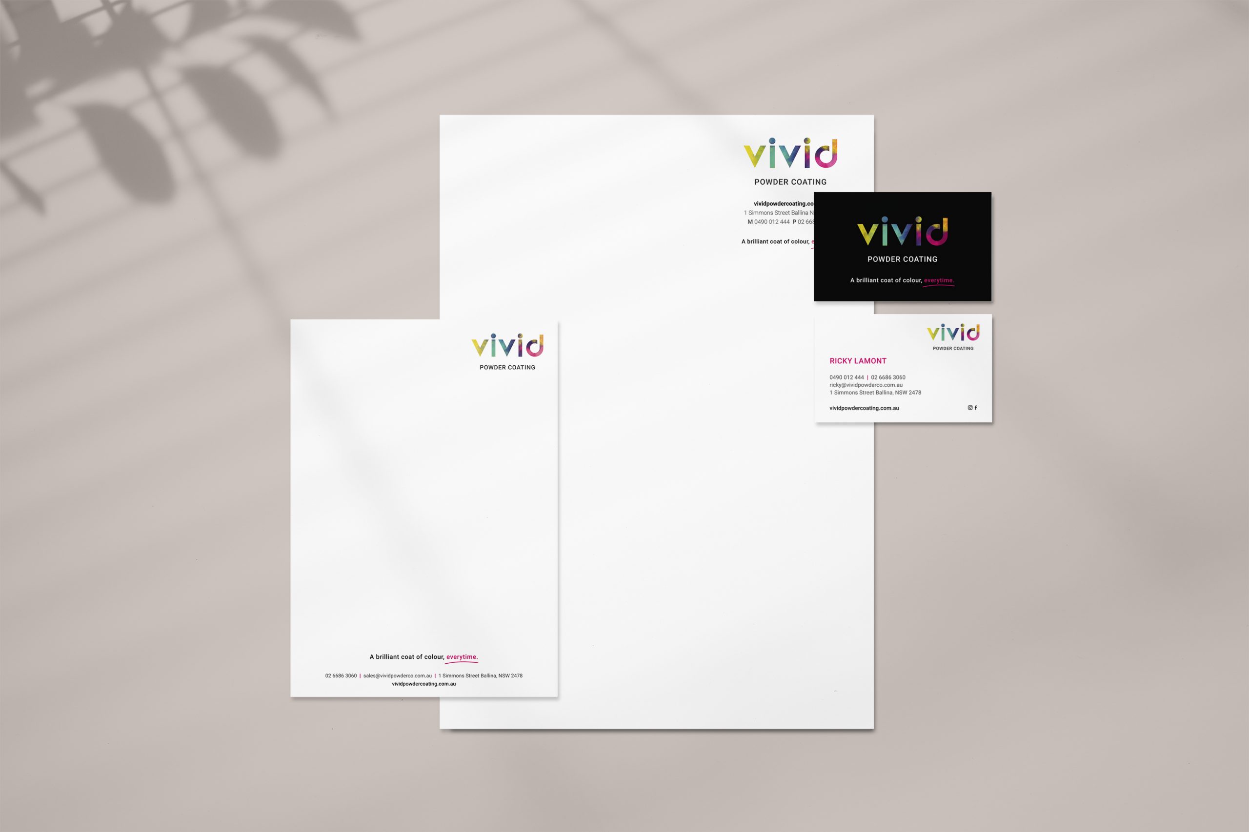
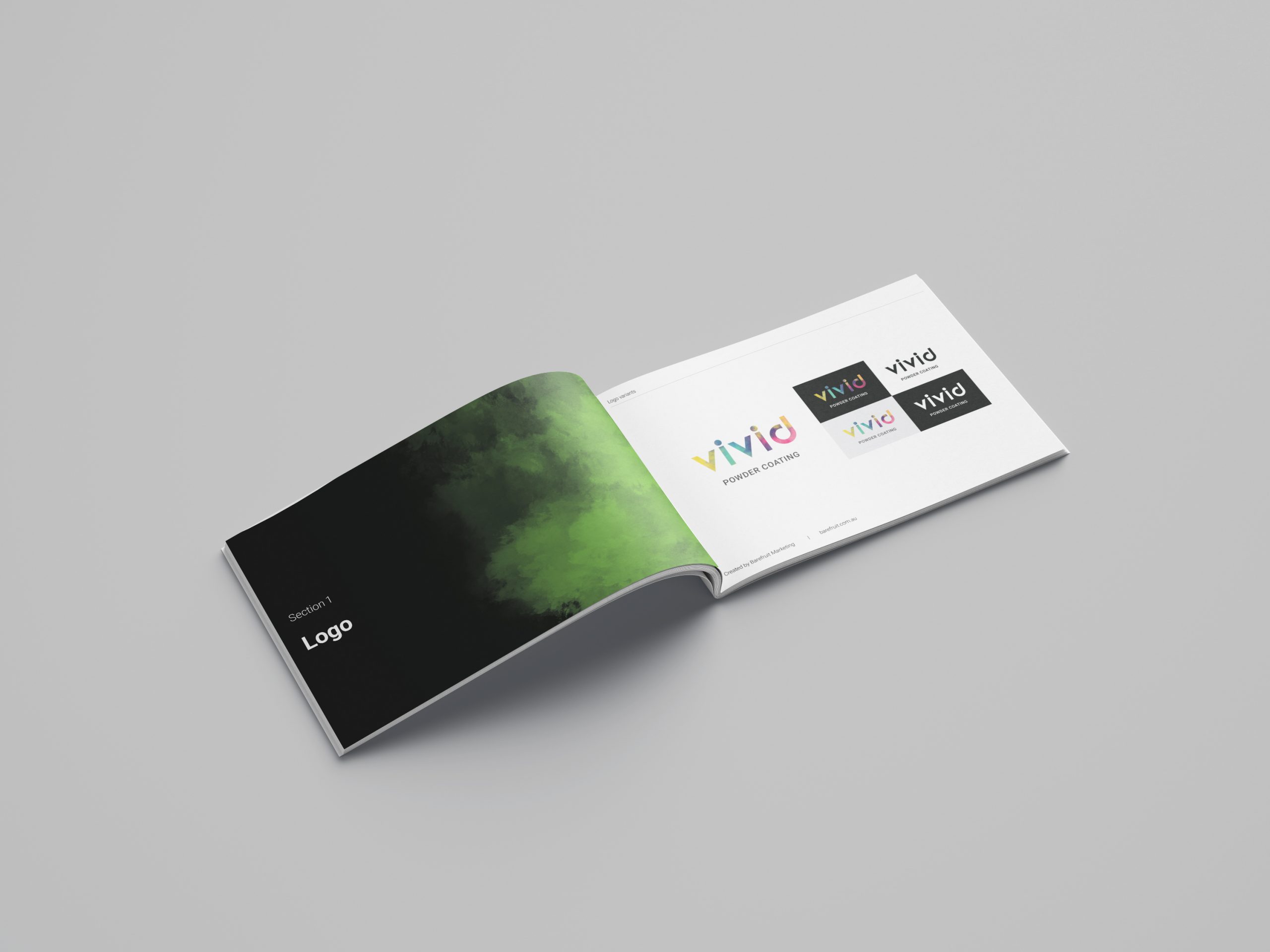
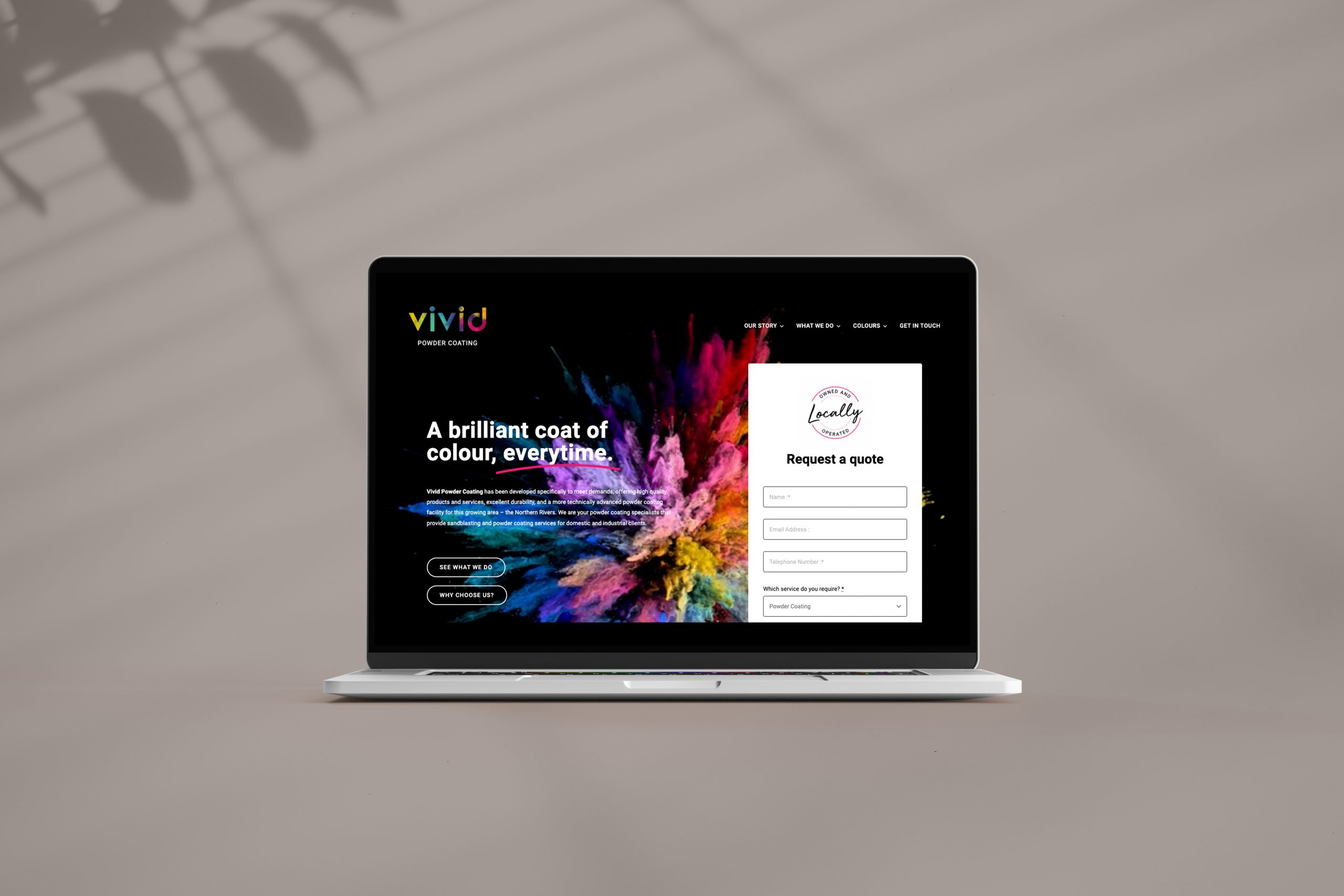
              With the business name decided we proceed on creating the identity for the brand, starting with mood boards to develop our initial concepts, the client loved the exploded powder of colour idea we presented and so this was to become the main feature of the branding on the Gold Coast and Ballina. We saw the direction for the branding working with a matt black to allow the colours to really pop, this allowed us to quickly concept how the brand elements were going to be applied. Choosing a typeface was a bit of a process, pairing a font that works with the personality of the word "Vivid" and the exploding colours, whilst staying professional looking meant the best route was a Sans Serif font. The final result was creative identity that tied in with what the business does. We also developed a strapline that really tied in with the logo and business service - "A brilliant coat of colour every time" and this has been applied consistently to their marketing.

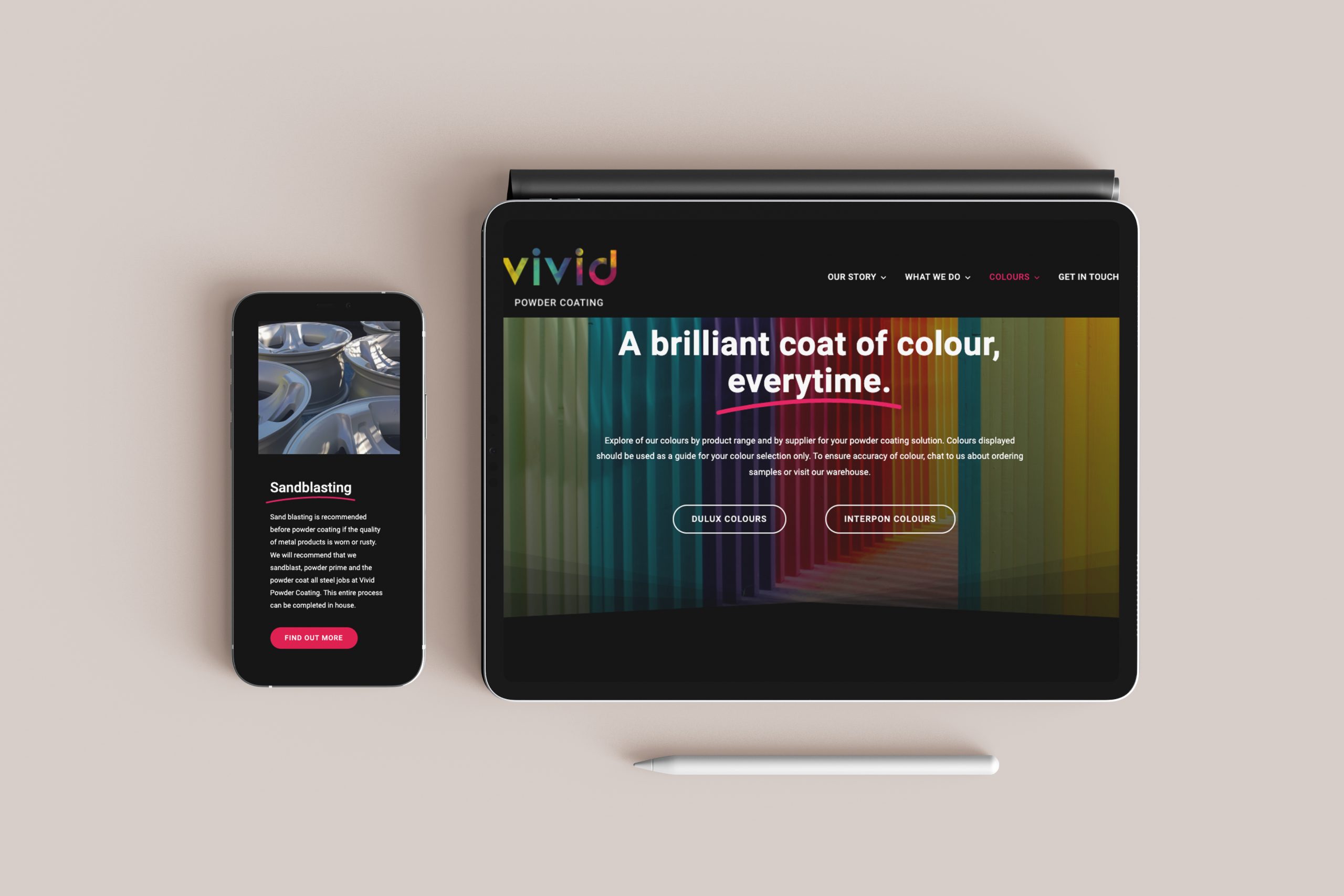
              The website was a fun process, prototyping the structure and thinking about the website goals. Styling, adding the video of the exploding powder on a black background became the website theme and we used the "hot pink" as the primary call to action and feature colour. We added in some subtle transitions to finish it off, including another brand feature which was the "Swoosh" animation added under the titles and strapline, this became a feature brand element that we used throughout the brand application to emphasis specific words and services.


              Vivid Stationary
              Vivid brand guide
              Vivid-Website mock
              Vivid-Website -desktop
              Vivid-Website-mobile

              Like what we do? Let us help your business grow?with an awesome branding project.
              Send us an enquiry below...

              Hey Team Fruity!

                I'm , I'd like you to help my business 'barefruit'.

                I am interested in

                You can call me on and email me at

                We'd love to know how you heard about us?

                Kerrect Re-brand & Website

                Kerrect - Re-brand & Website


                Kerrect Logo
                Kerrect Business card

                Background


                Kerrect is a unique service with skilled professional rope climbers and maintenance staff that can access and install safety netting and access points on buildings - they are the go-to experts for working safely at height without scaffolding. Kerrect came to Barefruit with the aim of refreshing their brand identity, website, creating a new strapline to stay ahead of its competitors and to modernise their look and appeal for today’s purposes.


                The work

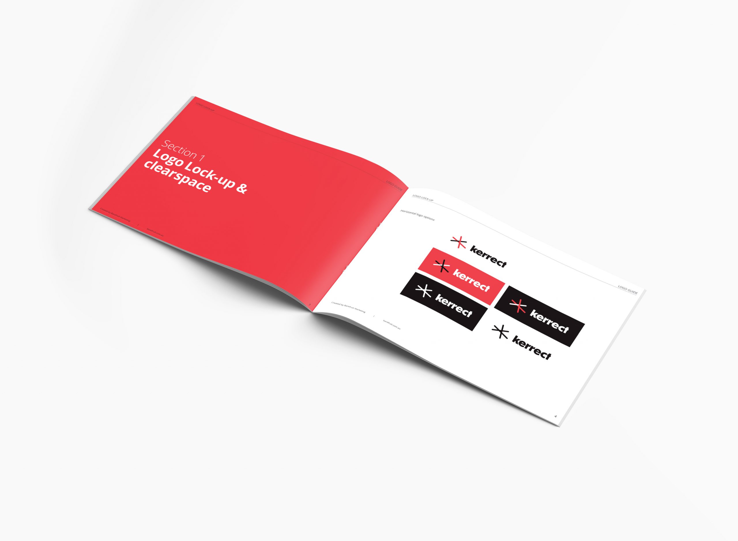
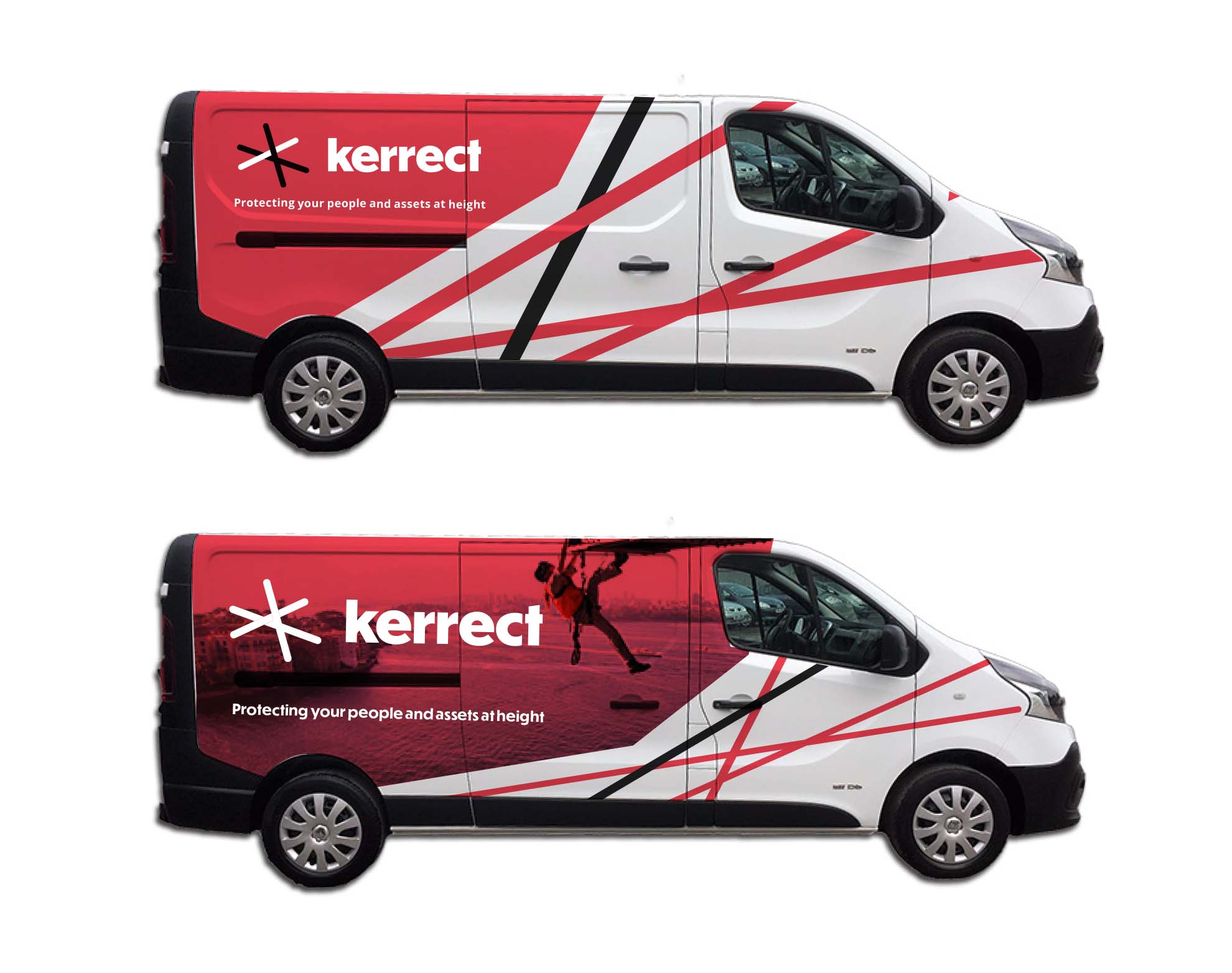
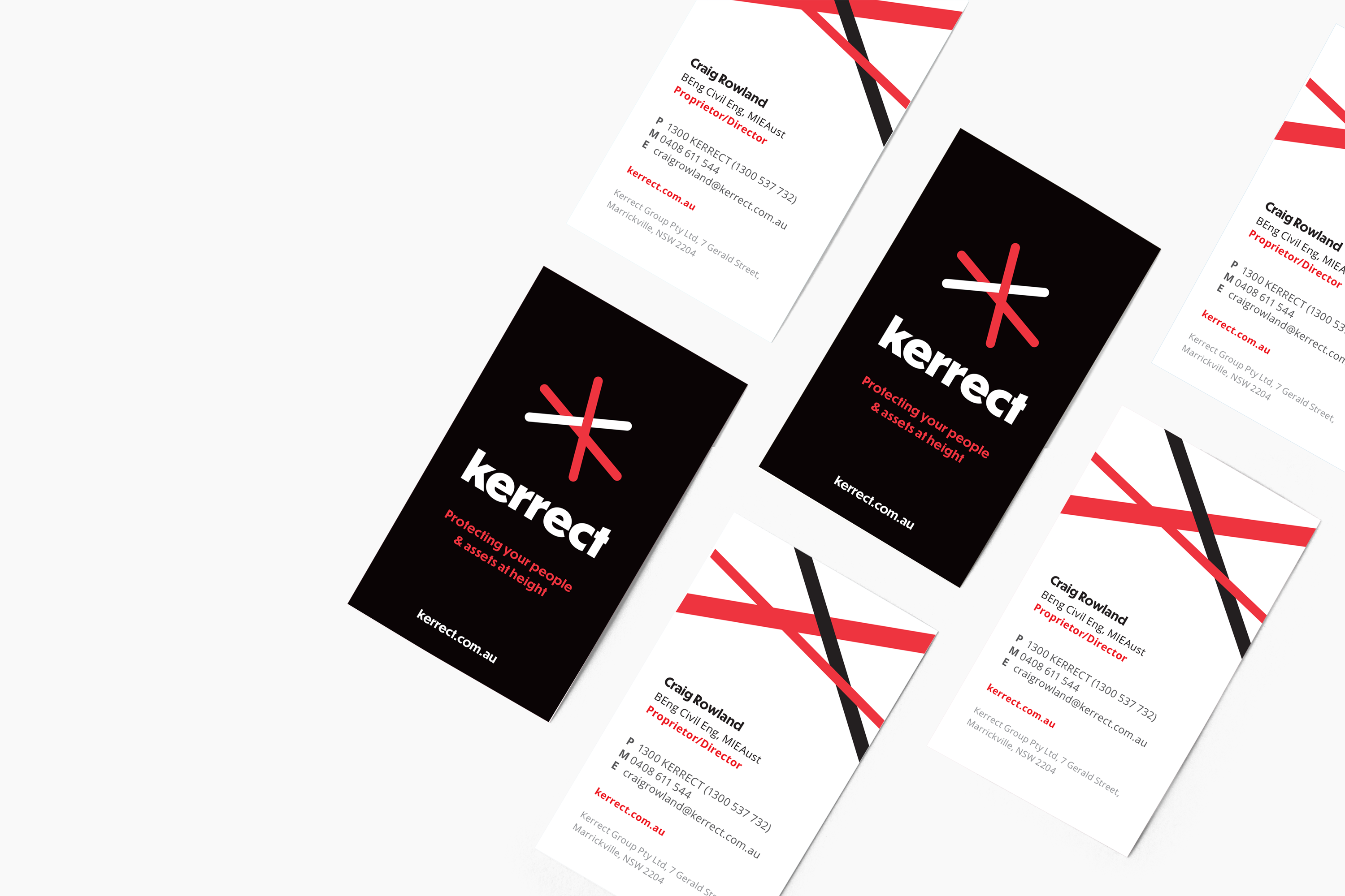
                The new logo evolved from utilising some of the old logo elements to create a stronger concept and brand identity that can be used in today’s digital world and on physical applications such as vehicles, netting on buildings, business cards and uniforms.

                The logo features lines to represent ropes, and uses the primary red and black colours of the brand to stand out amongst their competitors. The lines are positioned above the typeface to represent the safety netting and protection at height. Using a clean geometric sans font the brand identity is modern, approachable and professional.

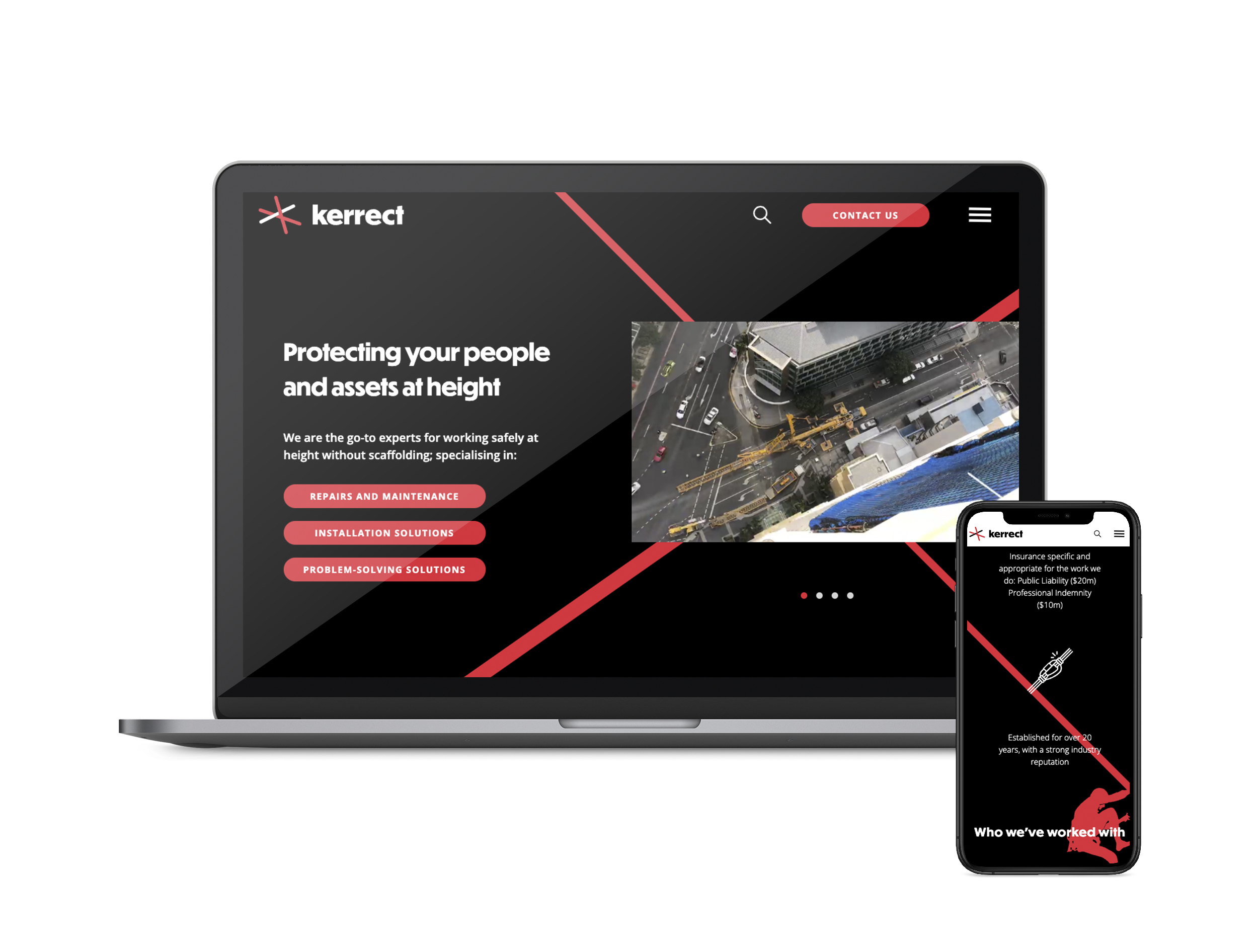
                As part of the brand process. we also developed a new strapline for the business that really specified what Kerrect is and does - the strapline needed to be unique and ownable for the business. The original strap was “Safety at height” but Kerrect do more than just that, therefore, it evolved into, “Protecting your people and assets at height." The new strap really captures the core value of the business and what the achieve on a daily basis, making sure people and any building or business assets are always safe and protected whilst caring out their height defying work.

                Barefruit also designed and developed a new cutting-edge website that was unique to Kerrect and what they do. We created a slick black themed website which made their primary colour 'red' really pop, and especially when used with unique parallax scrolling effects in the background, Kerrect now have a creative looking website. Parallax scrolling is a special scrolling technique used in website design where background images throughout a site move slower than the foreground image when scrolling. This creates a two-dimensional look and feel to the website and is accustomed to the way users behave nowadays - scrolling through feeds and pages. The whole website is fresh and up-to-date featuring areas for video or image based content with room to grow their portfolio projects. The navigation is also very simple to use on mobile and desktop and focuses on their user goals to enquire for one of their services.

                We are proud that the overall brand re-fresh has given Kerrect a big jump ahead of its competitors.


                Kerrect brand guide
                Kerrect website

                Guru_of_the_day_winner

                Award winning nomination from Web Guru Awards

                Click here to view the website

                Kerrect Van 2
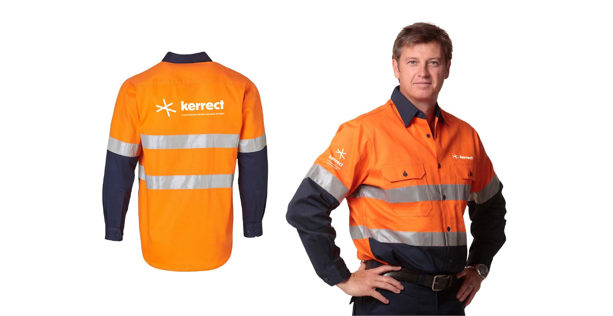
                Kerrect Uniform

                Like what we do? Let us help your business grow?with an awesome branding project.
                Send us an enquiry below...

                Hey Team Fruity!

                  I'm , I'd like you to help my business 'barefruit'.

                  I am interested in

                  You can call me on and email me at

                  We'd love to know how you heard about us?

                  A Guide to Email Marketing

                  Email Marketing 101

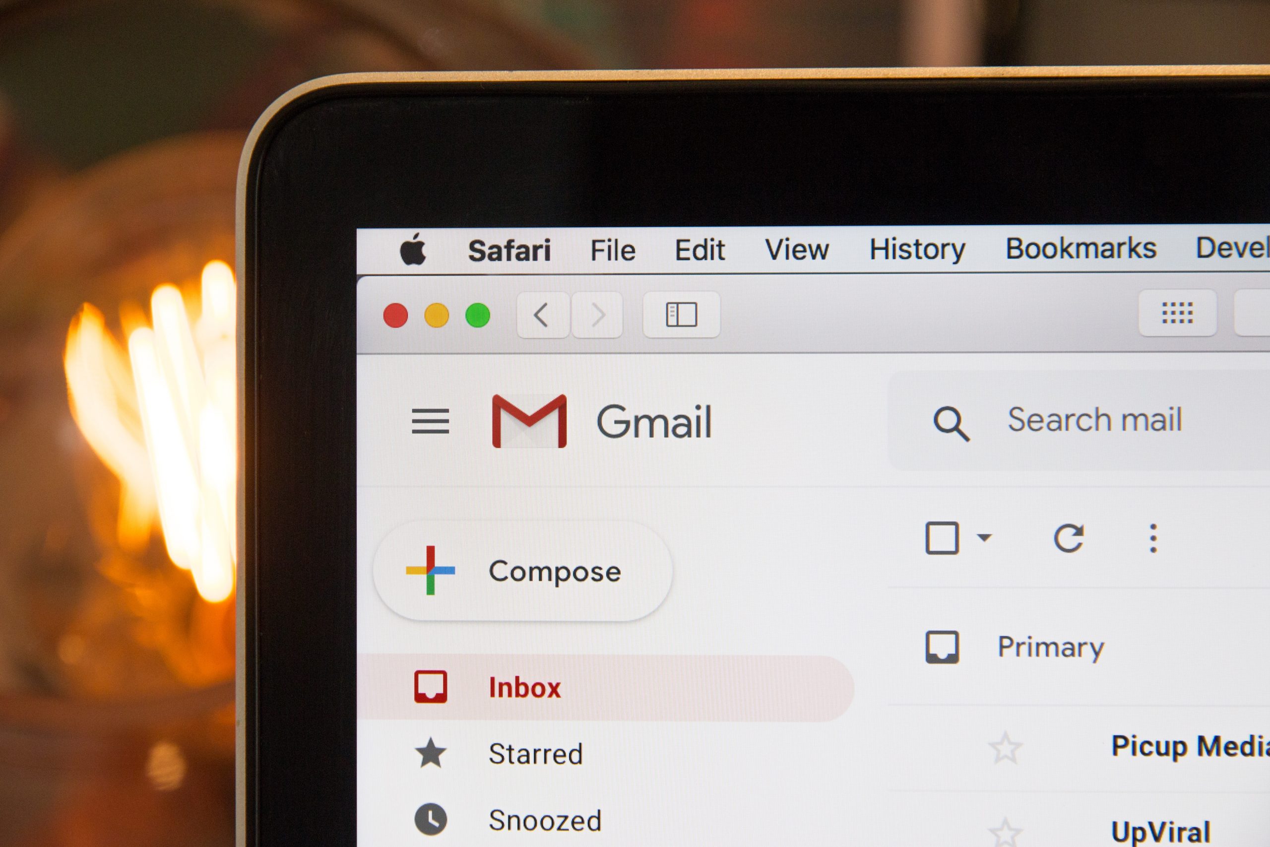
                  We know things are crazy at the moment for our local businesses. It’s a big juggle managing staff shortages, implications to supply chains and the ever-changing regulations, but there is one thing you can do to help your business maintain sales in this time, and that’s Email Marketing.

                  Email Marketing is your best friend. It’s one of the most effective ways to engage and build relationships with your customers, subscribers and leads. Why? Because you’re communicating with people who have already shown interest and see value in your business offering, and because of this they are much easier to nurture and convert into customers (and sales). Email Marketing on the Gold Coast can provide that extra push to move these people from the start to the end of the consumer journey.

                  The Golden Rule

                  Email Marketing is not about you or your brand, it’s about your audience. You need to really get in the mind of your target audience and create content you know they will value and engage with. Keep things simple to begin with and segment your contact list into customers and leads.

                  With your leads, your communication should give them the information and tools (in a non-salesy way) to make a purchase decision. Maybe that looks like behind the scenes content, product features and/or exclusive discounts. When it comes to your customers, Email Marketing is all about nurturing the relationship and doing what you can to get the most out of their appreciation for your brand, for example, tips on how to care for their purchase, how to use it in unconventional ways, loyalty and referral programs and asking them to leave a review. Top tip: offer something of value to your readers in exchange for an action, for example leaving a review, because if there is something in it for you, there has to be something in it for them.

                  Email Marketing

                  Automation

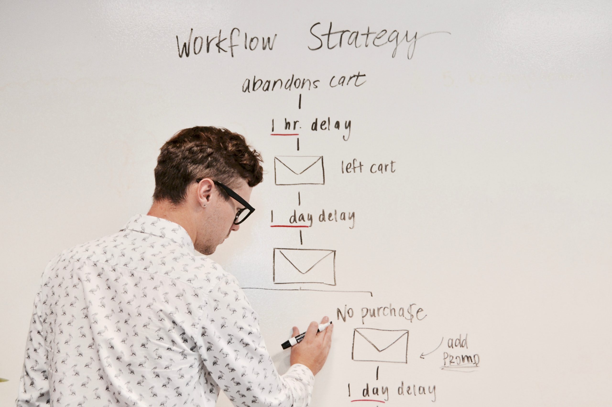
                  If you have a little time up your sleeve (perhaps when you’re isolating at home ?), setting up and automating a series of emails is the best thing you can do. Create a flow that a takes a newsletter subscriber or new customer on a journey to learn more about who you are and the products or services they are specifically interested in. The automated flow means all your new customers and subscribers are regularly reminded about your brand automatically. Remember, the content in these emails must be targeted to the reader (customers and leads need different information). Mailchimp is the place to get started and there are plenty of tutorials on YouTube to help when you get stuck.

                  Reach your readers in their inbox at the right time, with relevant and personalised content in a consistent manner and it’s more likely you’ll make more sales. Remember, there is a fine balance when it comes to how often you should reach customers on email. Don’t be a spammer – touching base with your valuable contact list every week or two is more than enough.

                  Check out what we’ve been up to

                  Lismore City Council
                  Lennox Centenary

                  Sunshine Sugar Website

                  Sunshine Sugar

                  Website and print collateral


                  Background and brief

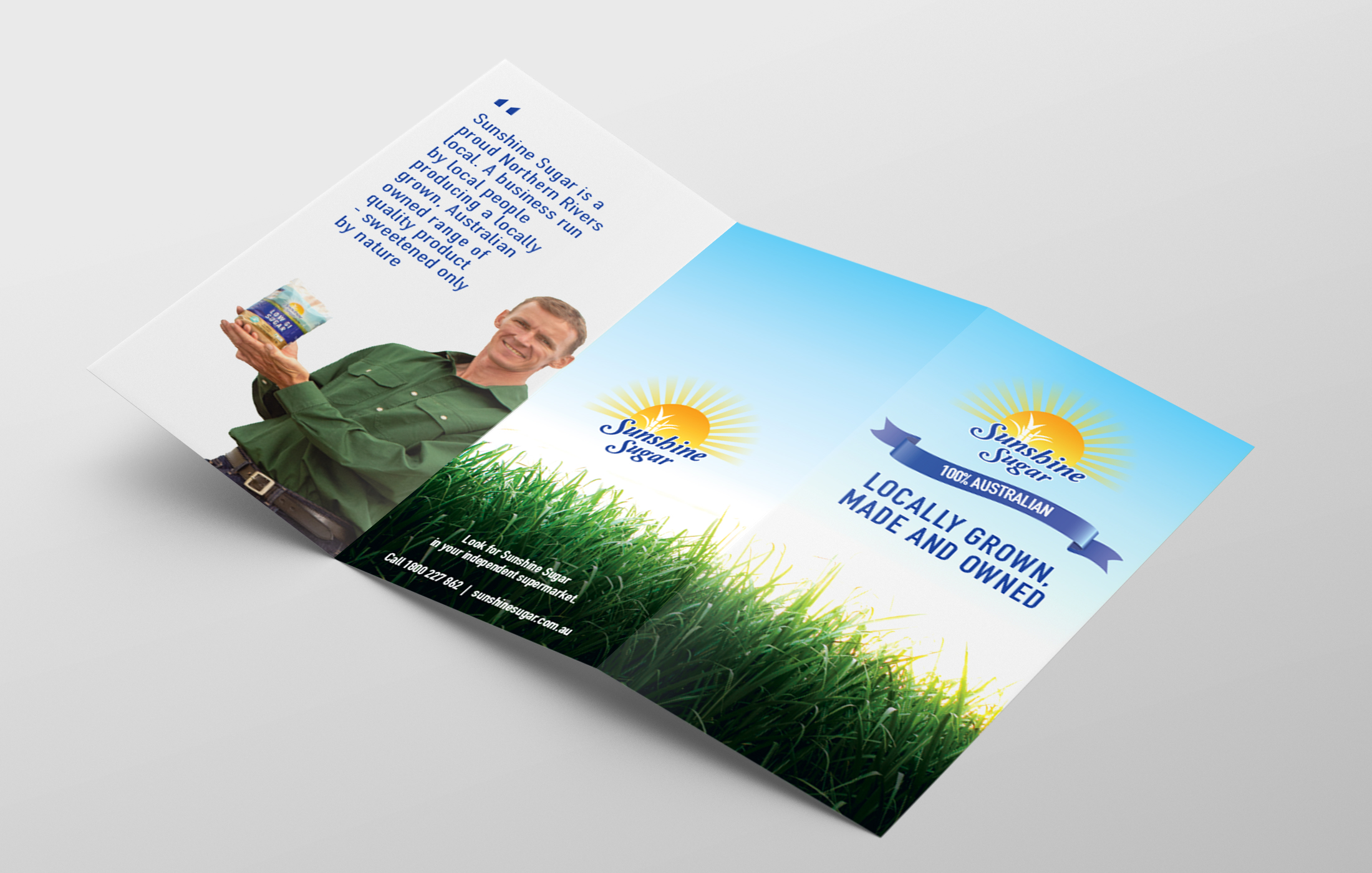
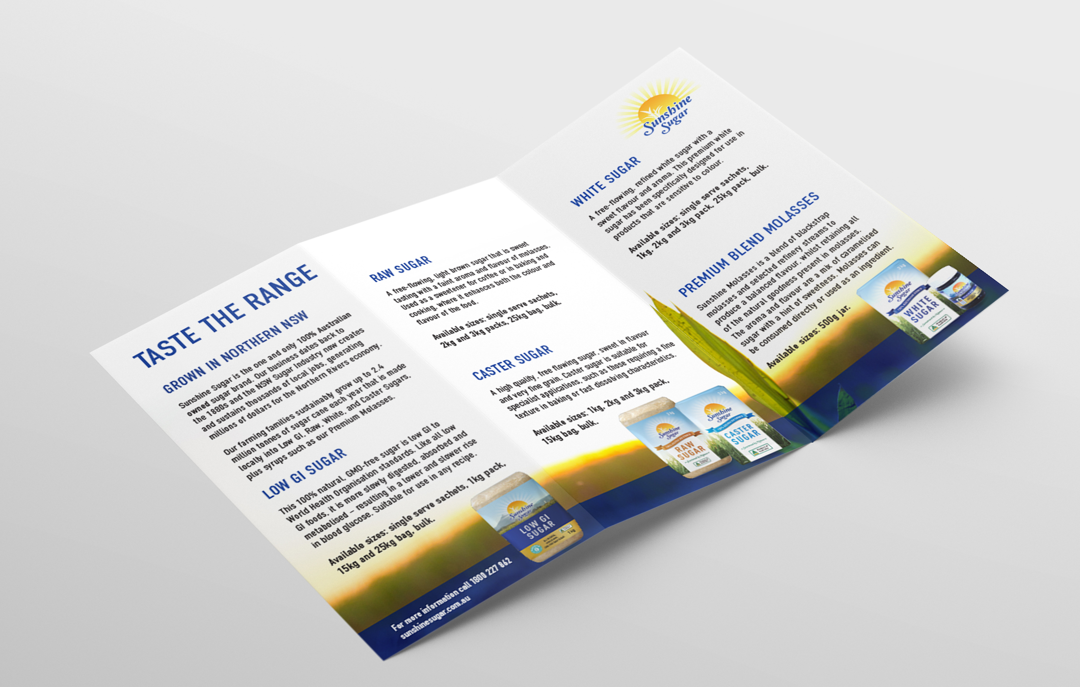
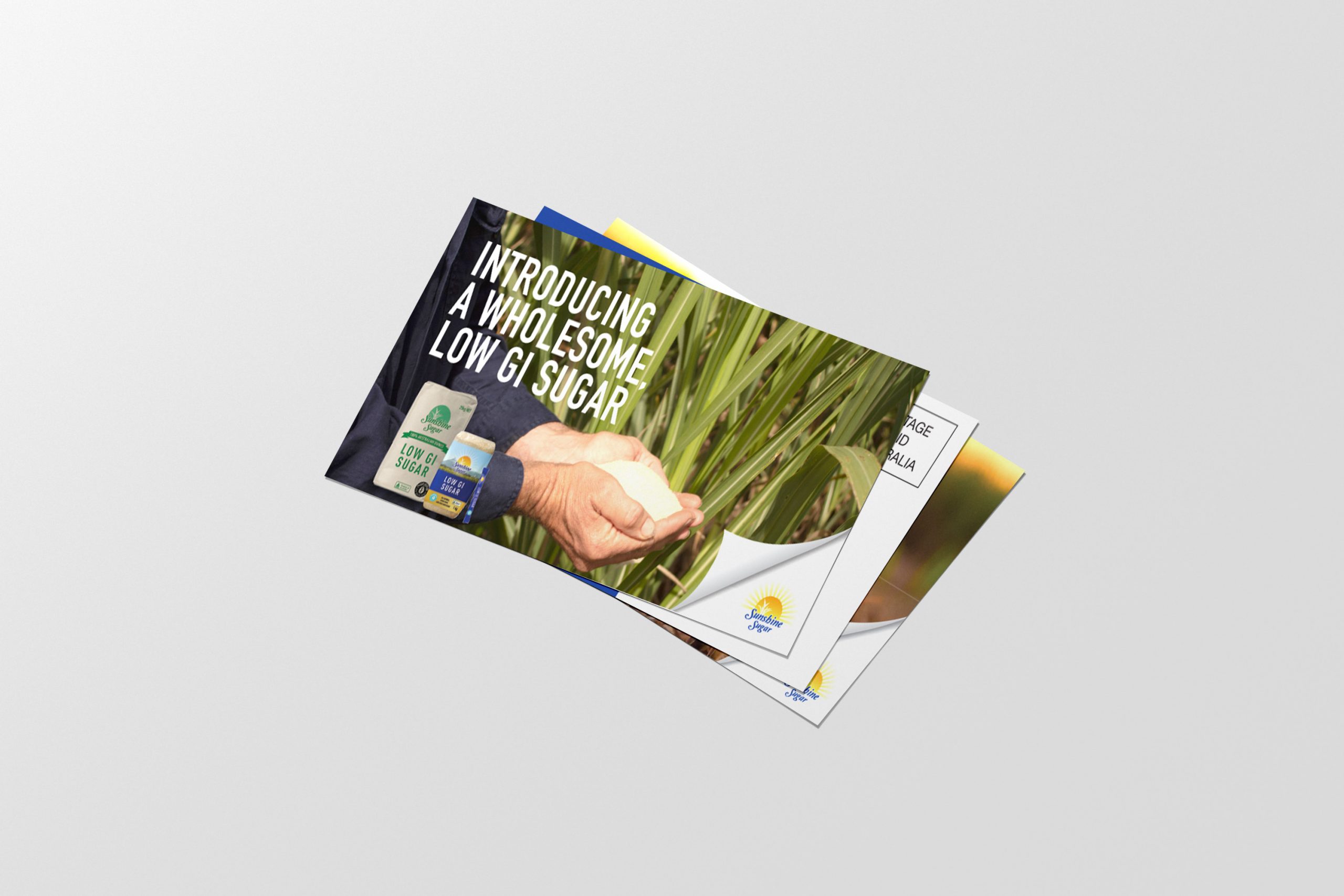
                  Sunshine Sugar is the only 100% Australian grown, made and owned raw and refined sugar manufacturer. We were approached by Sunshine Sugar to re-design and build a new website to target their business to a consumer target market. The old website was missing a professional look and feel and focused on their business-to-business audience using their corporate logo and brand colours.
                  The work

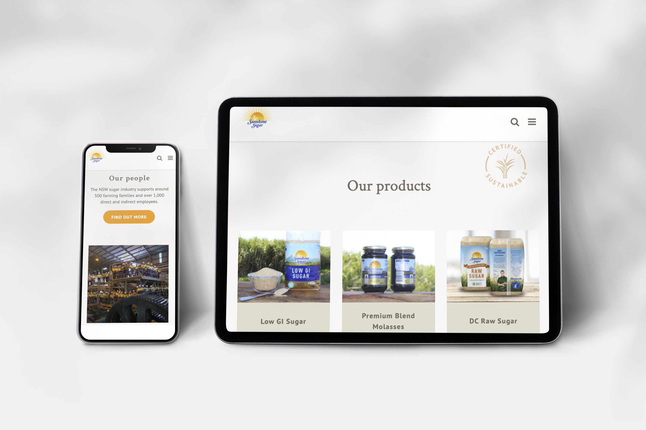
                  Our main objective was to design a new responsive website for mobile and desktop and to make it feel like a trusted brand for the consumer market rather than the corporate side of the business.
                  To showcase Sunshine Sugars’ authenticity in its business practice in being sustainable, local and offering a great product, we updated the brands colour palette to be more natural-looking with soft colour tones of neutrals and browns to work alongside their primary branding colours and recent photography.
                  To target their consumer audience specifically we updated the brand logo to the recognisable product branding that we all know to be Sunshine Sugar and showcased not just the products but also included a recipe section and fun fact features, such as a history of the business and links to careers and other information for customers and researchers alike.

                  Sunshine Sugar Website
                  Sunshine Sugar Flyer
                  Sunshine Sugar Flyer
                  postcard-sunshine sugar

                  Like what we do? Let us help your business grow?with an awesome website.
                  Send us an enquiry below...

                  Hey Team Fruity!

                    I'm , I'd like you to help my business 'barefruit'.

                    I am interested in

                    You can call me on and email me at

                    We'd love to know how you heard about us?